Disclaimer: This section is a TL;DR of the main article, and it’s for you if you’re not interested in reading the whole article. On the other hand, if you want to read the entire blog, just scroll down, and you’ll see the introduction.
- Losses terrify us as human beings. The possibility of losing what’s closest to our hearts and wallets impacts our decision-making.
- According to old wisdom, a bird in the hand is worth two in the bush, but that’s not always the case when we process our decision-making, especially when cognitive biases come into the picture.
- How you frame your offer helps how your customers perceive if you’re helping them save some money or lose it.
What Is Loss Aversion?
- Loss aversion is an automated response in behavioral economics that facilitates decision-making and helps us avoid loss at all costs.
- As humans, we go through tiny millions of decisions. On food, we overlook over 200 decisions daily.
- We’ve developed mechanisms to help us reach decisions faster to cope with overflowing choices.
- The riskier the context, the more loss aversion affects our decision-making.
Loss Aversion On A Riskless Context
- An experiment gathered three groups of people: sellers, buyers, and choosers of coffee mugs.
- The sellers received a coffee mug; they would have to decide on a selling price. No one wanted to sell their mugs for less than $7.12, while the buyers evaluated the mugs and established $2.87 as the maximum they would pay for acquiring them.
- Between the $7.12 and the $2.87 price evaluations lies a gain/loss perspective. Buyers saw the mug as a gain, so they attributed a lower value to it, as they were cautious about not losing money either. On the other hand, Sellers saw the mug as a loss of one of their goods, so they attributed a higher financial value to it.
- What about the choosers? This group could choose between gaining a mug or gaining money. Loss aversion plays upon somewhat risky situations than riskless ones such as the mug or money dilemma. The choosers didn’t overprice nor under-price the product because there was no risk involved. They would gain something, either way, be it money or a mug.
Loss Aversion In A Risky Context
- In this context, we’re examining patients’ reactions to a brochure on preventing advanced breast cancer.
- For the first group, the content emphasized the importance of performing self-examination. For the second group, the brochure highlighted the losses of not performing a self-examination.
- Scared by the possible losses, the second group indicated higher positive attitudes and behaviors related to the exams.
A Case Study On The Capuchin Monkeys
- Scientist Santos and her team created a non-human market where they introduced tokens as a means of exchange to get grapes.
- Soon enough, the monkeys understood they could get food if they handed one of the tokens.
- With time, the scientists started to change the offers, which changed the value of each token. Instead of getting one grape for one token, monkeys could get two or three grapes. With the change in offers, the monkeys had to decide between safe and risky bets.
- The scientists framed these bets differently in terms of loss and gain.
- In one of the scenarios, the monkeys could choose between indeed receiving one grape for one token, plus a bonus grape, or betting on receiving three grapes, two as a bonus, with the risk of getting just one grape (no bonus). In this gain perspective, monkeys always opted for the safe bet, the guy offering one grape plus one bonus every time.
- In the loss scenario, the monkeys started receiving three grapes for one token. But they had to make decisions on how many grapes they would lose. With these two scenarios, scientists could show monkeys, as humans alike, to avoid the certainty of loss and shoot for possible, uncertain wins.
Loss Aversion In Marketing: Framing your offers
- The not-so-hidden secret to employing this technique? Just frame your offers in terms of loss instead of framing them in terms of gains.
- When tested among other cognitive biases on an e-commerce platform, loss aversion outperformed its counterparts, reaching the highest increase in conversions and the highest mean scores for maximizing page views, as Daugirdas Jankus found out in his research at the ISM University of Management and Economics.
- If you want to highlight your offer from the perspective of loss aversion, make it risky, and offer a referent to base the comparison.
- Discounts are a great way to reinforce loss aversion. Just tell your visitors they could be spending more to buy the same item or service.
- With specific offers and clear deadlines, coupons frame the benefits of getting a product in terms of loss.
- Receiving a free trial or sample automatically makes users feel like owners. Once this is established, they don’t want to lose the product.
- Pre-order deals play upon loss aversion by offering discounts and bonuses and providing early exclusive access to new items. Early access creates an ownership people want to preserve.
Here’s A Longer And More Detailed Version Of The Article.
Losses terrify us.
The possibility of losing what is close to our heart, or wallet, impacts our decision-making process.
Naturally, we avoid going through any losses, but our brains have mysterious ways of averting losses and falling into risky situations.
A bird in the hand is worth two in the bush, old wisdom has taught us. Although that is not always how we process our decisions, especially when cognitive biases come into the picture.
So, the central question is: can you help your customers in making decisions that will keep the bird/dollars in their hands, by minimizing their losses? The answer is in how you frame your offers.
You will find in this article three leading experiments on loss aversion.
You will take a look as well at loss aversion outperforming other cognitive biases on increasing conversion rates for an e-commerce platform.
And you will also find inspiration in 13 marketing strategies to trigger loss aversion online.
Ready?
Let’s start!
What is Loss Aversion?
As one of our automated responses in behavioral economics, loss aversion facilitates decision-making, by leading us to avoid losses at all costs.
Decision-making is hard business.
Buying a car or committing to a mortgage stand out as major, energy-draining decisions. Not to mention choosing a career.
But we go through millions of tiny decisions as well. On food alone, we overlook, on average, 200 decisions a day. To cope with overflowing choices and prevent decision fatigue, we have ancestral mechanisms to help us reach faster decisions, based on our previous knowledge and interpretations of the world that surround us.
Our decisions may seem to follow a rational, clear, straight-forward process, but that is just our brains deluding us. We adopt a less logical route when evaluating our choices.
For instance, if we had to decide between gaining 10 dollars or avoid losing 10 dollars, we would avoid losing the money we already have. At a first moment, our happiness for a 10-dollar win should have the same intensity of our sorrow for a 10-dollar loss. But no! The feeling of loss is way deeper and more intense than the joy of gaining.
So, we avoid losses at all costs, and make decisions based on this cognitive bias.
The riskier the context, the harder loss aversion plays upon our decision-making. To better understand this correlation, let’s talk over a cup of coffee.
Loss Aversion on a Riskless Context

Image source: Pixabay
For a riskless situation, an experiment gathered three groups of people: sellers, buyers, and choosers of coffee mugs; as Nathan Novemsky, from Yale University, and Daniel Kahneman, from Princeton University, reminds us.
The sellers received a coffee mug they would have to decide on a price for selling. No one wanted to sell their mugs for less than $7.12, while the buyers evaluated the mugs and established $2.87 as the maximum they would pay for acquiring them.
Between the $7.12 and the $2.87 price evaluations lies a gain/loss perspective. Buyers saw the mug as a gain, so they attributed a lower value to it, as they were cautious in not losing money either. Sellers, on the other hand, saw the mug as a loss of one of their goods, so they attributed a higher financial value to it.
What about the choosers? This group could choose between gaining a mug or gaining an amount of money. Different from the sellers, this group would not receive a mug and then exchange it for money, they would either get a mug or money.
How would they put a price on the mug? Those who chose money over mug evaluated $3.12 as a fair amount to receive. They didn’t see the mug as something they already owned.
Loss aversion plays upon rather risky situations than riskless ones as the mug or money dilemma. The choosers didn’t overprice nor under-price the product because there was no risk involved, they would gain something either way, be it money or mug.
However, in this case, choosers’ evaluation of $3.12 almost matches buyers’ predisposition to pay $2.87. This low difference suggests that, in regular purchases, buyers’ expectation of exchanging money for an item diminishes the impact of loss aversion. Buyers didn’t think they were losing money if they spent $2.87. If loss aversion showed up for this decision, buyers would have set much lower prices in comparison to choosers.
In risky situations, loss aversion certainly comes in. Let’s see how this cognitive bias helps people take action when a life-threatening disease is involved.
Loss Aversion on a Risky Context

Just to make sure we are at the extreme of a risky context, let’s check patients’ reaction to a brochure on preventing advanced breast cancer.
Two groups of patients received almost identical brochures on breast self-exam. For the first group, the content emphasized the gains of performing self-exams, while the second group received a negatively-framed brochure, highlighting the losses of not performing the self-exams.
Scared by the possible losses, the second group indicated higher positive attitudes and behaviors related to the exams.
As the disease is scary enough, and the content on both brochures was similar, a rational reaction would be a high increase in self-exams in both groups of patients. But loss aversion drove the decision of one of the groups. Framing the self-exams in terms of loss, instead of gains, led patients to take action.
No, we are not the rational decision-makers we wish we were. And we are not alone. As it turns out, capuchin monkeys are loss avert, too.
Undeniable Loss Aversion

So far, we talked about loss aversion acting upon decisions on financial and health matters. It all seems pretty human. But, surprisingly, capuchin monkeys display the same cognitive bias for economic decisions, as scientists at the Comparative Cognition Laboratory at Yale University found out.
You can learn how the scientists created a non-human financial market in “A Monkey Economy as Irrational as Ours,” Laurie Santos’ TED Talk. In this market, Santos and her team introduced tokens which the monkeys could exchange for food. Soon enough the monkeys understood they could get food if they handed one of the tokens.
With time, the scientists started to change the offers, which changed the value of each token. Instead of getting one grape for one token, monkeys could get two, or three grapes. With the change in offers the monkeys had to make decisions between safe and risky bets.
The scientists framed these bets differently, in terms of loss and gain.
In one of the scenarios, the monkeys could choose between surely receiving one grape for one token, plus a bonus grape, or betting to receive three grapes, two as bonus, with the risk of getting just one grape (no bonus). In this gain perspective, monkeys always opted for the safe bet, the guy offering one grape plus one bonus every time.
In the loss scenario, the monkeys started out receiving three grapes for one token. But they had to make decisions on how many grapes they would lose. One of the guys always offered two grapes. This was a safe loss. The other guy sometimes offered three grapes, or just one grape. This was a risky loss. Rationally, the monkeys should choose the safe guy, with the safe loss, but acting on loss aversion, and mirroring human decision-making, they always made the risky decision of trying to keep more grapes, losing to risk one more grape in the transaction.
With these two scenarios, scientists could show monkeys, as humans alike, avoid the certainty of loss and shoot for possible, uncertain wins. Monkeys treat losses as more important than gains, just as we feel losses more intensely than we feel the gains.
The gain/loss scenarios also show the decision-making was based on the referent. The monkeys were considering taking the risky action when comparing the choice to the immediate option. They could not evaluate the general picture of receiving two grapes for one token, which was a gain already, when compared to the initial stage of one token buying one grape.
We need an enormous effort to understand reality in absolute terms, so, when making decisions, we use a baseline as reference. In evaluating a gain or loss scenario, we always chose a stand point of reference to base our assessment. This reference might trick us, as it happened with the monkeys and their decisions on trying to get more grapes.
When a close referent makes us lose sight of larger, more distant references, myopic loss aversion comes into play. Investors, in special, fall prey to this bias, as they tend to view their investments under short-term lenses. A larger gain accumulated within a year, for instance, gets dismissed by a recent minor loss over the last month.
As core as these biases are, they must have been shaping our decisions for a long time. Indeed, they have, and marketers could see them before scientists named them. As Robert Collier signals to us in The Robert Collier Letter Book, first published in 1931:
There are only two reasons why your reader will do as you tell him to in your letter. The first is that you have made him want something so badly that of his own volition he reaches out for your order card to get it. The other is that you have aroused in him the fear that he will lose something worthwhile if he does not do as you say.
Loss Aversion in Marketing: Framing Your Offers
When you want to inspire fear, be definite! Be specific! Robert Collier
Inspiring the fear of losing: a powerful technique since the 1930s.
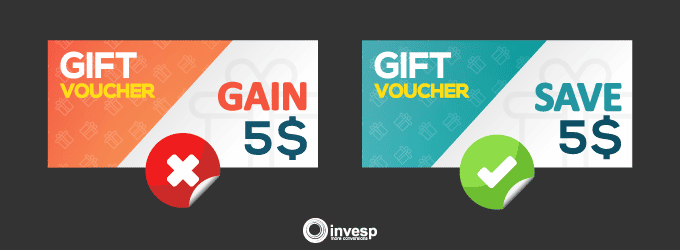
The not-so-hidden secret to employ this technique? Just frame your offers in terms of loss, instead of framing them in terms of gains.
When tested among other cognitive biases on an e-commerce platform, loss aversion outperformed the counterparts, reaching the highest increase in conversions and the highest mean scores for maximizing page views, as Daugirdas Jankus found out in his research at the ISM University of Management and Economics.
Along with loss aversion, Jankus tested the countdown effect, the bandwagon effect, the gain effect, and a control (no effect) variation. For one week, in a website with an average of 21,000 weekly sessions, the biases were tested for page views, view time, page value, and conversions. A weekly test on this platform guaranteed at least 400 unique session views for each of the page combinations with each bias.
The control variation, with no effects on, performed poorly for conversions, time on page, and all the other metrics. Pages equipped with cognitive biases had better overall conversion rates.
The messaging tested by Jankus was meant to trigger different cognitive biases on visitors of a food delivery platform:
| Cognitive Bias | Messaging |
| Loss Aversion | The meal is already reserved! Do not miss a chance to order it! |
| Countdown Effect | Order your meal in [timer] and we will deliver it to you by [delivery time]! |
| Bandwagon Effect | This meal was already delivered to 100+ clients! Be one of them – Order Now! |
| Gain Effect | The faster you order – the faster you get! |
You can see the messages above frame decisions from different perspectives. For loss aversion, the message implies that the meal already belongs to the visitor.
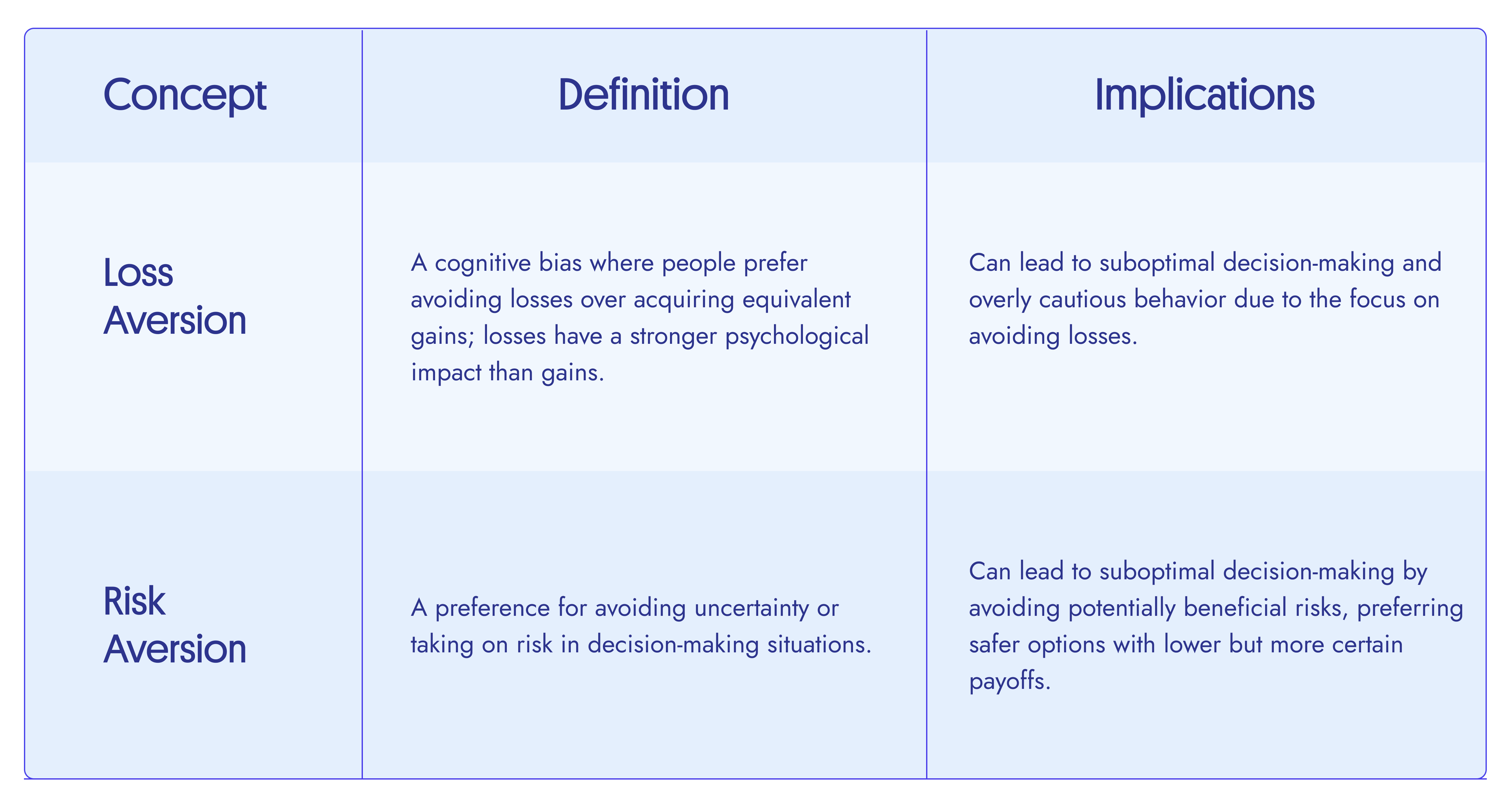
Difference Between Loss aversion and Risk aversion.
Loss aversion and risk aversion are related psychological concepts in the field of behavioral economics, but they have distinct meanings and implications:
Loss aversion:
Loss aversion is a cognitive bias where people tend to prefer avoiding losses over acquiring equivalent gains. In other words, the psychological impact of a loss is generally perceived as more significant than the pleasure derived from a gain of the same magnitude. This phenomenon was first described by psychologists Daniel Kahneman and Amos Tversky as part of their Prospect Theory. Loss aversion can lead to suboptimal decision-making, as individuals might be overly focused on avoiding losses, even when the potential gains outweigh the risks.
Risk aversion:
Risk aversion refers to the preference for avoiding uncertainty or taking on risk in decision-making situations. A risk-averse individual would typically choose a safer option with a lower, but more certain payoff, over an option with a potentially higher payoff but also a higher degree of uncertainty or risk. Risk aversion is a natural human tendency, as people often want to minimize the potential for negative outcomes. However, it can also result in suboptimal decision-making when the potential gains of a riskier option significantly outweigh the potential losses.
In summary, loss aversion is specifically concerned with the asymmetric psychological impact of losses versus gains, while risk aversion pertains to the general preference for avoiding uncertainty and risk in decision-making situations. Both concepts can influence human behavior and decision-making, sometimes leading to suboptimal choices.
How to frame loss aversion on your offers.
Let’s draw three guidelines from the three experiments of buyers under-pricing mugs, women acting on disease prevention after reading a negatively-framed brochure, and monkeys risk-betting to keep more grapes:
- Frame the offer in terms of loss.
- Make it risky.
- Offer a referent to base the comparison.
Let’s add three of Collier’s advice:
- Inspire the fear of losing.
- Be definitive, by setting a timeframe.
- Be specific, by stating a clear loss.
To sum it up, let’s check 13 techniques online vendors are using to frame loss aversion in their websites:
1. Discounts
The first money-saving technique that comes to mind.
If your goal is to inspire the fear of losing money, just tell your visitors they could be spending more to buy the same item or service. This is old, classic incentive.
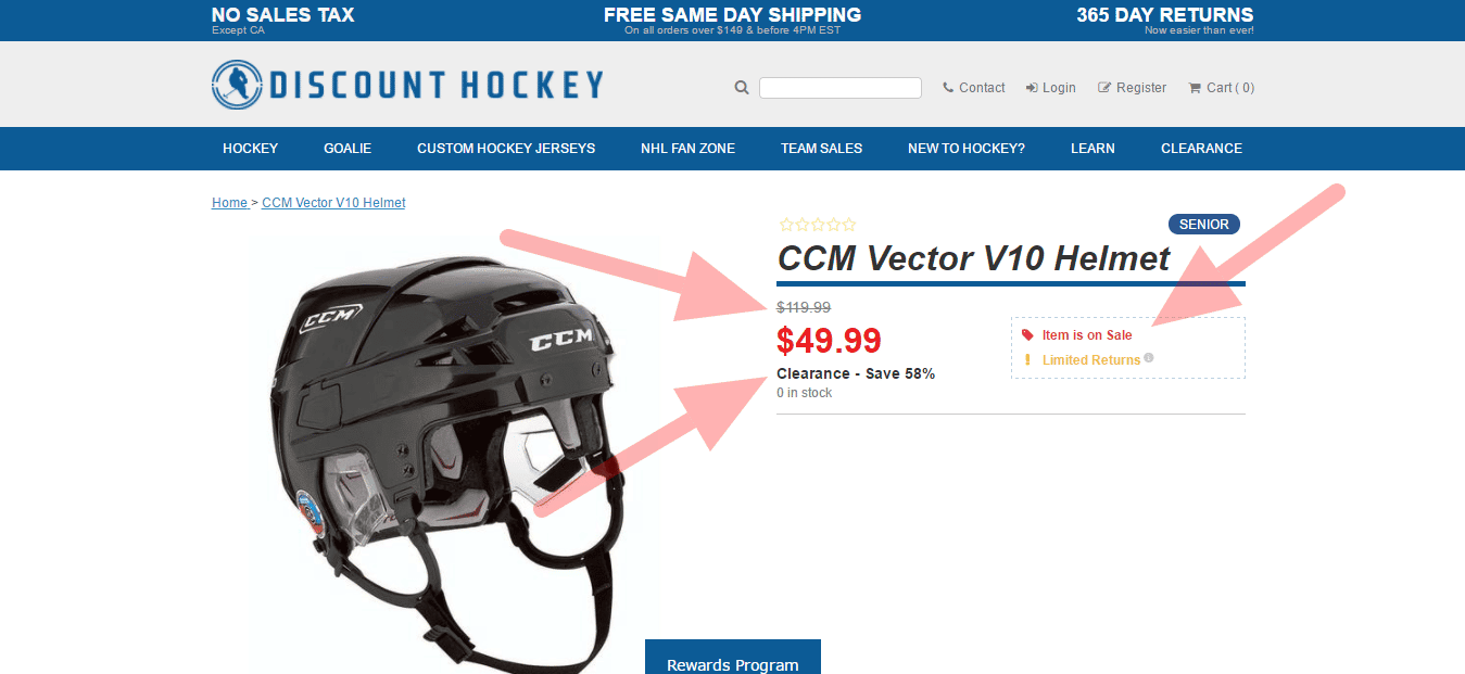
DiscountHockey.com offers hockey gear and apparel at reduced prices, as you can see in one of their product pages:
How does Discount Hockey reinforce the discount?
They repeat the offer three times, in three different formats. In the role of the referent, the original price is stroke through. “Item is on Sale” is announced in a contrasting color, red. “Clearance – Save 58%” is declared in bold.
The offer is specific, 58%, and definitive, with few items in stock (zero items in this case).
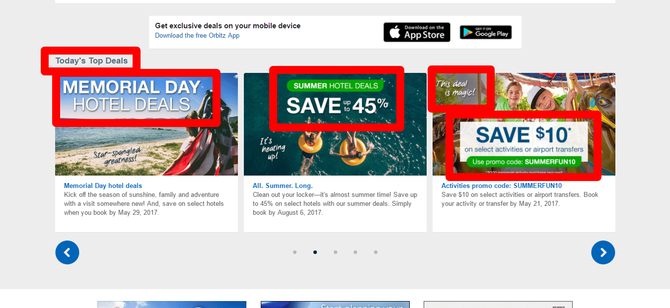
You will notice that sometimes discounts belong to the website’s value proposition. At Orbitz.com, for example, deals are the essence of their offers.
How does Orbitz reinforces the deals?
They specify the offers, as “save up to 45%” and “save 10 dollars.” There is a timeframe for acquiring the deals, so, again, from the buyers’ perspective, it is better to make the purchase soon, from this site, instead of buying somewhere else for a higher price.
Orbitz uses repetition as well to reinforce the losses. “Deal” appears seven times in the screen below, and “Save” appears five times:
2. Coupons
Coupons are a long-established tradition.
From paper to digital, e-retailers offer coupons on-site, newsletters, as well as in affiliate programs with deal websites or micro-influencers’ sites.
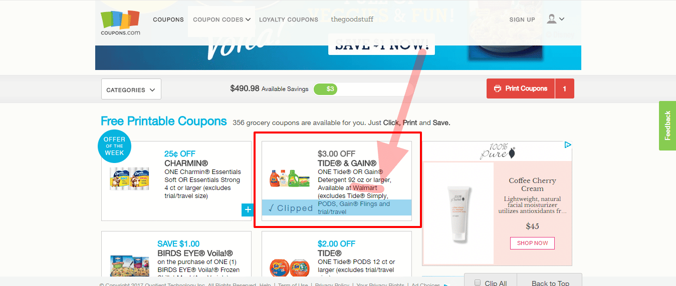
With specific offers, and clear deadlines, coupons frame the benefits in terms of loss. If clients do not use the coupons in time, they risk losing money in purchases of the same items at a higher, regular price.
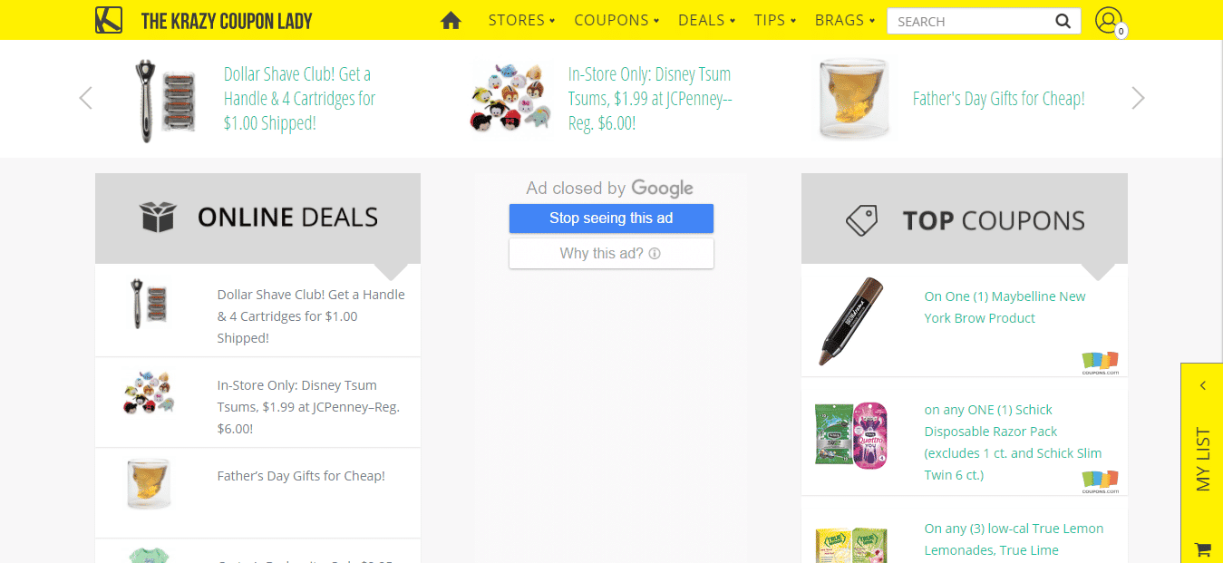
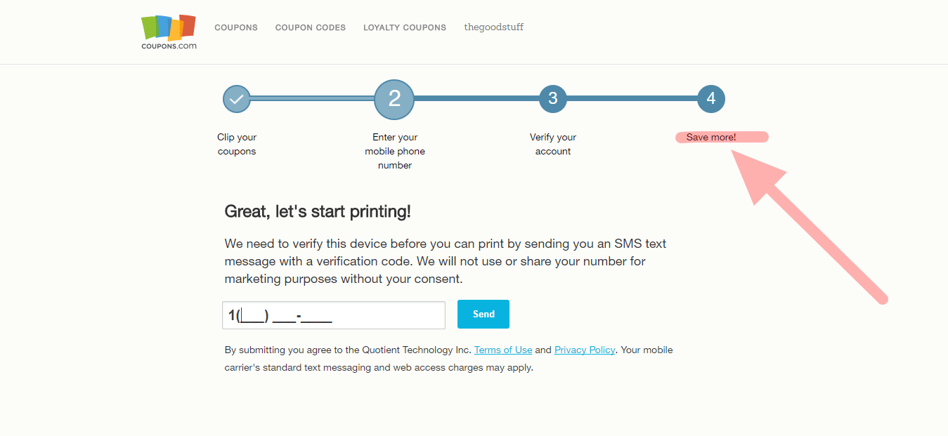
How do TheKrazyCouponLady.com and Coupons.com, for instance, advertise the deals?
They use repetition of terms, as “save” and “buy 1, get 1.” They state percentages and values of savings, as “$490.98 Available Savings.” They group the coupons in categories, so visitors can easily assess the discounts.
3. Free Trials and Samples
For saving money, free trials and samples loom large as customers’ favorites.
By receiving a free product or sample service, prospects become owners. Ownership makes the sample more valuable, as the coffee mugs priced around $7.00. Once prospects establish the ownership, they do not want to lose the item, or sample service.
An extreme example of successful free sampling comes from The Brazilian author Paulo Coelho. Once his books were pirated and distributed for free around the world, he experienced an astounding growth in sales.
Free trials of software as a service, as Netflix, Spotify, and Evernote, to name a few, also induce users to subscribe to avert the loss.
Although certain consumers may not be willing to pay the market price to try a good, they may pay the market price to avoid losing that good.
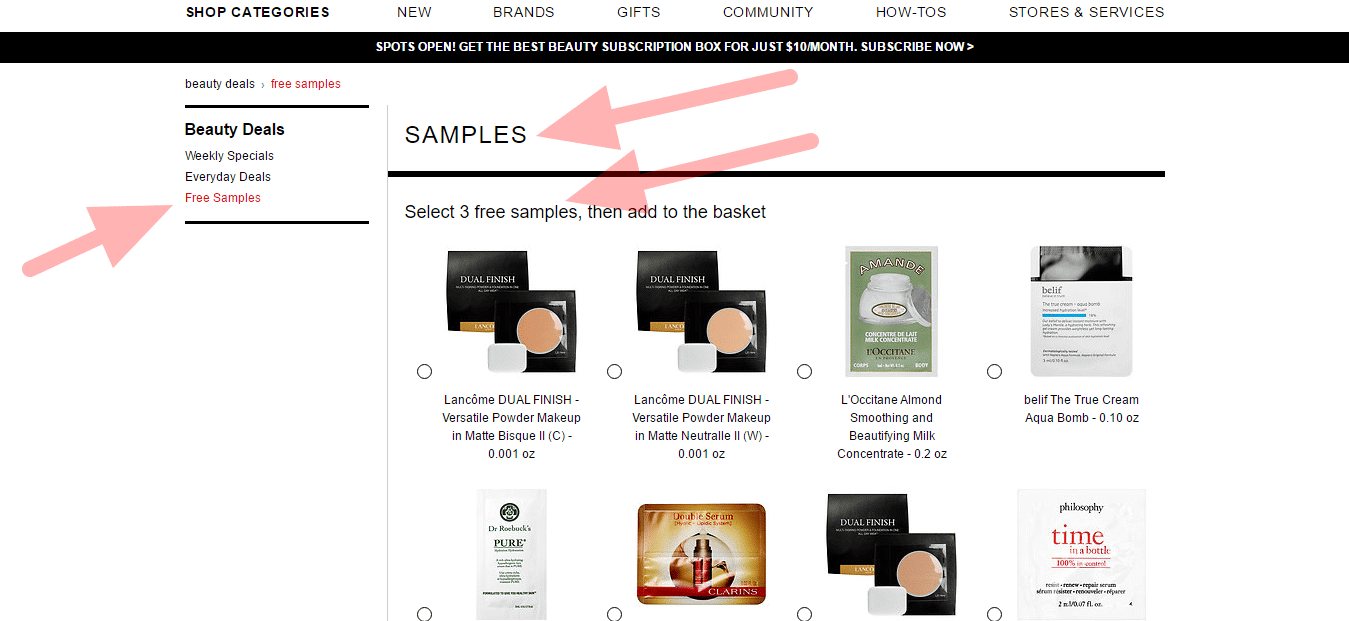
Sephora.com offers free samples the customers can choose to add to the basket, before checking out.
4. Pre-order Deals
Pre-order deals play upon loss aversion by offering discounts and bonuses, but also by providing early exclusive access to new items. Early access creates an ownership people want to preserve.
The time frame for buyers’ action is well determined in pre-orders, as the offer expires on launch day.
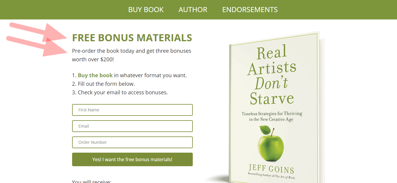
Jeff Goins, for instance, has a pre-order bonus for his new book. If customers skip this period for purchasing the book, they will lose money on the long run, when they will want to buy the bonuses separately. Goins has already used this strategy for selling his previous book, “The Art of Work,” which he sold 14000 copies in pre-orders.
This time, for “Real Artists Don’t Starve,” Goins is using a dedicated landing page, with clear directions, and a form to capture emails, to send the bonuses. Word repetition, “free” and “bonus,” accompanies coordinating colors between the CTA button, the menu, and book cover.
5. Referral Programs
Referral programs come in many forms, usually offering irresistible compensations in exchange for word-of-mouth marketing. They play with customers’ loss aversion specially when they offer discounts or free benefits.
Dropbox has a successful and famous case of referrals, that helped them go from 100,000 to 4,000,000 users in 15 months.
They framed their referral program as “Get more space:”
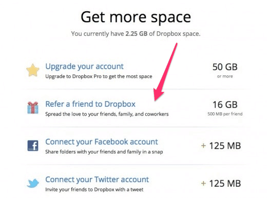
Image source: Referral Candy
6. Exclusive Launches on VIP E-mail Lists
Exclusive launches on VIP e-mail lists is a great strategy for using loss aversion on your behalf.
VIP email lists bring together people who are already customers, who trust the brand, and are willing to spend money on your products and services. Exclusive launches celebrate this relationship and signal that customers shouldn’t miss the opportunity of acquiring the new goodies.
Emails are, after all, the preferred means for receiving brand promotions:
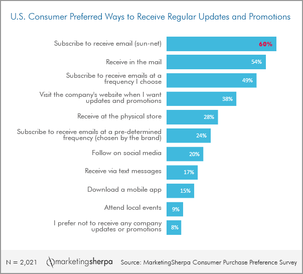
Image source: Marketing Sherpa
Evy’s tree has a fantastic example of using the VIP list to introduce their new hoodies:
“Here’s the formula and how it works:
A new hoodie inspired by a real woman is named, created, and topped with a story about why that woman is an inspiration
Evy’s Tree doesn’t immediately offer the hoodie for sale. Instead, it launches a sneak peek three days prior to the release. It slowly introduces the hoodie and tells the story behind the hoodie via its Facebook and Instagram channels
On launch day, Evy’s Tree sends out an email to its VIP email list letting everyone know the item is finally for sale and includes a link to a dedicated product landing page
Preorders are taken, with a delivery date somewhere between 2-4 weeks from the preorder date”
You can check the introduction of the “Diana” wrap, the announcement of the email, and the giveaway for the product launch.
7. Urgency
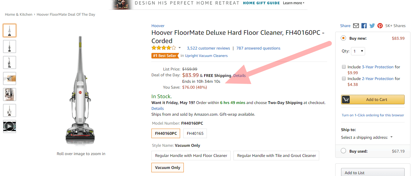
Urgency plays a crucial role in inciting loss aversion, as it sets the time frame for customers’ action.
By the end of the time frame, customers will lose all benefits, as those countdown clocks alarmingly indicate on landing pages.
Amazon, for instance, displays a small countdown clock for deals of the day:
8. Scarcity
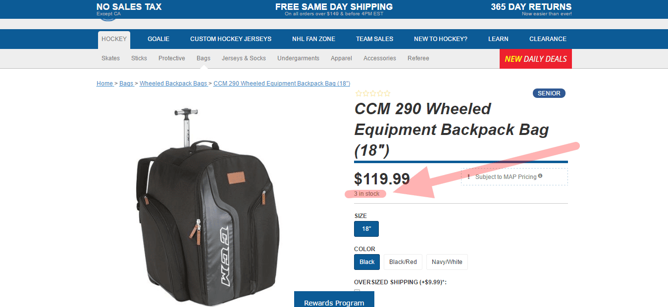
Scarcity is also a fundamental feature for framing loss aversion.
The customer needs to act fast to complete the purchase and not miss the opportunity of acquiring a product at a low price.
Discounthockey.com uses scarcity by informing the quantity of items in stock.
9. Rewards Programs
Rewards programs create a new currency.
By collecting points, customers have a new currency to exchange for products and services, so they can save their money.
You can find many formats for rewards programs, but product discounts are customers’ favorite feature. More than half of global loyalty-program participants, 51%, say product discounts are among the three most valued benefits.
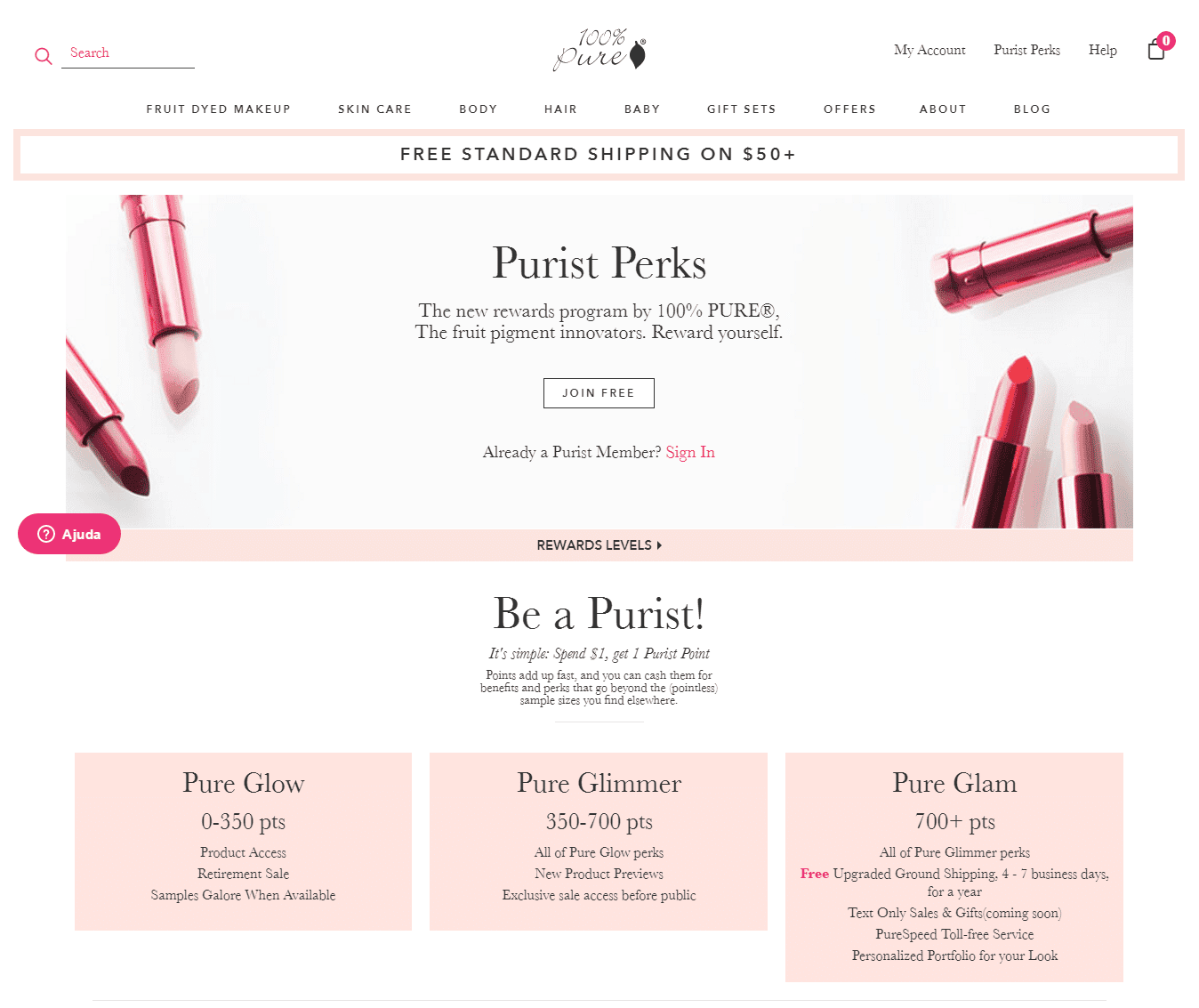
100percentpure.com has a rewards program called Purist Perks. The tiers of the program offer benefits that customers would not want to miss, as exclusive deals, sales, and product previews. You can see they use the repetition for words as “rewards,” “perks,” and “benefits.” They clearly point out that you can “cash points for benefits.”
10. Brand Ambassador Programs
Brand ambassador programs also come in a vast range of formats.
Among the incentives these programs bring to participants, discounts and mutual partnership on marketing efforts are features the ambassadors would want to keep.
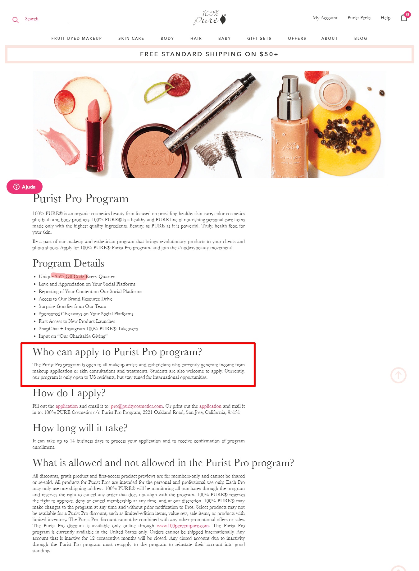
100percentpure.com also has an ambassador program. You can see how different this program is from the rewards program we mentioned above. Their Purist Pro Program is for makeup artists and estheticians who work with their products. These pros get discounts, the first benefit mentioned in the list below, but also a lot of marketing joint benefits.
11. Social Proof
Social proof can trigger FOMO (Fear of Missing Out), which, in turn, can play upon loss aversion. When suffering from FOMO, people want to keep up with trends and other people’s activities.
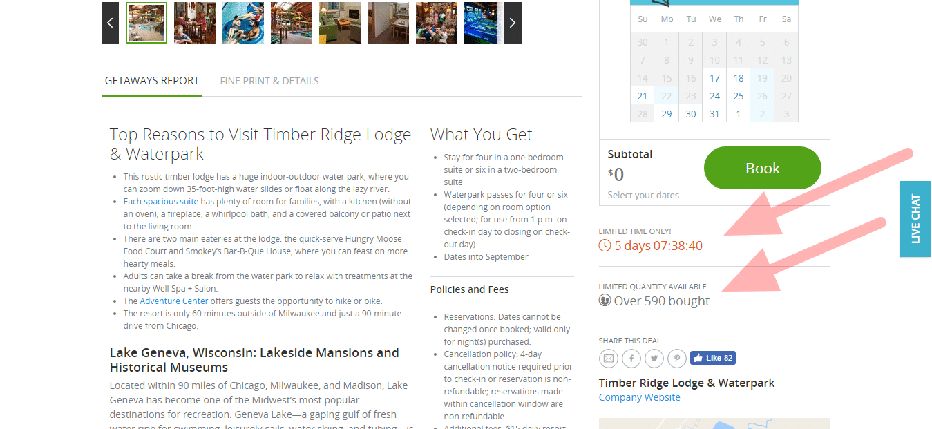
Groupon, for instance, employs many loss aversion strategies. For social proof, which doubles as scarcity in their website, they indicate how many people have bought the item, by also warning “limited quantity available.”
12. Cart Abandonment Notifications and Emails
With notifications for cart abandonment, you can reach out for your customers to recover items they were interested in buying. As they previous selected the items for purchase, they had already considered the items as their own. So, they should not want lose these products.
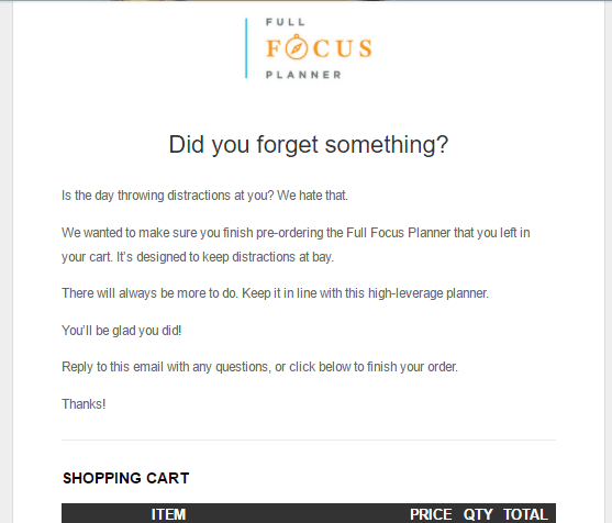
On pre-orders for the Full Focus Planner, Michael Hyatt chose to send a cart abandonment email, reminding the buyer to complete the purchase. The email mentioned the person could be distracted, and that’s why they left the site without buying the planner. He refers to the product that “you left in your cart,” meaning this belongs to the email recipient, it is just a matter of the person going back and retrieving the product, in order not to lose it.
13. User Interface and Design
At UI-Patterns.com, they compiled a list of four ways you can tingle loss aversion to users. You can:
- Segregate gains (since gain brings less intense feelings of joy, by segregating them, you make them stronger).
- Integrate losses (to intensify the strong feeling of sorrow).
- Integrate smaller losses with larger gains.
- Segregate small gains from larger losses.
Let’s check how Walmart organizes loss aversion on discounts. Their value proposition and tag line state “We save people money, so they can live better,” and “Save Money. Live Better.” We can expect their site to be structured to convey this message.

In the product page, you can see the “Save $50” in a contrasting color, that matches the CTA button. There is scarcity, “only 7 left,” in black.
They framed “2-day shipping,” and “free 2-day shipping” as gains, in green, with a note on the day of arrival. These gains are announced as nouns, opposed to the stronger command “save.” In this sense, the 2-day shipping comes as a benefit vs. the action the customer can take that will prevent him from losing money.
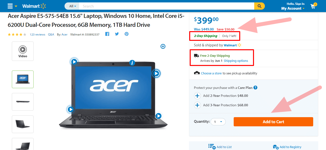
They keep the interface and layout consistent though the shopping experience.
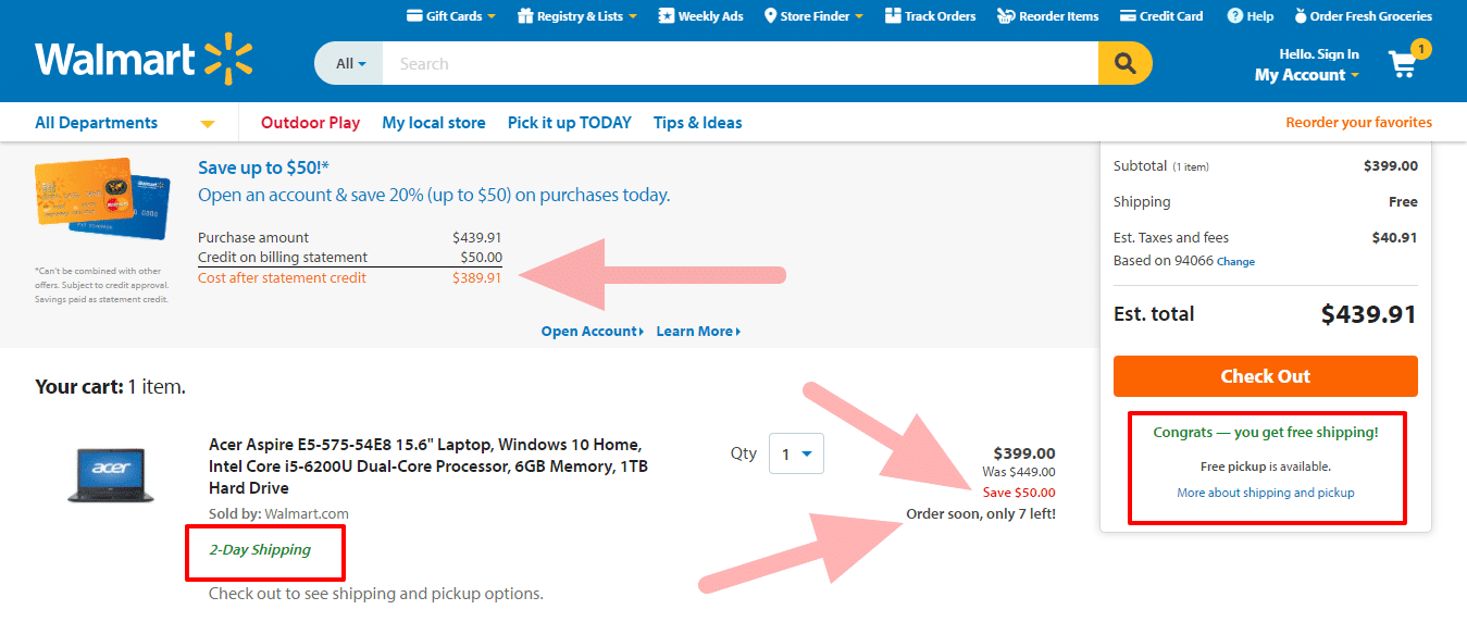
So, on cart page, when a new discount is introduced, in a banner, for opening up an account, it comes in the same orange color, with the same wording as “save.” The banner also offers a little calculation, so the buyer can see the savings of opening an account.
Free shipping is still in green, and it shows up below the item description, while the discount and scarcity indications show up under the price. So, gains on the left, losses on the right, close to price. Gains are reinforced under the CTA, as “Congratulations – You get free shipping!” again in green.
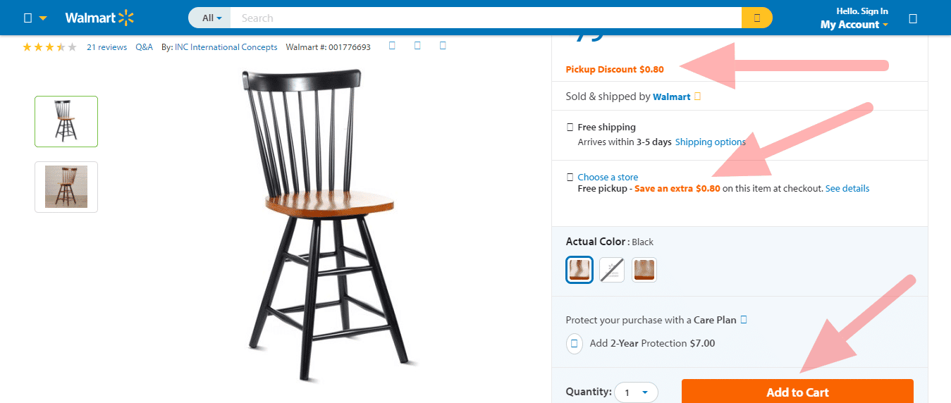
On another product page, you can check the consistency of the site. The discount appears twice, in colors that match the CTA button, with different wording, “Pickup Discount” and “Save an extra $0.80” Free shipping, as a gain, comes in black.
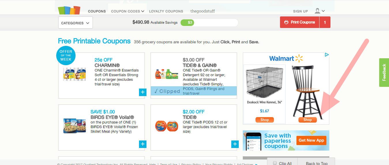
For retargeting, they keep the consistency, so you can see the CTA color and shape in this ad matches the CTA color and shape of the product page.
Final Thoughts: Optimizing Loss Aversion for Conversions
Do you know any other loss aversion strategy? If you have a suggestion to add, we would be thrilled to hear and add to our list!
After creating and implementing some of these loss aversion strategies to your site (or all of them, if you are extremely bold!), it is time to optimize them.
At a starting point, you should conduct qualitative research and carry out an Analytics investigation. You have to learn if your visitors are aware of all the benefits. Focus on evaluating the location and copy on your website that addresses the loss aversion strategies.
For instance, during research for one of our clients, we found out only 30% of visitors were aware of the incredible loyalty program the brand offered. In this case, we worked on streamlining the wording and adjusting the incentive so it was clearer for visitors the benefits of subscribing to the program.
You can also check our case study on improving copy and location for discount and social proof. With this optimization program, we helped our client reach 13.98% increase in conversion on mobile product pages and 17.75% increase in conversion on mobile cart page.
Remember to always A/B test your findings and hypothesis.

