Our client creates dance videos that people can pay one time for unlimited access. Customers typically “gifted” this product to their significant other during holidays, birthdays, or other special occasions.
Our client had a predicament during the February Valentine’s frenzy.
The majority of the site traffic was coming through Facebook at a decent clickthrough. However, conversions were a dismal 0.5%.
So, to increase the landing page conversion rate – I looked at ads and landing pages for companies during Valentine’s day.
Let’s take a look at some of the lessons I learned.
1- Avoid the safe approach – boring and not-memorable
The biggest problem marketers struggle with? The sea of noise that bombards our customers people every minute.
What do you prefer?
- Good and the same
- Good and different
You can be good, but if you aren’t different, you do not stand out.
You play it safe, but you get drawn in a sea of sameness: the same ads, the same copy, and the same landing page.
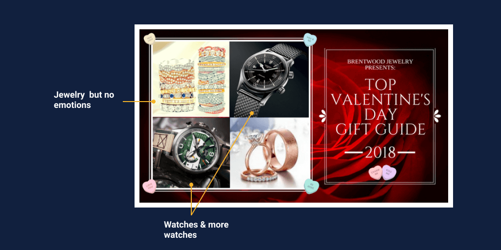
Most of the ads and landing pages are boring and mundane – they offer visitors no emotional or social persuasive elements.
Now don’t get me wrong- jewelry and watches could be a viable option. But if the marketers of the products describe the emotional push and pull of the gift.
It doesn’t mean that marketers don’t succeed with selling during the holidays with the mundane copy.
But they could do so much more if they got the copy and design elements right.
2- Don’t go there: cringe-worthy ads
Remember the question I asked? I will add a scary option…
What do you prefer?
- Good and the same
- Good and different
- Bad and different
Being different is not a goal.
Being good and different is the goal.
There a thin line between “good and different” vs. “bad and different”.
That is perhaps why so many companies decide to play it safe and stay in the Good and the same area.
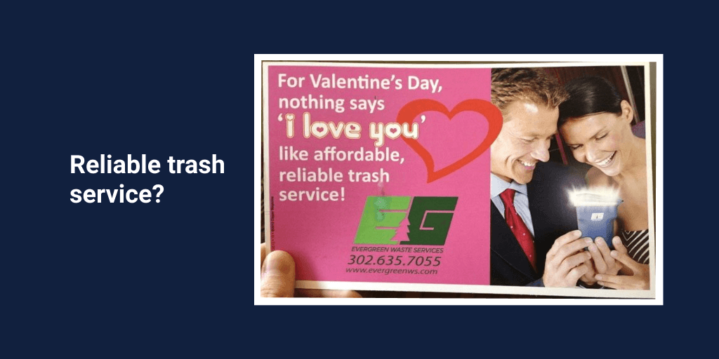
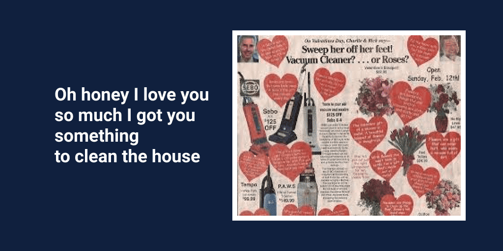
What on earth was the copywriter thinking?
Valentine’s day and the trash
Valentine’s day and the meat

Valentine’s day the vacuum cleaner
But the winner goes to
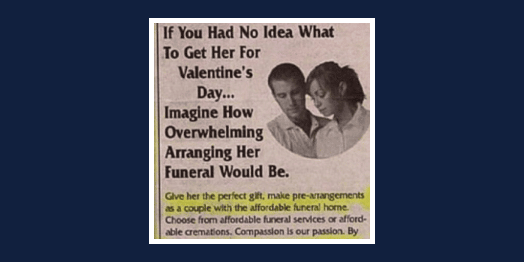
Valentine’s day and the funeral
How very romantic.
There’s no better way to put your loved one through an emotional roller coaster by gifting them pre-arrangements for their imminent death.
You’ve got to ask yourself – what on earth was this copywriter thinking?
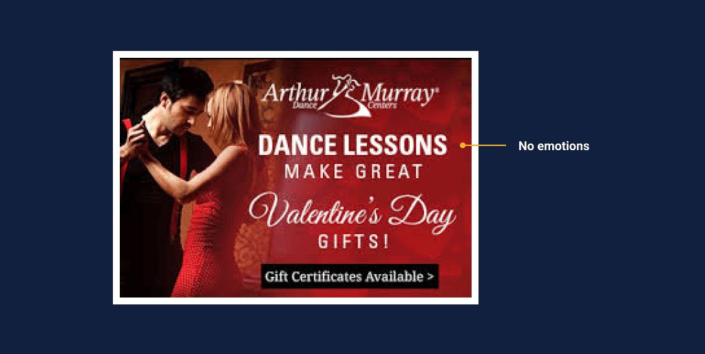
Okey – surely marketers can do better. So, we looked at ads on dance lessons from competitors of our client.
The lesson on what you should avoid continues.
3. Avoid Clichés
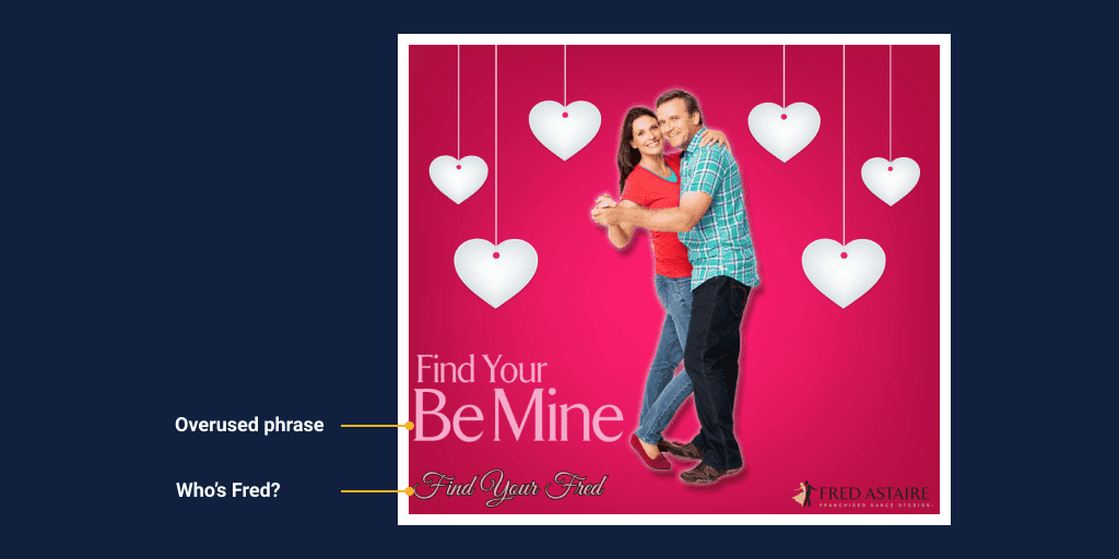
The ad started with a cliché. But then who is Fred?
4. Don’t be cute
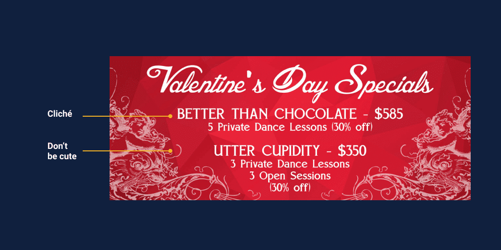
Really – cupidity? Someone thought of that ad – and someone approved it.
5- Don’t forget the emotional side
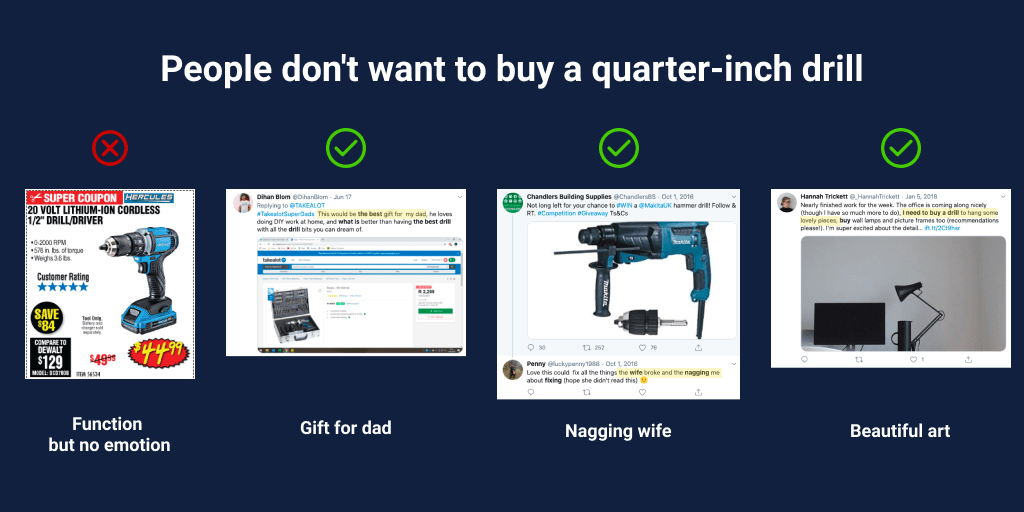
I know, I mentioned it. here it is again: People buy with emotions and justify with logic. Selling on emotions always wins.
6. Understand why people buy
Three reasons explain why people buy:
- The functional reasons – the functionality that the product or service provides.
- The emotional reasons– how the product makes the buyer feel?
- The social reasons – how the buyer is perceived his social circle when using the product?
Appealing to the emotional and social reasons behind a purchase turns visitors into customers.
Start by understanding the emotional and social pulls and pushes are in order to leverage them.
You will only do that by talking to customers.
7. Is it the ad or the landing page?
Facebook traffic doesn’t convert well.
But if your ads are well-targeted, then visitors are willing to give your product a chance. It was the landing page that wasn’t delivering.
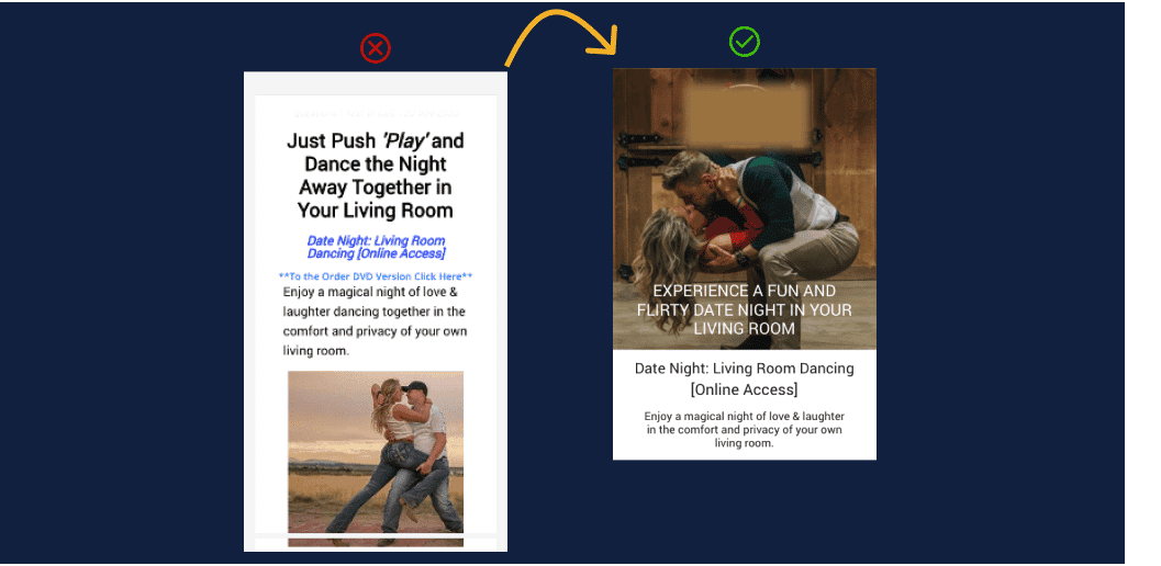
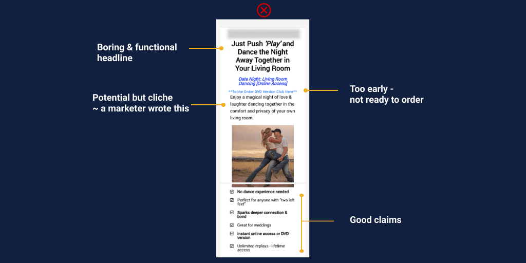
When we first reviewed the landing page, we found that there was a lack of emotional and social copy and elements that would drive the purchase. Much like the ads of the competitors.
8. People think they buy on impulse – they don’t
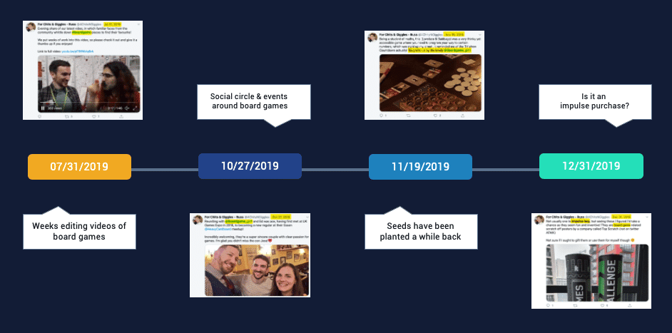
We are not big believers in impulse buying.
9. A bad question to ask: why did you buy the product?
We never ask customers why they bought a product.
Try this instead…
Ask people what was going on in their lives when they decided to buy the product.
10. Digging for oil: Jobs to Be Done interviews
Because most of the time, we get top of mind answers – simple and don’t get into the real reasons of why people buy.
So, we interviewed 15 customers and asked them to walk us through when they decided they wanted to buy the videos.
Most customers would initially state that it was on impulse purchase – they saw the ad, and they bought.
As we dug deeper we discovered:
- Most purchased as a gift
- Some were empty nesters
- Some had many young kids
- Most lacked intimacy in the relationship
- Some were in a relationship with a person who loved dancing
- Most noticed how others are happy when dancing
- Most were sick of mundane date nights
- Some were prepping for a special event in their lives that included dancing (like a wedding)
These weren’t only the common threads, but these were the most important.
Where is the causality in these issues that we uncovered?
11. A winning formula: People don’t buy “x” – they buy “y”
Logical vs. psycho-logical.
As it turns out – people don’t buy dance lessons.
- People don’t buy “dance lessons” – they buy “happiness.”
- People don’t buy “dance lessons” – they buy “intimacy.”
- People don’t buy “dance lessons” – they buy “better relationship”
- People don’t buy “dance lessons” – they buy “exciting dates”
Dance lessons are a tool for a deeper goal.
Again, remember that we spoke to people that had made the purchase already.
We wanted to understand from them what drove them to that purchase. Many of the items there were the pushes of the situation:
- It’s just him and her, or they have no alone time as a couple.
- Their date nights were so boring and always the same thing.
- They needed to bring intimacy back into their relationship
- He wanted to give her a gift that was unique and she’d always appreciate
12. Use emotions in your headlines
The copy on the site was now more focused on the emotional and social reasos behind someone buying dance lessons.
The results: a 10% increase in purchases.
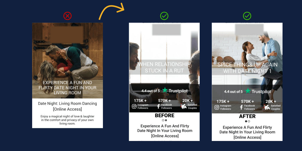
13. Use “before” and “after”
Copy and images can evoke emotion and persuade the visitor to buy.
Again –
- Before and after in the headline.
- Before and after in the images.
Customers struggled with the lack of intimacy or excitement in their relationship. It was a result of a life change, a busy life, or frustration in the relationship.
They thought dance lessons could possibly bring that back.
Before: an image of a copy at a boring dinner date night.
After: an image of a couple enjoying dancing in the middle of their home.
The results: a 17.14% increase in purchases.

