The internet is brimming with CRO case studies, with a quick Google search yielding thousands of results.
However, if you’ve been in this industry long enough, you know that many of these case studies can be impractical, promising unrealistic results.
Take, for instance, claims of a 400% conversion uplift from merely changing button colors—such outcomes are rarely grounded in reality.
Far more complex psychological factors influence purchase decisions than just the color of your CTA buttons.
In this article, we’ll cover three CRO case studies we executed, which successfully increased conversions. Unlike many case studies you may come across, we’ll delve into the thought process behind each case, our hypotheses, and the precise results we achieved.
Case Study 1: How Urgency Elements Catapulted Conversions by 17.17%
Let’s say you own an ecommerce website where you get plenty of traffic, but it’s still not showing the intended results regarding conversions. You still face issues like an alarming 82% exit rate and 53% abandonment before checkout—a norm for many online businesses.
Our CRO team encountered this challenge during their review of a client’s website.
Facing these daunting numbers, our team set out to understand the users. They gathered customer insights through expert reviews and customer interviews, using the Jobs-to-be-Done methodology to dive deep into the user experience.
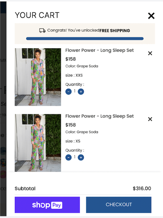
The Original Page:
As they scrutinized the original page, it became clear that something needed to change since the users needed to make the final purchase.
Here’s what the original checkout page looked like:
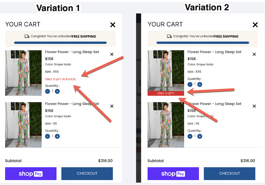
The Hypothesis and A/B Testing:
The team formulated a hypothesis: inject urgency elements to spur users into purchasing. The A/B testing hypothesis was crafted to boost conversion rates by 20%.
They meticulously designed four variations, with a laser focus on incorporating urgency elements. The urgency was in the language and strategically placed across the page, encouraging users to take action.
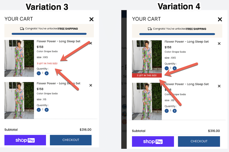
Here are the changes they implemented:
And this is what variations 3 and 4 look like:
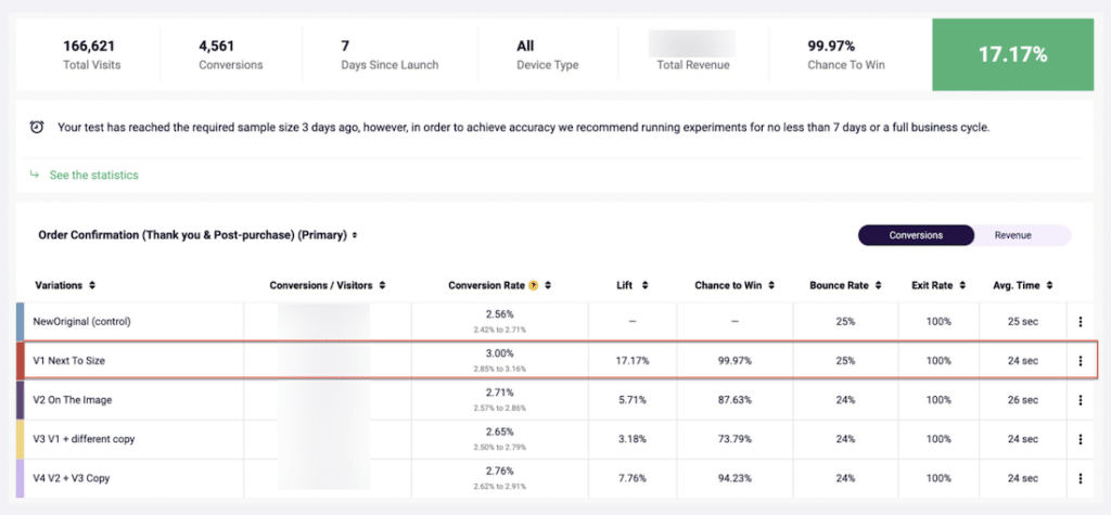
The A/B test ran for seven days, not just on the desktop but also on the mobile stage. Yet, they reached the necessary sample size within the first three days, a testament to the urgency created by the variations.
The Results:
As the results poured in, they painted a vivid picture of success.
- The Conversion Rate (CVR) improved 17%, and the Average Order Value (AOV) increased 4%.
- Version 1 (V1) stood out with a 99% likelihood of outperforming the original.
- Digging deeper, the team found that clicks on Gift Wrapping, Quantity, and the Checkout Call-to-Action (CTA) experienced a positive lift for V1 compared to the original.
Success was not a fleeting moment—InvespCRO’s team consistently witnessed it on mobile and desktop platforms.
Here are the results as shown in FigPii (InvespCRO’s all-in-one conversion rate optimization tool):
Key Takeaways:
The urgency messaging wasn’t just urgent; it was a catalyst. Users, prompted by the urgency, not only made quicker purchases but also added more items to their carts.
The Average Order Value surged, validating the strategy. The lesson learned: sometimes, urgency is the secret sauce that boosts conversions to unprecedented heights.
Case Study 2: Optimizing Checkout Process for Free Shipping
Imagine an ecommerce store where potential buyers are eager to make a purchase.
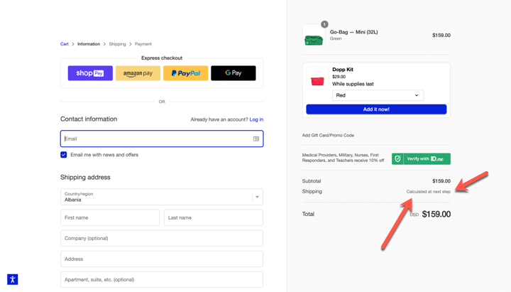
But there’s a catch—the promise of free shipping, a coveted perk, remains hidden until the second step of the checkout process. InvespCRO’s team realized this mistake when analyzing their client’s site.
During an expert review, they realized that 63% of potential buyers were dropping out at this stage.
Hypothesis:
Invesp’s team proposed the hypothesis that by introducing information about free shipping right from the start of the checkout process, customer engagement and, subsequently, purchase completion would significantly increase.
Here’s the original version as it appeared on the desktop:
Interactive Experiment Design:
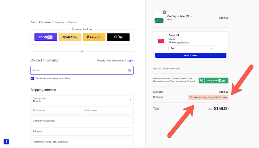
InvespCRO created three versions to validate their hypothesis: the original desktop version, Variation 1, and Variation 2.
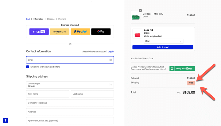
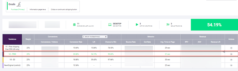
Although visually different, Variation 2 conveyed the same message as Variation 1: customers would receive free shipping for purchases over $50. They conducted an 11-day test on both mobile and desktop devices.
Here’s the variation 1:
And here’s the variation 2:
In a nutshell,
- Variation 1: Displayed the free shipping offer in a specific way.
- Variation 2: Retained the same message but with a different visual presentation.
Results:
- Variation 2 outperformed, increasing purchases by an impressive 54.19%, with a high confidence level of 99.65%.
- While Variation 1 did not surpass Variation 2, it still performed better than the original setup, boosting purchases by 15.86% and achieving a confidence level of 78.55%.
- A third option, Variation 3, increased purchases by 39.43%, with a confidence level of 97.66%.
Here are the results as shown in FigPii:
Key takeaways from the case study:
- The case study emphasizes the importance of strategically placing shipping details throughout the website, particularly on funnel pages (category pages, PDPs, cart pages, and checkout pages).
- It also acknowledges the distinctive nature of online shopping and the need for periodic reassurance for online customers.
Case Study 3: Elevating Conversions Through Strategic Homepage Enhancements
Upon analyzing a client’s website analytics, InvespCRO made some key observations, including the percentage of buying customers visiting the homepage, the proportion of new users, and the lower conversion rate for new users on mobile devices.
After these findings, they conducted an expert review of the homepage, revealing limited access to product pages, the absence of mentions of best sellers, and an ineffective “Recommended For You” section.
The hypothesis aimed to boost the site’s conversion rate by enhancing the homepage with a prominent section. The section showcased bestsellers, featured products, and clear details such as prices and colors.
Experiment Design:
The experiment ran for 18 days, with two versions (V1 and V2) of the enhanced homepage being tested.
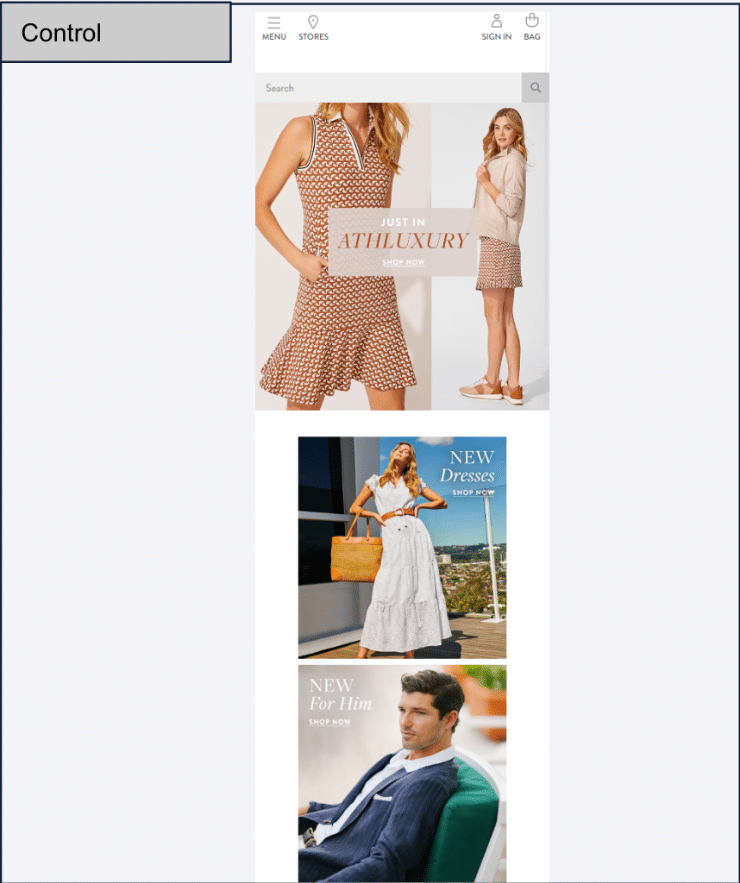
Here’s the original version as it appeared on the mobile:
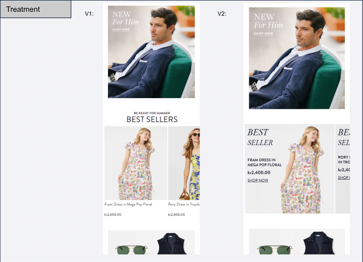
Here’s what the variations looked like on mobile devices:
Invesp’s team monitored the key metrics, including overall impact, checkout performance, device-based analysis for orders and checkouts, click-through rates (CTR) for bestsellers, and product page views.
Results at the 11-Day Mark:
Overall Impact:
- V1 showed a small increase (+3%) with a directional chance of success (74%).
- V2 had a negative impact of 1.94%.
Checkout Performance:
- V1 experienced a positive change in checkout rates, increasing by 4% (82%).
- V2 had a negative impact, decreasing by -4.85%.
Device-Based Analysis for Orders:
- V1 showed no significant change in mobile orders (-1.03%, 42.82%) but increased on the desktop by 5.60% (80.57%).
- V2 had negative effects on both mobile and desktop orders.
Device-Based Analysis for Checkout:
- V1 showed a slight decrease in mobile checkouts (-3.98%, 26.36%) but positively impacted the desktop with an increase of 8.91% (93.35%).
- V2 had negative effects on both mobile and desktop checkouts.
CTR for Best Sellers:
- The best sellers section had a fair CTR.
- V1 performed better with a CTR of 0.92%.
Product Page Views (PDP):
- There was a modest increase in PDP views, up by 1.76% (99.04%).
Customer Experience Improvements:
- Enhanced Visibility: Both versions increased overall visibility, with V1 positively impacting checkout rates. This suggests an improved navigation experience for users.
- Mobile Experience: V1 positively impacted mobile orders, enhancing the user experience. Conversely, V2 hurt mobile and desktop checkouts, emphasizing the importance of optimizing for mobile users.
- Best Sellers Engagement: V1, with a higher CTR for best sellers, successfully engaged users with featured products. This improved the customer experience and increased the likelihood of conversion.
- Product Page Views: Both versions contributed to a modest increase in PDP views, indicating that users were more inclined to explore specific product details. This signifies an improved and engaging product discovery experience.
Final Conclusions & Insights:
- The current homepage had limited access to specific product pages (PDP).
- Highlighting best-selling products led to a slight increase in PDP visits.
- Featuring best sellers significantly boosted orders and encouraged visitors to proceed to checkout.
Beyond the CRO Case Studies: Your CRO Action Plan
These case studies paint a vivid picture of the transformative power of CRO. But how do you translate these takeaways into your own success story?
Here’s a quick checklist:
1. Strategic Urgency Messaging:
- Integrate Urgency Elements Thoughtfully: Place urgency messages strategically in the checkout process to evoke a sense of immediacy. At the same time, craft compelling language that motivates users to take prompt action during the purchase journey.
- Monitor User Interaction with Urgency Elements: Track user engagement with urgency elements, including clicks on CTAs and specific product features. Don’t forget to analyze how urgency messaging impacts different stages of the conversion funnel to refine strategies.
2. Transparent Shipping Information:
- Sprinkle Shipping Details Across the Website: Ensure shipping information, especially free shipping offers, is visible on key pages like product listings, cart, and checkout. Providing clarity early in the user journey also helps instill confidence and reduces hesitation during the purchase process.
- Reinforce Shipping Benefits Consistently: Reiterate shipping benefits throughout the website, especially on funnel pages, to reassure users and enhance their overall shopping experience. Use clear and concise messaging to communicate shipping perks effectively.
3. Homepage Optimization for Engagement:
- Feature Best Sellers Prominently: Highlight best-selling products and featured items on the homepage to capture user attention and encourage exploration. Optimize visual elements and product placements to create an engaging and visually appealing homepage.
- Tailor Homepage for Desktop and Mobile Users: In a world where everyone is hooked to their mobile phones, don’t overlook designing the homepage with responsiveness in mind, ensuring a seamless and enjoyable experience for desktop and mobile users.
4. Mobile-Focused Enhancements:
- Optimize Checkout Process for Mobile Users: Streamline the checkout process for mobile users, minimizing steps and providing a user-friendly interface. Once you optimize your site for mobile devices, don’t forget to test and iterate mobile-specific features to enhance navigation and conversion rates on smaller screens.
- Leverage Mobile-Specific Engagement Strategies: Implement mobile-specific engagement tactics, such as interactive elements and personalized recommendations, to captivate mobile users.
5. Continuous Testing and Iteration:
- Embrace Regular A/B Testing: Conduct regular A/B testing to evaluate the impact of changes on key conversion metrics. Also, test different variations of elements, including urgency messaging, shipping details, and homepage layouts, to identify optimal configurations.
- Iterate Based on User Feedback and Metrics: Continuously analyze user feedback and metrics to identify areas for improvement. In addition, iterate on strategies based on insights gained from testing, aiming to enhance the overall user experience continuously.
CRO Case Studies…Final Thoughts!
Do the cart abandonment blues get you down? These three real-world CRO case studies reveal actionable tactics to transform hesitant clicks into delighted purchases.
It’s not just about fancy landing pages or endless A/B testing—it’s about understanding your shoppers’ desires and unleashing the conversion beast within your website.
Key Takeaways:
- Urgency Ignites Action: Craft strategic messages and visuals that nudge users towards immediate purchases.
- Transparency Builds Trust: Be upfront about shipping, discounts, and customer perks.
- Homepage: Your Conversion Portal: Showcase best sellers, personalize recommendations, and streamline navigation.
- Mobile is King: Streamline checkout, leverage interactive elements, and make every tap a step towards buying.
- Test Continuously: Don’t guess – A/B test and analyze data relentlessly.
Remember, CRO is a journey, not a destination. Implement these strategies, experiment fearlessly, and watch your conversion rate soar.