For the purposes of this post, we need to get one basic thing straight: what is a landing page?
The literal definition is: a ‘page’ that a web visitor ‘lands’ on when clicking on a link to that page or when arriving at a site after entering a URL in a browser.
So a landing page can be just about any page on your website. A fact confirmed by lots of leading landing page specialists, including Unbounce and Hubspot.
The Term ‘Landing Page’ Sucks
What good is it if it refers to every page on your site? Why not just stick with ‘web page’ and have one less bit of jargon to deal with. Yes, in their definitions Hubspot and Unbounce go on to clarify that a landing page is really one with a single purpose, usually some form of conversion; but the term is never-the-less confusing.
Oddly, of all the landing page definitions we researched, Wikipedia’s was most clear and concise, including: “… a landing page (is) sometimes known as a “lead capture page”.
That’s how we’re going to play it – landing pages are those whose sole purpose is to capture leads. In the case of ecommerce landing page, those ‘leads’ could be sales.
Landing Page Optimization
With the importance of landing pages now in proper perspective, it’s no wonder landing page optimization is a topic endless amounts of information and advice on the web.
But even the best of that information can be somewhat misleading. The sheer volume of information creates its own ‘waves’ of truths that may not always be true in every case. Unsuspecting landing page optimizers can’t be blamed for using the well-intentioned online advice for their own optimization, but not get the expected results because the practices were applied in exceptional circumstances.
The following are just three examples how this can happen, but they touch on some of the most staunchly promoted landing page optimization best practices.
1. You’ll Get Better Conversions Rates if You Reduce the Number of Entry Fields in Your Web Forms
If yours is a lead generation landing page, the web form is the focus of everything thing you do to design the page and drive traffic to it. You can break the bank on SEO, PPC, user experience and social media, but if your landing page form doesn’t work, you’ll have few leads and be poorer for it.
The conventional wisdom is that fewer form fields means the visitor has less to do and less anxiety about doing it, so there’s more chance that they will. You’ll find countless studies on the web that prove this is true, including from Marketing Experiments, Quick Sprout, and Unbounce. And they are absolutely correct. Most sources say that, for maximum LPO, you should have three to five form fields on your forms.
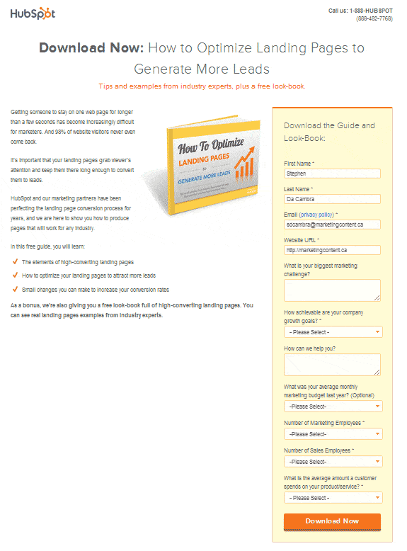
So why does HubSpot use 11 fields on their ebook landing page forms?
- We all place more value on something that we have to give up more to get. In other words, an offer that only requires your name and email address is viewed as somewhat less valuable as one that requires more information.
- HubSpot has developed a reputation for providing top quality content for free. Visitors know they will get something worthwhile, so they are willing to part with more information to get it.
- Three of the HubSpot fields are optional, so visitors know they don’t have to fill out the entire form if they don’t want to.
- None of the information HubSpot asks for is redundant, out-of-line or pointless.
So when is the conventional wisdom that fewer form fields mean higher conversion rates not true for you? When you offer a good enough incentive to get the information you seek; when you make at least some of the fields optional so people don’t feel bound to complete the entire form, and when you do not ask for information repeatedly, like State, Country and Zip Code, (when the zip code alone will do) or info that is out of line – imagine the plunge HubSpot’s conversion rates would take if they asked for your telephone number.
2. One Clear Call-to-Action Button Will Increase Conversion Rates
The call-to-action button, whether it’s on your web form, or on a landing page that leads to your form, is the point at which a visitor becomes more engaged with your message, your product and/or your business – indeed, it could be the point she becomes a customer.
How important is that?
Again, you’ll find copious amounts of online advice and studies showing that a single, distinct call to action button increases conversion rates. At least 91 of HubSpot’s ‘101 Examples of Effective Calls-To-Action’ are just that – one button that is different from every other button and element on the page in color, shape and/or size.
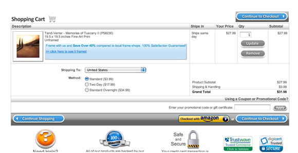
But a recent Invesp case study showed that multiple call-to-action buttons increased conversions by 20%.
What gives? The page in the Invesp study is an ecommerce shopping cart page. Among other conclusions about why the second button increased conversions, Invesp pointed out that, when a number of items were placed in the cart, the lower call-to-action button was pushed below the fold. The added button, placed at the top of the page was always visible and drew customers’ attention.
3. You Will Boost Conversion Rates if You Remove the Website’s Navigation Menu from the Landing Page
This is an extension of the idea that a single call to action helps visitors focus on one point of conversion. The conventional online wisdom (and again, studies abound to prove it) holds that, by including your website’s standard navigation bar on your landing pages, you give visitors a distraction that takes away the focus of the page and reduces the chance of conversion.
This one is somewhat different from the other examples we’ve used so far because we can’t find any examples that the opposite can be true.
So when can this ‘truth’ not be true for you? Seemingly always.
While all of other bits of advice and study results we’ve looked at in this post are generally accepted and adopted across the web, only 16% of landing pages are free of navigation bars (MarketingSherpa). It’s odd, one of the few apparently irrefutable LPO best practices is used by fewer than one in five landing pages.
What Should You Do?
There’s lots of great landing page optimization research being done by respected and reliable organizations across the web. But LPO is a young science and, like all youth, it can be fickle. That means, despite the conventional wisdom, you need to find what works best for your business, page and conversion goals. It would be a huge mistake to ignore the findings of others, but the only way to know what works for you is to test it and keep on testing it.

