Whether you want to increase your conversion rate, generate leads or make a sale, the very last step in your funnel involves some sort of sign-up form. But, just because you got them this far doesn’t mean your prospects won’t bolt in a second if your form isn’t optimized at least as much as the rest of the funnel.
The following tips will help you improve your prospects’ experience when using your forms and plug the leaks that happen too often at the crucial end-point of your funnel.
1. Short is Sweet – Getting prospects to your sign-up form means you’ve conquered the fears, uncertainties and doubts (FUDs) that everyone experiences when shopping or ‘signing-up’ online.
The worst FUDs happen when they are asked to enter personal information. Online customers are increasingly aware of the value, security and misuse, of their personal data. So they are increasingly hesitant to submit it.
The more information you ask for, the more FUDs your customers experience, and the less chance you have of getting them to convert.
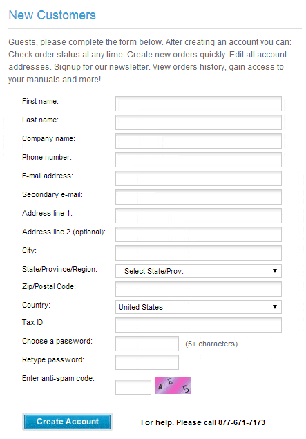
Check the epic length of the form below. Like sitting through a four-hour movie, you’d be exhausted at the end of this one.
So many fields are absolutely not needed here, including:
- Secondary email? Why?
- The prospect is asked for a City, then State/Province/Region, then Zip/Postal Code, then Country. This isn’t rocket science. If your prospect enters a U.S City, a U.S. State and a U.S. Zip Code, they’re not likely to be from Scotland. Indeed, except for the actual street number, you can get all the same information, which takes up five fields here, from the single Zip/Postal Code field
- Tax ID? Way too soon in the relationship (which hasn’t even started) to ask for tax numbers.
Getting Information vs. Getting Conversions – With the chances of conversion shrinking as the amount of information you ask for grows, it’s better to keep your initial sign-up forms short and sweet. Once customers take your initial call-to-action, they have entered into a relationship with you and are more likely to submit the info you need at subsequent stages of the relationship.
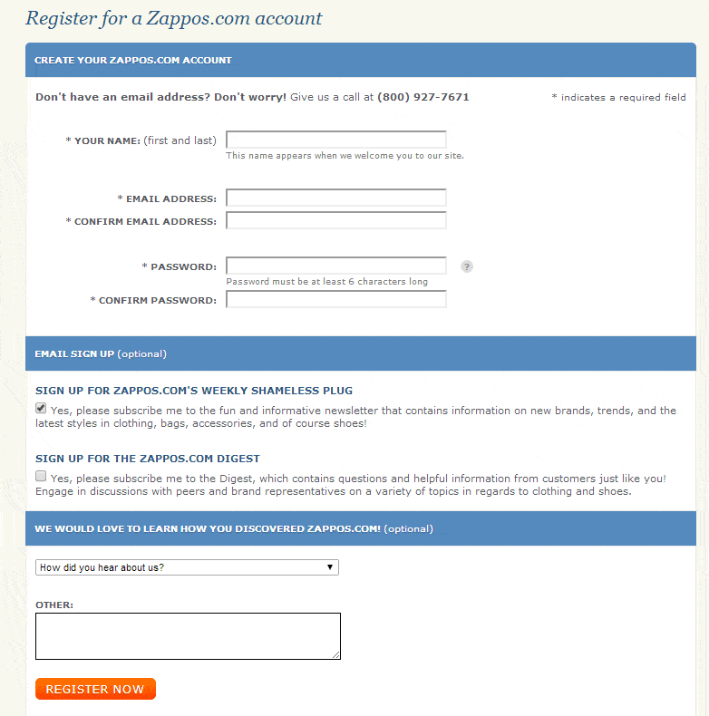
Contrast the form above with the one below from Zappos. Knowing they can get more information later, they use a very short form for their account registration.
2. Keep Reducing the FUDs – A shortened form stops more FUDs from creeping in. But some already exist and the more you do to dispel them, the more success you will enjoy.
Zappos surrounds its sign-up form with a number of anxiety-reducing elements including: assurances against unauthorized charges; a “Safe Shopping Guarantee”; trust symbols like the BBB seal; a “How we protect your data” link and an assurance that returns can be made free of charge. (One of the biggest concerns online shoppers have is what to do if an item bought online needs to be returned or exchanged.)
3. What’s in it for Me? Even the humblest among us like to get things. And when you’re asking a prospect for something, especially closely guarded personal information, it helps to offer something in return.
This is particularly important for lead generation. An ecommerce shopper is motivated to complete your form because she wants to make a purchase. But the same is not true for a prospective lead.
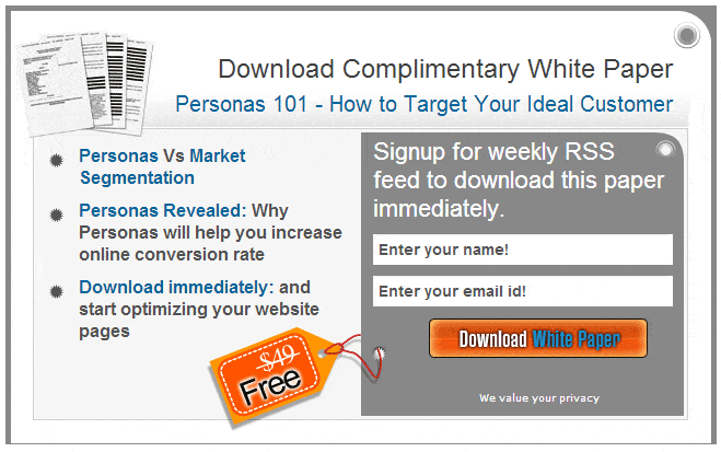
The closer that you place the benefits of signing-up to your form, the better. At Invesp.com, the sign-up form is completely enveloped by the benefit.
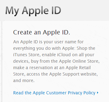
Outlining the benefits the customer will enjoy can help your ecommerce sign-up too. Apple includes the following beside their AppleID sign-up form.
4. Tell Them Why – It’s all well and good to know that you should keep your forms, but what can you do when you absolutely must have certain information to complete the conversion?
Fear about submitting personal information comes from not knowing what will happen to that information; how it will be used and who sees it. It helps to make your Privacy Policy easily visible and accessible, and include assurances, similar to those outlined above on Zappos.
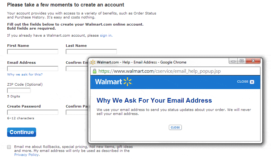
But it’s even better to tell your customers exactly why you ask for certain information. Like Walmart does:
5. Clear Call-to-Action – It’s the single most important element of any sign-up form. You can minimize the information you seek, you can give airtight assurances and offer undeniable benefits, but if your prospect does not find and click on your CTA button, it’s all for naught.
Check all the images in this post. In those that have a CTA button, it is the most distinctive element on the page.
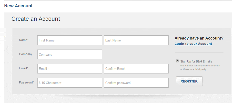
But we still see major sites with unispiring CTAs like the one below – a grey button that tells prospects to “Register”:
Putting it All Together on Your Sign-Up Form
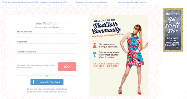
Some sites are getting it right. In researching sign-up forms for this post, the best one we found comes from ModCloth.com.
- It’s Short – They don’t even ask for your name!
- FUD Relief – They outline their Return Policy and include a link to their Privacy Policy immediately beside the CTA.
- Lots of Benefits – Including “Discover …”, “Gain …” and, best of all, “Get $10 Off”.
- Clear CTA – Big, orange and simple.
- Social Logins – This may not be an option for everyone, but it sure is the best way to simplify your sign-up form: eliminate it. The best part? Social logins increase registration rates by 20 to 40% (http://blog.gigya.com/real-roi-with-social-login/)
Change Your Sign-Up Form Focus
No one intentionally creates poorly performing sign-up forms. Forms began as a technical way to get to customer information online. As a result, they focused on what your company needs from your customers.
The first step in improving them is to focus instead on what your customers need from you.

