The eCommerce wave is still unfolding.
This year, the US eCommerce revenue is expected to reach 469.2 billion dollars.
And, next year it’s projected to go above 500 billion dollars.
Global retail eCommerce sales are more likely to reach 4.921 trillion dollars by year-end.
Looking at those figures, you’d be forgiven for thinking that success in the eCommerce space is guaranteed.
But, you’d be wrong.
The eCommerce failure rate is also high – 80% of eCommerce businesses don’t make it. This means that only 2 out of 10 eCommerce businesses succeed.
What makes the 20% succeed while the majority fails? Is there a secret sauce behind this?
Well, since we have been working with different successful eCommerce brands for over 15 years, we’d like to believe that we know a thing or two about what makes them prosperous.
One thing I can tell you is that there are no shortcuts to success if you want sustainable growth. Critical thinking, working and testing are some of the ingredients you’d need to use along the way.
And another thing is making sure that your product pages are optimized for conversions. In this article, I will show you 5 non–obvious Shopify product page tips that we’ve seen working over and over again in big and small eCommerce brands.
So, let’s get started…
1. Weave your Value Proposition into your product page
There’s this belief among marketers that a value proposition should only be placed on the website’s home page and not anywhere else.
But that’s a myth that has to be debunked.
Your brand’s value propositions should be spread out across the whole website.
Remember, your homepage is not the only entry to your site.
Users coming from social media sites, landing pages, or blogs may land directly on your website’s product page – and never visit your homepage.
If a visitor lands on your product page, you have a few seconds to let them know that they are at the right place. And guess what’s the right way of showing them?
Yes, you’re right…you let them know about the value that your product provides.
Weaving your value proposition’s DNA on your product page is one of the things that is easier said than done.
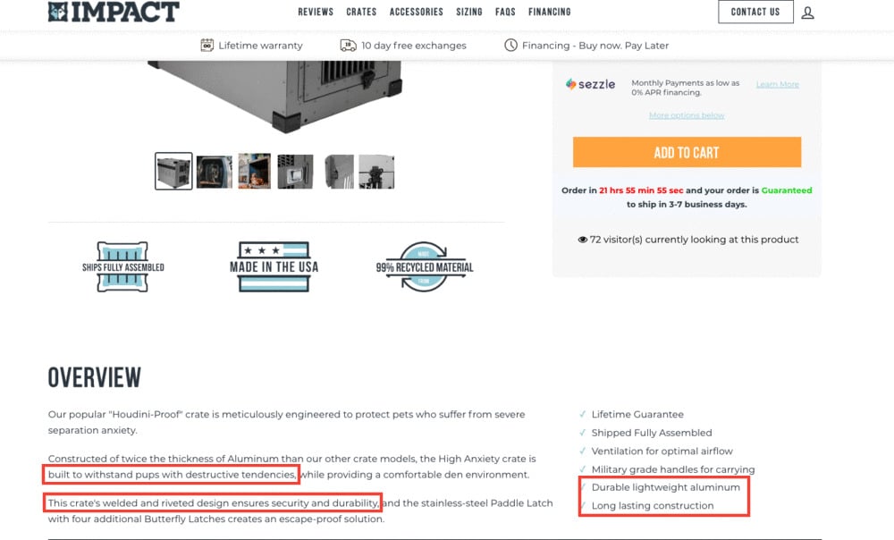
The value proposition of Impact Dog Crates is The only crate you will ever need. Guaranteed.
2. Share your Product Story
According to the founder of Frictionless Commerce, Rishi Rawat:
“A product story is a special type of a story that’s designed to connect with visitors and make them fall in love with your creation. The job of the product story is to educate and convert new visitors.”
In simpler terms, a good product story doesn’t only tell what a product is, but it also gives customers a reason to purchase the product.
Man crates is a good example of an online store that makes use of storytelling on its product pages:
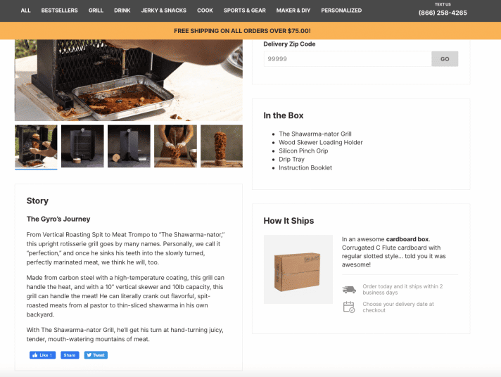
As you can see, Man Crates tells a story of the many names of its Shawarma–nator Grill. In that same story, they also tell you about the materials used to make that product.
Over the years of working with big and small eCommerce companies, we have noticed that people believe that product stories on product pages can only be told via product descriptions.
But that couldn’t be further from the truth.
Sometimes images and texts can fail to bring out the emotion and honesty that can make customers convinced about your product.
Videos can also be used to convey a product story. The adage ‘if a picture is worth a thousand words, then a video is worth a million’ rings true here.
In fact, in one of the research studies, we conducted we noticed that 73% of online consumers are more likely to purchase a product after watching product videos.
ALSO READ: How Videos on Product Pages an Increase Conversion Rate of eCommerce Sites
Another study conducted by SearchMetrics discovered that pages with video content have longer session duration and lower bounce rates. This simply explains the power of storytelling using video.
Tufina Men Watches is an excellent example of an eCommerce brand that uses videos to tell stories of how their watches are assembled:
The good thing about the above product videos is that they can be repurposed throughout your marketing efforts.
3. UX matters
User experience is often overlooked when talking about eCommerce product pages, but if you are serious about increasing conversions, you can’t afford to ignore it.
One thing we have noticed over the years is that a good UX, on any website, takes a lot of critical thinking and testing. This is to say you will probably have a lot of misses before you hit the big time.
So how do you ensure that your product page UX is on point?
ALSO READ: 5 UX and Conversion Tips to Improve Product Pages Conversion Rate
Well, the best way is to make sure that you answer all the questions that visitors may have once they land on your site. Here are some customer questions that you should anticipate and answer:
- Should I trust this website?
- When will I receive my order?
- Is shipping free or do I have to pay?
- Where should I click?
- If I have a problem with my purchase, what do I do?
- What makes this product different?
- How can I justify this purchase?
- How good is this product?
If answers to the above questions are not obvious, then you might as well be leaving money on the table. As you answer the above questions, avoid being fluffy and just give users solid information.
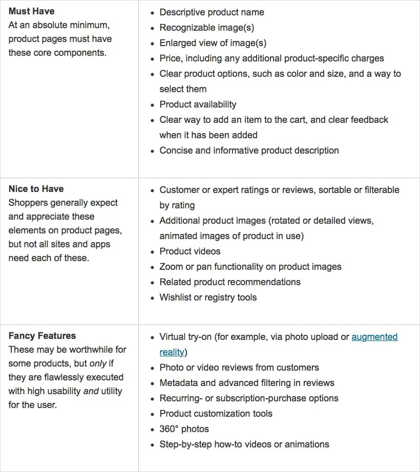
In this article written by Nielsen Norman Group’s Katie Sherwin, there’s a table that shows all the features you should include on your product pages:
4. Implement a keyword strategy
As you optimize your product pages for more conversions, you need to give your pages a chance to appear among organic search results and drive the right kind of traffic to your store.
In other words, a keyword strategy for your product pages is a necessity.
It’s important to know what words your buyers are using when searching for your products.
There are two common fatal mistakes that marketers often make when it comes to optimizing product pages for SEO.
The first one is focusing on the keywords volume instead of relevancy. And the second mistake is simply copying and pasting suppliers’ product descriptions.
ALSO READ: CRO vs. SEO – Does CRO negatively impact SEO?
Sometimes the most relevant keywords may have lower search volumes, but they tend to have higher click-through rates. Remember, the quality of the traffic is always more important than the quantity of the traffic.
According to Acronym’s SVP, Winston Burton:
“Product pages have transactional intent so make sure your landing pages are optimized for searchers ready to buy because you want to sell the items on your site.”
A good keyword strategy for product pages goes beyond what’s on the product pages. It also incorporates offsite marketing efforts by paying attention to things like meta titles and meta descriptions.
Hush Blankets does a great job of including the most important elements in title tags and meta descriptions:

What makes the above Hush Blankets’ title tag and meta description so good is that it includes details like:
The materials used – 100% bamboo
The name of the product – Cooling weighted blanket
The model number – Hush Iced 2.0
The target audience – hot sleepers
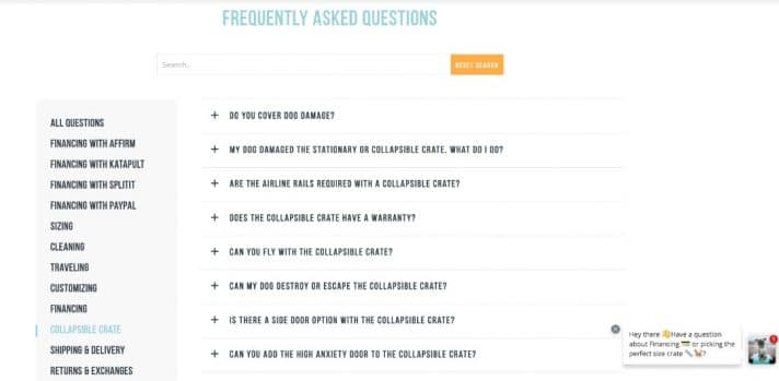
Adding an FAQ section can also help you rank high in SERPs.
Remember you don\t just want to drive the right kind of traffic to your product pages, you also want to answer all the questions that users have in order to avoid high bounce rates and sell more products.
Impact Dog Crates is also a good example of a site that has a well-structured section on its product page:
Now that we have talked about keyword strategy for product pages, how do you come up with the right keywords?
So, to come up with an effective keyword strategy for your product pages, you can use tools like Ahrefs, Moz, Surfer, and Semrush.
These SEO tools will provide the right keyword suggestions and help you choose the right tools. After you have typed your main keyword into Ahrefs’ keyword explorer, you will see related or similar keywords – with lower search volumes – that you can also explore.
5. Always be testing
Do you always have to be testing something on your product pages?
The short answer is yes.
I know this sounds cliche, but you really have to.
A product page has so many different elements in it – this means that you can never run out of testing ideas.
Here are some of the elements that you should consider testing?
| Element | Variation 1 | Variation 2 |
| Product title | A simple version with a standard product title | Keyword-rich product title |
| Product images | Single product images | Multiple product images |
| Product images | Wide-angle | Focused images |
| Product descriptions | Short descriptions | Detailed descriptions |
| Product descriptions | Tabular descriptions | Blog type description |
| CTA | Font style | Positioning on the page |
The benefits of A/B testing have always been evident.
We conduct more than 20 strategic tests on our clients’ eCommerce websites every month – and by trying out different strategic options we have managed to double and sometimes triple the conversions for our clients.
But here’s the thing, we don’t just test because we can. We first have to do adequate research and come up with a solid research-backed hypothesis.
Here’s a simple illustration of how the process plays out:
One hypothesis can have more than one test. Each and every test we launch teaches us something about the user behavior and it also feeds to the next test.
Conclusion: Your product page is the most important page
Your product page is the most important page on your online store. Why? Because it is the point of entry for most of your users coming from social sites, blogs, or landing pages. And it’s where the decision to make a purchase happens. If anything on your product page is broken or not clear, you are more likely to lose the sale. A product page is not the place to use superlatives or technical terms. But it’s actually the right place to appeal to your potential customers’ imagination since they can’t physically hold your product.

