Treat your site’s visitors well by avoiding these 6 reasons your visitors are leaving your E-commerce websites. From auto-rotating banners to weak search engines, from broken links to surprise costs, find out what irritates your customers and how to address each mistake to decrease visitors’ confusion and raise customers’ satisfaction.
1. Auto-playing carousels on your homepage
Auto-rotating banners bring in a lot of room to confusion.
If the slides’ speed of change is set high, visitors might not have enough time to read all information before an image gets replaced. By forcing your clients to read as quickly as possible, these banners raise an unnecessary level of anxiety.
For users, it is annoying when things move on screen without their control. Your visitors want to have control over their browsing experience. Trying to stop, return or advance the carousel might become a distraction from the plan customers anticipated when visiting your site.
The changing banners also confuse visitors who are trying to figure out the main features your site offers.
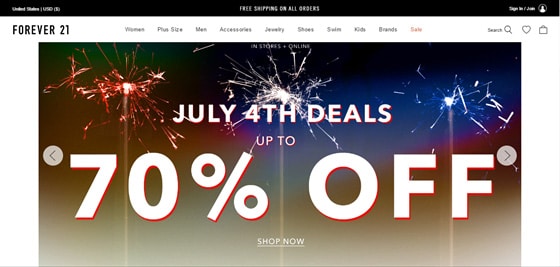
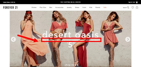
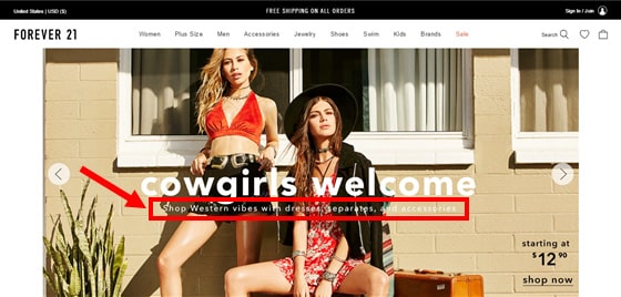
The homepage of Forever 21 presents deals and collections in a slightly confusing auto-rotating carousel. As you can see below, the three slides grab visitors’ attention with stunning pictures, but they change too fast to allow time for reading the small white subtitles. In case the customer wants to stop the carousel, there is no clear indication of how to do it.
How can you help your visitors find their way around a carousel?
- Introduce a manual carousel. Give visitors control on when to change the images.
- Use big arrows to easily sign visitors how to control the feature.
- Choose a maximum of 4 features. Be aware that an average of 1% of visitors clicks on carousels. Of these clicks, 84% goes for images on position 1.
- Add a cycling function to randomize slides, so the banner on the first position varies each time the homepage is visited.
- Don’t use carousels at all. Select a still hero image for your website first fold, calling attention to one main seasonal item, category or promotion.
- Segment your visitors, and transform each slide of your carousel in the still image of targeted homepages. For example, use geo-targeting to focus your offers and take advantage of the growing cross-border shopping.
- Remember manual sliders can work wonders on other pages.
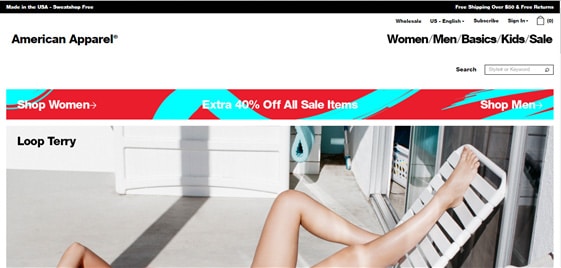
American Apparel’s homepage first fold, for example, uses the top part of a still image instead of an auto-rotating banner. Visitors can only see the whole picture by scrolling down. This image does become part of a carousel, but only if customers click on it and land on a “Loop Terry” category page. On the homepage, nothing distracts the visitor from the top menu, which even comes in coordinating colors with the outfit the model is wearing.

2. Too many menu options
Online shoppers are a practical crowd. When set in buying mode, they expect to find products in a snap. Not browsing, their primary concern is confirming you have what they need.
Over 29% of online shoppers choose “easy to buy” as their primary motivation to purchase from e-commerce stores. Goal-oriented, with a slight tendency to impatience, these consumers privilege the advantages of shopping fast, while taking care of multiple tasks. They need your store to provide clear, concise, direct, and easy to find information, especially if you have a large inventory.
To help your visitors in their quest for the right product, your site needs to be clearly labeled and well organized.
Too many menu options force a lot of guesswork on visitors. The structure of your website should follow an information architecture that gives users the feeling that content is divided up and connected in ways that match their needs and expectations.
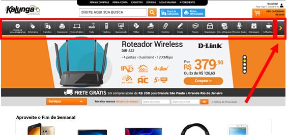
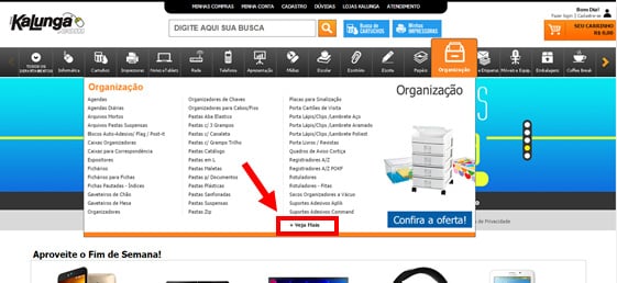
Catering for a large catalog of office supplies, Kalunga’s horizontal top menu might confuse visitors who don’t notice the small arrow on the right side indicating more menu options. Clicking on each category opens a box with another extensive, incomplete list of options. Customers have to click on “See more options” to get a glimpse of the entire list.
How can you help your visitors better find your products?
- Improve both findability and discoverability in your website.
- Create a clear website structure.
- Limit top menu choices, reorganizing categories to place first the ones that are most important to your customers.
- Remember that simplicity wins over abundance of choice.
- Simplify with a mega menu.
- Use extra navigation at the top right and vertically at the left, always on places where your visitor expects to find them.
- Go for a minimalist design strategy if you think it fits your user’s expectations.
- Add a sitemap to help your visitor find further information.
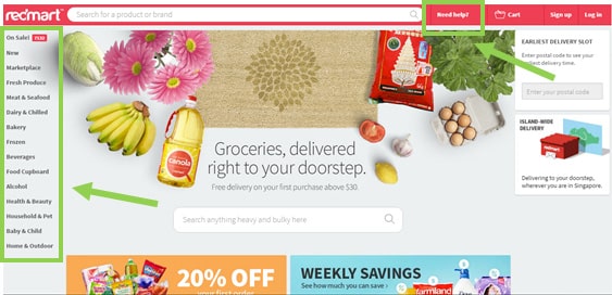
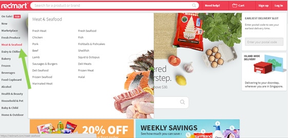
Redmart has an excellent example of a homepage designed to help customers easily navigate and find products.
Organized under a clear hierarchy, the page has two main menus. A short menu with the option “need help?” follows the search bar on top, while a complete list of categories is shown on the left side, headed by “On Sale!” items. Each category opens a box containing a full set of options.
It takes the visitor one second to either start searching products or find adequate customer support. All information is readily detectable, allocated in different spots of the page. There is a lot more to see when the visitor scrolls down, but customers in a hurry do not need to check the entire page or go through extensive options.
3. Weak search engine
Nothing like a bad search engine to confuse visitors.
Especially in large-inventory stores, where users rely rather on search than on products categories or left navigation widgets, search engines that can’t handle typos, plurals, hyphens, and other variants of the query terms become useless for visitors.
By 2014, 70% of the 50 top-grossing US e-commerce websites required visitors to search by exact jargons. For instance, if “all-in-one printer” was typed, the search engine of these websites would not be able to also return relevant products labeled as “multifunction printer.” Weak results annoy users and contradict shoppers’ expectations of easily finding products to buy online.
An extensive list of search results with few, unhelpful filters is just as irritating for users. If shoppers can’t refine the results, they might not find the specific product they want. That “all-in-one printer”? Comes with different printing and scanning resolutions, different copying and printing speeds, of different manufactures, in different price ranges. Customers expect the help of filters in these cases to find the best product for their needs.
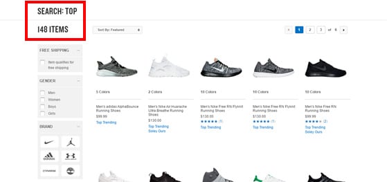
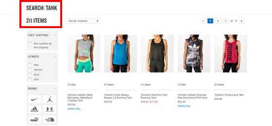
At Finish Line, the search engine provides a good range of filters, from free shipping to gender, size, color, activity and brand. It also handles typos. However, the search box doesn’t offer autocomplete suggestions and can’t list results of relevant variants. As you see below, a search for “top” does not list the 211 items labeled as “tank.”
How can you provide your visitors better search experience?
- Place an easy to identify search box in a prominent position, at the top where visitors expect to find it.
- Use an open text field box.
- Offer autocomplete/search suggestions.
- Add useful filters to your visitor’s searches, placed on the left.
- Consider creating a faceted search.
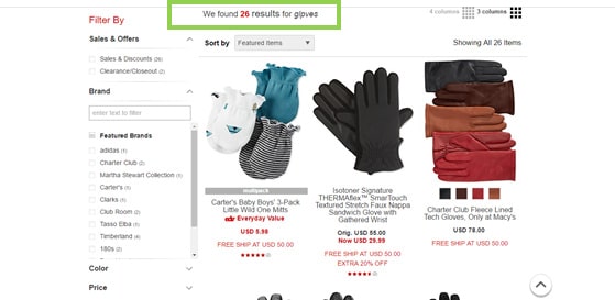
The search engine at Macy’s offers autocomplete suggestions, helping visitors refine their searches right at the beginning, as the first image below shows.
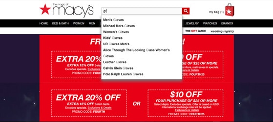
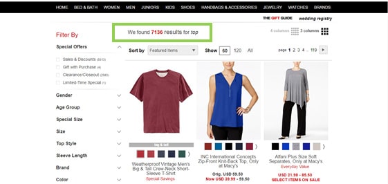
Macy’s engine also considers variant relevant terms, as a search for “top” brings a list that includes “t-shirts,” “blouses,” and “tanks.”
4. Broken or misplaced links
An effective way to stress your clients is to promise something and not fulfill it.
One of users’ basic expectations is to follow through when clicking a link. At each click, they are following a path, hoping to get to the right place. Broken or misplaced links promise a path for customers but fail to deliver. Internal search error pages do the same to irritate and annoy users.
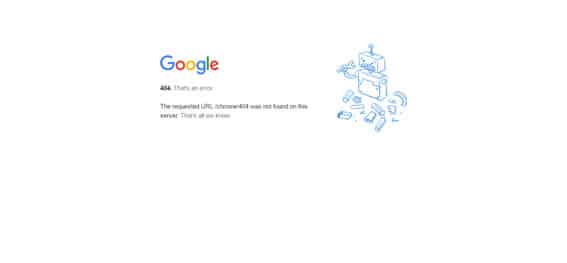
A generic 404 page leaves visitors wondering what to do next, because it offers no solutions to help users find the desired product or information. The error message in these generic pages simply acknowledges the problem, similar to the Google example below.
Thankfully, 404 pages are not always bad news. They might even be funny, but it is crucial that they contain helpful tips to send customers back on the right track.
How can you help your customers return to their right path?
- Run routine tests to make sure all links in your store are working properly.
- Update all links when loading new content.
- Analyze your 404 page.
- Create a custom page to help your customers find anything that they are not able to find due to internal errors or via the search bar. In this page:
- Reinforce your brand, by including your company name, logo, headers and footers. Use the same color scheme as the rest of your website.
- Add a friendly message in your 404 page telling visitors that the page they are looking for cannot be found.
- Consider offering users a way to report the problem.
- Implement a search box.
- Insert a sitemap.
- Provide contact numbers and emails.
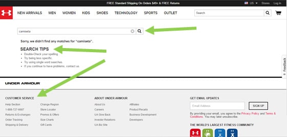
Under Armour’s custom 404 page reinforces the brand by maintaining the site’s design, as you can check in the image below.
In addition to the contact information at the bottom, the feedback tab on the right side provides customers the option of reporting the problem by filling a form.
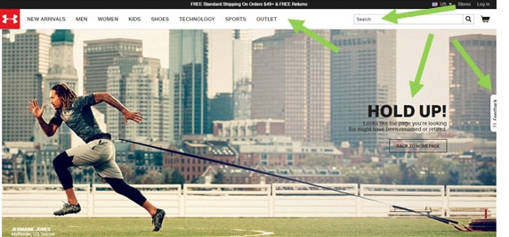
For search errors, Under Armour’s site displays a page that also maintains the design and preserves the top menu and search bar. To help visitors, an additional search bar is placed along with search tips and contact information.
5. Only positive reviews
While shopping, most online customers expect to find reviews based on previous buyers’ experiences. Shoppers rely on this input to make an informed decision.
Consumer reviews are nearly 12 times more trusted than manufacturers’ descriptions and valued as much as personal recommendations by 88% of consumers.
Smart as they are, online shoppers crave for critical reviews as much as good ones. Negative experiences provide information on what could go wrong with that purchase. By showing both approvals and disapprovals, you can reduce customers’ FUDs (Fears, Uncertainties and Doubts).
It seems counterintuitive to add negative reviews, especially considering that they have an 11% chance of changing a person’s intention to purchase. However, 68% of consumers trust reviews more when they see both good and bad scores and 63% are more likely to make a purchase from a site which has user reviews.
Visitors just browsing through reviews might end up trusting your site and purchasing another similar product from your store, or even the exact criticized product if the downsides mentioned do not bother them.
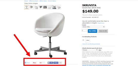
Product pages at Ikea’s store do not display any customers’ reviews, neither positive or negative. As the image below shows, the store only provides social media statistics, next to small buttons, under the product’s picture. These statistics do not offer enough insight and feedback to help customers make an informed decision.
How can you help your visitors find trustful opinions?
- Display both positive and negative reviews.
- Consider the easiest way to display the information. You can use charts to better visually organize reviews.
- Add average review score summaries to help customers have a general idea of ratings.
- Use ratings as filter options of search.
- Add a variety of user-generated content to your website.
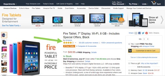
Amazon displays a score summary under the title on product page. Accompanying the summary, the first link directs visitors to all reviews, a total of 58,426 in the example below, while the second link directs to answered questions about this specific product.
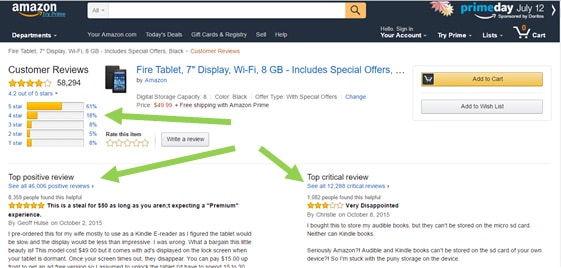
The customers’ reviews page specifies percentages of rates, from one to five stars, giving visitors a straightforward general idea of ratings. The page also clearly displays the top positive and top critical reviews, followed by links to all reviews of each kind.
6. Hidden costs
Hidden costs are a major letdown for customers. At the final frontier of the checkout, your customers expect to pay the same price they saw on your product page, or less.
38% of online shoppers state that low prices are their primary reason for buying online. They know the price range they can afford and always enjoy finding a good deal. Considerable online commerce lives off the possibility of offering the lowest prices.
Customers who make online purchases naturally expect great discounts and pride themselves for finding them. 36% of online shoppers say they spend time to find out which site stores their desired item at the lowest price and more than 64% wait to buy things until they go on sale.
Surprisingly huge taxes or unexpectedly expensive shipping costs that show up at checkout are proven ways to irritate an otherwise happy buying customer. 44% of web buyers abandon shopping carts when they see high shipping costs while 22% stop the purchase when they find the store did not clearly mention shipping costs.
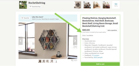
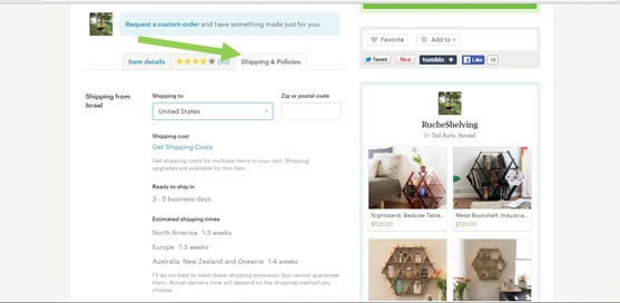
E-commerce sites gathering several retailers have to pay special attention to clearly display shipping costs. Etsy attempts to avoid confusion by automatically including local taxes, as indicated next to the price, and by adding a tab of “shipping and policies” for each product, as shown below. However, since each vendor fills their own information, there might be discrepancies between announced prices and final checkout prices.
How can you avoid showing surprise costs to your customers?
- Always be clear on pricing, shipping, and taxes.
- Do not hide any additional costs. Make them visible on the product page.
- Free shipping policy might be worth to invest in. You can also consider other shipping strategies, as a flat rate, for example.
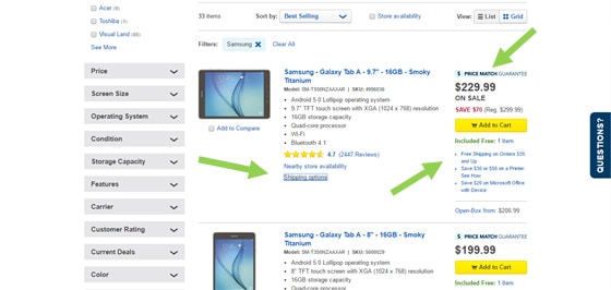
Best Buy provides clear information on pricing as soon as possible, starting on product listing pages, as shown in the image below.
Conclusion
Want to find out if your online store is confusing and stressing your visitors?
Complete an entire purchasing process there, as if you were one of your customers. Choose a specific product and follow through to buy it.
Check whether the carousel is sickening or informative; whether the menu options are clear or overwhelming; whether the search engine is helpful or misleading.
Analyze the effectiveness of your 404 pages, the vibrant presence of positive and negative reviews, as well as the absence of hidden costs, from a client’s point-of-view.
You might find enlightening ways of meeting customers’ expectations.

