If you spend enough time optimizing websites for conversions, you will discover that there is no magic solution for the design of any web page to increase conversion rates. Your design process should start with making assumptions about how visitors will interact with the website in order to determine which design that works best for them. Of course always test these assumptions through the process of AB and multivariate testing.
What’s we will do over the next few blogs is compare the homepage design for some of the Internet top retailers. These companies spend and continue to spend hundreds of hours optimizing their homepage designs. The goal is to learn from the experimentations which these websites have gone through. The companies we will evaluate include:
- Amazon.com
- BestBuy.com
- Staples.com
- Homedepot.com
- CDW.com
Please remember that these blog posts aren’t meant to encourage to copy some of these e-tailers designs by any means. However, it is worthwhile to consider factors that can propel customers on the homepage to move forward. What can cause your hp to become more “sticky” is key to better performance.
1. Screen Width

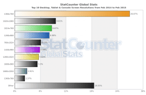
All of these retailers still rely on fixed width in their website designs. 4 out of the 5 retailers use website width around 960 pixels. Amazon is the one exception coming at a width of 1440 pix. This allows Amazon to have more space to present more information for their website visitors. Data from StatCounter shows that the majority of website visitors worldwide use screen resolution higher than 1024×768.
Conversion Framework Connection: The FUDs element (fears, uncertainty and doubts) is usually a driving force behind changes of site width, etc. The visual appearance of website will directly impact UX and how the visitor interacts with the site. Another CF element to consider is buying stages. By increasing the width, Amazon has increased “prime real estate” on the page giving them more room to promote products and cater to the different buying stages.
2. Location of the top logo

4 out of the 5 online retailers place their logo in the upper left corner of the website which is the standard location most websites use. Staples, however, chooses to place their logo in the middle of the top bar. Our testing indicates that that the placement which staples uses is not ideal but again, it’s interesting to consider why Staples has done this.
Conversion Framework Connection: Trust. It’s what visitors feel once they see your logo. Where it is placed, how it looks, and what it says about you are all factors that can enhance trust and confidence in your site. Never underestimate the power of a strong logo.
3. Use of a tag line

Two of the websites have a tag line displayed in their top header. Staples,CDW, and Amazon choose not to display any tag lines. However, Amazon’s logo is clever in that the arrow pointing from “a” to “z” is almost saying something like a tagline.
Conversion Framework Connection: There is a value that you are trying to promote to your visitors once they land on your site. Very often, one of the many ways you can display this value is through the tagline. Best Buy: Above the logo: Expert Service. Unbeatable Price. The Home Depot: Next to the Logo: More Saving. More Doing. What are these tagline saying about these companies? Is it necessary to add a tagline? It is not necessary. But one of the objectives you need to achieve on the homepage is enhancing trust. Many times enhancing trust is achievable through a strong presence of the value proposition in more than one area of the page.
4. The Search box
![]()

The location of the search box, its size and design is different from one e-tailer to the next. Amazon.com has the largest, placed in the middle of the header and most clear search box amongst the 5 commerce websites which we evaluated.
Conversion Framework Connection: Focusing on increasing “buyer momentum” and increasing “scent” on your site is key to addressing all the “needs” and “wants” of site visitors. Increasing buyer momentum means offering numerous outlets and way to navigate your site. Search is a “go to” for many site visitors. The location, design, and of course most importantly, the results that a visitor will get, when optimized, have achieved optimal results for our customers. This is an element where we can clearly tell you, test it if your search works.
5. Use of customer service phone number
Only two of the e-commerce websites evaluated, CDW & Homedepot, have customers service phone number listed on their homepage. CDW has their number listed in the top header while home depot lists the number at the very bottom of the homepage.
Conversion Framework Connection: Call centers require a lot of resources and cash to maintain. Most websites, especially top 100 retailers, offer some sort of “phone call support” but it’s a last resort because most times visitors can figure out the “issue” on their own by reading some of the FAQs on the site. The move to hiding the phone number, and not displaying it on the Homepage is a business decision. Very often some element can increase conversion because it enhances trust and confidence, such as the phone number displayed prominently on the site. However, from an operational perspective, it is draining because the number of calls increases significantly with the prominence of the number.
6. Geo-targeting
 Three of the e-commerce websites we evaluated have physical “brick-and-motor” presence: Best Buy, Home Depot and Staples. Both Home Depot and Staples used geo-targeting to identify which store we would use based on our zip code.
Conversion Framework Connection: Having a physical store and establishing a connection between it and your web presences is important for engagement purposes. So many companies place geo-targeting feature on the site to help the site visitor establish that link and possibly see the locations near-by. What’s important to consider is engagement through community connections and networks establishes a better more effective brand which resonates with visitors to the physical store and website.
7. Use of product categories in the header
Three of the websites (BestBuy, Staples and CDW) display product categories in the top header. Amazon and Homedepot don’t display product categories in the header and rely instead on the left navigation for displaying them.
Conversion Framework Connection: We’ve deployed a number of tests that have to do with displaying carousels, product categories, top selling items, etc. The theory behind each of our tests after much research was how can we increase site scent by providing all types of visitors with a clear trail depending on the buying stage they are at. By providing numerous outlets, you’re catering to the many different type of site visitors, however, sometimes your site has sufficient scent but the clutter is what is stopping visitors from proceeding. It is important to distinguish what is the obstacle that is stopping scent? Is it the obstacles? Is it the lack of navigational paths?
8. Header size
These retailers have different approach to the size and the amount of information they include in the header. Amazon & Bestbuy use a header that is smallest in size occupying about 10% of area above the fold, Staples is on the other extreme using a large header occupying about 30% of area above the fold.
Conversion Framework Connection: Size of a header and how the header is used can often be the cause of friction on the site. We have tested this on many pages throughout the site, but found on category and product pages, that a large site header which takes away form the objective of the page tends to increase bounce rates because of the friction it causes. What’s important to determine is whether or not you have higher than normal bounce rates on your homepage, and whether your header size can have anything to do with it.
9. Location of the cart
![]()


Of the different items we evaluated in the header, location of the cart icon is the most consistent item we found. All of the retailers use a cart icon that is placed in the right side of the header. Some of the retailers used the word “cart” in addition to the cart while some relied on the icon by itself. They all display the number of items in the cart as well.
Conversion Framework Connection: Making the site more user friendly and alleviating any changes for concern or questions is related to FUDs. The cart is an important element that if a visitor is actually adding items to it, will be something they look for. What we recommend is that you evaluate your cart image and how it functions from a visitor’s perspective; Is it clear, do they need more information, how can I improve the experience.


