Sometimes, CRO gets you in a rut, and you need inspiration. And what best way to attain that inspiration than through actual implementations done on other sites? But where to look, who to look at, and how to get that information? Well, we’ve carried the brunt of the work for you! We conducted research on over 500 SAAS and e-commerce sites to develop some great resources for you.
The greatest perk for all of these articles is that we provide you with a lead magnet to the library of screenshots we took of all these companies.
Before we jump into our analysis, I recommend reading about the different abandonment rates an e-commerce site suffers from. You can also see our detailed guide on crafting cart abandonment emails.
The first article is a comparison of shopping cart pages of 200 different e-commerce websites. We evaluated a various number of elements on these different cart pages:
- The pricing summary
- Checkout button(s) placement
- Top navigation present or not
- Sales price display
- Alternative payment methods present or not
- Assurance centers (secure pay and such) present or not
- Cross-sells present or not
- Promotional banner
Here are some interesting shopping cart pages statistics that we found and will elaborate on throughout the article:
- 88% of carts evaluated have the top navigation inside the cart page
- 35% of carts didn’t include the sale price next to the line item of the product
- 37% of carts have “trust icons” or an “assurance center.”
Pricing summary placement
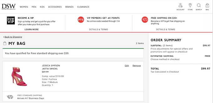
The placement of the pricing summary and the primary CTA (usually proceed to checkout) is very important. We observed that the majority of the 200 companies placed the pricing summary on the right side of the page. Other companies placed it directly below the product(s) listing. In all cases, the primary CTA was always right below the pricing summary.
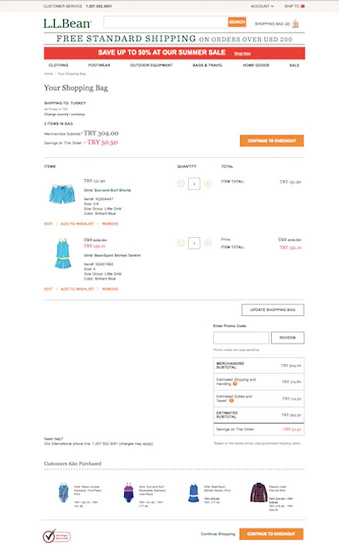
47% of companies place the pricing summary under the product listing. Below are some examples: add the order summary under the product information:
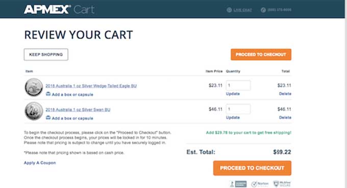
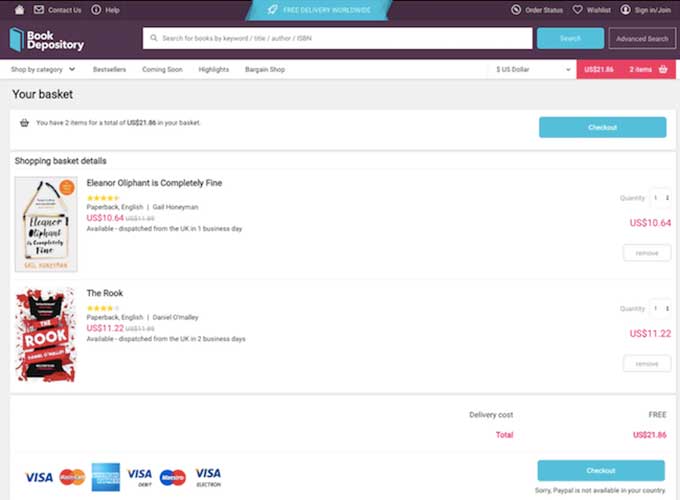
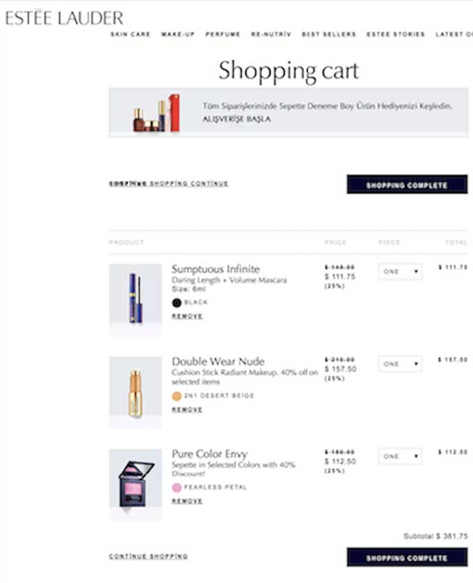
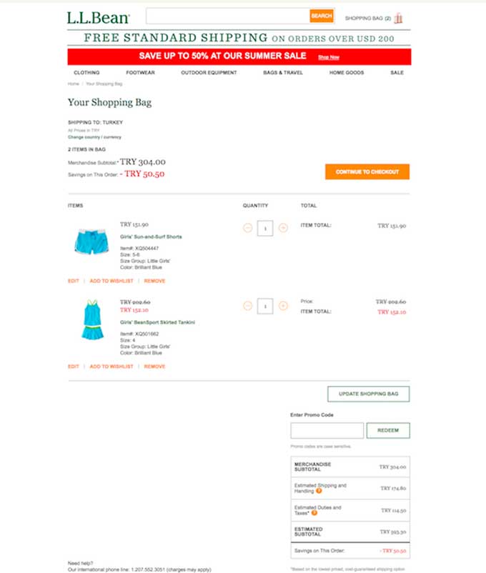
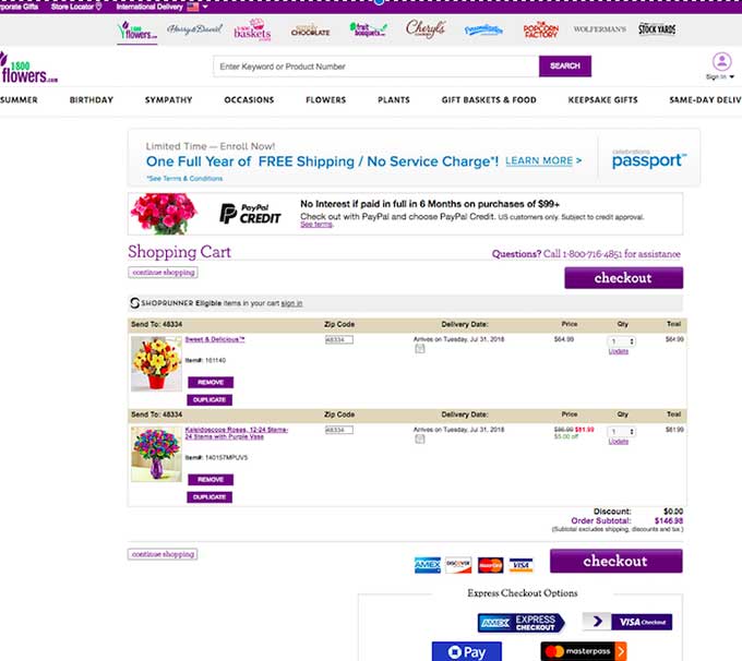
Of the 200 carts evaluated, 48% place the pricing summary on the right side of the page.
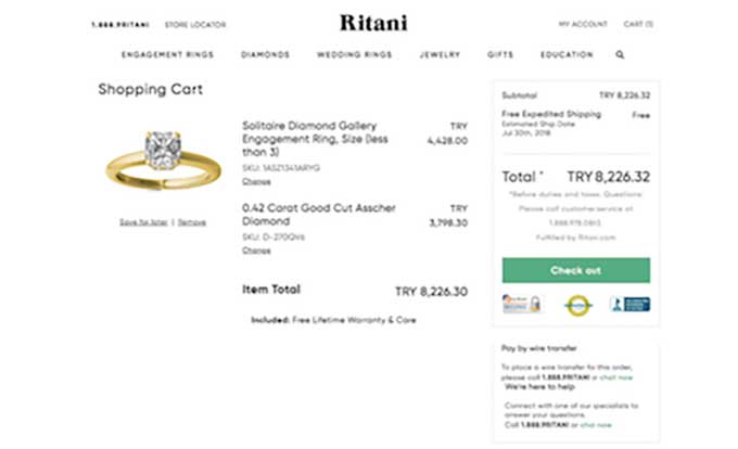
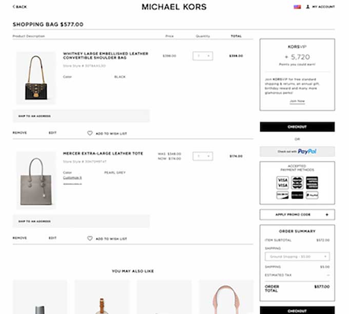
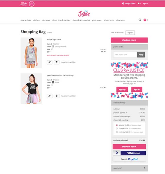
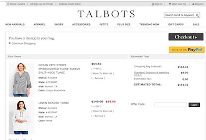

Only 2.5% of carts place the pricing summary on both the top and bottom of the product listing.
Primary Call to Action
We noticed throughout our research that the majority of cart pages are simple and reduce unnecessary clutter. That’s definitely why CRO for e-commerce is becoming challenging. Usability issues on sites are mainly non-issues. So unless a CRO understands how to make a site more compelling and engaging and is involved in multiple projects for a site, there will be few improvements made to the site.
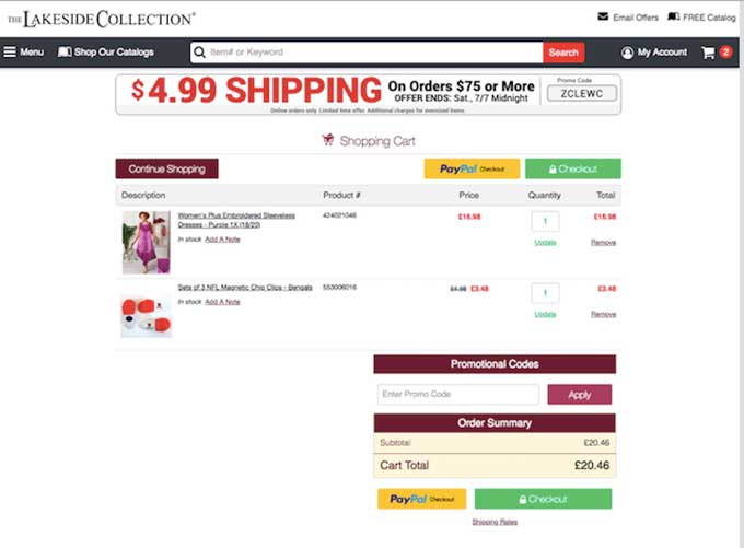
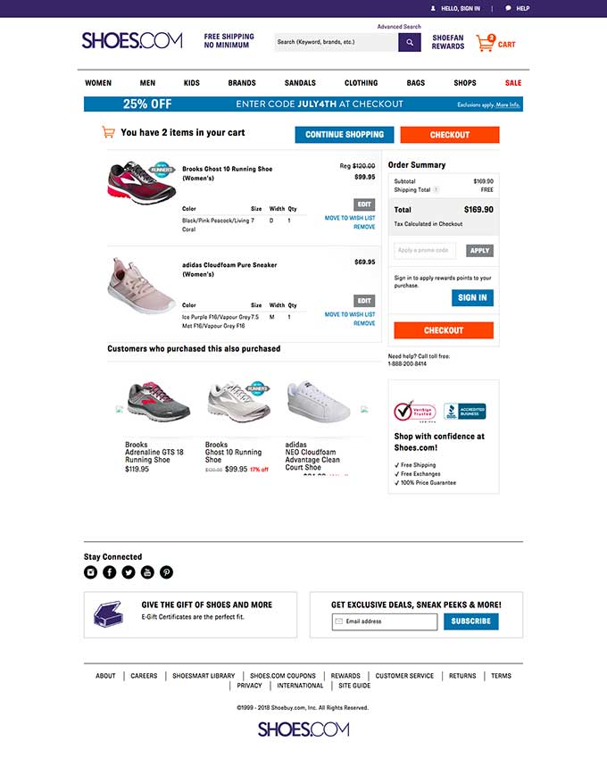
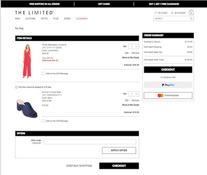
Ultimately, 2 vs. 1 primary CTA (or Proceed to checkout) on a cart page is a minor change, but definitely, something we thought was interesting. Of the 200 carts evaluated, 54.5% used just one CTA.
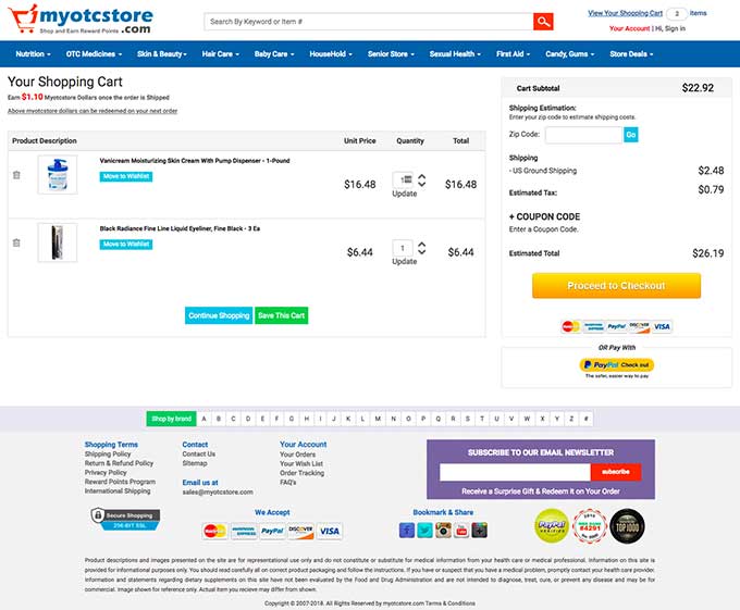
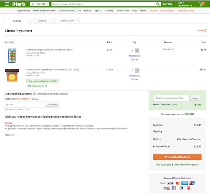
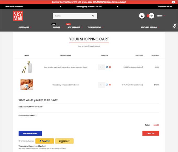
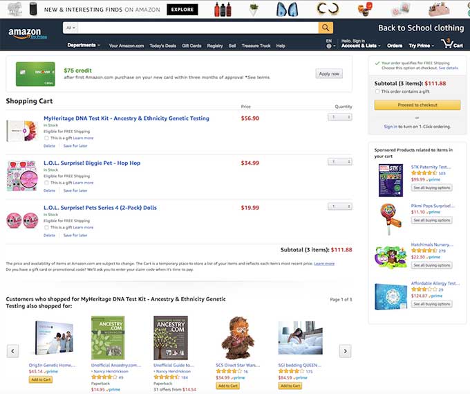
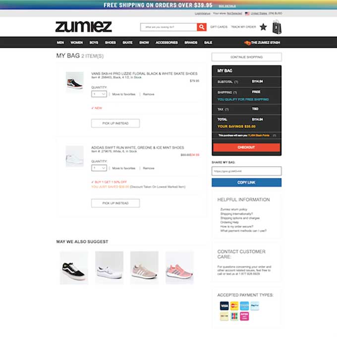
While 43% of carts used two CTAs:


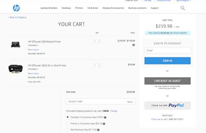
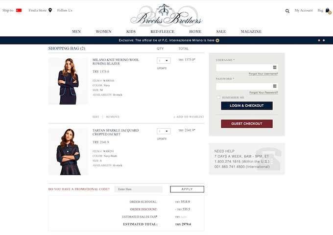
Interestingly, 2.50% replaced the typical CTA with the login or guest checkout options. Creative!
Top Navigation
Typically, removing an element such as top navigation to limit distractions is a win-win for most of our clients. Before you go ahead and rip it off the cart page, we don’t just decide to test an element like that blindly. If we notice that visitors remain on the cart and don’t click on that navigation, it’s likely an element not worth testing. However, when we see those patterns, testing is generally positive.
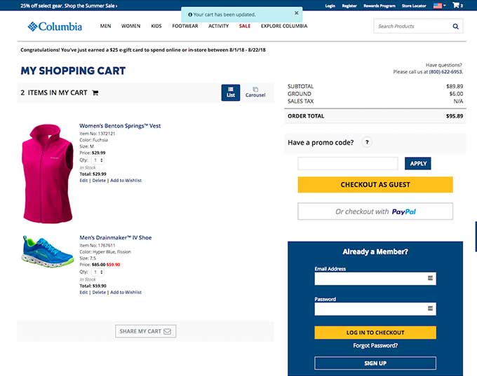
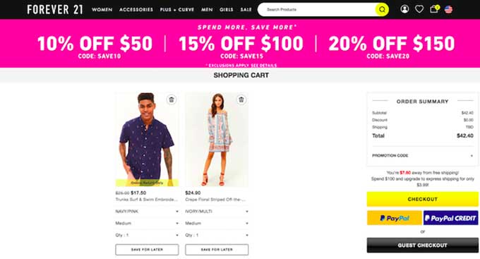
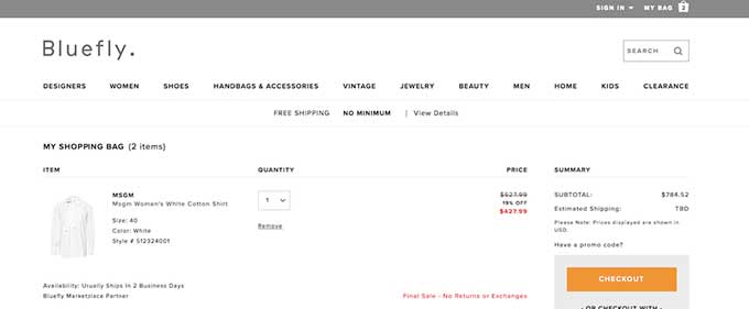
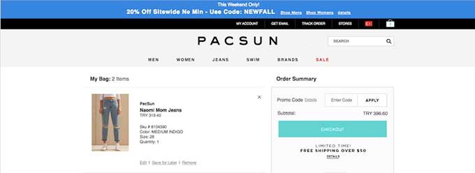
Of the 200 carts we evaluated, an overwhelming 88% have the top navigation inside the cart page, and just 12% of companies do not. Here are some examples with top navigation:
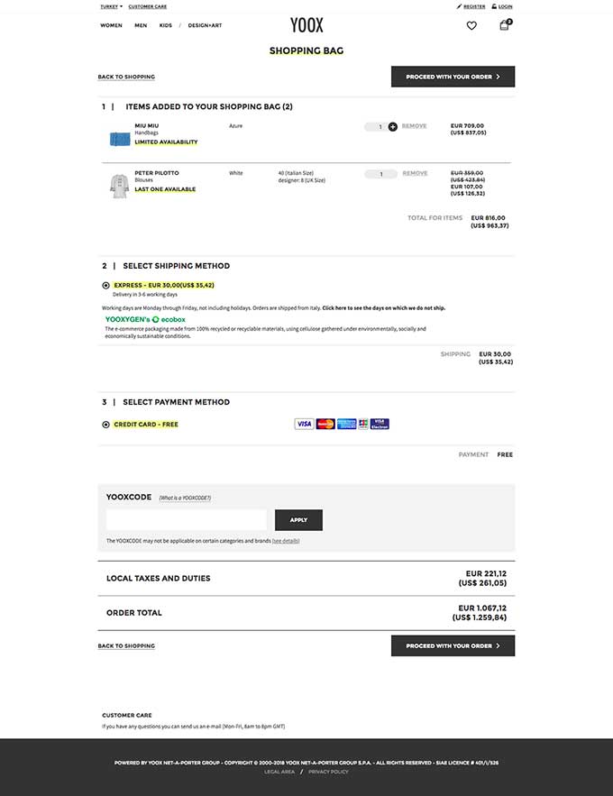
Here some examples of companies with no top navigation
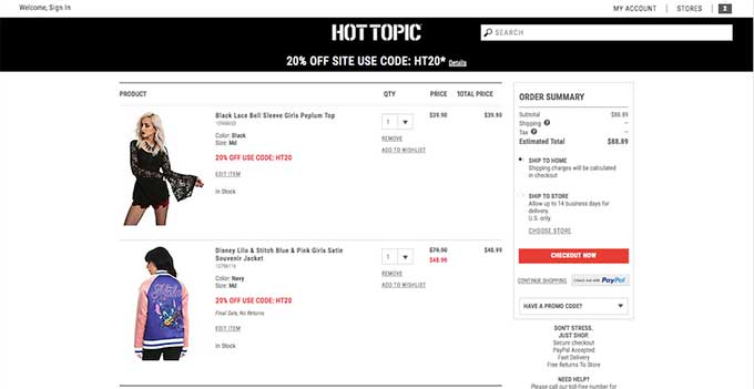
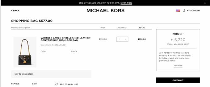
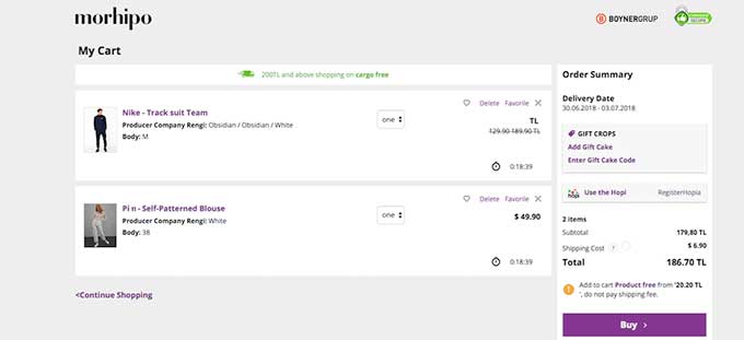
Sale Price
An easy one. If your item is on sale, display it. Well during our research this painstakingly obvious element isn’t always clear.
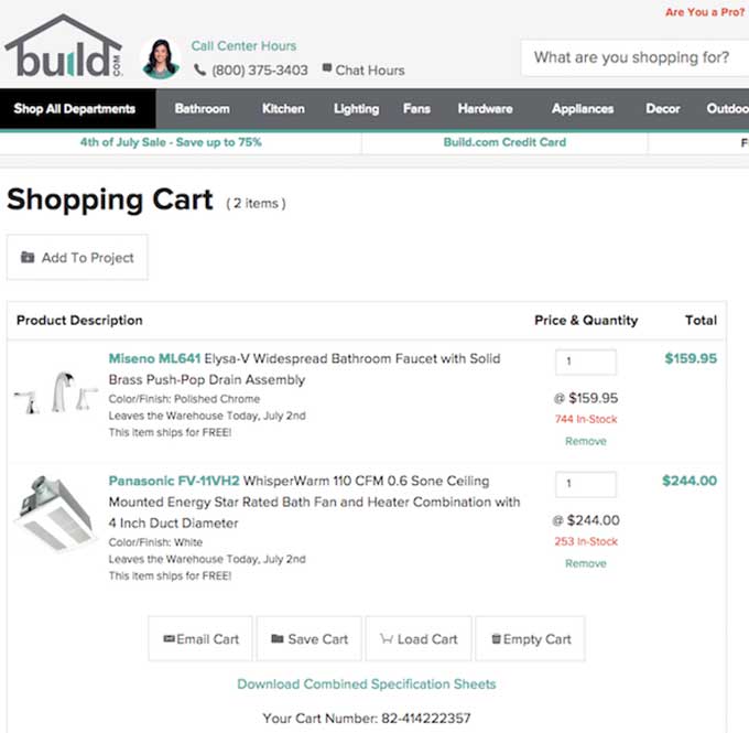
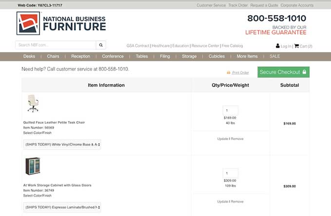
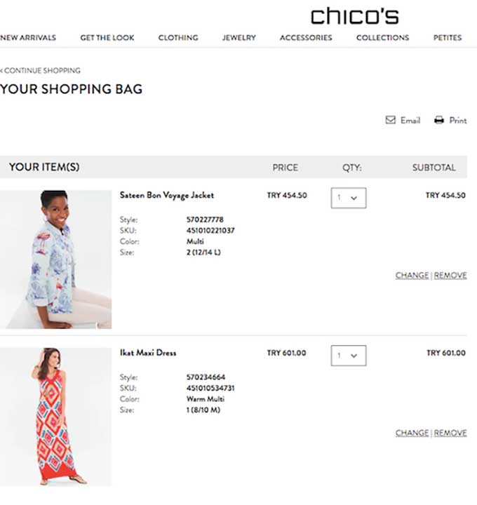
Of the 200 evaluated carts, 65% include the sale price. Duh!
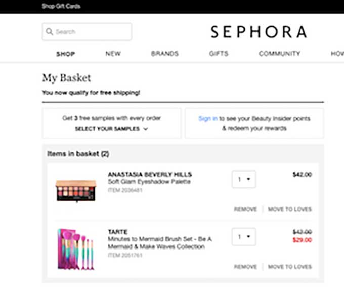
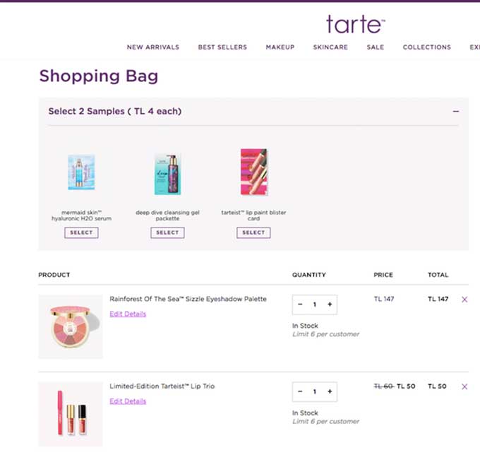
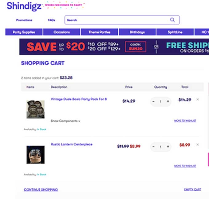
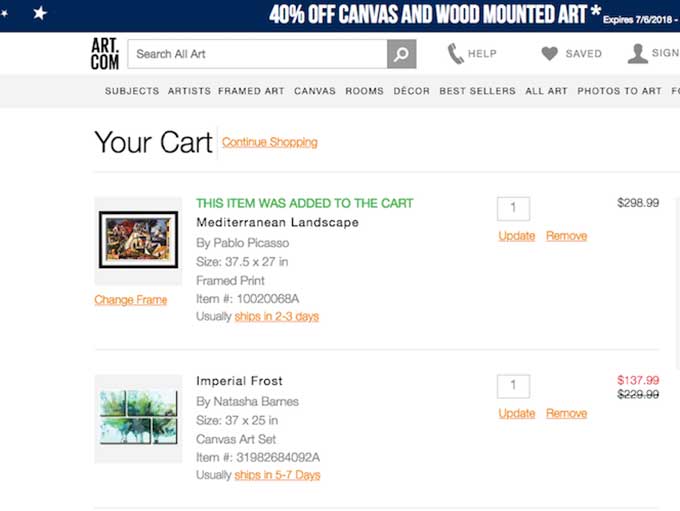
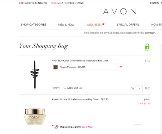
But shockingly, 35% do not include the sale price! But why!??!?!
Alternative Payment Options
In the article we posted on the simplicity overabundance of choice, we relayed the story of Professor Sheen Iyengar of Colombia University and her grocery store experiment. She found that when she offered 24 different jam options, although 60% tasted, less actually bit and ended up buying (only 3%). When she offered 6 flavors only, just 40% tasted, but 30% stopped buying.
What does this mean? Sometimes offering multiple forms of payment (PayPal, Google, etc.) isn’t always the best thing. And if you do present it as an option, it should be easy and clear.
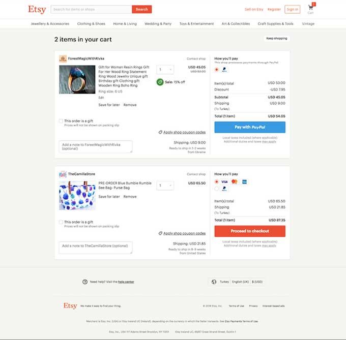
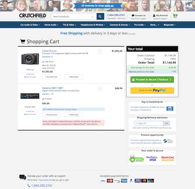
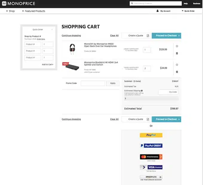
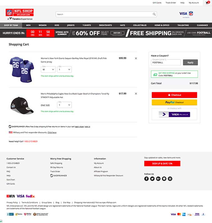
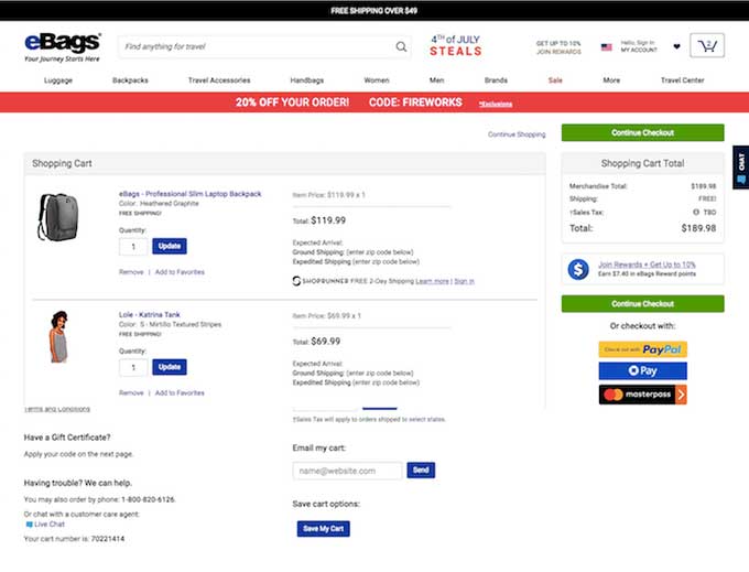
52.5% of the evaluated carts offered an alternative Payment, while 47.5% didn’t present that option on the cart page.
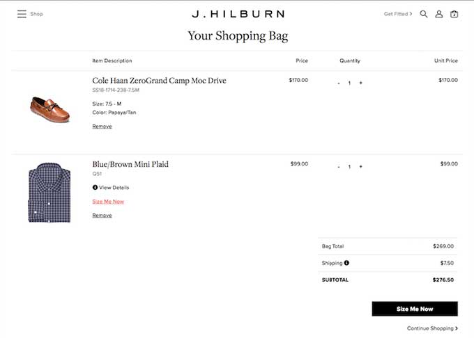
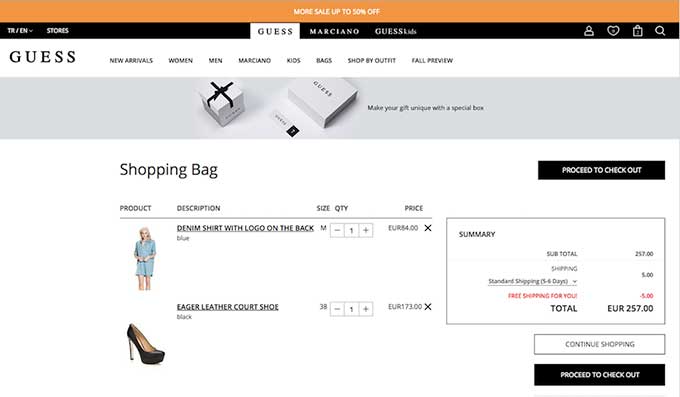
Here are some examples of sites that do not have an alternative payment option.
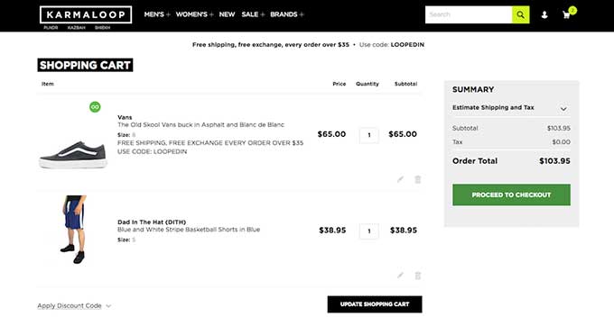
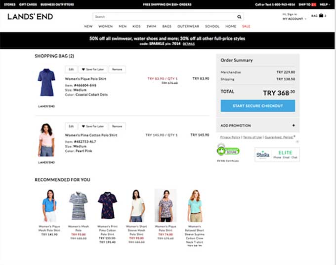
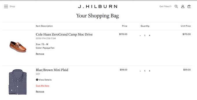
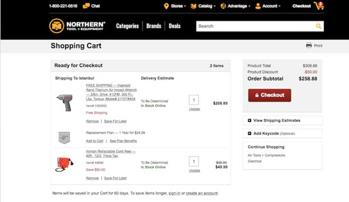
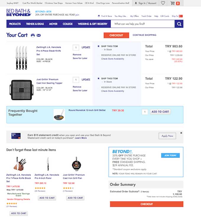
And here are some that do have alternative Payment
Assurance center
We actually like to take credit for coining the term: “assurance center.” In 2008 we added an assurance center with trust seals to a client cart page and saw amazing improvements in conversions. As a result of this amazing result, we wrote a lengthy post in Internet Retailer Magazine about the case study. After that article went viral, everyone was talking about assurance centers and how they are must-haves. The funny thing is, we do not believe it is an end-all solution. We tried assurance centers with other clients, and they failed miserably!
The takeaway is any of these elements or competing sites don’t offer the golden ticket solution to your site.
Of the 200 carts evaluated, 37% have some trust icons or assurance center, while a whopping 63% don’t have anything at all.
Here are some carts with no trust icons or assurance center:
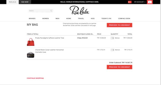
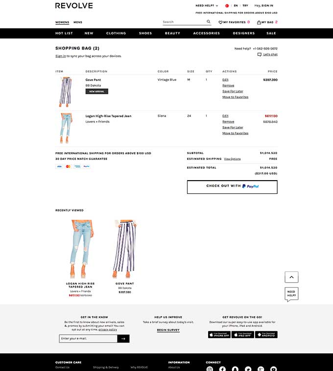
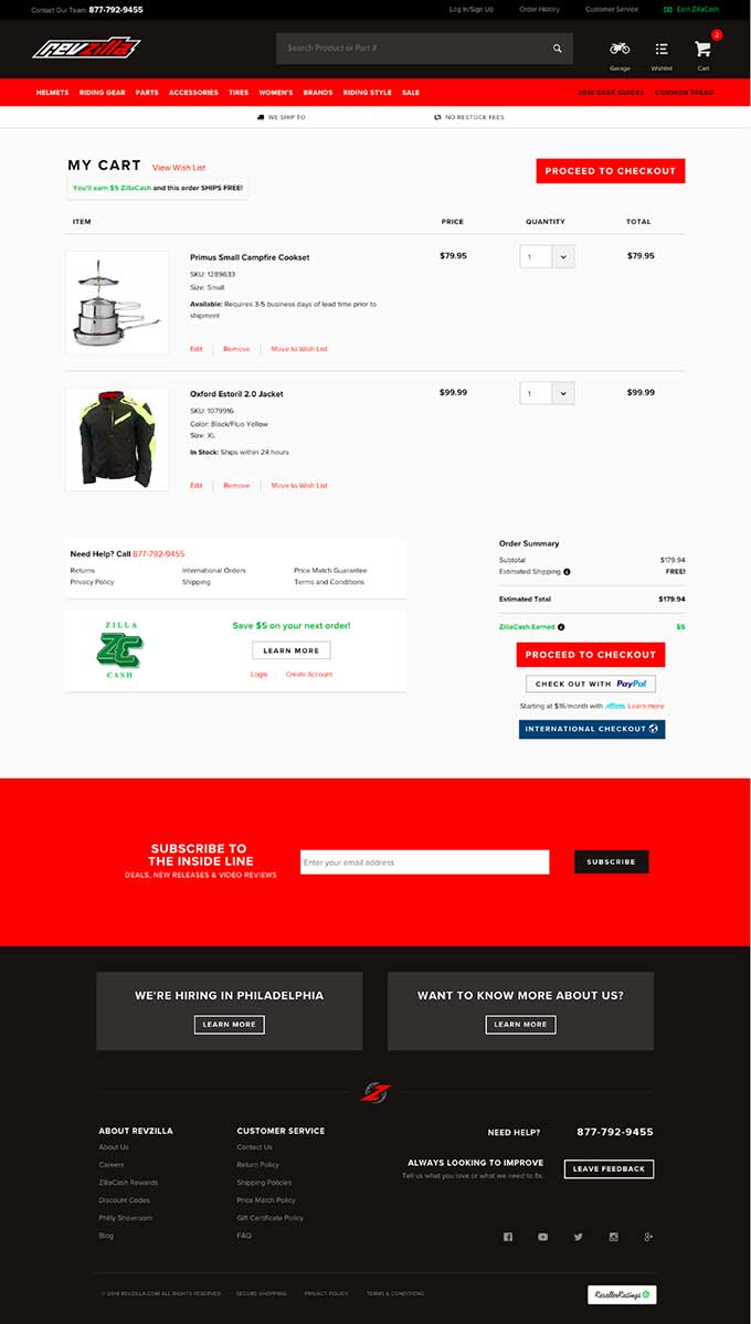
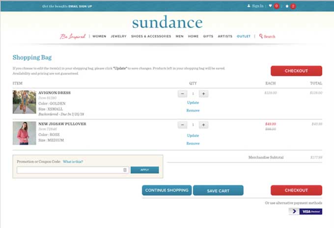
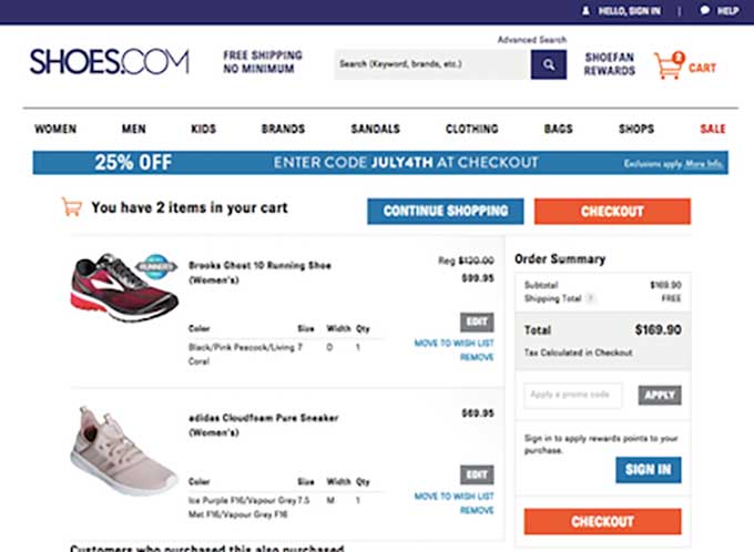
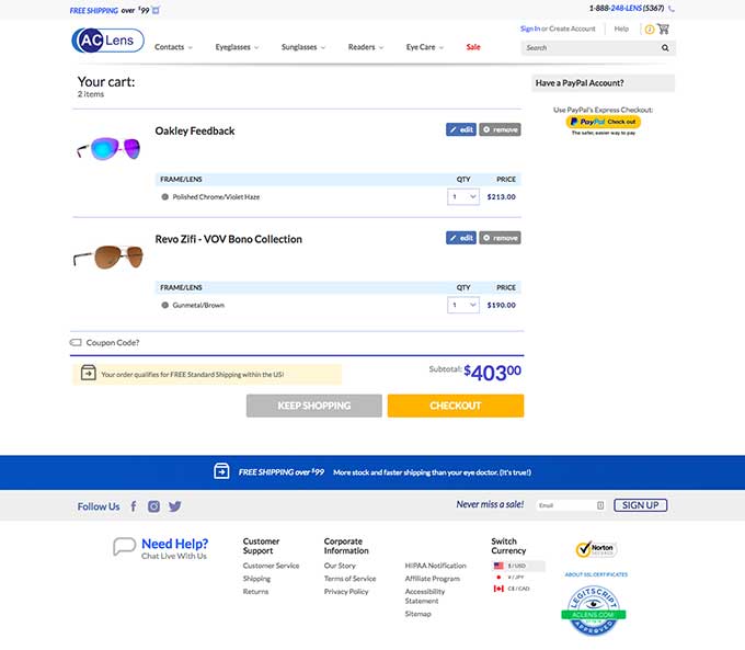
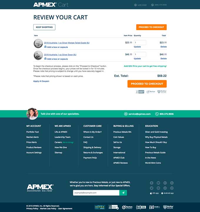
Here are some examples with either icons or more: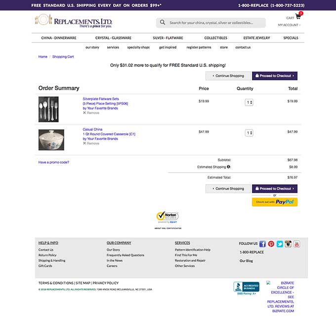
Cross-Sells
Cross-sells are a popular element to include on the cart page. The question always becomes, is it better to direct visitors to another product page or remove any obstacles that may distract them from moving forward in the conversion process.
- 63.5% of the 200 carts evaluated had cross-sells present on the page.
- The other 36.5% remove all distractions from the page.
- Additionally, not all carts had cross-sells on the bottom. There were different placements: a whopping 96.50% placed cross-sells along the bottom, 3% on the right side, 0.5% on the top of the cart page.
Let’s take a look:
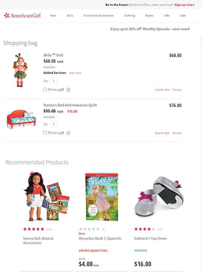

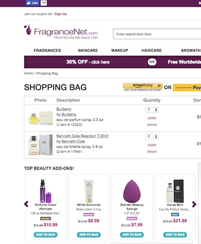
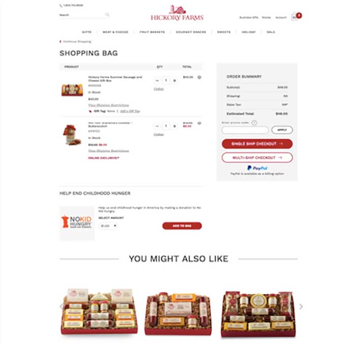
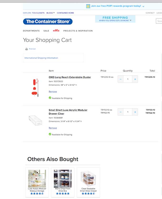
Here some examples of placing the cross selles on the right side of the page.
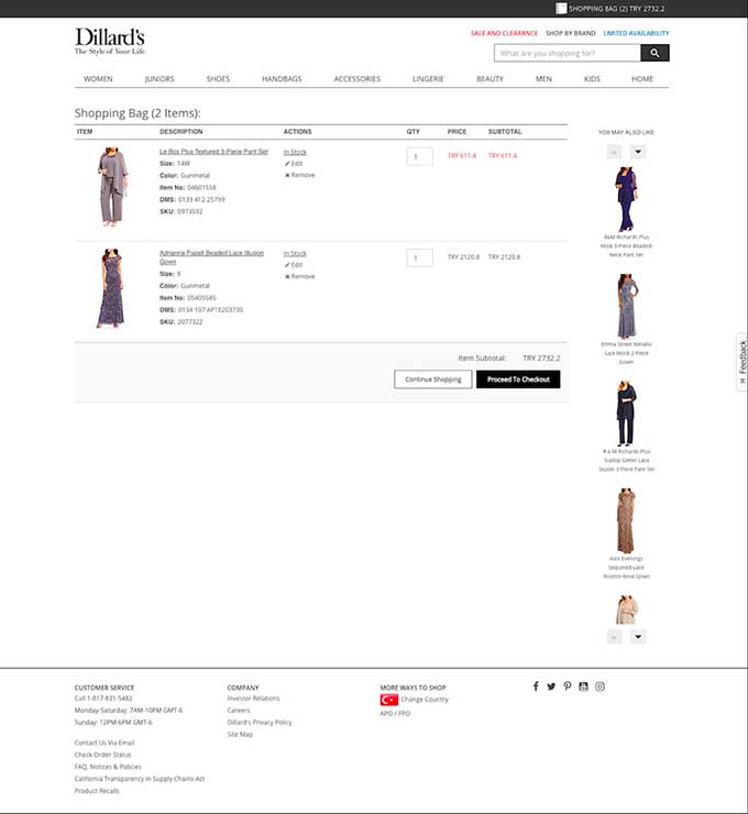
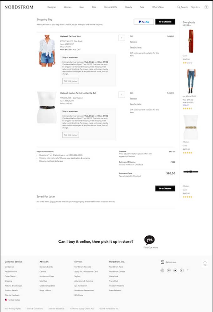
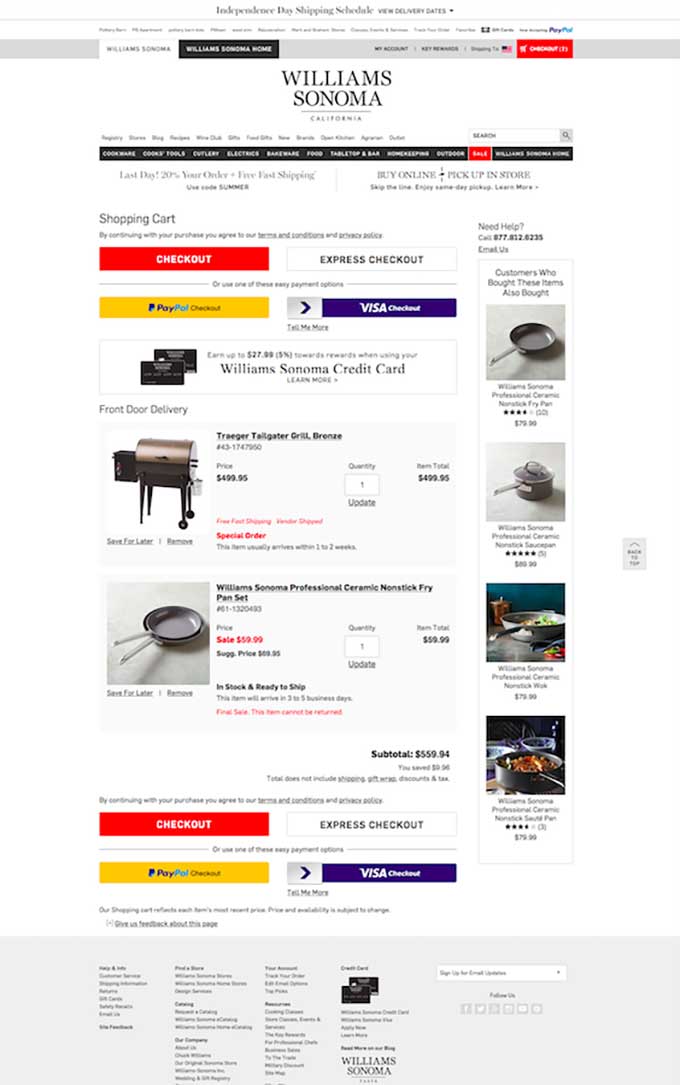
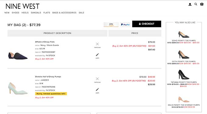
Of the 200 carts evaluated, 63.5% had cross-sells present on the page, most of which directed the visitor to the PDP. Actually, 72.44% direct visitors to another product page, while 21.25% of companies directly on the cart add option. Which do you think is better for usability?
Here are some examples of cross-sells that direct visitors to the product page
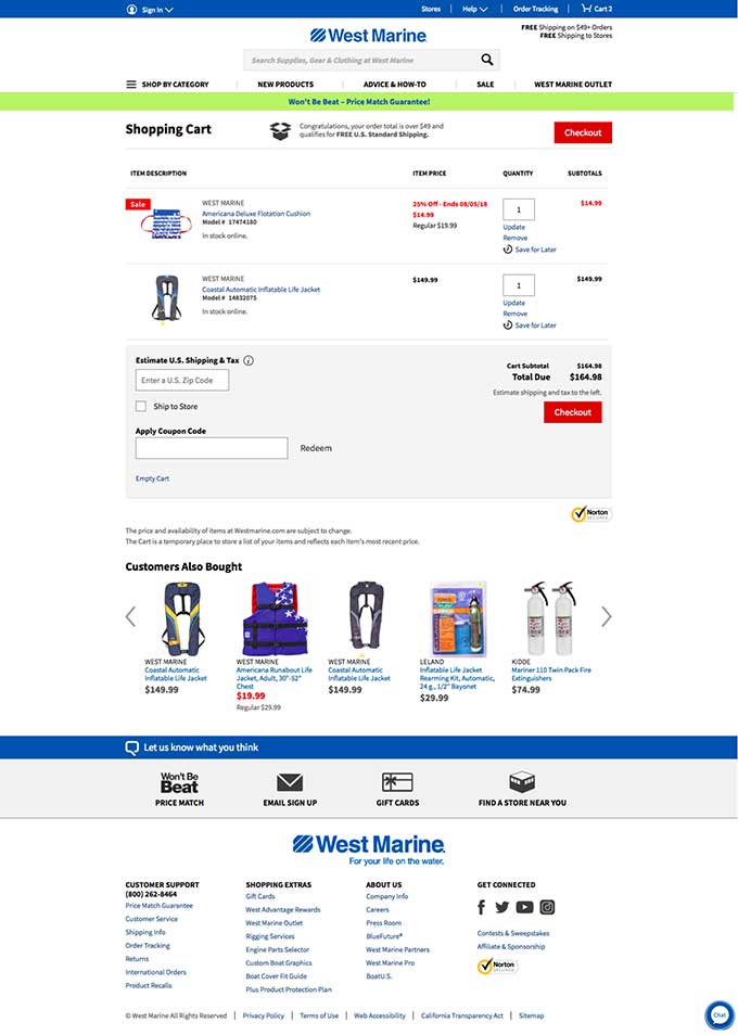
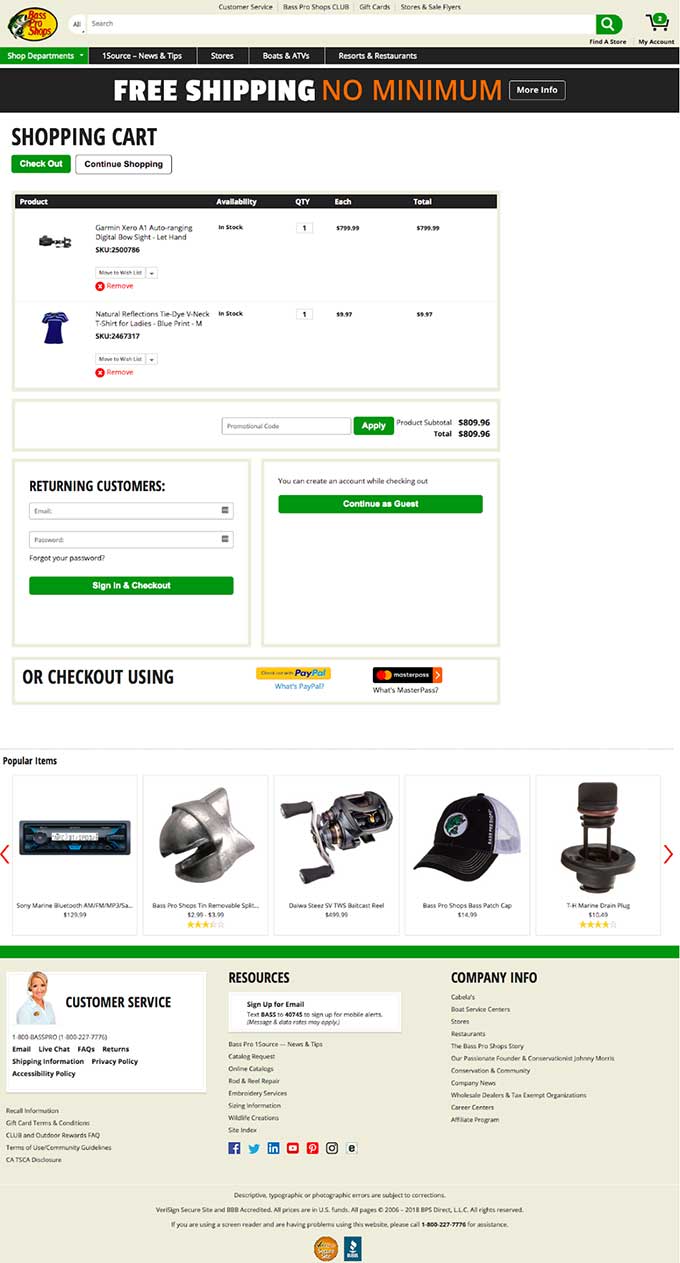
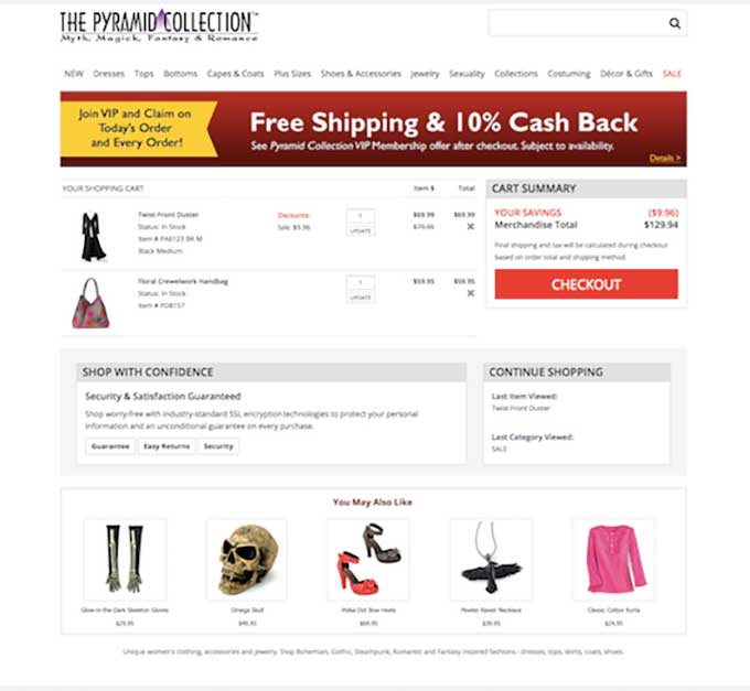

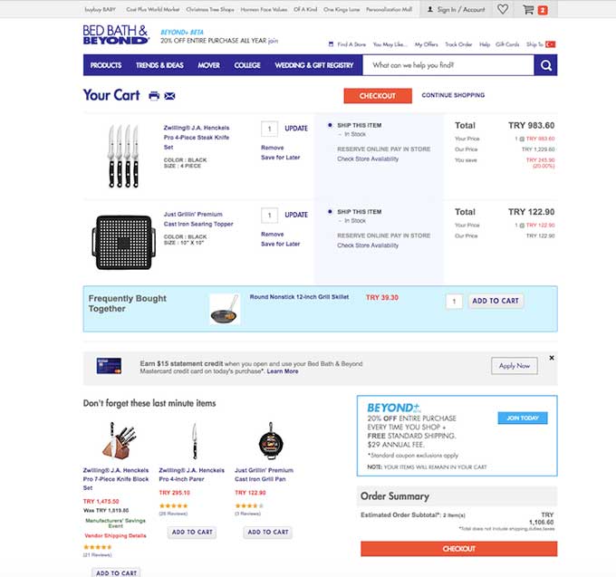
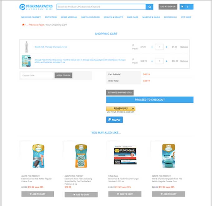
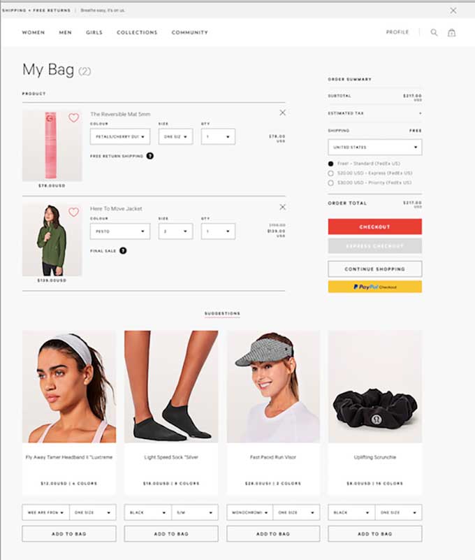
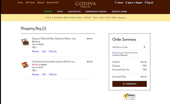
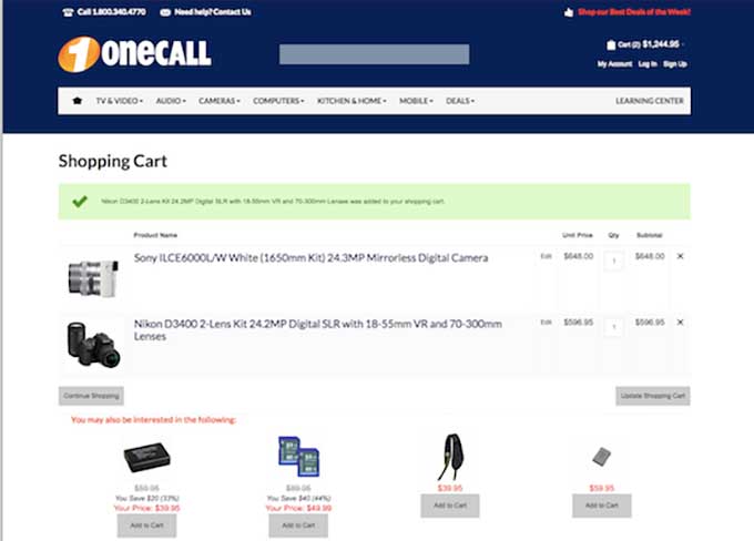
And here are some examples of companies that allow the visitors to add the items directly from the cross-sells to the cart.
Promotional Banner
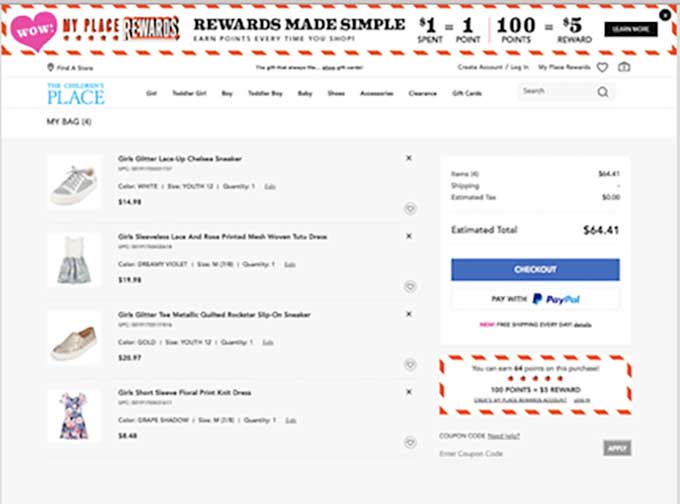
Of the 200 evaluated carts, 51% have some promotional banner, while 49% don’t. Also, there were different placements, of the 51% that have the banners: 88% have the banner on the top, and 11.7% on the bottom of the cart page.
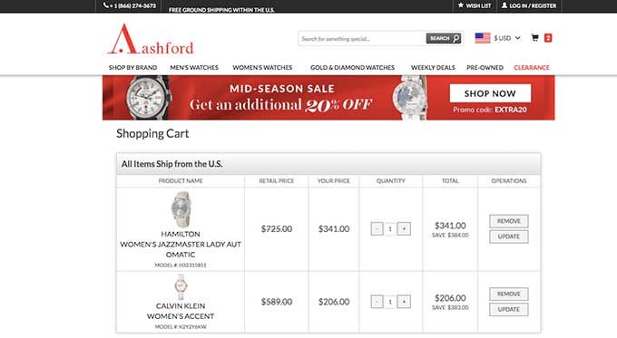
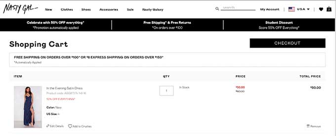
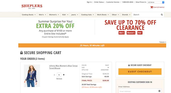
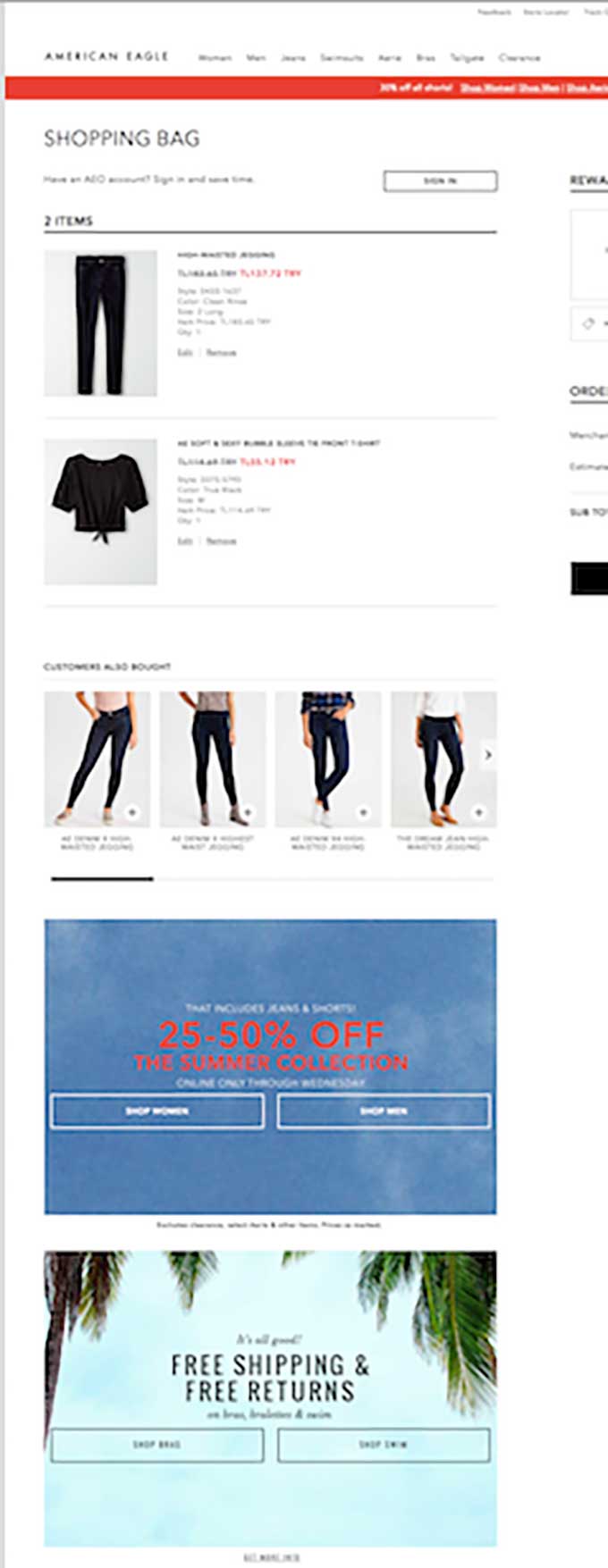
Here are some examples of companies that include the promotion banner:
Conclusion
There are a lot of elements to evaluate on the cart page. In this series, we evaluated a lot of other pages and types of websites (SaaS and e-commerce), so keep a lookout for our next version, and don’t forget to download the actual screenshots!
- Make sure to read our article on understanding the different abandonment rates an e-commerce site suffers from.
- A case study showing how we improved cart conversion rate by 17.75%.
- Best practices guide with strategy and tactics on reducing cart page abandonment.
- Understanding the reasons why visitors leave and abandon your site
- Using Persuasion At Every Stage In The E-commerce Conversion Funnel
- Optimizing ecommerce conversion funnels including interviews with 4 CRO experts


