The 1960s were known for many things, but to copywriters and advertisers, it was the golden age. The Mad Men era was popularized in the hit series Mad Men which focused on the madison square garden advertising agencies that changed creative and copy forever.
This reminds me of William Bernback‘s statement,
There are a lot of great technicians in advertising. And unfortunately, they talk about the best game. They know all the rules…They can tell you that body copy should be broken up for easier reading. They can give you fact after fact after fact. They are the scientists of advertising. But there’s one little rub. Advertising is fundamentally persuasion and persuasion happens to be not a science, but an art.
Layout vs. Content isn’t a debate that just was popularized after the dotcom boom, but it is a debate that was put to rest by the early madmen. It’s funny now, reflecting, what they discovered back then is still an aha moment that many agencies need to arrive at. So,
What really comes first: content or layout?
When creating a website, some agencies think of the layout-first approach as a godsend, but others see this as a hassle and they prefer the content-first strategy in every project. Choosing whether to take a layout-first or a content-first approach is a critical decision that can have a vital impact in terms of web development and the time taken to have a site up and running.
The design layout can attract more traffic to your site, but what keeps users coming back is your content. The point is, your website can’t have one without the other. But if it comes down to one or the other, which one should you focus on first when redesigning or creating a new website?
Well, this is why we wrote this article —to answer this age-old question and to ensure that you use the right approach when the need arises. This article will take into account all the benefits and shortcomings of each approach and see how best you should tackle your web development strategy.
Why the Content-first approach
I’m sure you have bumped into this popular Bill Gates phrase: content is king. At Invesp, we understand the importance of content, but it’s not that simple. We do believe that content is the cornerstone of online success, but that’s just it – a single cornerstone.
The idea behind the content is king adage is that content, text in particular, is central to the success of any website. It goes without saying that web visitors learn about the purpose of the site through interacting with content. Without content, a website is meaningless.
It’s true that a website’s aesthetics and visuals are the first things that can impress a visitor as soon as they land on the site. But what determines whether the visitors will convert and return again depends upon the value he or she is provided with—and that can only be guaranteed by the site’s message which is conveyed by the content.
Content is what all users need and it is what breathes life to design. I mean, your website can have an eye-catching design, but if your content strategy is sub-standard then don’t expect too many returning users. This is probably the reason why Jeffrey Zeldman, the Creative Director of Automattic says:
Content precedes design. Design in the absence of content is not design, it’s decoration.
When taking a content-first approach, copywriters come up with the content and they hand it to the designers who then prepare a design layout that can contain all the content. According to Circle S Studio’s Tim Asimos,
Content-first” is a philosophy that leading digital agencies have adopted to guide their clients’ websites in a more efficient direction and to ultimately create a better user experience (UX).
The life of designers is made easy if the content is drawn up first, I mean with content available, designers are able to come up with layout elements (colors, buttons, fonts) that suit the tone of the content. But there are some instances where copywriters would prefer having a layout first —this also makes their task pretty easy as they would be only required to fit their content into the layout.

However, the content-first approach doesn’t necessarily mean that every single word has to be ready before the design —only the primary elements of the content should be available. The primary elements of content can at least give directions to web designers on how to layout the site’s brand story.
So if you are to take the content-first approach, it’s best to think of your content as a strategy that is meant to convince your visitors to take the desired action — make a purchase, download, sign-up, subscribe, etc. — of the site. In order to do this, you should conduct user research.
User research will aid you to uncover the language that your targeted audience is familiar with and it will ultimately generate more leads. Here are some benefits of starting with content before design:
Content gives directions for layout
Most people think of content as text only, but in reality, content consists of a variety of media —videos, audios, images, and gifs. If you have been in this digital industry long enough, you’d know that not every website is built to support all media formats. And this means that web designers have to know the type of content to be used before they come up with a layout for the site.
You can think of content as a compass tool that denotes the direction of the voice, tone, and brand to designers. Without content, designers may have difficulty in creating a sensible flow towards call-to-action buttons, customizing the colors to be used and vectors. The type of content, as well as the tone used in the content, will help designers with the style of the UI Design.
Content first saves time
In most cases, when website design begins without content, the process is likely to devolve into endless changes down the road. I mean, starting with a layout will rapidly put you behind schedule as the designers will be forced to realign their layout to the copy. Besides this being a frustrating process for the designers, out-of-scope revisions also come with other negative implications such as an added cost.
But when you begin with content, you will know exactly how your site is going to look like even before the designs are approved. You are guaranteed that your content will fit on every page and if you are designing with content first in Webflow, the whole process will be much easier and faster.
Content helps chart out the user journey efficiently
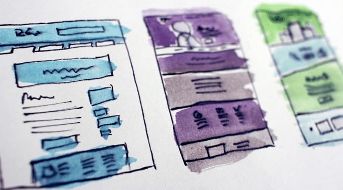
Once the content is mapped and sketched out, it becomes easy to understand what is needed in design, to map out the user journey and to frame the product story even without higher fidelity designs. The flow of the content from one screen to another pinpoints to designers the appropriate elements that they have to use to guide the user towards the central goal.

Things that can go wrong with the content-first strategy
When I was conducting this research, I noticed that most of the web development process prefer the content-first strategy. The reasons given are good, but that doesn’t mean that this approach is not without its own flaws. Articulated below are the pitfalls of the content-first strategy.
Incompatible Content
If you haven’t seen the design, you don’t fully understand the amount or type of content you need to get across to the website. That knowledge is what should drive every aspect of your content creation, from the amount of content on a given screen layer of navigation to the type of content needed on a certain page. So, if designing without content is nothing but decoration, then what is content without design? Notes!
Possibility of visual glitches
When you take a content-first approach there is a high possibility of coming up with a copy that does not match the design. This is the most common pitfall with the content-first approach. Content can either be too small or too big for the design, and this may result in visual glitches.
For instance, let’s say the layout you have designed has room for 250 words on the Homepage, but your content pitch is 400 words. You will be forced to substantially edit your content as the extra text will not fit well in the layout.
Why the layout-first approach
The layout-first approach advocates for building a wireframe or sitemap and other site elements first before content creation. As mentioned earlier, content can turn visitors to lifetime customers but a persuasive layout/design can also increase a site’s conversion rate.
Visitors can get hooked to your site because of great design layout, and it goes without saying that great design makes visitors less confused when they are navigating on the site.
So, if you are from the content-first school of thought, how will you know the type of content you need without layout and navigation to guide it? It’s true, user research will tell you about the language to use on the site, but it won’t guide you when it comes to your site’s navigation path.
Research on online health sites concluded that when it comes to trust, a site’s design elements are exponentially more influential than content. The argument behind this conclusion was that people trust what they see more than what they are told. Of which it makes sense when you think of it.
If you are still not convinced on why you should use the layout-first approach, here is more supporting evidence:

The design layout dictates the content
The same way that content can shape up layout is the same way that layout can shape up the content. The amount and type of content on a site depends on the kind of layout that a site has. For instance, if your layout has about 5 layers of headings on the homepage, then copywriters will just have to come up with the required number of headings instead of just going in blindly writing.
Having the layout set before creating the content can act as a guardrail that informs your copywriters of the amount of text needed on your site. In other words, it aids your copywriters from creating overlapping content that can make a site untidy.
The layout design can tell a story without words
Your website layout design is the first impression that your visitors will have before your visitors read your words. A well-structured design layout can hold a visitor’s attention and make your brand stand out by communicating a story of trust and confidence in regards to the services or products on offer.
Some visitors may not want to read the words on your site because they already know what they want or they can quickly identify what they want through your site’s visual elements. How many sites have you left simply because the web elements didn’t stimulate any confidence in you?
Things that could go wrong with the layout-first approach?
At its essence, the web layout design is a form of art. And this type of art requires web designers to combine form and function so as to give your users an enjoyable experience. There are certain unwritten rules that web designers should follow, but when they go with the layout-first approach without content at hand, some of those rules go out the window.
Here is a discussion around some of the pitfalls that are associated with the layout-first approach:
Inconsistency with the meaning of the content
Everything about the layout has to support, communicate and reinforce the meaning of content. But if you are to begin with the layout first, then how are you going to make sure that your layout design is in tandem with the content? Yes, it’s nearly impossible. Knowing the format, volume, type, and delivery method of the content isn’t a green light to start designing without actual content to be used on the site.
You don’t have to have the whole copy figured out, but knowing the real meaning of the copy can go a long way in designing for good user experience.

Unplanned Redesigns
When taking the layout-first approach, designers tend to use standard filler texts known as the Lorem ipsum. But these may be so deceptive because they can convince you that your design layout is more balanced when it is not so with the final content. There is a high chance of the section breaking when the real content is placed or the final content can be disjointed from the page. When this happens, it translates to excessive redesigns that may stretch your budget.
How to choose the right approach?
In a perfect world, this content vs. layout debate doesn’t exist. Do you know why? Because the designers and copywriters come up with a collaborative plan were content and layout inform each other. In other words, content and the design layout are built towards each other. The copywriter feeds the designer with a bit of copy and the designer informs the writer of how the design is going to shape up. But in this world, it seems easier said than done.
At Invesp, our belief is that content and design layout should ultimately tell the brand story. Meaning that there should be cohesion between visual appeal (colors, shapes, fonts, white space and images) and text in expressing the story of the brand.
When people click on your site, they are more likely to first pay attention to the visuals than the writing. Before the visitors interact with your textual content, your design layout and visuals should tell what your site is about.
So, in accomplishing this cohesion, do we start by writing content or designing layout?
Well, the way we tackle down the content vs layout issue is very different. When creating or redesigning a website we do not have a proclivity, but whatever approach we take is dependent on these two factors:
- Research findings
- Type of website
When given a task to redesign or create a new site, we first ask our clients to give us time to conduct enough research so we get to know the concerns of the targeted audience. It is through this research that we learn of the approach we will take. Having a series of conversations, through customer interviews or usability testing, with real users can reveal to us if a site has usability or trust issues, or whether or not the copy is addressing their main motivations and pain points.

In some instances, it depends on the type of site we are working on. If its a lead generation website, this means that we are more concerned with the placement of our content, so in such a case, the content will probably precede design, with the design layout working to support the words. Conversely, on an e-commerce site, the design layout is more important and the content should be created in a way that fits the design layout.
Over to you…
It’s wise to begin your web development process by conducting research so as to know the real concerns and motivations of the targeted audience. Content, layout and overall design are really aspects of a site that work hand in hand. Each of those pieces will help relay the final story of the site you are working on.


