Let’s start with some customer loyalty stats
- 65% of business comes from existing customers
- Repeat customers spend 33% more.
- The cost of getting new customers is five times higher than retaining old ones.
It’s a great thing to have your customers come back for more.
Unfortunately, gaining their loyalty isn’t easy.
Nowadays, choices are overflowing, and customers are getting pickier. 77% of brands could disappear, and customers wouldn’t bat an eyelash. One-third of millennials won’t hesitate to drop a brand like a hot potato if it doesn’t meet their expectations.
To gain customer loyalty, you need to connect with them emotionally. You have to transform the “brand – customers” relation from a transactional one to an emotional one.
How do you ask?
Well, in this article, I will cover how to get your audience emotionally attached.
Let’s dive in.
Decision making and power of emotions
We all have been led to believe that our decisions are rational. Everything we decided based on the pros and cons. Even early economists formulated their theories based on such assumptions.
That’s how it should be in a perfect economic world. But we don’t live in an ideal world.
Often our emotions override our logic and reasoning. And it has to do with our brain. Thanks to thousands of years of evolution, our brain now has three parts: 1.) Reptilian brain. 2.) Limbic brain 3.) Neocortex.
The reptilian brain is responsible for survival reflexes.
The limbic brain oversees our emotional responses.
The neocortex is the latest development. It controls all the logical reasoning.
From an evolutionary standpoint, the limbic brain is more mature than the neocortex. As a result, when these two conflicts, the limbic brain gains the upper hand.
Why do you think people smoke even after knowing how dangerous it is for health?
Even when we purchase, the same thing happens. We make buying decisions based on our emotions. And our attachment to any particular product or brand is also emotional.
Therefore, your marketing messages should take account of users’ emotional makeup.
There are many ways to identify the emotional driving factors of the audience. However, I would like to do a small discussion on a specific marketing tool, the Limbic model.
Limbic Model
What sets the Limbic model apart from the rest is, it directly addresses human motives and emotions. The limbic model reveals different emotional systems inside customers’ heads, how those systems interact, and how they shape behaviors.
We have three broad emotional systems inside our heads. One of these three dominates the other two. However, dormant ones also shape an individual’s personality and preference.
- The Balance: The balance system is responsible for our tendency to conform and to seek security. Simply put, a person with an overpowering balance system tend to avoid risk and less likely to challenge the status quo.
- The Dominance: If you consider the balance system as “defensive,” then the Dominance system is “assertive.” Power, status, pride, and competitiveness— individuals with proponent dominance system love to exert their will and win all the time.
- The Stimulant: The stimulant system is all about adventure and novelty seeking. People with this system might have a keen interest in learning and applying new things. Some of the common behaviors associated with stimulant systems are curiosity, knowledge-seeking, and creativity.
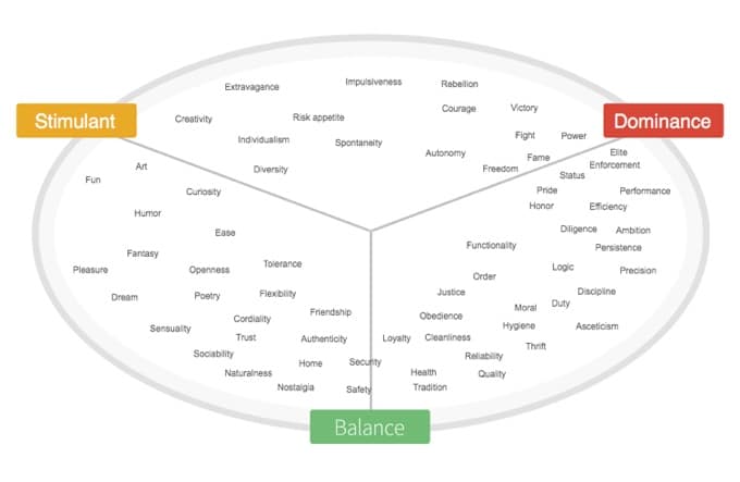
Now, though we all are dominated by one system, the other two do leave a mark to a varying degree. For example, two individuals with the dominance system might have different personalities. One of them might prefer status and ambition, thanks to the influence of the Stimulant system. While the other might value qualities like justice and loyalty if the Balance system has a significant effect.
By taking into account the interactions between emotional systems on personality, scientists came up with seven Limbic types:
- Hedonists: Curious, loves novelty, fun, creative, impulsive, extroverted.
- Adventurer: Rebellious, thrill-seeker, self-reliant, risk-takers.
- Performer: Loves challenges, go-getter, focuses on success, ambitious, assertive.
- Disciplined: Logical, disciplined, dutiful, prefer clear structure.
- Traditionalist: Sticks to tradition, protective, has a strong sense of justice, frugal, loyal.
- Harmonizer: Authentic, family/community-oriented, caring, craves a sense of security, conformist.
- Open-minded: Openness to new ideas and experience, sensual, flexible, dreamer, tolerant, has a sense of humor.
Understanding your customers’ limbic type helps to design marketing experiences according to their emotional profiles.
How to connect users by appealing to their emotions
But why do only a small number of companies inspire such loyalty while others can’t?
Because humans don’t get attached to some entity, instead, we get attached to personality. Whenever we describe a person, right after their visual description, we talk about their personality.
Branding experts behind the wheels of successful brands understand this. Thus they offer a brand experience that feels like the brand itself has a specific “personality.” And when a brand hints of a brand personality, customers feel a connection.
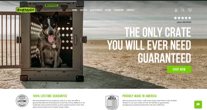
Take, for example, Impact Dog Crate. They are not the biggest brand, but they are not some faceless organization either. They are passionate about dogs and American culture. Their blog and video library are full of useful content. They offer unique benefits to veterans and support charitable events. Their website copy and design reflect their values.
When it comes to building connections, they would be ahead of their competition.
In the following sections, we would talk about how you can connect with your audience and join the ranks of a few brands that are doing it right.
2.1 Emotional Design
According to researchers, a strong first impression boosts the overall impact of the product.
And when it comes to making your views say, “wow! That’s cool,”, the visual appeal is unmatched. It even beats usability. Tests after tests prove people assume attractive products function better. And after repeated purchases, they even backward rationalize that they like to those products. In other words, the right design can contribute to customer loyalty.
Now, what impresses an individual depends on his/her emotional profile. Something impressive to a hedonist might not be appealing to a traditionalist.
That’s why you want to choose an emotional design considering your audience’s preference.
The term “Emotional design” is self-explanatory. These are the design patterns engineered to evoke certain emotions. You start with a message in your mind and arouse emotions like joy, excitement through design to amplify that message.
According to Don Norman, any successful emotional design hook the viewer in three different levels:
- The Visceral level- This is the first impression based on the look and feel. Designs based on viewers’ Limbic types leaves a positive impact on the viewer.
- The Behavioral level- Once viewers have the first impression, their logical brain kicks in. The logic brain analyzes both the usability and ease of navigation. On this level, a great design triggers specific desirable user behavior.
- The Reflective level- This level is a conscious one. Based on their impression of the first two levels, viewers choose their actions logically.
To hook your users in all three levels, your design should check off these three boxes:
1. Color
Colors are crucial in design because of these evoke emotions. Brighter colors stimulate our emotions centers inside of our head, which leads to an evaluative reaction- either we like it, or we don’t. And this evaluative reaction leads to prompt action like impulsive buying.
Cooler colors, on the other hand, take awake the arousal and encourage relaxation. Cool colors also shorten our perception of time. That’s why checkout feels shorter if cooler and softer colors are used in design elements.
While designing, keep in mind, the emotional association of color could vary, depending on hue and tint. For example, Crimson, a variant of red, is often linked to aggression, power, and blood. Pink, another option of red, stands for romance and kindness.
Here is an example of a smart choice of color. The whole design is based on fresh colored design elements with ample white space in between.
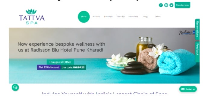
The first impression of this design is calm, cool, and relaxing. Chances are good viewers who would spend more on this site and request appointments. Here is another example.
Soft Surroundings is a female clothing brand with a mission of celebrating feminity. As they put it on their website,” Softsurroundings gives women a way to take a moment in their busy lives and be good to themselves.”
Their website design fits well with the brand image and radiates a soft, relaxed, and feminine vibe.
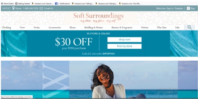
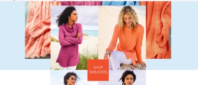
Header, images, banner—-Pastel colors like salmon, light purple, and cream are everywhere on this design. Pastel colors are associated with feminity and have a soothing effect. Therefore designers used those colors to create a design that feels warm and relaxing.
Also, there is plenty of blank space ( which reduces visual clutter), which is light aquamarine, instead of white. Aquamarine has a relaxing effect on our psyche. So such colored blank space further enhances rejuvenating feel.
2. Images and visuals
Images are not just for only looking pretty. The impact of an image on design is indeed profound. However, I won’t go deep into that because you can find many great articles on the internet.
Instead, let’s talk about how images help you to use two powerful tools straight from a psychology book:
1.) Priming
2.) Emotional contagion.
1. Priming
Priming is the act of introducing a stimulus that gives cues to the existence of another stimulus and influences human behavior. For example, if you hear the word “ride,” you would immediately think of words, bike, or car. In the case of emotional design, images allow you to use priming. A right image could trigger behaviors like spending more time on the website or clicking on the signup button.
Sometimes this connection between stimulus and action could be very obvious. For better understanding again take a look at the above example. That image of a flower, oil, and smooth black stone makes you think about a relaxing spa environment. That image serves as the first stimulus that priming your thoughts about spa sessions.
However, in some cases, things are not that straight forward. You might need to use images to evoke a feeling instead of triggering just some mental images. Let me show you an example:

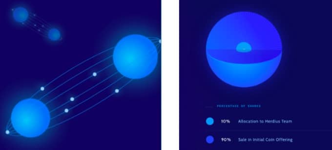
Now here is a word of caution. Priming is very powerful but uses it responsibly. Otherwise, you would run into the issue of negative priming where the stimulus triggers a behavior that defeats your purpose.
And keep in mind that there is always a chance of gradual decline in the degree of triggered response. You don’t check your Facebook notification every time your phone beeps, do you? Someone new to social media would be far more excited.
Long story short, priming isn’t magic, but that doesn’t mean you shouldn’t grab what it has to offer.
2. Emotional Contagion
Emotional contagion is the phenomenon of having one’s emotions transferred to another. Ever wondered why positive and happy people are a blast to hang with? Because of emotional contagion, their positivity gets siphoned into others.
With the right images, it’s possible to evoke virtually any emotion and subtly spread the same emotion into the viewers. According to research, people witness emotional contagion when they watch advertisements. When test subjects are shown ads with images of happy faces, they felt delighted too. This phenomenon doesn’t hold for positive emotions only.
Interestingly, another study found emotional contagion doesn’t always need to directly related to the product. You can use an unrelated image, and viewers can still anchor their feelings. For example, if the viewers feel excited after spotting a picture of their favorite celebrity, that same emotion gets carry forward to the product associated with that image.
Another example of indirect emotional contagion is the usage of food images on restaurant websites.
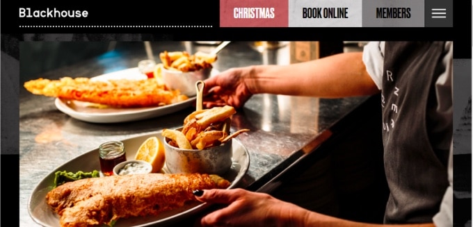
These images play on viewers craving for food and indirectly anchor that idea inside their heads that specific restaurant equals to yummy food.
3. Reduce cognitive load
Users hate when they have to pay extra attention just to find basic information. Instead, they prefer to move on to the next website or business.
In his book “Don’t Make Me Think,” Steve Krug wrote:
As a rule, people don’t like to puzzle over how to do things. The fact that people who built the site didn’t care enough to make things obvious– and easy–can erode our confidence in the site and its publishers.
According to psychologists, a high cognitive load is a reason behind such behavior.
The cognitive load is a fancy term to describe the amount of brainpower required to complete a task. Driving, strolling in the park, listening to a song—- every activity put some cognitive load on our memory. It goes wrong only when that load crosses a certain threshold. Researchers found high cognitive load disrupts performance in tasks requiring at least some degree of attention.
If your design, no matter how pretty it is, makes the viewers work hard, you are drifting away from the goal– the emotional connection.
So stick to an intuitive and straightforward design. An intuitive design leads to higher user satisfaction. And user satisfaction is positively related to brand loyalty.
Any intuitive design stands to two principles: 1. Simplicity 2. Familiarity.
1. Simplicity
Our working memory holds seven, plus or minus two, pieces of new information at any given time, for 20 sec. Anything more than that and our memory has to stretch itself.
Keeping this limitation in mind, you want to limit the information required to be processed, both in number and complexity. There are a few ways to do it. You can break down any task in multiple steps, remove visual clutter, put on a clear CTA per task, and so on.
2. Familiarity
It’s tempting to be different and cool. However, being creative doesn’t always mean better. When Bucknell university tried a better-looking design in 2014, it performed worse.
Our brain learns a new thing by processing the data in real-time. However, after enough repetition, you no longer have to think about it. Our working memory just refers to the process of our long term memory and be done with it. In other words, familiar things are less cognitively taxing.
The same goes for your design. So at least stick to fundamental conventions. Don’t put your menu on the right side instead of the top. Or use unfamiliar icons. Or use poetic lines or metaphors which are hard to relate.
3. Using the right words in copy
Many marketers make a fundamental mistake. They feel the only way to make sales is to convince users that their product is the best, even when there are identical products available.
It doesn’t work.
People buy experiences, not just products. Emotions influence every buying decision. It could be positive, like fascination, joy, or negative like fear or anxiety.
When you address that underlying emotion or arouse it, it starts a cycle. Emotions initiate the purchase, positive post-purchase experience leads to repeat purchases, and repeated purchases build an emotional connection.
Words, when used correctly, are unmatched at piquing emotions.
Emotional copywriting starts by stating the benefits instead of features. Next comes speaking the readers’ languages. Once you nailed the basics, you include incorporating psychological persuasion principles in your copy.
For example, Problogger subtly uses “authority” to attract more readers.

Now emotional copywriting is a vast subject, and discussing every nitty-gritty of it is beyond the scope of this article. Many extensive guides are already available on the internet.
However, I would like to discuss how to use words to match your readers’ limbic profile and emotional state.
As discussed above, the same stimulant can evoke completely different emotions based on a user’s limbic profile. What feels amazing to a hedonist might turn off a traditionalist. That’s why it’s essential to sprinkle words that match your readers’ limbic profile.
Allow me to explain it with an example.
Patek Philippe is a luxury watch brand. They usually target incredibly wealthy people with refined taste. If you look at the limbic map, many customers of Patek watches are “traditionalist.” They value justice, tradition, quality, and reliability.
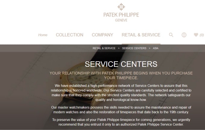
In their web copy, you see words and phrases like “carefully selected,” “honor,” “value… coming generations”. These words are used intentionally to connect their target audience emotionally. It’s a very effective way to subtle appeal to the emotional side of your readers’ brains.
But writing your copies based on limbic profiles also has limitations. Think about this: When your business appeals to a larger, mixed-bag audience, how many versions of the same marketing copy are you going to create?
In such situations, amplifying individual emotional states does a stellar job. But what do I mean by “emotional state”?
Consumers or visitors associate different sets of emotions with different businesses. These emotions influence their purchase behaviors. For example, people are more likely to try a spicy and exotic food when they feel a little “adventurous.”
Your job is to amplify whichever positive emotions people associate with your business by using the right words. What you are doing here is getting readers attached to your brand by being the source of positive emotions.
Athlean X web copy is an excellent example of how to do it right.
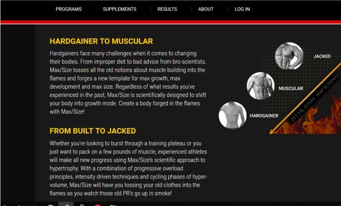
People associate emotions like feeling stronger, achievement, and a sense of growth with fitness. Look at the usage of words here. “Growth mode,” “Intensity-driven,” “old PR’s go up in smoke”—- these are chosen to amplify the emotions people want to feel.
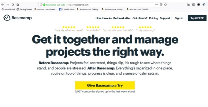
Let’s see another example: Basecamp.
Basecamp is a web-based project management tool.
Their audience is business people who are looking for a reliable way to keep their projects and teams on the same page, which often is not the most straightforward task.
What basecamp does is they offer a solution to their audience’s problem. Basecamp web copy does a great job of reassuring the reader.
First, the headline. It’s in emboldened font and directly addresses visitor’s pain points. The paragraph below the headline further emphasized how much difference the tool can make. The whole web copy sticks to this theme and removes customer objections one by one.
Without a doubt, this is another excellent example of how to amplify the desired emotional reaction through the words.
4. Powerful storytelling
Evolution has wired our brains for bonding with others through stories. Back in the cave days, the knowledge was passed down through generations in the form of stories.
Stories remain as powerful. People still get captivated by a great storyteller.
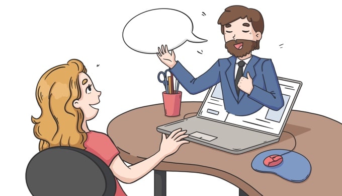
No wonder, a great brand story get the audience out of autopilot and makes them emotionally invested.
But what makes a brand story a good one? Well, a good brand story does a couple of things:
- It shows the audience that the brand is not a faceless entity. It has certain values, moral standards, and a mission.
- It makes the audience a part of the story itself. They start projecting themselves on the hero as the struggles and experiences shown are so relatable that it’s hard not to.
Interestingly, when storytelling is done right the brand never gets the spotlight. It’s always the audience who takes the role of the hero. In a good story, a brand is like a loyal sidekick who helps the hero to win.
Muscleblaze “Tum nahi samjhoge” ( You won’t understand) campaign is an excellent example of successful brand storytelling.
Muscleblaze is an India based sports nutrition brand that targets fitness enthusiasts and athletes.
In a country like India, where academic excellence is held in highest regards, athletes don’t get the encouragement they deserve. Those who try to pursue a career in sports or fitness have to endure a lot of criticism and doubt, coming even from their friends and families.
Muscleblaze started off its campaign with a hard-hitting youtube video depicting silent discipline and sacrifices of fitness enthusiasts, which rest of the world just can’t understand or relate to.
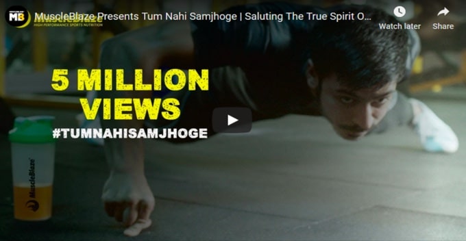
That 2:20 min video so far managed to get 7.6 M videos on YouTube. It’s a great achievement considering this was Muscleblaze’s first fully fleshed-out campaign.
Along with that film, MuscleBlaze also kickstarted a social media contest #tumnehisamjhoge. The brand asked fitness enthusiasts to share images of their best physique. Fifteen winners were offered free supplements, and the grand prize was a professional photo shoot with a reputed photographer. Muscle Blaze team promoted the campaign on Instagram, Facebook, and Twitter.
Here comes the juicy part.
The campaign received 9000 images and 4000 videos in three weeks. The visitors spent 7X more time on Muscleblaze site, and the percentage of repeat customers went as high as 23%. Brand searches on Google went up 2.5X times.
Last but not least, the total number of views across all the channels crossed the 20M mark.
All of these happened because MuscleBlaze weaved a perfect brand story in which the audience was the hero.
Muscle Blaze hired some of the best agencies of the country, but what if your pockets aren’t very deep? Is it possible to still harness the power of storytelling at a limited budget?
Yes.
If you mold your style of storytelling to suit your audience and platform you are using, you are all set.
Josh Braun, is an outreach expert and Sales leader. He uses LinkedIn to build his audience. Since small written posts, ( some call them Broem-s ) do exceptionally well on LI, he creates those posts regularly.
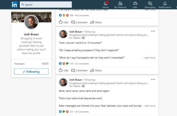
Josh’s posts are relatable and entertaining at the same time, provide immense educational value. He checks off every box of great storytelling.
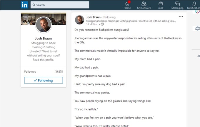
Result? Josh quickly built up a sizeable following, which, I would say, is far more engaging compared to many other influencers around his size.
5. Personalization:
Personalization is an umbrella term for ways of tailoring customer experience based on each customers’ unique habits, preferences, and backgrounds.
Personalization has a profound effect on marketing success. For example, after great personalized experiences, first-time buyers 44% more likely to become repeat buyers. If done right, personalization can forge emotional bonds between the brand and customers.
There are many ways to tailor the marketing experience, depending on the customers and goals: web, email, product, and whatnot. We have an extensive guide on how to plan, execute, and measure personalization efforts.
However, when an emotional connection is a goal, some ways might work better than others. Usually, personalized experiences with human touch build strong attachments. That’s the reason, personalized customer service, for example, is more effective than abandoned cart emails in this situation.
Here are two ways of examples of connection building personalization:
- Sometimes great retail personalization may not require any tech at all. A simple well-thought, handwritten note is enough to make the customer feel special.
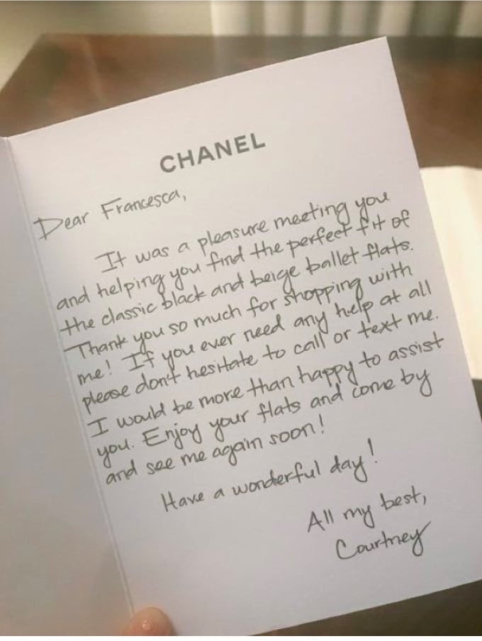
Here is one from Channel. The shopping associate, Courtney, thanked Francesa for shopping with Channel. Courtney closed the letter by saying she is available over text.
This is an excellent example of personalized customer service. As 33% of customers consider customer service quality as a significant determining factor of loyalty, such gestures are priceless.
2. Celebrating “customer relationship milestones” with existing customers is a great non-invasive way of getting into their minds. With the right visual presentation, such an effort immediately sets your brand apart from others.
Take inspiration from the DavidsTea newsletter.
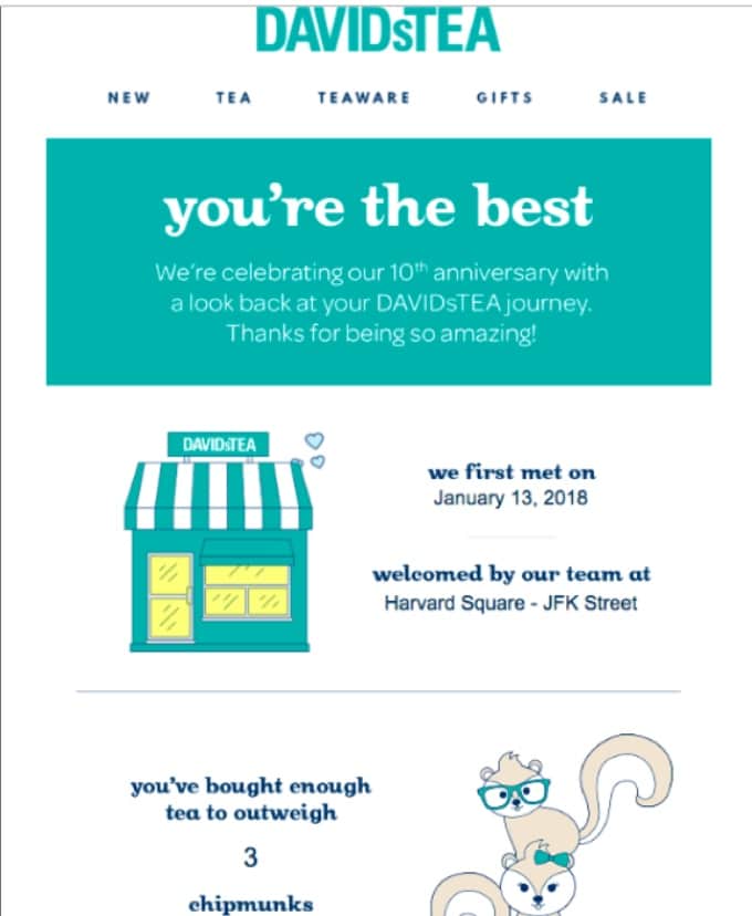
They summarize customers’ entire purchase history and present it in a story form. And they include cute chipmunks too.
Emotional Branding
Have you noticed some brands just have a cult-like following? Their fans refuse to buy from any other brands. Their customers wait in line for days just to get their hands on the newly launched products. Their loyal users spit fire on internet forums just to prove their favorite brand is the best.
That’s what I call a whole new level of branding – customer relationship. Your customers become your supporters.
Powerful emotional branding is the only way to achieve that.
Now, marketers often use “emotional branding” and “emotional advertising” interchangeably. However, there is a difference between these two.
Emotional advertising is a one-time thing. You can create an advertisement, make users feel in a certain way. But after sometime when the novelty wears off, everybody slips back to autopilot.
Emotional branding is much bigger than that. You start by understanding who your audience is and what you want them to feel about your brand. After that, every campaign you start, every content you publish, or every post that goes live— should be aligned in such a way that those contribute to the brand image in your audience’s mind. You set your brand as a trigger for certain feelings.
But how do you start doing emotional branding in the first place?
By researching your audience and being polarizing. Emotional branding by nature is polarizing. Within a limit, more polarized your brand is, more powerful emotional response it inspires. For example, Harley Davidson has a certain image, and their bikes are the go-to choice for rebels, toughs, and free spirits. Harley has a cult-like following.
Any brand that takes a mass approach can’t create that such strong emotional response.
You want your brand to attract your target audience hard and repel others. When you go niche, it’s easier to be polarizing in the right way.
Once you determine who your audience is and be ready to stand out, you start designing, writing, and crafting stories to get them hooked.
Understanding the target users’ limbic profile comes handy here. You can pick one or two emotional triggers they value and stick to those.
Rolls-Royce is a perfect example of emotional branding done right.
They target wealthy, powerful, top 1% of society. If you consider the limbic profile of Rolls-Royce’s audience, they are mostly “Performers”– go-getters, sophisticated, elite, assertive, and powerful.
Everything about Rolls-Royce screams power and sophistication.
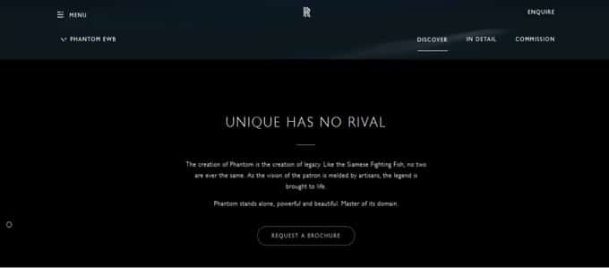
Take a look at the copy. “No Rival,” “Powerful and beautiful,” “Master of its domain”— these words convey a sense of dominance and superiority. It’s something that Rolls Royces’ audience values.
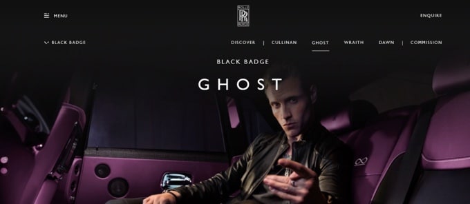
Let’s talk about design and visuals. The primary colors are black and purple— both are associated with power and royalty. Here is an image of a young-ish man who looks sophisticated and assertive. Again, the design is catered to the target audience.
Another example to learn from is Shinola, a Detroit based luxury product brand. What makes Shinola unique is they try to be a genuine American luxury brand in every sense. From picking slogans like “where America is made” to hiring a local workforce, everything Shinola does fits well with their image. If you go through their site, you would see how this sentiment is reinforced in their copy and design.
Here is a product description from Shinola.
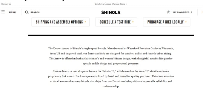
They pointed out that their material and manufacturing unit is from America.
Even their blog topics are on American culture and people.
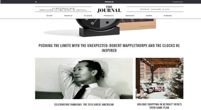
Another interesting thing is how Shinola maintains its image as a luxury brand. They use a vintage looking design: a lot of white space, black and white photos, traditional font style. Usually, such design is common among posh luxurious brands as they tend to be classy and subtle.
Interestingly, Shinola is a new company compared to other luxury brands. Still, it managed to pull this vintage American luxury brand image well.
And whom they attract? Wealthy Americans who took pride in their country and even US Presidents. The former president Bill Clinton bought 14 Shinola watches and called the company an American success story. Another former President Obama also gifted a custom made Shinola watch to UK prime minister David Cameron.
Needless to say, when presidents are a fan of Shinola, they are doing it right.
Conclusion
Customer loyalty is all about getting your customers emotionally attached. And to do so, you need to appeal to their emotional sides. Now, everyone might not have the same triggers. You need to identify their “buttons” with the help of tools like the “Limbic model” and address their underlying motivations.

