What do many ecommerce managers/eCommerce analytics specialists have in common?
They’re frequently checking their Google Analytics dashboard or what other analytics services they use to find out if their checkout abandonment rate is going up or coming down.
Suppose the checkout abandonment rate is going up; this indicates that there are specific bottom-of-the-funnel strategies they need to implement or be doing more to implement.
The truth is that the bottom of the funnel can make or break an ecommerce business.
When a customer has made it to this stage, they are very close to becoming a paying customer – they just need another push.
You can increase your customer lifetime value and improve your bottom-of-the-funnel conversion rates with some ecommerce conversion funnel tips and thorough analysis.
This article will look at some strategies for improving your ecommerce funnel, increasing your average order value, and making sure your ecommerce store converts better.
1. Offer live chat for real-time product and checkout help.
Many potential customers are still hesitant to buy online because they don’t feel confident in finding what they want and completing the transaction. This is especially true for first-time buyers and those unfamiliar with a company’s website or brand.
In a survey, 26% of prospective customers stated that long or complex process is the reason for cart abandonment during checkout.
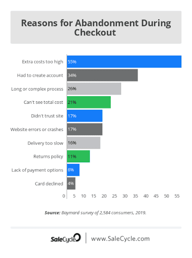
(Source)
Customers often have questions about products and how they work, so it makes sense to offer them real-time help via live chat. This way, customers won’t have to wait for someone to get back to them after submitting their email or filling out a contact form. They can get immediate answers from an expert in just a few seconds.
Live chat can help solve this problem by offering real-time product and checkout help at key moments during the purchase process:
- After site visitors have added items to their shopping cart before proceeding with checkout.
- At check out, after they enter payment information but before they submit their order.
Sephora, a well-known makeup and skincare company, found that their customer satisfaction increased by over 90% when they started using Live Chat.
This increase happened because the Sephora experts immediately answered questions about products and helped customers buy what they wanted.
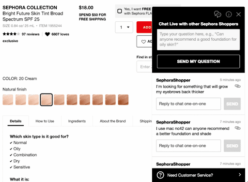
(Source)
They also increased customer satisfaction by over 90%, which was earlier at around 75%.
In addition, live chat can help you upsell customers on additional products or services during checkout that complement what they’re buying from you now. Similarly, you can use it to cross-sell complementary items or services that will increase the perceived value of what they’re buying from you now.
2. Let shoppers checkout as guests.
You have to convert shoppers into customers at the bottom of the sales funnel.
One of the biggest bottlenecks in this process is checkout. Many shoppers abandon their carts because they want to avoid creating an account or logging in.
In a 2022 study, 24% of customers mentioned that they abandoned a cart because the site wanted them to create an account. Another study found that conversion rates increase by 45% if your site offers guest checkout.
Guest checkout allows you to increase the number of visitors who purchase on your site. Some of these visitors may have been deterred from buying before because they didn’t want to create an account on your site. Guest checkout is an excellent way for these people to complete their purchases without creating an account.
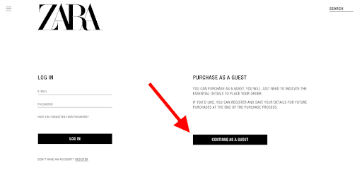
However, guest checkouts can have some drawbacks as well.
You will have fewer data about your customers and less engagement in the long term because they won’t create an account with your store.
You won’t be able to send them personalized emails or newsletters either. And suppose they decide to return their purchase. In that case, there won’t be any information about them on your return policy page which could lead them to abandon their purchase due to a lack of information about the returns process.
3. Reduce the length of the checkout process by automating fields and remembering information.
When you buy something online, do you know how much time it takes to complete the payment? If you’re anything like me, then it takes a while.
You often must enter all my personal information, billing details, and shipping address. Then you must click on the “Agree” buttons for terms and conditions—and read them. You get distracted by offers from other companies and fill out forms for them, too (and then get even more distracted).
It’s no wonder that 17% of shoppers in the US abandoned an order due to too long/complicated a checkout process.
But there is a simple way to reduce this number significantly: automate fields in your payment form so that users don’t have to re-enter information they already gave you or remember information from previous purchases.
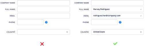
(Source)
In addition, consider removing superfluous form fields to reduce the length of the entire checkout process.
According to a large-scale checkout usability test, an ideal checkout flow should be 12-14 form elements. It can be 7-8 if you only count the form fields.
4. Remove unnecessary steps in the checkout process.
The goal is to remove unnecessary steps in this process so that customers stay focused and interested along the way.
For example, let’s say you’re searching for a new pair of shoes on Amazon and find a pair that looks exactly like what you want. However, when you go to add them to my cart, there are 25 different options for sizes and colors! There are also two other brands and two different price points – which one should you choose?
This creates unnecessary steps in your buying process and distracts you from reaching your goal: buying these shoes!
Here are some tips to remove unnecessary steps from your checkout process:
- Remove or hide fields that aren’t required. If you ask for shipping address information when it isn’t needed, people might not complete their purchase because they are annoyed at having to fill out extra information.
- Hide fields that can be used later in the process. For example, suppose you request phone number information during registration but don’t actually use it until after checkout. In that case, it’s a waste of time for both parties if it gets hidden from view behind other sections of the form (which is what happens by default).
- Remove unnecessary fields from payment pages, such as billing address and credit card number, when using PayPal or other services where you don’t need them (don’t forget about security!).
Here’s a great example from Best Buy.
They only ask for your shipping information and contact details before allowing you to go to the payment screen.
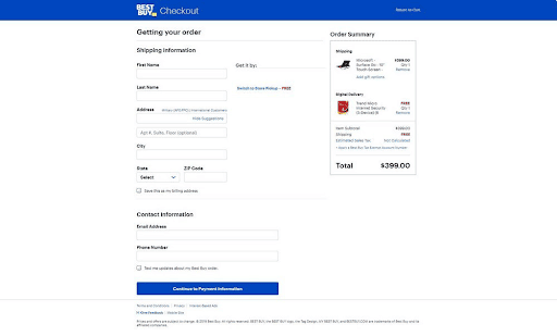
(Source)
To make the process of checking out even simpler, Best Buy divides the checkout process into multiple pages, allowing buyers to check out items as a guest or sign in to their accounts.
5. Add security badges near the form fields.
You have probably seen many online stores that offer free delivery in different countries, or free returns policy, or show their trustworthiness by mentioning certificates like “SellersCloud Certified.”
These are all ways to prove that your store is trustworthy and provide your customers an extra layer of safety.
In fact, in a study, 48% of participants reported that trust badges reassure them of a site’s security and trustworthiness.
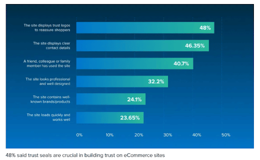
(Source)
The idea is that by adding trust elements such as a security badge or the word “secure,” you’ll make customers more comfortable with entering their information into your website.
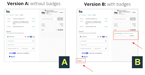
For example, the TrustedSite client conducted an A/B test to see if adding a trust badge directly under the checkout price would have an impact on conversions.
(Source)
After the test, it was found that adding the trust badges resulted in a 16% boost in overall conversions, a 22% increase in conversion rate amongst new visitors, and a 21.3% increase in overall revenue.
6. Show shipping costs upfront during the checkout process.
Shipping costs are a big factor at the bottom of the marketing funnel if you want to convert prospective customers. If you do not show shipping costs upfront, your customers will hesitate to purchase from you.
This is because they have to go through the entire checkout process and then get hit with an extra charge at the end after all their hard work. This causes them to lose trust in your brand, which is bad for business.
In a survey, 16% of shoppers said that they abandoned a cart as they were not able to see or calculate total order cost up-front.
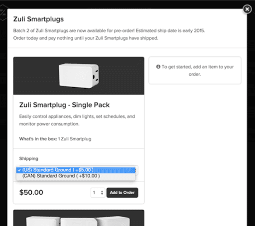
Here is a look at the checkout for Zuli Smartplugs.
(Source)
You’ll see that you will be charged for shipping at the beginning of the process.
Showing shipping costs upfront naturally increases trust and makes it easier for customers to complete their purchases.
7. Offer a customized refer-a-friend program.
If you’re not using a referral program to optimize the BOFU of your e-commerce store, then you’re missing out on a prime opportunity to increase sales and customer loyalty.
A refer-a-friend program is a marketing strategy designed to increase the number of customers by incentivizing existing customers to refer their friends, family, and colleagues to your business.
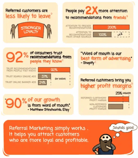
Referral programs are a powerful tool for increasing customer loyalty. Referred customers are more loyal and generate 25% higher profit margins than non-referred customers. Not only that, but people pay more attention to recommendations from friends.
(Source)
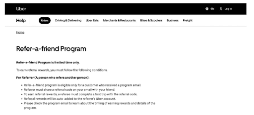
The success of Uber, a leading company that provides mobility as a service and other services, can be credited in part to its “refer a friend” program.
(Source)
Uber has two different referral programs for riders and drivers. If you’re a rider, you can join the referral program by signing up for an account and entering your information. After your first ride, you’ll receive cash credits. When you refer a friend to sign up with your code, both of you will earn $5 as a referral reward in credits.
The key to a successful refer-a-friend program is customization. You need to offer your customers something that will make them want to share their experience with others.
Whether it’s an incentive or special treatment, offering something unique will help you stand out from the rest of the competition and encourage more people to join your referral program.
Here are some more tips to get started:
- Incentivize referrals with discounts, free shipping, or other rewards.
- Ask for permission. Don’t assume that people will want to share their friends’ email addresses with you. Instead, ask permission and provide clear instructions on how they can do so.
- Make it easy for them to share by providing an email template and instructions on how to create a social media post.
- Create a referral landing page that explains why people should refer friends, what they’ll get in return and how they can share information about your business with others.
8. Send emails to encourage shoppers to return to the site.
One way to optimize your buyer journey is by sending automated emails to shoppers who have visited but have yet to purchase.
This is a necessary step in the customer journey.
These emails can be used to reengage customers who have abandoned their shopping carts to encourage them to complete their purchases.
But how do you get people to come back?
The best way to get shoppers to return is by sending them an email with a discount code or a free shipping offer. You can also send them coupons for products they’ve browsed or wish lists they’ve saved on your site.
With a re-engagement email campaign, you can leverage the power of social proof, FOMO (fear of missing out), scarcity, and urgency. Here’s an example of a re-engagement email from Kate Spade that uses these elements:
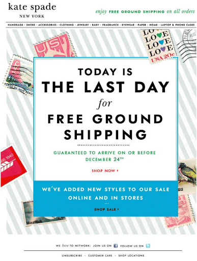
(Source)
If you’re worried about sending too many emails, consider conversion rate optimization ideas like; testing different types of messages, offers, designs, and timing to see which one impacts your subscribers most and will improve your store’s conversion rate.
Another email conversion optimization technique is sending a newsletter highlighting new products or sales events.
This will keep people coming back for more information about what you have in stock or what’s available on sale now or in the future.
Final thoughts.
This list of strategies for the bottom of the funnel will prove helpful to your ecommerce business in achieving an optimized ecommerce conversion funnel.
Whether you place yourself in an ecommerce analytics role or an ecommerce marketing position, you will no doubt be responsible for tactics that optimize visitor experience and ultimately increase conversion and sales.
Hopefully, these tactics give you a few more ideas and ways of doing just that!

