I’ll often quote TED talks because I find them interesting and many topics relevant to CRO and general marketing trends. One recent talk I heard by Sheena Iyengar describes how to make choosing easier. The idea being that if customers are presented with less choices, or choices are strategically presented, it is more likely that customers will make a purchase.
Iyengar outlines 3 things that choice overload reduces:
- Engagement – customers are less engaged. They will likely bounce or exit a site when overloaded
- Decision quality – the quality of their decision or AOV will be less.
- Satisfaction – customers will be less satisfied with their decision. Making return customers more difficult to acquire.
Considering the online experience, customers are always overwhelmed and bombarded with choices, so what can site owners do about “being choosy about choosing?”
Iyengar recommends four techniques that mitigate choice overload for consumers, and I will reflect on the online experience with each:
-
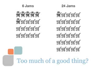
- Cut: “Less is More”Iyengar argues that offering customers less choices will allow them to make decisions faster and more likely to convert. In a study she conducted in a super market she found that customers presented with less jam choices were 6 times more likely to purchase than when presented with more Jam options. Below is a chart that shows that although more customers stopped to sample the jam when offered 24 options, more customers that sampled the 6 jams ended up actually making a purchase.
 Proctor and Gamble reduced their Heads and Shoulders line of hair care from 26 to 15 products and saw an increase in sales by 10%. Golden Cat got rid of their 10 worst selling cat litter products they saw an increase in profits by 87%.Solutions online:
- Remove products that do not sell well.
- Daily Deals highlight specific products over others, thus engaging customers with a few choices, rather than full array of choices.
- Concretize:When people are able to understand the consequences of their choices, they will likely make smarter and better purchase decisions. Consequences need to be felt in a vivid and concrete way.Solutions for online:
- Allow people to compare products side by side.
- Make sure benefits and features are clearly displayed
- Cut: “Less is More”Iyengar argues that offering customers less choices will allow them to make decisions faster and more likely to convert. In a study she conducted in a super market she found that customers presented with less jam choices were 6 times more likely to purchase than when presented with more Jam options. Below is a chart that shows that although more customers stopped to sample the jam when offered 24 options, more customers that sampled the 6 jams ended up actually making a purchase.
- Categorization: The reality is that customers can handle more products, if they are categorized in a way that they can understand. However, categories need to tell something to the chooser and not the choice maker. So although it makes sense to you to display products in a certain way and categorize them a certain way on your site, you need to consider what makes sense for the customer trying to make the selection on your site.Solutions online:
- Review your categorization scheme and ensure that products are categorized in a way that makes sense to them.
- Add refine search features within the category framework so customers can easily locate products they desire.
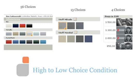
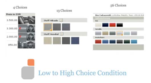
- Condition for Complexity:This had to be one of the more interesting points she made. Customers can handle more information, but only if it is gradually presented to them. In a study they conducted for a car company, customers were more engaged, and more likely to make a purchase and decision when the choices for customizing the car were gradually presented. For example, if the company had: engine 4 choices, interior13 choices, then color 56 choices, and the order of these selections was presented in that same order, they would be more likely to convert and more engaged than if the selections were ordered from 56, 13, to 4 choices.

 Solutions online:
- If your product requires customization, consider gradually presenting the customer with the selection options from the lower, to the higher number of choices within the selection.
- Always order items online, it makes it easier for the customer to proceed and process.
We are always looking at ways to engage the customer. By understanding how information overload can impact their decision, it allows us an opportunity to think of ways to reduce that content overload and make it a more fruitful user experience. Remember Ms. Sheena’s more infamous line in the video: “Be Choosy About Choosing!”
Related Links:


