Just like bricks and mortar retailers, winning at ecommerce comes down to providing your visitors with the best user experience (UX).
From the shoppers point of view, the best experience can be a simple as finding the lowest price, even on a poorly designed site with otherwise bad UX .
But, generally speaking, a better overall ecommerce UX translates into more conversions, better conversion rates and – ta da – higher sales.
The problem is that creating a better UX can be a complex task with seemingly endless options, each of which must be researched, tested, implemented, including for different buying personas, color combinations, page designs, product layouts, calls-to-action, etc., etc., etc..
The good news is there are many easy (relatively) and proven ways to improve your UX, and, in turn, your conversion rate. Here’s five of them:
- Page Loading Speed: This is number one for a reason. A slow site means many of your potential customers will never even see your site because they’ll click away at the first sign of hesitation in your page loading.Even those that stay can be lost if they continue to endure slow paint-up speeds. 11% of shoppers cited “website too slow” as a reason for abandoning their shopping carts. Is at least an 11% increase in checkouts worth the minimal time and cost of improving your server speed and reliability?
- Images: The web continues to offer a more visual experience. It means your shoppers not only expect higher quality images, but they are also looking for multiple viewing angles and the ability to zoom into details.
- Credibility Symbols: Every visitor to your site has some level of fears, uncertainties and doubts (FUDS) about buying from you. Many aspects of your site can serve to quell the FUDs, including everything from the site’s overall layout and design to the inclusion of customer testimonials. Few of these are easier to incorporate than adding credibility symbols, including logos of watchdog associations, like the BBB, or payment security and authentication services, like VeriSign.
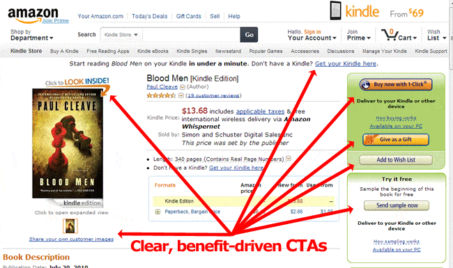
- Clear Calls-to-Action: More than just using a large orange button that’s visible from next door, your CTAs should also make clear the benefit of clicking them. And that’s very easy to do. Amazon shows you how – see below.
- Checkout Process: The average shopping cart abandonment rate is over 65%. That means two-thirds of shoppers who add items to their carts never checkout. You can chip away at that monumental number with a few easy simplifications to your checkout process. These stats on why shoppers abandoned their carts show you the way:
14% – No guest checkout option – People don’t want to open an account, they just want to buy from you. Let them.
12% – Asked for too much information – Ask only for the information that is necessary to complete the sale. At very least, stop asking for state and country information if you already have their zip code. Sheesh.
11% – Complex checkout process – Again, when confronted by shoppers who want to spend their money on your site, step aside and let them proceed as swiftly and simply as possible.


