If you’re looking for a better approach to conversion optimization on your product pages, stop thinking of it as “conversion optimization”.
Instead think of it as: “persuading a human being that the combination of your brand and product offers her the best value”.
Regardless of how you think of it, the point is to always keep your eye on the target, your customer, who is human – not a conversion rate percentage point on your analytics report.
If you want to maximize conversions, or persuade your web visitors to buy, your product pages should appeal to humans on at least three levels:
Sensory
When your product pages appeal to a customer’s senses, you don’t just tell them about your product, you make them feel it, or what it’s like to own it.
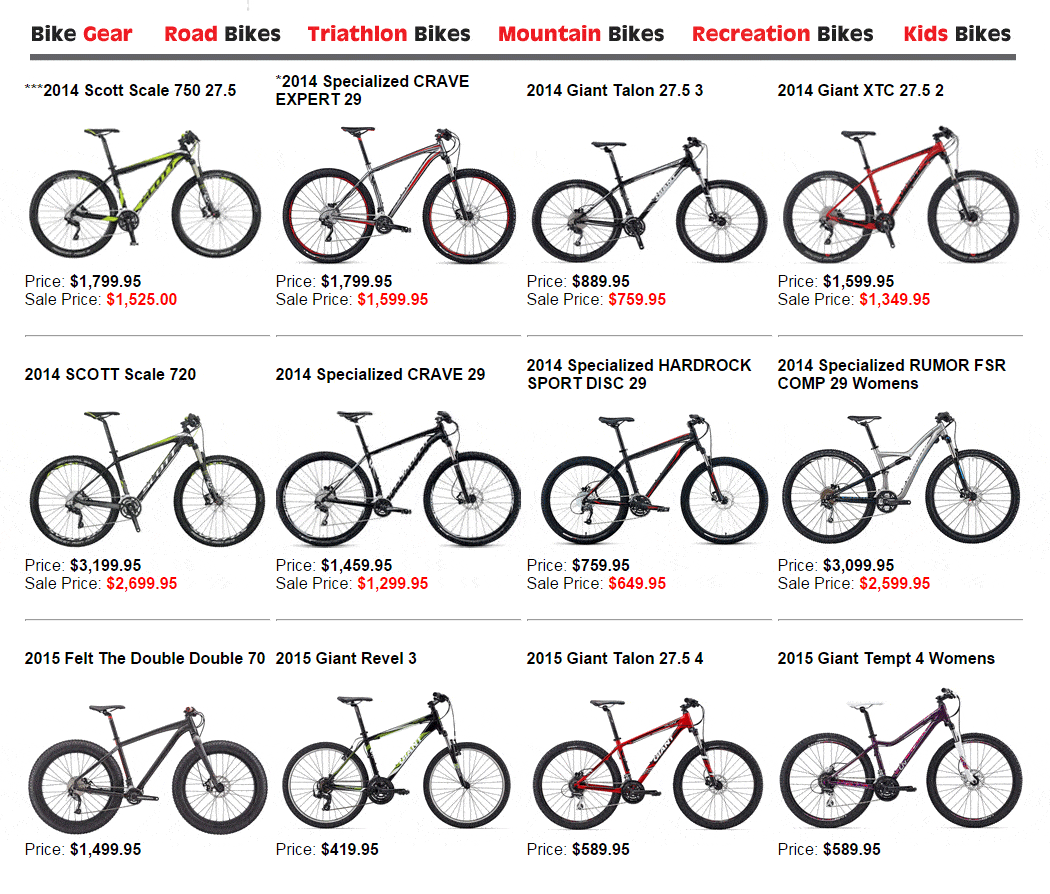
Here’s a quick example: the first product page below is from a local bike shop. It quite capably displays the bike models in stock.
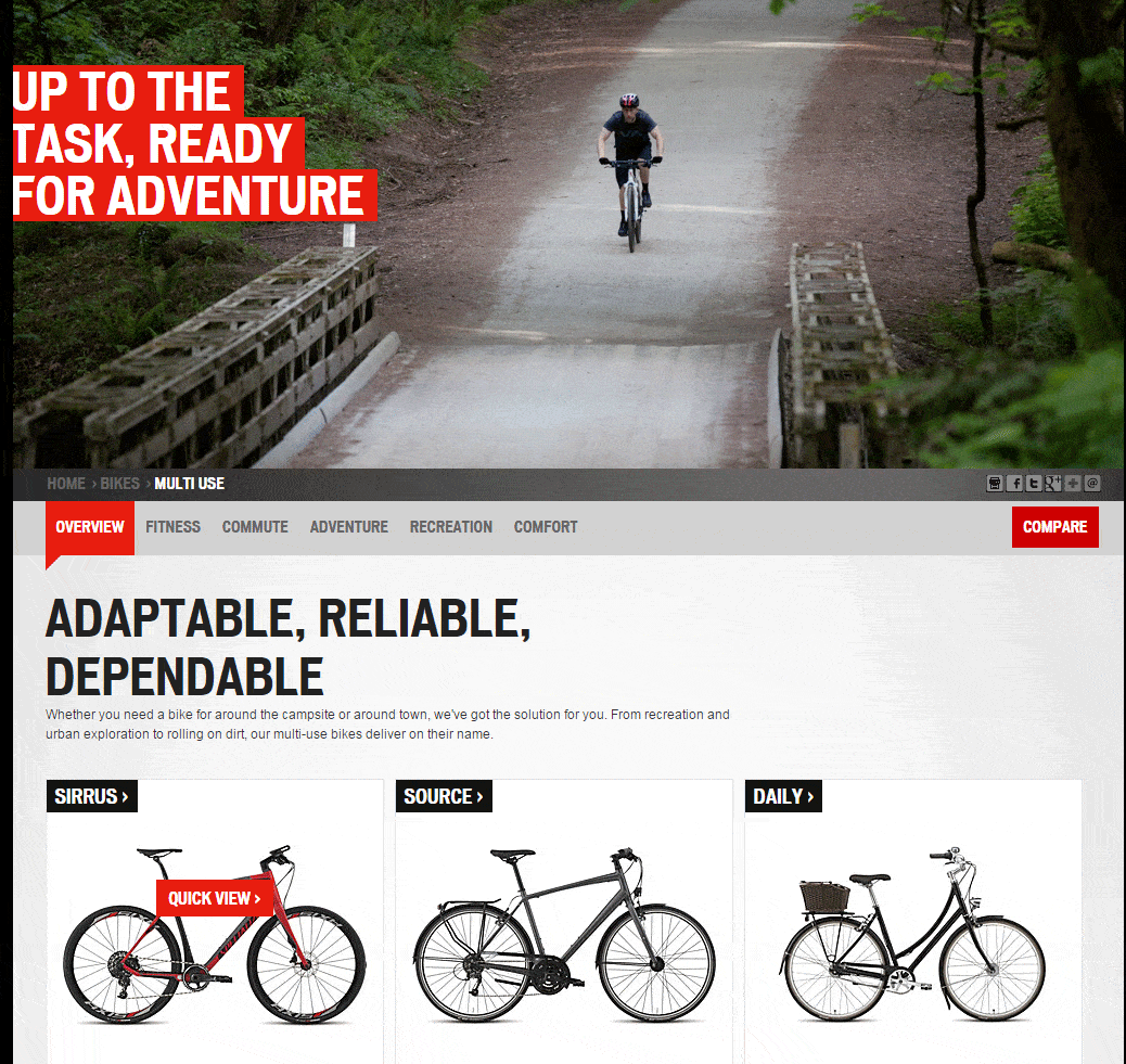
The second product page is from a bicycle manufacturer. It too displays bike models, but almost half the page is devoted to an image of the product in use. The photo helps capture the viewer’s imagination. Combined with the “…Ready For Adventure” copy, the top half of the page is “sensual”; appealing to the human senses of adventure, the excitement of escaping the daily grind and the feeling of wind in your hair.
And the bottom half of the page niftily offers the products that facilitates all those cool experiences.
Sensual content is tricky on the web because, as advanced it is, the internet still only lets you directly appeal to just two of our five basic senses: sight and sound.
But you can’t let that stop you from indirectly engaging the others. Think about the “ready for adventure” copy in the product page above, or the image. They both appeal to more than our sense of light and sound.
To take it up a notch, while staying on the subject of bikes, check out this video from Kona (full frame and with the volume at a decent level).
Did you feel anything other than what you saw and heard?
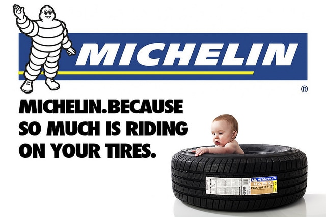
Of course, it’s somewhat easier to motivate your senses with video of bikes screaming down a mist covered hillside than … let’s say … a car tire sitting on its side. But Michelin’s famous ad campaign from back in the day shows sensual content can be created around the least exciting products.
And don’t worry if you can’t afford a Michelin-style ad campaign or the production values of Kona’s video. You don’t need to develop all your own content. Suppliers and manufacturers are usually open to let you at least link to their content.
Benefit
Regardless of how sensitive, sacrificing and charitable humans may be, they are also selfish. Especially on the web. We only hang around websites where we see a benefit to ourselves for doing so.
The very act of online shopping, which we rarely do for anyone else’s benefit, is a very selfish pursuit.
So should your product page copy talk about your product’s features and/or your business’ accomplishments? Definitely not as a main focus. Your selfish customers really don’t care about “your” anything. They want to know what’s in your offer for them. To optimize conversions your product pages should emphasize the benefit(s) to the customer of your product(s), at least as much as they emphasize anything else.
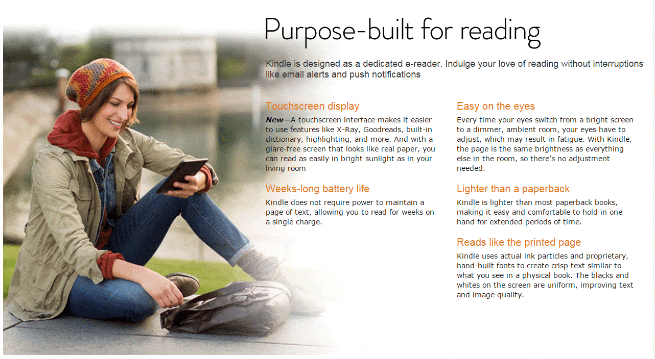
Check the section below from the Kindle product page. It harps on benefits more than features throughout, including:
> “Indulge your love of reading without interruption” instead of “no email alerts or touch notifications”
> “…read for weeks…” instead of “battery life = 40 hours”
> “lighter than a paperback” instead of “lightweight” or “weighs 10 oz.”
Even the image conveys the benefit of being able to read anywhere – rather than the feature of being portable.
Social Acceptance
Why do people line-up for hours on end (some of these people waited for over a week) to get every new Apple iGadget? It’s not because having it somewhat sooner – a matter of days or hours – will make any difference to their work or lives. It’s not because the new iProduct solves anything that other similar products don’t.
It’s because they know new Apple products are almost guaranteed to be popular and they will have the bragging rights of being among the first to possess something that has a very high level of social acceptance.
Social acceptance is a major indication of the suitability of your product for purchase. The more people that use or recommend your product, the more reasons there are to buy it.
Social acceptance, or social proof, which is shown on your product page through customer testimonials, reviews, social media shares, media coverage and influencer endorsements, among other devices, tells your web visitor that others, who have presumably been through the same buying cycle and faced the same decision points, chose your product as their best option. For the visitor, that means they don’t have to find their own answers about the suitability of your product. If so many people found it acceptable, it must be good.
For another indication of the power of social acceptance, think about how many people would line up for an iThingy if no one else cared for the product or ever bought it.
It’s important to remember that, while numbers of “likes” or tweets are an indicator of social acceptance, getting them shouldn’t be the point of your page.
“Social” means “human”, and, by appealing to the senses, stressing the benefits and showing social acceptance, your product page conversion optimization must focus on what’s at the top of your conversion funnel. A human being.

