Converting a customer. It’s the goal of everything you do in business. From your website design, to the services and products you offer, everything is aimed at getting more customers to buy. In that way, there is no beginning and no end to conversion optimization throughout your business.
While online conversions are part of the overall conversion focus of your business, they also help you expand your market reach beyond the limitations of a bricks and mortar location and let you conduct business entirely without a formal physical location.
So how important is that?
Very. The power of your website to convert customers will, at very least, add a significant revenue stream to your business. That should make the optimization of your website for conversions a top priority.
But what is it about your website that gets customers to take your call to action? Is it the design? The images? Your URL? While all of these contribute significantly to conversions, none of them can work by themselves.
The only element of your website that could work entirely on its own to turn visitors into customers is your web copy.
So, now that we’ve determined that conversions are the focus of your business, and online conversions can be a major part of that, and copy is at least as important for conversions as any other element on your page, if not more so, here are some tips to write landing page content that converts:
1. Tell Them What’s Different
Believe it or not, customers don’t buy from you because your product and services are the same as your competition’s. They buy because they have found some sort of difference in what you offer. It’s your unique selling proposition (USP).
Whether it be the price, your location, value-added features or something intangible, they make the decision to buy from you because they have found a difference that appeals to them.
So why would your written content tell them exactly what they hear from your competition: that you are “customer-centric”; that you have “years of experience”; that you have “effective solutions”?
If You Are Struggling to Discover Your USP – the good news is that you can highlight a USP that may not actually be “unique”.
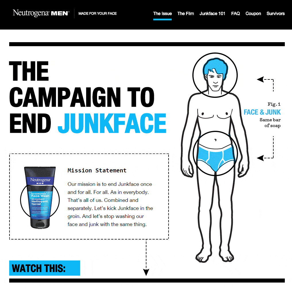
Check the Neutrogena landing page below. No other soap or body wash manufacturer offers to do everything in their power to end “junkface”. While every other soap and body wash could claim to do the same thing, it’s too late. Neutrogena has made this their USP (which really isn’t unique) and any competitive duplication of it would just as likely help Neutrogena’s cause as hinder it.
2. Appeal to Your Customer’s Self Interest
Your customers are selfish. At least when they shop online. Even if they are shopping for someone else, they want to get something by which they will be remembered. So even when buying a gift, they have personal reasons for doing so.
So you landing page copy must appeal to your customers’ personal interests, not yours.
The mistake made by many businesses and web developers is they assume that, by highlighting a feature of a product, customers will automatically connect that feature to a personal benefit. You write “four-wheel disc brakes” and expect them to connect that with “you and your family are safer in this car”.
Perhaps they will, but when you go straight to the benefit, you don’t have to rely on the customer to make the connection; you have made it for them, which makes it easier for them to “get it” and convert.
In a way, when your copy is too feature-focused, you are really writing about yourself. After all, you work diligently to offer your customers the best products and services and it’s very tempting to let them know about all your work.
But you should highlight every feature as a benefit for the customer and here’s why:
- Feature-focused copy is really about you: “We Offer 24/7 Customer Service”
- Benefit-focused copy appeals to your customers’ personal interest: “Get straight answers to all your questions any time of day or night.”
If you were selling music lessons, what points would you highlight in the copy? Your many years of experience? The variety of instruments that you teach? That you will customize lessons to each student?
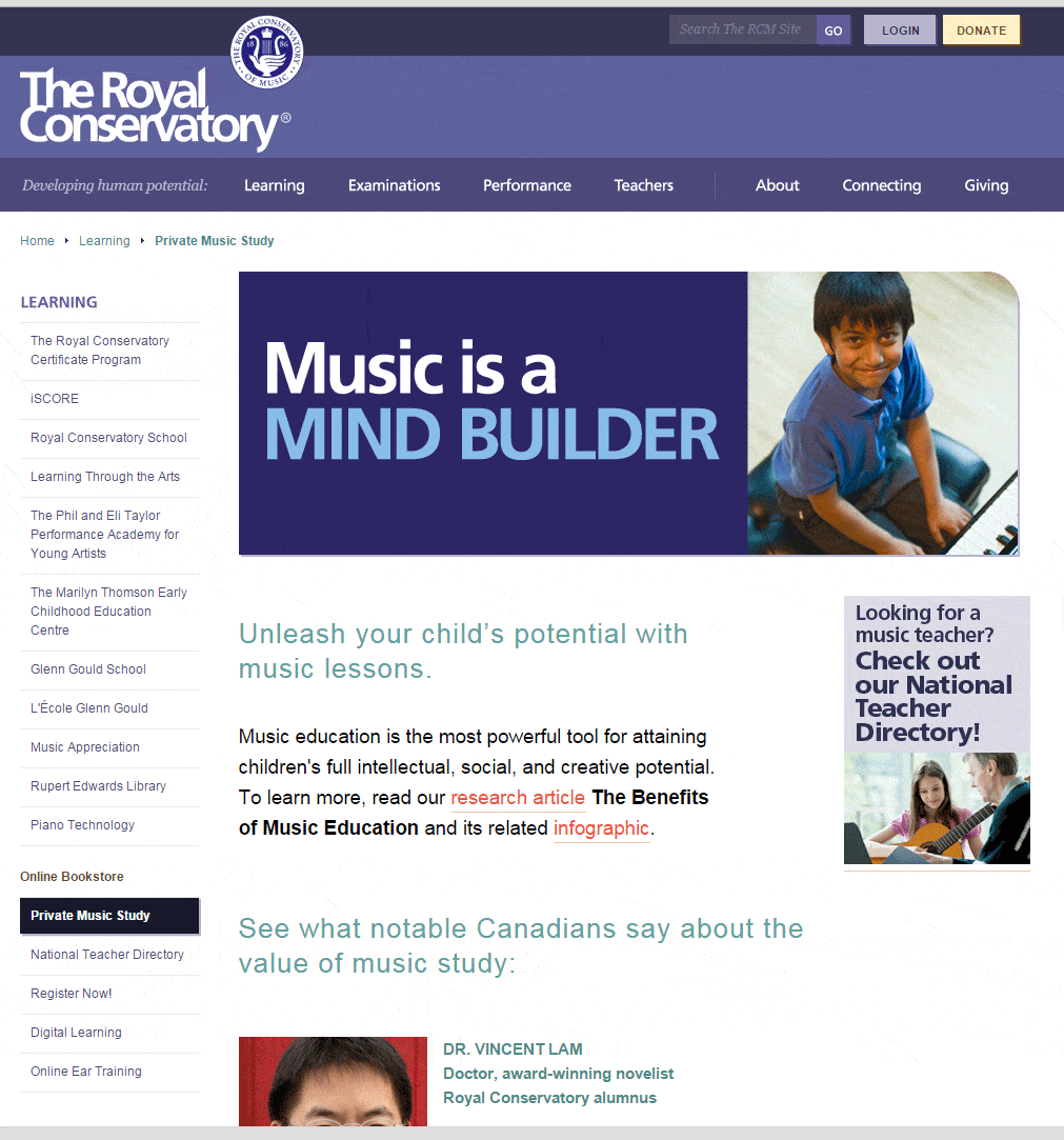
Or would your copy read: “Music is a Mind Builder?”
The Royal Conservatory of Music landing page is a mini-textbook on benefit-driven landing page copy. And here is some of what it shows you:
- Immediately appeal to the customers’ personal interest – In this case, their children’s wellbeing and growth
- Put the “action” of providing that wellbeing into the customers’ hands. Instead of saying “we will unleash your child’s potential…”, the copy tells the customer that she will “Unleash your child’s potential…”
- Questions are a great way to engage visitors. “Looking for a music teacher?” is a question that a massive percentage of visitors to a music school’s website will have. So the answer is most likely “yes”. And the more your web visitors say “yes” while on your site, the more likely they will be to convert
3. Make the Call to Action
It’s the oldest rule of selling: you must ask for the sale. Just like you shouldn’t leave it up to the customer to connect your features with their benefits, expecting them to buy just because of the awesomeness of your offer is a great way to lose a sale.
Your call to action is the online equivalent of asking for the sale or conversion. In a face-to-face sale, when the customer appears ready to buy, you might ask: “can I wrap this up for your?” or “are you ready to take delivery?”
On the other hand, you would never ask “are you ready to submit your personal information” or “do you want register?” If the copy on your call-to-action buttons speaks to customers this way, you’re not likely to get as many conversions.
Why? For the same reasons that you use your copy to tell the customer what’s different about you and what benefits your products hold for them. They are profoundly self-indulged when searching online for a product or service and even your CTA must feed that indulgence.
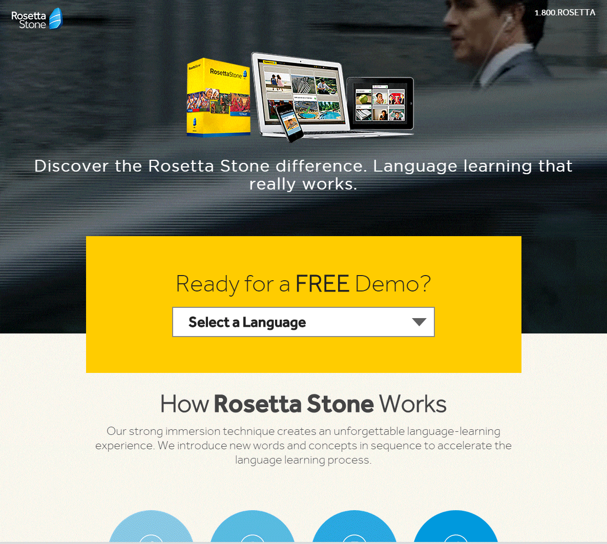
Rosetta Stone does an admirable job of writing call-to-action copy aimed squarely at the customer’s personal interest.
Ready for a FREE Demo? “Free” is probably the most powerful conversion trigger of all time. It implies the visitor can get what she came for without making a commitment.
And Rosetta Stone hits it out of the park by using a call to action within a call to action. “Select a Language” appeals to the customer desire to learn a new language. And when they do, they have almost unconsciously taken Rosetta Stone’s CTA.
Judging from the vast majority of landing pages, most digital marketers underestimate the importance of their landing page copy for conversion optimization. But that state of affairs gives you a ripe opportunity to leapfrog your competition.


