Let’s say you’ve set up your Shopify store, and traffic is steady, but sales aren’t where you want them to be. What’s missing?
Here’s where Shopify CRO (Conversion Rate Optimization) comes in.
Consider CRO, the secret sauce that helps turn those casual visitors into paying customers.
It’s about fine-tuning every part of your store—from the product pages to the checkout process—so that more people make the all-important purchase step.
Focusing on the right strategies can help you maximize the full potential of your Shopify store and watch your sales grow.
Does this sound like something you need? Read on to discover the essential tips and optimization tactics for Shopify stores.
What is Shopify Conversion Rate Optimization?
CRO is a marketing strategy that maximizes customer acquisition and engagement by improving the user experience on your website or app. The goal is to increase sales and revenue while minimizing costs through experimentation with different designs, content, and messaging.
Shopify CRO is a set of strategies and techniques to increase the number of site visitors who purchase from your e-commerce store. You can achieve this by improving the user experience and focusing on specific product or service aspects.
The ultimate goal of conversion optimization is to increase your business’s sales, ecommerce conversion rate, and revenue. It’s about finding out what works best for you and your existing customers and then improving your store.
What Makes Shopify CRO so important?
Here are some key benefits of Shopify CRO that make it essential to master Shopify conversion rate:
- Increased Sales and Revenue: The primary goal of CRO is to drive more sales and revenue. You can increase your revenue by improving the user experience and making converting visitors easier.
- Improved Return on Investment (ROI): Shopify CRO can help you get more out of your marketing efforts. By optimizing your website for conversions, you can attract more qualified traffic and convert a higher percentage of visitors into customers, resulting in a better ROI.
- Enhanced Customer Experience: A well-optimized website is easier to navigate and provides a better overall customer experience. This can lead to increased customer satisfaction, loyalty, and repeat business.
- Data-Driven Decision Making: CRO relies on data and analytics to identify areas for improvement. By tracking key metrics and conducting A/B testing, you can make data-driven decisions to optimize your website and improve conversions.
- Competitive Advantage: Having a well-optimized website can give you a significant advantage over your competitors. It also helps attract and retain new customers by providing a better user experience.
Implementing Shopify CRO strategies can help you improve your online store’s performance and achieve your business goals. But how? Let’s find out.
12 Shopify CRO Tips for Beginners
How do you boost your conversion rate on Shopify? Here are some tactics for your Shopify CRO:
1. Simplify your checkout process
How do you stop potential customers from abandoning their carts halfway through checkout? Simplify the process. Cart abandonment is a common issue for Shopify stores—according to the latest research, around 70% of online shopping carts are abandoned.
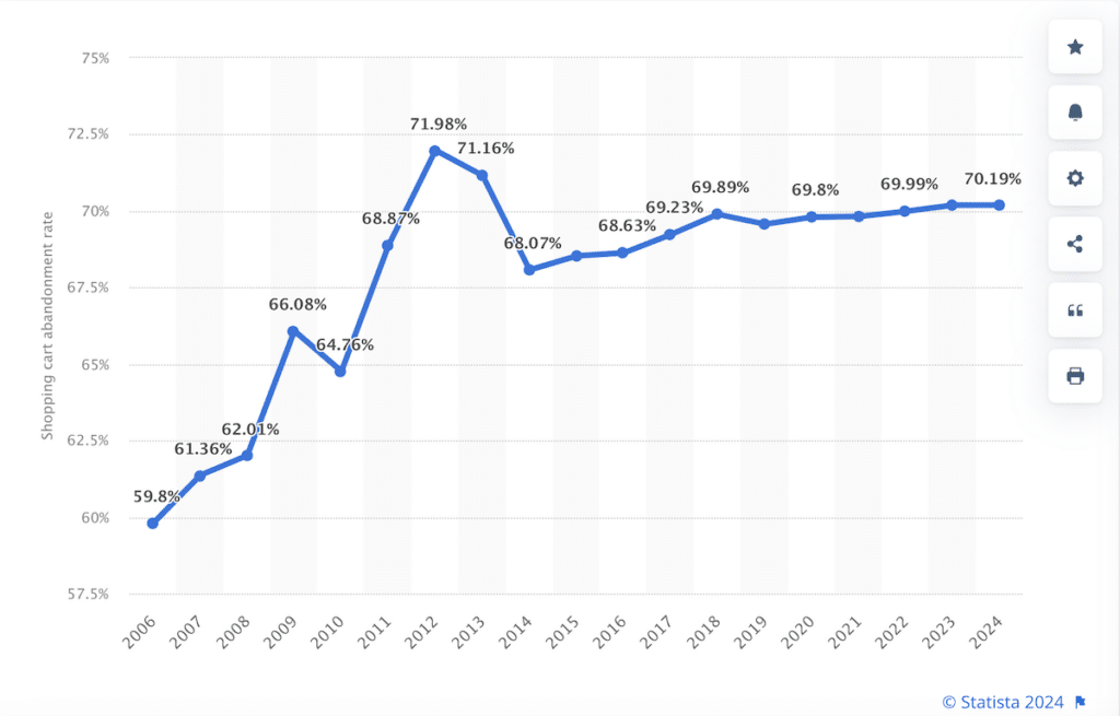
One of the biggest reasons is a confusing or complicated checkout process. People are busy, and they don’t want to jump through hoops just to make a purchase.
However, streamlining the checkout can boost your conversion rate and make shopping more seamless for your customers.
Here’s how you can do it:
Reduce checkout steps:
The fewer clicks, the better.
Each extra page or form field gives shoppers more time to reconsider purchasing. On the other hand, one-page checkouts work wonders for conversions since cutting down unnecessary steps makes it easier for customers to complete their purchases.
Here’s how to go about it:
- Only ask for essential information (name, shipping, and payment).
- Enable address auto-fill so users don’t have to type everything manually.
- Avoid asking for personal details unless absolutely necessary.
Look at this one-page checkout option, for example:
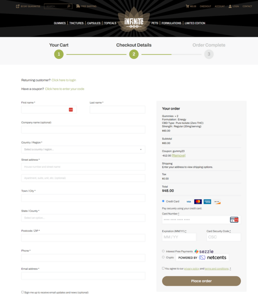
This checkout option is crisp and succinct, and it ends on a single page. The best part? They only ask for the information that is absolutely necessary for the delivery of the product.
Offer guest checkout
People value convenience over commitment. Forcing customers to create an account just to buy a product is a surefire way to increase abandonment.
In fact, 28% of shoppers say being required to sign up is a significant reason for cart abandonment.
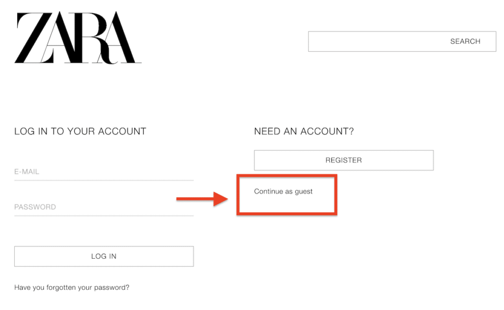
Zara, for example, allows guest checkout to give users a smooth experience without registering. This method captures more sales and offers account creation later in the process, making it a choice rather than a requirement.
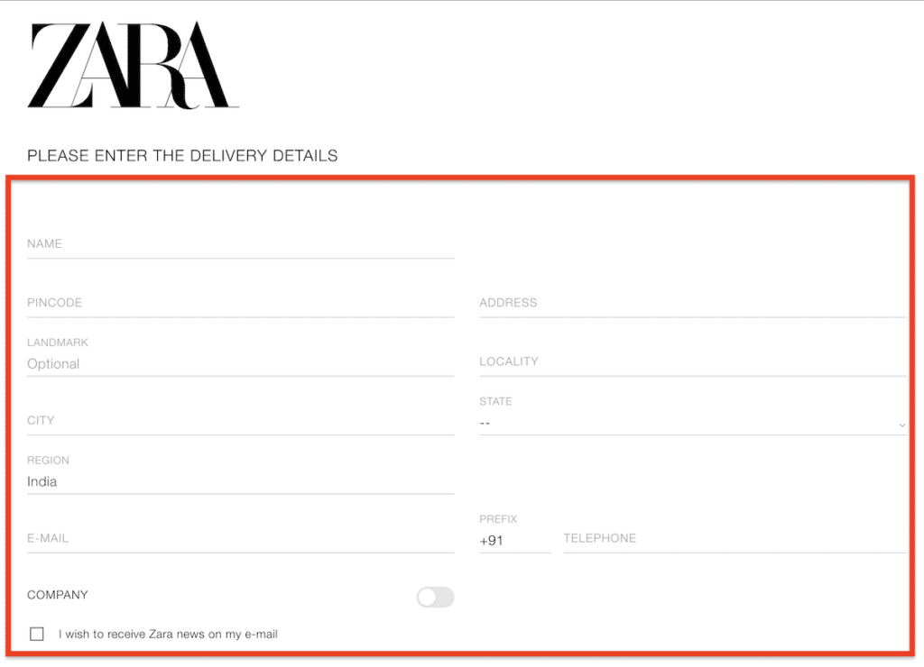
Once you hit the guest checkout option, you are redirected to a succinct, one-page checkout form that only asks for the essential details, such as your address, name, and email address, that are absolutely required for the delivery process.
Here’s how to go about it:
- Allow guest checkout, but include a subtle option for account creation post-purchase to retain customer data for future marketing.
Display transparent costs early.
Hidden fees or unclear shipping costs at the final checkout page are conversion killers. Customers don’t like surprises, especially if they involve unexpected expenses.
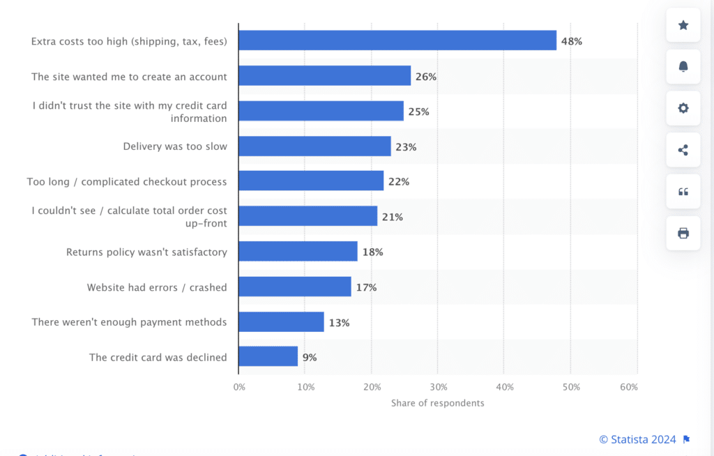
A study by Statista showed that 48% of shoppers abandon carts due to high extra costs, such as shipping and taxes.
Companies like Amazon build trust by showing a clear breakdown of costs upfront.
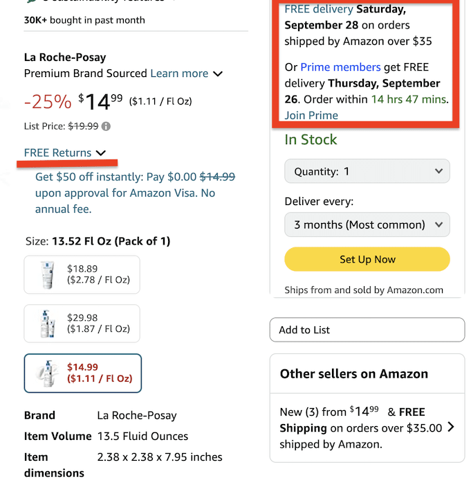
Their “Prime” option also helps reduce friction by eliminating shipping fees, making it easier for users to buy without second-guessing.
Here’s how you can also offer transparent pricing early on:
- Display shipping, tax, and total costs on the cart page before users checkout.
- Offer free shipping where possible, or at least show the cost early to avoid last-minute sticker shock.
- Place your shipping and return policies in an easy-to-find spot on the checkout page.
- Highlight free returns or exchanges to reassure hesitant shoppers.
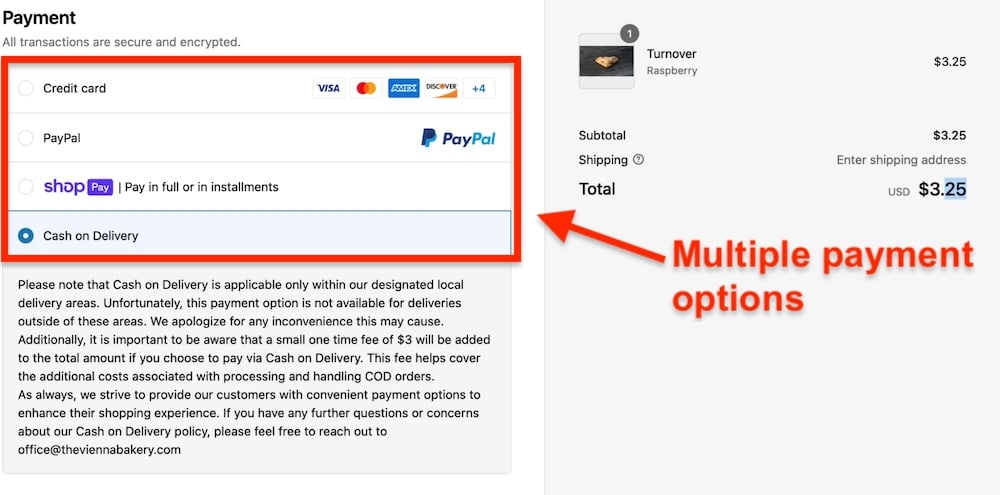
Pro tip: Provide multiple payment options—flexibility in payment builds trust and increases conversion rates. If your store only accepts one or two forms of payment, you might lose customers.
Make sure your Shopify store offers multiple payment methods, such as credit/debit cards, PayPal, digital wallets, and even cash on delivery, for higher checkout completion rates.
2. Optimize for mobile users
With over 6.92 billion smartphone users worldwide, mobile commerce is the future of online shopping.
Historically, ecommerce shifted towards mobile with the rise of smartphones in the late 2000s, but companies that ignored this shift initially lost market share (think of BlackBerry’s decline due to missing the touchscreen trend). Today, a slow, unresponsive mobile site is your BlackBerry moment.
So, how do you avoid turning your Shopify store into another Blackberry moment? Here are some tips to optimize your store for mobile users:
Speed up your Shopify store:
Mobile users are impatient—53% of visitors will leave a site if it takes longer than 3 seconds to load.
Shopify store owners can speed up their stores by implementing the following:
- Use high-quality images and videos, but compress them. Tools like TinyPNG can compress images to reduce their file size without sacrificing quality.
- Minimize the use of heavy code and remove unnecessary apps or plugins that slow down performance.
- Use Shopify’s built-in mobile optimization tools to ensure fast load times.
Design for thumbs, not cursors:
Your site needs to be easy to navigate with just a thumb. Buttons should be big, and menus simple. Mobile screens are small—don’t clutter them with too many elements.
Here are some tips:
- Place key CTA buttons like “Add to Cart” or “Buy Now” prominently and ensure they’re large enough to be tapped without zooming in.
- Use a sticky menu so users can access the cart or checkout page anytime, no matter where they are on your site.
Typeform nails the “Design for Thumbs, Not Cursors” idea by simplifying their mobile site and using big, easy-to-tap buttons.

This makes it super user-friendly for anyone filling out their forms on the phone.
Offer mobile-first checkout:
A complicated checkout process is one of the biggest reasons for abandoned carts.
Focus on making checkout as smooth as possible on mobile. Here’s how:
- Enable Shopify Pay or Google/Apple Pay so users can checkout with a single tap.
- Keep forms short. Ask only for essential information, reducing the number of steps for checkout.
- Test your checkout process on multiple devices to ensure it’s seamless.
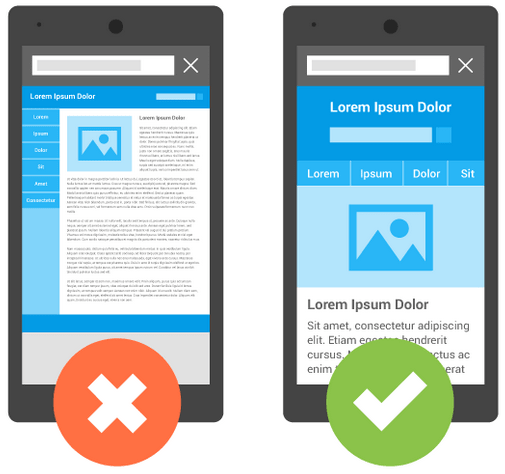
Finally, remember to optimize your images for mobile devices using responsive design, which automatically adjusts to different screen sizes.
Here’s how it works in action:
3. Set up an automated welcome email
How do you get that automated welcome email when you sign up for a new service? The one that tells you the basics and helps you get started?
The welcome email will be sent automatically to each new customer, and it’s an opportunity for you to make a great first impression.
This email should include:
- Information about your return policy.
- A link to your store policies page.
- An offer for free shipping on their first order (optional).
The main reason is that it will help you increase your sales by keeping in touch with your paying customers. You can send them messages about your latest products or promotions and remind them to leave reviews on your store.
It’s also a great opportunity to give them a discount code or coupon code to encourage them to make an additional purchase.
The best part? Welcome emails have been shown to increase the unique open rate by 86% and have a 91.43% open rate.
Moreover, a study suggests that 74% of people expect to receive a welcome email right after subscribing to your list. Another study points out that welcome emails generate up to 320% more revenue per email than other promotional emails.
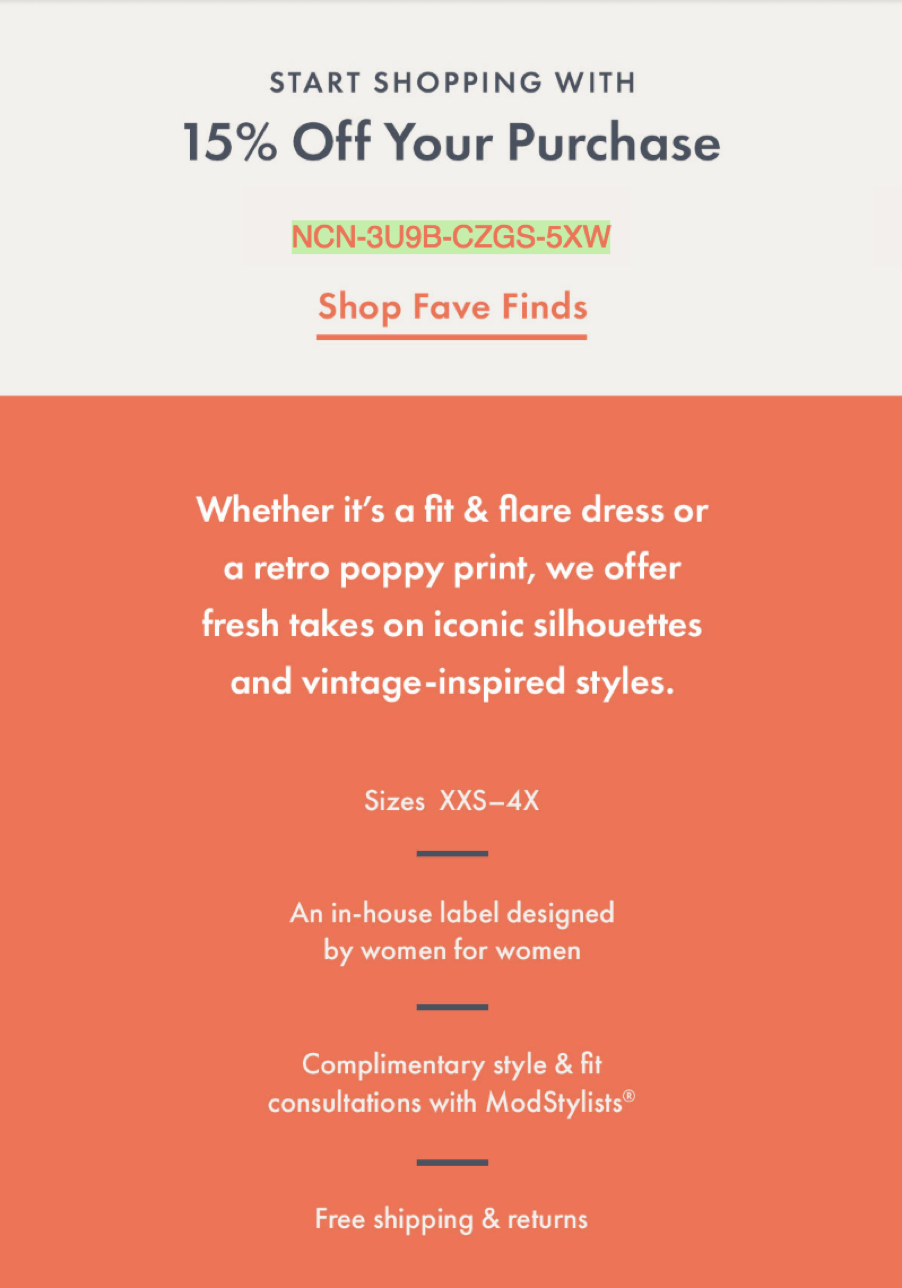
For instance, ModCloth uses its welcome email as an opportunity to introduce itself while briefly providing some benefits of your purchase.

(Source)
The brand also includes a coupon code to entice customers to make another purchase immediately.
Look at how ModCloth uses several appeals to build trust with potential customers, including complimentary style and fit consultations, free shipping, and “for women by women.” This language appeals to a specific audience.
4. Add customer accounts to reduce friction
When someone is about to make a purchase, they should be able to do it quickly and easily. If they have to fill out a form, there’s a good chance they’ll abandon the purchase.
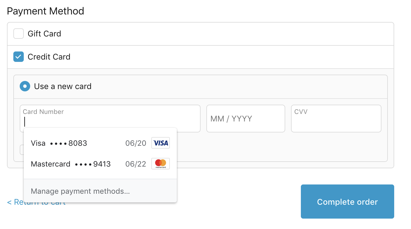
One way to reduce friction is by adding customer accounts. This allows you to display content based on their purchase history with your store, which can increase average conversion rate and boost repeat purchases.
(Source)
When users create an account, they’re more likely to make repeat purchases since they don’t have to enter their billing information every time they buy something from you. Adding customer accounts also lets them view previous orders and track shipping status so they can avoid problems with missing packages or delays in delivery times.
5. Use Shopify heatmaps to discover what customers are doing.
Shopify heatmaps are a data-driven way of measuring user behavior on your website by tracking mouse movements and clicks during a session. They can tell you which areas of the page are getting the most attention and where people are clicking.
You can use this information to improve your site’s usability while creating an optimal user experience that flows naturally with their journey through your site.
That way, you can learn what they like — and what they don’t like.
If someone clicks “add to cart” but leaves without purchasing anything, something might be wrong with your product description or images. You’ll also see why some people abandon their carts without making a purchase: Maybe there aren’t enough payment options or delivery costs are too high?
6. Add one-click upsells with plugins
Upsells are products or services that complement those in your cart. They could be related to the original product or a complimentary item that customers might like with their purchase. This upselling increases sales by suggesting complementary products at the right time during the customer journey.
Here’s an example of a one-click upsell from Native. The brand offers two options to shoppers interested in their body wash—a one-time purchase option for $8 and a subscription for $6—and subscribers get 25% off their first order.
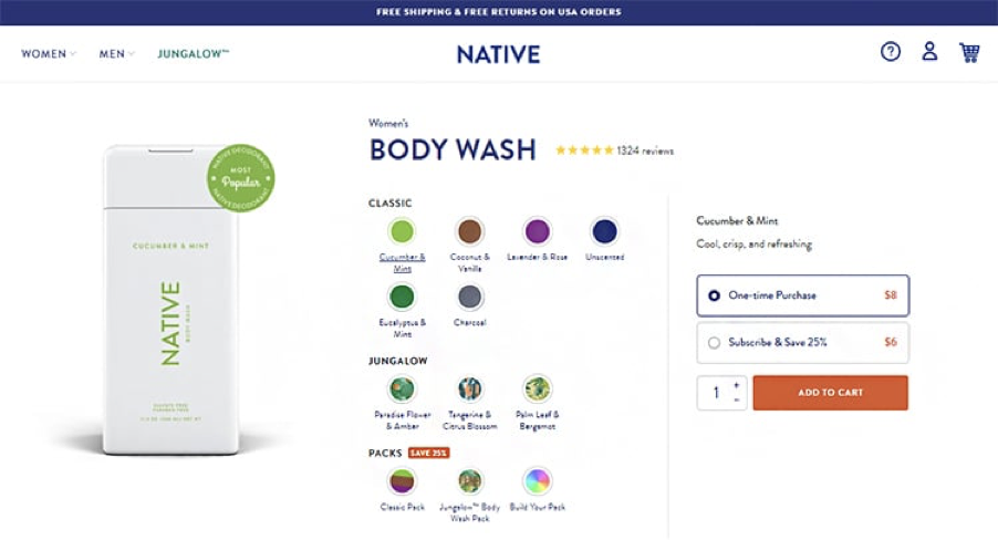
(Source)
Subscribing to a product online allows customers to try it out before they buy. This saves them money if they don’t like the product.
7. Use trust symbols and trust-building elements
Trust symbols and trust-building elements are powerful tools that you can use to increase your Shopify conversion rates.
Trust is a significant component of the purchase decision, and it’s something your customers need to have to buy from you.
The most common trust symbol is the “Secure Trust Seal,” which indicates that your website uses HTTPS encryption technology. This is a sign of security and privacy and will help convince your visitors that they can trust you.
Here are some more effective ways to use trust symbols and trust-building elements on your Shopify store:
- Use user-generated content, aka customer reviews, prominently on your site.
- Add testimonials to your product pages.
- Use security badges like McAfee Secure or VeriSign Secure Site Seal.
- Use social proof like “people who bought this also bought…” popups.
- Include a returns policy (and clarify what this policy covers).
- Use a money-back guarantee, especially for high-priced products or services that require a significant investment of time and effort (e.g., fitness programs).
8. Always show your pricing and make it clear
It’s important to let customers know exactly how much they’ll pay for an item before they add it to their cart. You can do this by either adding a price tag directly onto each product image or adding a separate “add to cart” button in addition to the main “add to cart” button.
If you charge extra for shipping, you should also include it in your prices. If you’re selling something online, you’re going to have to pay extra for shipping—so don’t just assume that people will know what they’re getting into when they click on your products!
Another problem with hiding your prices is that people will assume a catch or hidden fee is involved — especially if you’re trying to sell an expensive product or service.
Transparent pricing also establishes trust and credibility.
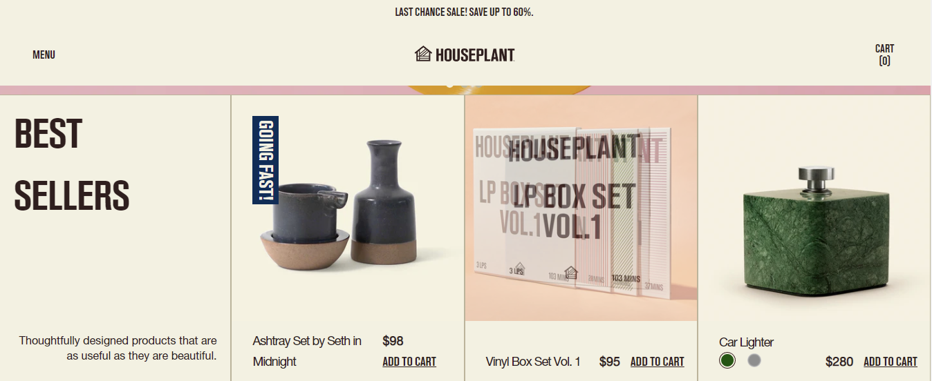
(Source)
In fact, researchers conducted six experiments and found that when a company voluntarily discloses its costs, customers are more attracted to the brand and more likely to buy.
Researchers examined buyers interacting with an online retailer in a real-world academic experiment. As the holiday season approached, the retailer added a leather wallet to its site for $115 in five colors.
To promote sales after the holiday, a retailer added an infographic on each product page showcasing the price of leather, construction, duties, transportation, and the overall cost of producing the product.
However, there was a mistake: the retailer included the costs infographic for only three colors.
The researchers didn’t find out about the inconsistency in the labels for five weeks, creating a natural experiment that allowed them to evaluate how shoppers responded to wallets with and without unit costs.
Finally, the researchers found that revealing the cost of each color boosted daily unit sales by 44%.
9. Remove unnecessary elements from your product pages
The first step to improving your Shopify CRO is to remove the unnecessary elements from your product pages.
By removing the unnecessary elements, you can clear up the clutter and focus on the product itself.
Even statistics suggest that 84.6% of web designers find cluttered web design as the most common blunder committed by small businesses.
But what are these unnecessary elements?
Here are some examples:
- Plain backgrounds. Instead of using a plain white background, try using a photo of the product or an image that relates to the product. The more visually appealing you can make your page, the better.
- Tons of text and descriptions. People don’t read anymore — they scan. Instead of trying to force them to read all of your text, use bullet points and short sentences that get right to the point.
- Too much information on one page. Many products have multiple variations and options available — but don’t be afraid to break up this information into multiple pages with different tabs (like this). This will help keep things organized and easy for customers to find what they need when they need it — even if it means having a few extra clicks here and there!
- Remove any images that aren’t relevant to your products (ex: stock photos). If an image does not contribute in some way to the visitor’s experience (i.e., it doesn’t enhance their understanding of what they’re buying), then leave it out!
10. Showcase reviews and testimonials
Showcasing reviews and testimonials is one of the best Shopify CRO tips for beginners.
This is because it can help you increase conversions and sales by:
Increasing trust, credibility and social proof.
Providing social proof that your products are good.
Helping you target customers who are looking for a specific type of product or service.
That said, it’s important to have a balance between showcasing too many reviews and testimonials, and not enough. If you don’t show any, then visitors may think that your business has something to hide, which could make them not trust you.
If you show too many, then it can look like a spammy tactic as well as being overwhelming for visitors who are looking at your site for the first time.
For example, Navy Hair Care saw a 264% increase in repeat-visit rates, an engagement rate of 73% on shoppable Instagram posts, and 360 checkout comments on average when they combined text-based reviews with customer media.
Another example is Alora Boutique which uses the top of its review page to show customer photos. The brand also replies to each review and displays the Fera verification icon to show that the reviews are from real customers.
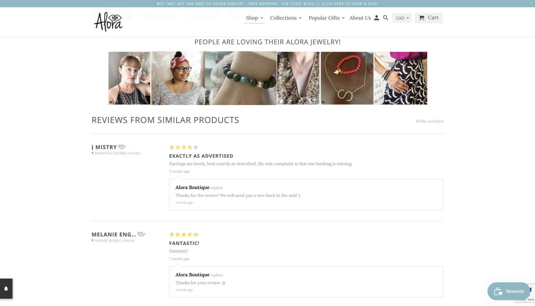
(Source)
You can also add several short and sweet testimonials.
Here’s an excellent example of Baremetrics. They created a testimonial collage – called the “Wall of Love.”
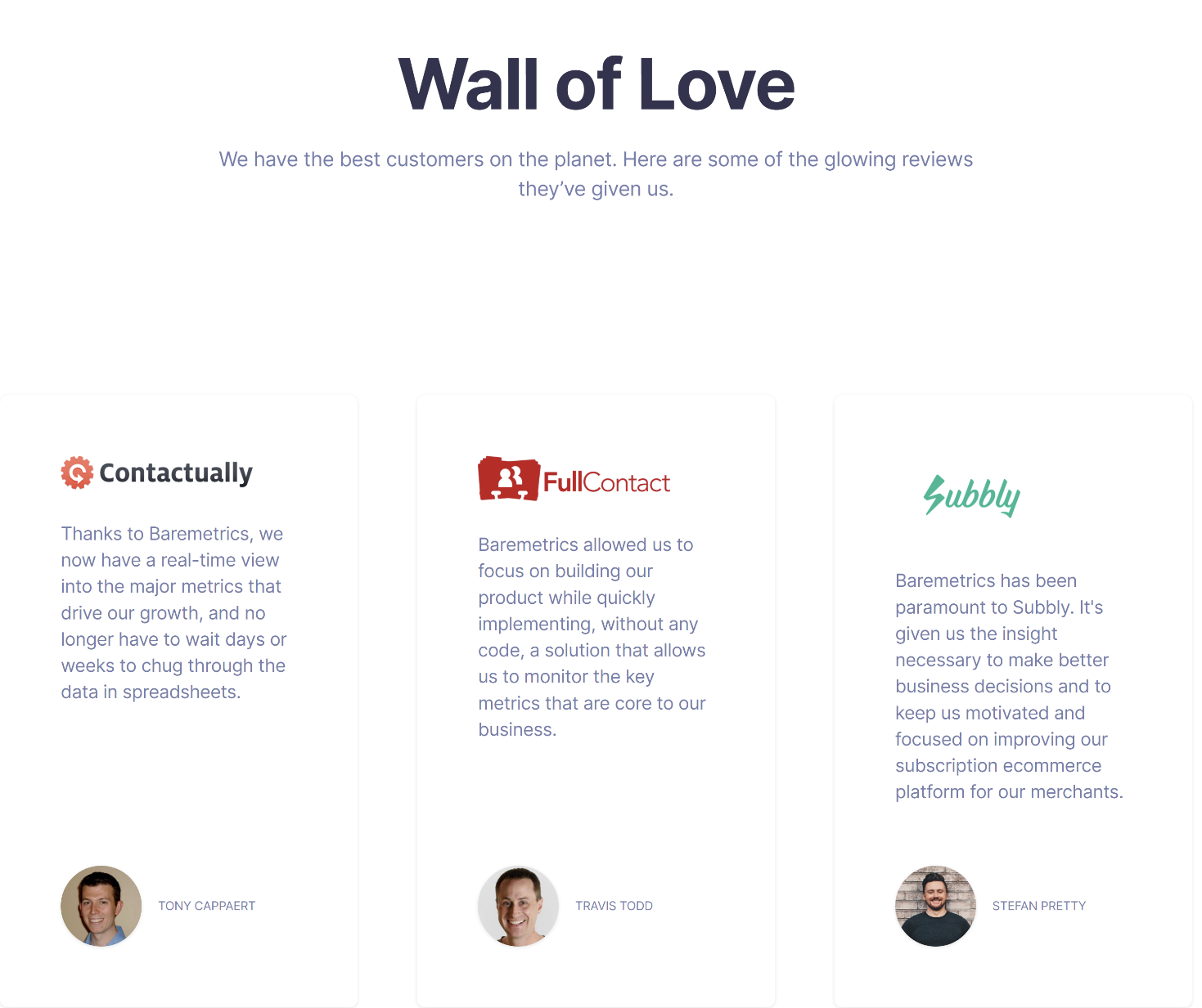
(Source)
11. Provide customer support options
One of the most important things you can do as an online retailer is to provide good customer support. As an entrepreneur and business owner, your customers rely on you for products, services, and help when they need it most.
When someone has a problem with your product or service, they want answers fast — preferably within 24 hours. You should always respond to customers within this time frame so that they know their concerns are being addressed as soon as possible.
If you can’t get back to them right away because you’re busy with other things (like running another part of your business), let them know when they can expect a response from you.
Here are some tips on how to provide the best customer support possible:
- Have a live chat feature on your website. This will allow you to communicate with your customers directly without having to wait around for a reply. It also makes it easier for them because they don’t have to send an email and wait for you to respond – they can get their issue solved right away!
- Offer phone support as well as live chat if possible. If your business has many international customers who are unable to access live chat all day long, then phone support is essential. Phone calls take longer than emails, but at least they’re convenient for everyone involved.
- Create a customer support email address. This can be as simple as “@storename” or “support@storename,” but make sure it’s recognizable and easy to type into a search engine. If you already have an email address set up in Shopify, you can simply set up a filter that forwards all emails from customers to this address.
Most importantly, provide multiple options for contacting your store on a comprehensive contact page. Whether it’s a live chat or phone number, ensure your customers have numerous ways to get in touch with you. This will help you better meet their needs and provide better overall satisfaction.
12. A/B test your web pages
A/B testing is one of the most important parts of conversion rate optimization (CRO). You can use A/B testing to find out which elements of your landing page are working and which aren’t — so you can focus on improving the ones that aren’t.
Before creating an AB test, you must determine what you’ll be testing. You can find out which pages are performing poorly but are candidates for tests by looking at Google Analytics, heatmaps, and session recordings.
First, you need to have a hypothesis in mind to create an A/B test. You can write down your assumptions about how changing some aspects of your site will affect conversion rate or sales.
For example, if you want to increase the number of people who sign up for your email list, then you might ask yourself these questions:
What content could I include in my welcome email that would encourage people to opt in?
How can I make it easier for visitors to sign up?
The best part? There are plenty of tools available today that make it easy to create effective A/B tests. For example, tools like FigPii and Optimizely allow you to set up tests quickly and easily without writing code!
Common Shopify CRO Mistakes to Avoid
So, we have covered the conversion rate optimization tactics to implement, but what about the things to avoid?
How do you ensure your Shopify store doesn’t just attract visitors but converts them into loyal customers? Avoid these common CRO mistakes that can sabotage your sales potential.
1. Overcomplicating the checkout process
Imagine walking into a store, ready to buy, but the cashier is nowhere to be found, or the checkout process takes forever.
A complicated checkout experience can make customers abandon their carts faster than you can say “discount.”
Tip: We’ve already discussed this, but it’s worth repeating: Simplify your checkout process as much as possible. Offer a guest checkout option, minimize the number of required fields, and provide clear progress indicators.
2. Ignoring mobile optimization
With over half of e-commerce sales coming from mobile devices, paying attention to mobile optimization is like opening a restaurant but only serving food to diners who walk in. If your Shopify store isn’t mobile-friendly, you’re leaving money on the table.
To avoid alienating half of potential buyers, use responsive themes and test your store on various devices.
3. Neglecting user experience (UX)
Think of UX as the welcoming ambiance of your store. If customers feel lost or overwhelmed, they leave before browsing your products. A poor UX can drive visitors away, no matter how great your products are.
Tip: Focus on intuitive navigation, fast loading times, and appealing designs.
4. Overlooking A/B testing
Imagine baking a cake without first checking if it tastes good. That’s what it’s like to run your Shopify store without A/B testing. Before committing to changes, you need to know what works best for your audience.
Tip: Regularly conduct A/B tests on key elements like headlines, images, and CTAs.
Final Thoughts!
Mastering Shopify’s conversion rate isn’t a cakewalk, but you can do it with the 12 conversion rate optimization tips listed in this article.
Customer satisfaction is a major part of selling products, especially with excellent customer service. If a customer is happy with their shopping experience and feels like the company knows them, they are more likely to tell others about it, thus increasing the likelihood of future sales.
Instead of focusing your efforts on trying to buy your way into customer loyalty with discounts, tiered pricing, and unique rewards programs for loyal customers, focus on what you can do today to create a great experience that will increase customer satisfaction.

