Ecommerce has been an increasingly important channel for business-to-consumer (B2C) companies. Even though ecommerce has been around for a while now, it is a relatively new channel for many businesses.
Experimentation is vital to a successful ecommerce business, but it’s not just about testing different versions of your landing page, homepage copy, or category pages. It’s also about determining which features and functionalities will help you achieve your business goals, such as increasing sales or improving customer retention.
To do that, you need to conduct website usability tests (which is all about understanding how people interact with your website, which means understanding how they use it — its usability.)
Usability testing can help you discover which parts of your site could be clearer, more effective, or more engaging for your customers.
Before we dig deeper into usability’s role in ecommerce experimentation with some usability testing examples, let’s get an overview of usability and ecommerce usability testing.
What is “Usability” in Ecommerce Experimentation?
Usability measures how easy it is to do something on your website. We often want to ensure that users can find what they’re looking for and complete their goals – when they come to our website – without experiencing friction.
For example, if you have a product page where customers can add an item to a cart, we want them to be able to find the button easily and click on it without any confusion or frustration.
When you run an experiment using usability as a metric, you are testing whether or not users can complete their goals on your site.
There are many ways of carrying out e commerce usability testing, but one of the most common tests is called “click testing,” where you show users different versions of a page and then record how many times they click on each element on the page (or which version they prefer).
If a particular element gets more clicks than others in your experiment group, that element might be better than others because people were more likely to interact with it.
What Role Does Usability Play in E-Commerce Experimentation?
Let’s see the role usability has in e-commerce experimentation, along with different usability testing examples:
1. Usability has a direct link to conversion optimization:
eCommerce experimentations are all about improving customer experience, leading to more conversions. If the customer cannot find the product they are looking for or cannot reach their desired goal (such as checkout), you will lose customers who would have converted into sales.
The good news is that usability testing can help you ensure your website works for everyone who visits it — no matter what device they’re using or how old their browser is.
The goal of usability testing is to determine whether certain elements and features on your site are easy to use and understand. This will help you gain insight into how visitors interact with your site and identify any potential issues that may be keeping them from converting into customers or subscribers.
To increase your conversions, you need to focus on two key areas:
- Visitor experience (UX) – This is about how people feel when they visit a website. You want to make sure that it’s easy for visitors to find what they’re looking for, whether that’s by using good navigation or by having clear calls-to-action (CTAs).
- User interface (UI) – This is how easy it is for visitors to interact with a website. You want them to complete tasks efficiently and quickly so they don’t get frustrated while trying to buy something from you.
Let’s take this real-life case study of JustThrive, a health company that sells supplements, for instance. The company wanted to boost e-commerce conversion rates on auto-ship subscriptions and increase ROI on their ad spend.
Because JustThrive’s product pages had some product variations, visitors sometimes found it hard to choose when buying. This could deter them from taking action. To encourage auto-ship subscriptions, the goal was to guide the visitor to opt for that instead of the other two choices on the page.
To understand how visitors interacted with their site, they used Google analytics and a heat map tool to see where people were clicking or trying to click.
After the test, they changed the product images, added white space, and included trust signals such as a 30-day guarantee and secure payment options.
To further encourage visitors to subscribe to the auto-ship subscription offer, they made the button more prominent in the layout design. They used a “Best Value” button and highlighted the free shipping offer.
Have a look at the original layout of the desktop version:
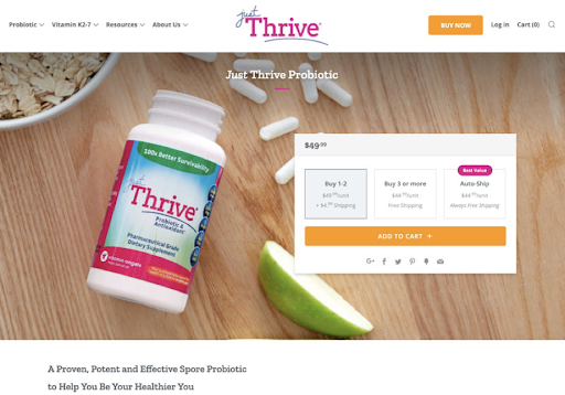
(Source)
Here’s the original layout of the mobile version:

(Source)
The following is a winning variation that they created after conducting usability testing:
Desktop Version:
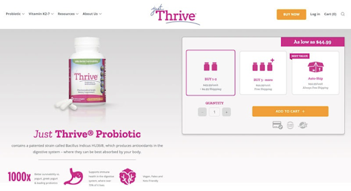
(Source)
Mobile Version:
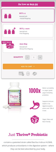
(Source)
After over a month, their conversion rates increased by 25.4% over the control, auto-ship subscriptions boosted by 41.5 %, and the revenue increased by 30.4%.
2. Usability can help you find bugs and design flaws before they impact your customers:
When people experience bugs or design flaws in an ecommerce site, they’re likely to abandon their shopping cart or leave negative reviews online.
The longer these issues go unnoticed by companies, the worse they will get and the more expensive they’ll be to fix.
By conducting usability tests on your website early and often, you’ll be able to identify these problems before they impact your sales figures or reputation.
Here are some ways to spot issues and fix them before they impact customers:
- Use a user experience expert. You can hire one or use an agency to test your site for usability problems. Either way, it’s best to have someone who knows how users think and what they expect from their experiences.
- Test with real people. It’s important to get feedback from real customers rather than using automated tests or just reviewing analytics. Those methods can miss usability problems that aren’t yet impacting revenue or conversions.
- Use a combination of methods. Automated tests provide significant data, but they don’t tell you everything about how people actually use your site — which is why you should also conduct live user tests with real people (not your friends).
For instance, prior to the launching of their app in the United Kingdom, McDonald’s implemented a usability test to spot any usability problems.
They conducted 20 usability tests, and the task scenarios covered the whole customer journey from end to end. The test plan also comprised 225 end-user interviews.
The usability study showed valuable results. They detected some usability issues during the study:
- The CTA buttons were not clearly visible and had interactivity issues
- There were communication issues between restaurants and the smartphone app
- Order customization and favoriting were missing, which impacted the overall user experience
After the test, McDonald modified their mobile app:
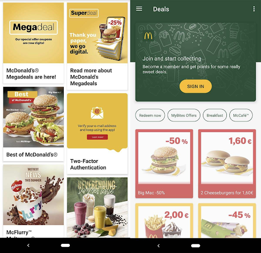
(Source)
3. Usability issues and slow page loads can hurt your bottom line:
One of the most common usability issues with ecommerce websites is slow page loads.
This has been proven time and time again through multiple studies conducted by Google and other organizations.
Slow page loads mean customers will leave your website without converting or buying anything from you.
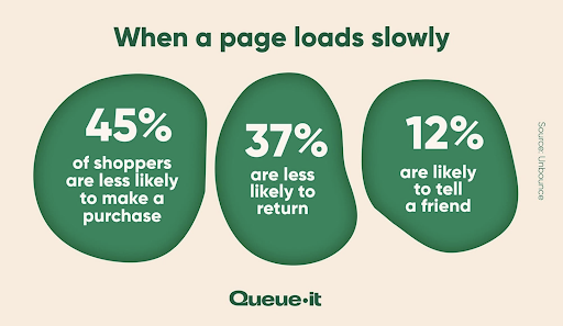
Statistics suggest that 45% of shoppers may only buy a product from a site if the page takes less time to load. And when the page loads slowly, 37% may not return to that site.
(Source)
Usability testing can be done on any site, but it’s especially important for ecommerce sites.
Here are some of the benefits:
It helps you find ways to speed up your site. When you run usability tests, you see exactly where people are getting stuck and what they’re struggling to understand. That gives you insight into how to improve your site’s performance — whether through design tweaks or by adding more text or instructions.
It helps you fix issues that slow down load time and cost you money. Many websites have problems that cause them slow page loads and high bounce rates. These problems include broken links, images that don’t load correctly, or forms that aren’t submitted correctly (because users left out required fields). You might only realize these issues exist if someone tells you about them during a usability test session.
Let’s take this real-life example of Zitmaxx Wonen, a furniture retailer.
The company revealed that mobile traffic was rapidly increasing, but the site wasn’t optimized for mobile. To fix this issue, they undertook a project to optimize the speed and usability of their mobile site.
To improve the site’s performance, Zitmaxx Wonen used Google’s Pagespeed Insights and Test My Site to review its performance.
The report helped them redesign their mobile site. By doing so, they managed to get 100 on Google’s PageSpeed Insights, reduce load time to under 4 seconds and increase mobile conversions by 50.2%.
4. Site usability can affect your brand’s reputation:
It’s no secret that a site that is easy to use, intuitive, and visually appealing will have a higher conversion rate than one that isn’t. But what you may not know is that your site’s usability can actually affect your brand’s reputation.
Here are some eye-opening statistics:
- Statistics suggest that 40% of visitors will likely abandon your website if it takes over three seconds to load.
- In a survey of 500 customers, 50% said that site design is vital to a business’s overall brand.
- And as per stats, 13% of consumers will tell 15 or more people after a bad experience. And 72% will tell six or more people after good experiences.
These numbers indicate that when people have a bad experience on an ecommerce site, they are more likely to tell others about it than when they have a good experience. This is because poor usability often causes frustration and stress — both emotions people don’t like feeling and thus don’t want to share with others.
On the flip side, if you have an excellent user experience, then you can expect happy customers who will go out of their way to share their positive experiences with friends and family via word-of-mouth marketing.
You have to make sure everything works as expected if you want to keep your brand reputation intact.
The best way to make sure everything works as expected is by using analytics tools like Google Analytics or FigPii, or CrazyEgg (or any other tool). You can use these tools to track what people are doing when they visit your site, giving you valuable insights into how well your site is performing — and where there might be room for improvement.
5. It can determine how improvements in site design and functionality drive business impact:
Usability testing is about understanding how people use your website and identifying ways that you can make it easier for them to achieve their goals. It’s not just about making sure your site is easy to use but also about making sure it helps people achieve their goals.
For example, if you want people to buy products on your site, then it’s important that they can find what they’re looking for quickly and easily. If they don’t find what they want quickly enough, they may leave the site without buying anything at all.
Let’s take this real-life example:
An e-commerce eyewear company was able to grow its business and outshine its competitors by establishing an efficient QA team and procedure within the company.
They set up a team of 100 test users and performed functional and usability tests.
The key highlights of the tests included the following:
- Report of 400 functional and UI defects
- Report of over 200 blockers and critical issues
- A 70% decrease in UI bugs within six versions
The above example is a testimony of how usability testing is one of the most effective ways to improve the user experience and design of your e-commerce website and drive business impact. By applying usability testing techniques, you can:
- Understand why potential customers are leaving your site before they actually do so,
- Identify and fix problems with navigation, content, and call-to-action (CTAs),
- Make informed design decisions by watching customers interact with mockups or prototypes of new features,
- Track which features are most effective at driving business impact—and which should be prioritized for future development efforts.
Ecommerce sites are always evolving, with new features added every day. To keep up with this pace of change, the ecommerce UX or web design of your ecommerce store must be tested before they go live — especially when it comes to improving usability.
That’s a Wrap!
The focus on usability in your online store design is essential. On a fundamental level, user testing and a usability test (checkout page optimization, internal search result pages, category page optimization)help create a more enjoyable experience for the customer and target audience — one that decreases bounce rates, encourages repeat visits, and ultimately increases click-throughs, sales, and revenue of your ecommerce website.
Plus, it’ll allow you to save time by avoiding features that aren’t really helping your bottom line or are negatively affecting user experience.
Another important test you can try is the sidebar or footer menu (site users navigate there a lot to make their experience better).
So if you want the most bang for your buck, usability testing should be at the top of your priority list.


