Your website hosts an astonishing number of factors that could make your users leave after just a couple of seconds. Fears, uncertainties and doubts, or simply FUDs, group a big portion of these factors.
FUDs are certain elements that cause bad user experience and deflate user confidence. These elements raise doubts on your website visitors, as whether your product or service is the right choice for them. Ultimately, FUDs result in a complete loss of trust and/or abandonment of your site.
As part of our Conversion Framework, FUDs are web-centric factors that you can address to increase the conversion rates of your website.
In this chapter, you will learn about the top ten FUDs-causing issues. We also will explain how to reduce FUDs by predicting users’ behavior on your website through cognitive progression. You will discover how to detect and analyze the bounce around effect of the disoriented visitors on your site and you will find out how to use FUDs as a part of your marketing strategy.
How FUDs and Trust Relate to Each Other?
Trust is an essential element of the conversion process. Keep in mind that visitors won’t provide you with any personal information or buy from you, if they don’t trust you in the first place.
In our book “Conversion Optimization: The Art and Science of Converting Prospects to Customers,” we point:
“As you are able to successfully establish trust with your customers, you will build their confidence with your company. The more confidence a customer has in your store, the more likely s/he will purchase from you, often coming back for more or even recommending you to others”.
However, no matter how many trust aiding features or elements you’ll include, they wouldn’t do you any good if there are loading errors, wrong information, security breaches, or even poor design. You should address these fundamental, FUD-causing problems first, before you start building trust and confidence.
Thus, FUDs are holes that cause visitors to bounce, exit and abandon a website without even reaching consideration phase.
We found out that the closer a user gets to typing in their personal information on a website, be it a name, an email for subscription, or credit card information for a purchase, FUDs go into overdrive. Anything that is off-putting will lead to an abandonment.
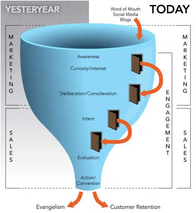
Image Source: Optimizing your sales funnel into a marketing funnel
Do both site and cart abandonment relate to FUDs? Of course not. Nothing is quite that simple when it comes to visitor’s behavior online compared to offline. However, our research has indicated that reducing FUDs throughout the website experience, on average, leads to a 34% increase in conversions and reduction in abandonment rates.
To better understand how to deal with FUDs, let’s break the acronym down:
- “Fears” relate primarily to security and privacy concerns and the overall of site errors;
- “Uncertainties”, on the other hand, relate mostly to the usability of the site. That is to say; the less user-friendly your site is, the more uncertain your visitors become throughout the navigation process;
- As for “Doubts”, they relate mainly to users’ questions and concerns about the product or service they are planning on purchasing.
Causes of FUDs

Image Source: Unsplash
Every visitor experiences some level of friction on a website. The greater the friction, the higher the chances of the user leaving the site.
You’ll find below the elements that could be the main source of FUDs on your website:
- Pop-ups: They are hated by most visitors. However, they are effective. So, our advice on pop-ups is use them sparingly. That is to say, make popups brief and give visitors good reasons and incentives to fill them. Also, you’d better have an excellent plan in hand on how to use the leads you collect from pop-ups.
- Long forms: Companies go to great lengths to get the user to checkout, or to a sign-up on their website. But that once the visitors see that form, they leave. Why? Most of visitors consider long forms to be intrusive especially when the form has too many unnecessary fields. It is crucial then to take a hard look at your forms, minimize the number of fields and determine what you can do for the greater chance of getting people to fill it.
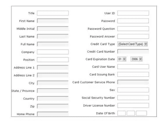
Image source: Invesp
- Non-persistent carts: You do not see it much nowadays, but it happens often enough. Do not lose a visitor who shops around, leaves the site because of some distraction, only to return a few days later to the site and see an empty cart. Giving your visitors the opportunity to find what they have selected before reduces skepticism and FUDs.
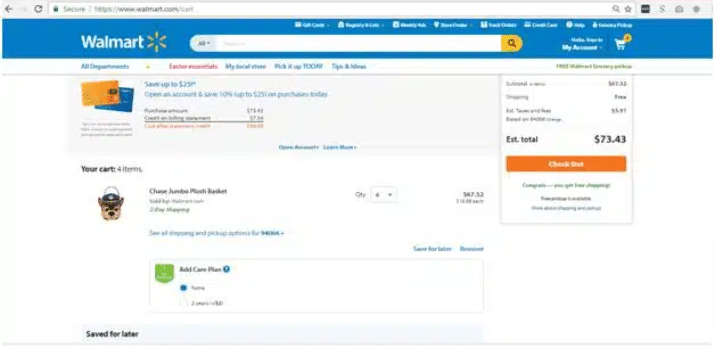
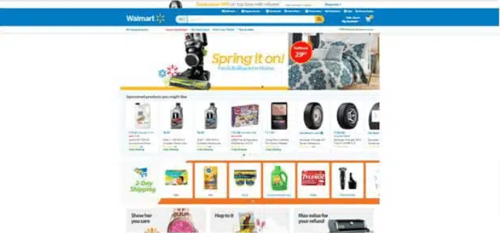
Image source: Walmart
The above screenshots are examples of a persistent cart; I can see the elements I selected previously on my shopping cart which makes it easier for me to add or delete or proceed to check out, I don’t have to go through the process of shopping again which is time saving and does not frustrate the visitors.
- Error messages: This occurs a lot. You go to a form, type in the information needed, but forget a field or two (or enter something wrong). You have made an error, but do you know it? Do you know where you made the mistake on the form? Too many times, a poorly designed system makes it unclear that there is an error and where it occurred. To avoid misinterpretations, Under Armour’s site, for example displays a page with the same design of the site and preserves the top menu and search bar. To help visitors, search tips and contact information are provided, along with an additional search bar.
Image source: Invesp
- Load time: Servers slowing you down? Visitors are not very patient. If your page takes a few more seconds to render, especially on mobile, people will leave your site without hesitation.
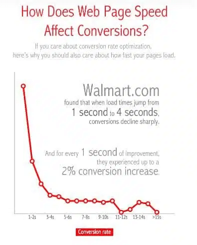
Image source: Web Performance Today
- 404 errors: Make sure your site is inspected daily to confirm that all pages are working properly. Test your contact form or checkout to ensure users will not face unanticipated issues with not working links.
- Unnoticeable CTAs: A well-designed website always clearly indicates the CTA to the visitor. On every page, your CTAs should be clear and prominent. They should make the visitor flow from one page to another seamless.
- Unsecured checkout: With fraud and identity theft on the rise, anything which requires a visitor to enter sensitive information must be secured. Adding security information like the security seal and credit card logos can beat FUDs and make your website a trustworthy one. Another issue to consider here: for checkout or payment purposes, some visitors may find suspicious if your site redirects them to a third party website.
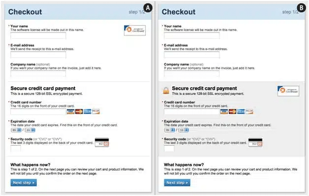
Image source: Baymard
- Mandatory signup at checkout: Visitors love options and the feeling of having control over their choices. Do not force your visitors to sign up to your site. Give them the option of checking out anonymously.
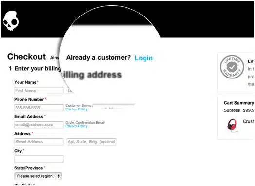
Image Source: kissmetrics
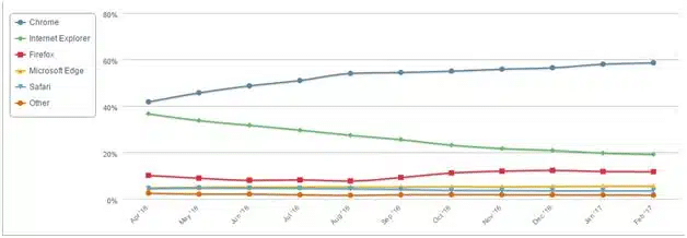
- Browser incompatibility: The data provided by Net Market Share shows that as of February 2017, Google Chrome had 58,53% of the browser market, the share of the Internet Explorer was only 19,27% while only 11.68% use Firefox installed on their devices. So, you should make sure that your site is compatible with the main browser types. To make your website experience flawless, you should also know the preferences of your audience. And the way to do that is through analytics; your analytics provides you with a wealth of information, including the browsers visitors are using to get to your website. Why this is important? Let’s say the audience of your website is mostly 40+ women. Obviously, in most of the cases they will not update their browsers regularly. Even if they use Chrome or Internet Explorer, it will be some old version. This could result in them abandoning your website only because it is not rendered properly on their devices. That’s why you need to check how your design looks on different versions of different browsers. Fixing these problems will for sure decrease the FUDs for your site visitors.
Cognitive Progression and FUDs
When developing or optimizing a website, you can anticipate visitors’ behavior based solely on the price, the investment, and value of the product or service you are offering.
This correlation allows marketers to determine how to reduce certain FUDs right off the bat. This science is called “Cognitive Progression”: predicting a visitor’s expected mental process regarding your product or service.
The importance of cognitive progression is embedded in taking you back to the basics and eventually leads you to making assumptions about the mental process your buyer personas will end up having before converting.
Naturally, visitors at the knowledge stage are considering the perceived risks of buying your product or doing business with your company. At this stage, visitors are curious about the value you are offering. They usually make some conclusions about value of your service or product in few seconds. Depending on that they will leave or stick around your website.
So, if you’ll manage to pre-empt some of the risks by predicting visitors’ primary concerns about price, investment, and value, you automatically reduce the FUDs that the user may experience as a result of your offering. By addressing the buyers’ worries through design and content, you get more conversions.

Price
Price is at the core of your business, however; you should bear in mind that the higher the price is, the greater the FUDs are. In this case, opting for an adequate pricing strategy as well as countering some of the price-related concerns with incentives gives your visitors additional reasons to trust you.
As a matter of fact, for one of our clients we reduced FUDs on cart page and added some trust elements which eventually increased conversion rate by 6.89%.
Investment
Usually, under investment we understand a combination of several factors: time, effort, complexity of decision making process, resources and price. All these factors are considered by the user when buying your product or service. The higher the investment, the greater the FUDs.
You may have a low-price product, but buying this product will involve a lot of people to participate in decision making process and the product will require a lot of resources to maintain it. In this case the investment from the user is anyway high and he will have plenty of FUDs.
A company we assisted with increasing conversion rates was offering a low-price service; however, the service required lots of time and effort from the user. By anticipating through cognitive progression, we concluded that visitors had high FUDs because of inflated checkout process with no to little explanation of the steps. After we optimized checkout process, conversion rates soared.
Value
The higher the value of the product or service, the lower the FUDs.
When something is of a great value as a product or service, and users recognize that value, they overlook many aspects of the website.
Surprisingly, to be valuable for the customer, your product or service may not have any outstanding qualities. It should just function as well as, or a bit better than competitors.
But how your website visitors perceive the value of your product or service? Through the content and usability of your website. If you do not present the right info, with the right usability, the right incentives, the right guarantees, visitors will not stick around your website.
The Bounce Around Effect
The bounce around effect assesses how many of your visitors seem disoriented and unable to locate the page that they are looking for, on a given navigational path on your site.
A typical linear navigational path may include home page, category page, product page, and, finally, checkout. Of course, people do not navigate around your website in a linear fashion. You can, however, expect the majority of visitors to follow general paths, if they find the information they are looking for.
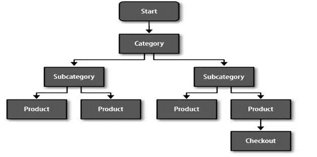
Image Source: Invesp
Users that are impacted by the bounce around effect find themselves going back and forth between pages on the site for a better sense of “what to do next,” and “where to go from here” in nonlinear paths (as displayed in the figure below). Considering this metric can help you determine the reactions of your site users. If visitors get confused, you can be certain their levels of FUDs increase and they will soon abandon the site, likely, never to return.

Usually you can see users bounce around by setting up funnels in analytics. For instance, it may be the case that 40% of your website visitors suddenly go back to cart page and then only 20% goes again to checkout? What is the reason for that? Maybe your checkout doesn’t have a proper order summary and they have to go to cart again to make sure that they ordered the right products.
FUDs as a Marketing Strategy
Everything we have discussed has centered around countering FUDs because they lead to visitors’ abandonment of the site. However, sometimes FUDs can also be used to push visitors to make a certain decision.
For example, a company that sells scuba equipment offered their top gear at $130 while a generic competitor gear was also sold at their location but for a tremendously lower price of $30. How could the company persuade a visitor that, although the $30 had passed all the safety regulations, the $130 was still a better option? Well, the number of accidents that had happened with the $30 gear was a bit higher, so the company used this information for their advantage and created a marketing campaign from it.
The campaign’s concept centered on the dollar amount of the visitor’s life, $30 or 1$30? Now, this creates a lot of anxiety and fear for the visitor, but it is the fear and anxiety the company needed to get more people to purchase their in-house $130 product.
Political campaigns also use FUDs to discredit their opponents. Watching some of the political ads, you can come to the conclusion that the opposing candidate is the scum of earth because of all the negative messaging and fears these ads carry. By making you fear the opponent, they are hoping to gain you as a voter.
Ultimately, FUDs are a double-edged sword. You have an ethical responsibility to present your visitor with honest information. Certainly, reducing FUDs from your site with the information in this chapter will help you gain a significant advantage over competitors as well as decrease the risk of losing potential converters in the future.

