Ecommerce conversion rate optimization is both an art and a science, and the difference between a site that merely attracts visitors and one that effectively converts them.
It’s no secret that optimizing your store for conversions is integral to a successful business. It’s one of the few aspects of ecommerce that matters.
It’s also no secret that ecommerce conversion optimization is often a science more so than an art. To achieve the best results, you must follow best practice techniques proven to work.
In this post, we’ll walk you through the ecommerce conversion rate optimization process and discover the strategies that work.
The Ecommerce Conversion Rate Optimization Process:
Conversion rate optimization involves increasing the number of visitors that convert into customers or decreasing the rate at which they leave.
It’s a valuable process for any business, but it’s essential for ecommerce companies since they rely on conversions to make money.
You can break down the conversion rate optimization process into the following five steps:
Step #1 Setting Clear Goals:
The first step in the conversion rate optimization process is to set clear goals. Goals should be specific, measurable, and time-bound.
- Specific: Define your goal precisely and clearly. It should have a particular target of visitors, conversion rate, or number of signups. For example, if you want to increase sales leads from your website, you need to define how many leads you want to generate each month and the target conversion rate for them (how many will convert into sales).
- Measurable: A goal should be measurable, making it easy to track and evaluate.
- Time-bound: Make sure your goal has a deadline for completion. Otherwise, it becomes difficult to evaluate the effectiveness of your efforts toward achieving it.
Step #2 Analyzing Data:
The next step in the conversion rate optimization process is to analyze your data.
This means closely examining all your website’s metrics to see what’s working, what isn’t, and why.
To begin with, you can use tools like Google Analytics 4 to gather quantitative data on user behavior.
To dig deeper and get a firsthand glimpse of user behavior, you can turn to heatmap and session replay tools like FigPii. Such tools show how users engage with your site, how far they scroll, and which elements aren’t working as they should.
The key is to look for patterns in the data that can help you make decisions about your website and marketing efforts.
Step #3 Identifying Problems:
The next step in the conversion rate optimization process is identifying the problems. You can do this by looking at your website analytics and finding out areas with low conversion rates.
For example, if your website has a high bounce rate or low time spent on site, there may be issues with your website design or landing page copywriting. You can also look at user feedback and complaints on social media sites like Twitter and Facebook.
Once you have identified the problem areas, you must find ways to fix them. For example, if many people are leaving your site after navigating to only one page, it’s because they need to see what they came for immediately upon arrival. The solution here might be to ensure that essential links appear first on each page or section of your site so visitors can experience them when surfing around.
Step #4 Testing Hypotheses:
You’ve identified the problem, and it’s time to test your hypothesis.
The first step in testing your hypothesis is to ensure it’s valid. If it isn’t, you’ll waste valuable time on a test that won’t help you improve anything.
There are two ways to test for validity:
- Is it logical? Does your hypothesis make sense? Does it address the problem at hand?
- Is there data to support it? If not, there’s no reason to proceed with the test.
Once you’re sure about the validity of your hypothesis, use these methods to test it:
- A/B Testing (or Split Testing): This is when you compare two versions of a webpage to see which one gets better results. Commonly used by e-commerce sites, A/B tests are simple and easy to set up with tools like Optimizely or FigPii.
- Multivariate Testing: If you want to test more than two variations of a page or website design element, multivariate testing can help. This involves creating multiple versions of a component, such as an image or banner ad, and showing them all at once to different groups of people. The winners are then shown together on one page or ad campaign.
- Surveys: Surveys are great for getting qualitative data from real customers about their experience with a product or service to improve it based on their feedback. You can conduct surveys through email campaigns or by embedding them on your website.
Step #5 Implementing Changes:
The last step in the conversion rate optimization process is to implement the changes you’ve made.
This can be a simple or complex task, depending on the amount of testing and changes you’ve made.
It’s important to test after implementing each change to know what worked. Otherwise, you won’t know what to do next.
The Conversion Rate Optimization Strategies for Ecommerce Success
1. Create a clear and compelling value proposition
The first step towards achieving success with conversion rate optimization is creating a clear and compelling value proposition that will resonate with your target audience.
Your value proposition should be based on one or two important key benefits to your target customers.
Here are some key characteristics of a winning value proposition:
- Clarity and Simplicity: Ensure the message is easily understood and succinctly communicates the core benefit.
- Relevance to Customer Needs: Address your target audience’s pain points or desires.
- Uniqueness and Differentiation: Highlight what sets your brand apart from competitors.
- Emotional Appeal: Connect emotionally, invoking feelings or aspirations that resonate with customers.
Take Chewy’s value proposition, for instance.
Chewy specializes in pet products and has built a reputation for offering a vast selection of pet products in one place. Their value proposition, “Everything your on-the-go dog needs from food to gear,” reflects this.
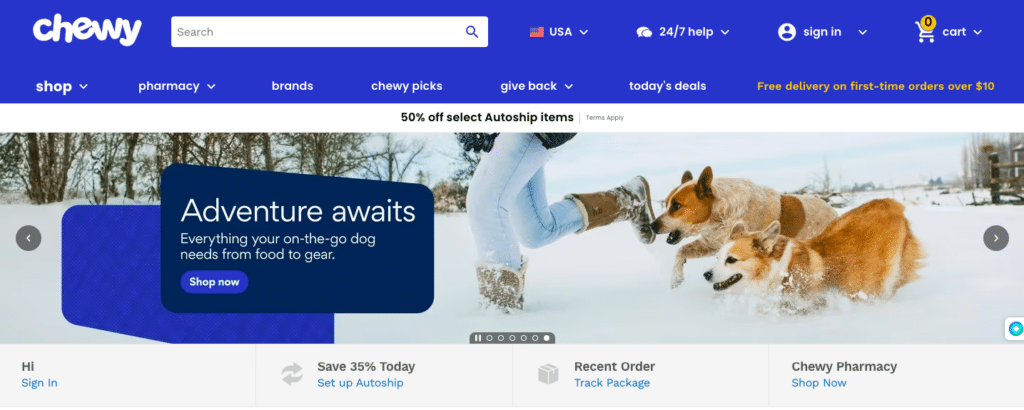
Firstly, their value proposition communicates the comprehensive nature of their offerings and the convenience of shopping with them. It’s clear and succinct – their website visitors will immediately know what they can expect from the brand and what makes them stand out.
They combine it with suitable visuals. Chewy’s hero image features happy pets and their owners, creating a sense of community among pet lovers and depicting the joy and satisfaction their pets find in Chewy’s products.
Pro Tip: Test different versions of your value proposition by showing different versions to different people and see which ones are more attractive.
2. Streamlined checkout process
The checkout process is one of the most important moments for conversion optimization. The last thing you want is for your customers to abandon the purchase at this stage.
A streamlined checkout process helps your customers complete their purchases without any hurdles or errors. It can increase your conversion rate and boost your sales.
Here are some of the best ways to increase your conversion rate through streamlined checkouts:
- Remove distractions and reduce clutter from your shopping cart page.
- Provide easy navigation through related, cross-selling, and up-selling products to create a smooth flow from the product page to the checkout page.
- Add social proof elements such as reviews, testimonials, expert ratings, etc., to make your site trustworthy and reliable for your visitors.
- Make it easy for customers to choose their preferred payment method with multiple options like PayPal, credit card, debit card, gift card, etc.
- Keep the registration form short and simple by asking for only the necessary details, such as username/email address/password, etc.
Amazon is an absolute winner in providing its customers with a streamlined, hassle-free checkout process.
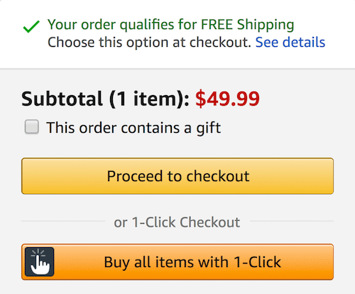
For instance, Amazon’s patented “1-Click” ordering allows registered users to purchase with a single click, eliminating the need to re-enter shipping and payment information.
3. Optimize your site for mobile devices
According to Statista, global mobile internet traffic accounted for over half of all internet traffic in recent years. This number continues to increase and will reach 5.1 billion users by 2028.

Google also prioritizes mobile-optimized websites in its search rankings. This proves the apparent prevalence of mobile usage.
The shift from traditional TV to mobile streaming platforms like Netflix mirrors the changing consumer behavior towards preferring convenient, on-the-go experiences.
To ensure that you are getting the most out of your ecommerce efforts, it’s more important than ever to optimize websites for mobile devices.
Here are some tips to help you optimize your mobile sites:
- Use concise, scannable content and larger fonts for easy readability on smaller screens.
- Use a responsive design template that allows users to easily view content across various screen sizes and orientations (for example, making sure buttons don’t get cut off when viewed on a smartphone).
- Test different color schemes that work well with various devices (for example, using primary colors on black backgrounds works well on desktop computers but not as much on smartphones).
- Use prominent and easily clickable CTAs, ensuring they are well-spaced and easily accessible.
- Avoid intrusive pop-ups that obstruct content to provide a seamless browsing experience.
- Simplify menus and navigation to make it intuitive and easy for users to find what they want.
- Minimize form fields and use autofill options to reduce typing on smaller screens.
4. Improve your website performance (speed, security)
Having a fast website is essential for conversion rate optimization. Slow websites frustrate users and drive them away from your site.
In fact, one study revealed that 53% of online shoppers will abandon your site if it takes more than three seconds to load.
If you’re looking to improve your website’s speed, consider the following tips:
- Optimize images: Large images can slow down your website. Image compression tools can reduce the size of your images without compromising on quality.
- Minimize HTTP requests: Each element on your website requires an HTTP request. By minimizing the number of elements on your website, you can reduce the number of requests.
- Use a content delivery network (CDN): A CDN can help reduce your website’s load time by caching its content on servers located closer to users.
- Minimize the use of plugins: Plugins can slow down your website. You can minimize their use by only using essential plugins.
Security is another important factor affecting your website’s performance – and it’s not just about protecting data from cyber-attacks.
Companies that don’t consider security as part of their SEO strategy risk losing customers when they suffer a cyber attack or get hacked by malicious hackers who target their site via an exploit in their code or vulnerabilities in third-party plugins or extensions.
5. Improve your site’s navigation
Navigation is an essential part of any website. It allows users to navigate and find the content they need.
To begin with, make sure your navigation is clear and simple.
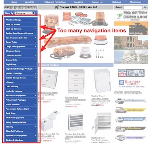
One of the biggest mistakes that ecommerce sites make is creating overly complicated menus.
It’s tempting to cram as many options as possible into each menu item, but this makes things more confusing for your visitors. If they have trouble finding what they’re looking for, it’s unlikely that they’ll hang around long enough to buy anything from you.
Here’s an example of a website cramped with too many navigation items:
In contrast, here’s an example of a clear, concise, and effective website navigation menu:
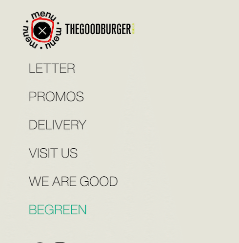
Well-designed navigation will help your users navigate different website sections and increase their satisfaction.
If you want to increase your conversion rates, start by making sure that:
- Make categories clear and easy to find. If there are too many categories or poorly organized, users will have trouble finding what they want — no matter how well-designed your navigation menu is.
- You have an “About” or “Our Story” section with a brief description of who you are and what you do – this gives visitors a chance to get to know more about you before buying from you.
- Ensure there are no broken links on your site – this will lead to confusion and frustration among visitors.
- Use breadcrumbs (a list of links at the top or bottom of a page) so visitors can see where they are and how they got there.

6. Optimize your product pages
Optimizing your product pages is one of the most important steps in your conversion rate optimization strategy. It’s a great place to start because it’s where you can make the biggest impact on your overall conversion rate.
The more information you can provide about each product, the better your chance of converting a visitor into a customer.
For example, if you’re selling shirts, make sure each shirt has its own page and product description. This gives people more insight into what they’re buying and more information about the brand behind the product.
Aside from detailed product descriptions, don’t forget to highlight every angle of your product using high-quality images. Get professional photos of your products to look their best when viewed online by customers.
Here are some more tips to help you create high-converting product pages:
- Use social proof (i.e., testimonials)
- Include reviews and ratings in the description
- Create a sense of urgency with limited-time offers or sales events
- Create a clear call to action (CTA)
- Test different layouts
Aloha, the shoe retailer, has truly mastered the art of user-centric product pages. Their attention to detail is evident when you land on their product page.
Each product listing offers a detailed description of sizes, fit, colors, material, composition, and more.
They further showcase their products using high-quality images – with every angle and detail of the shoe captured.
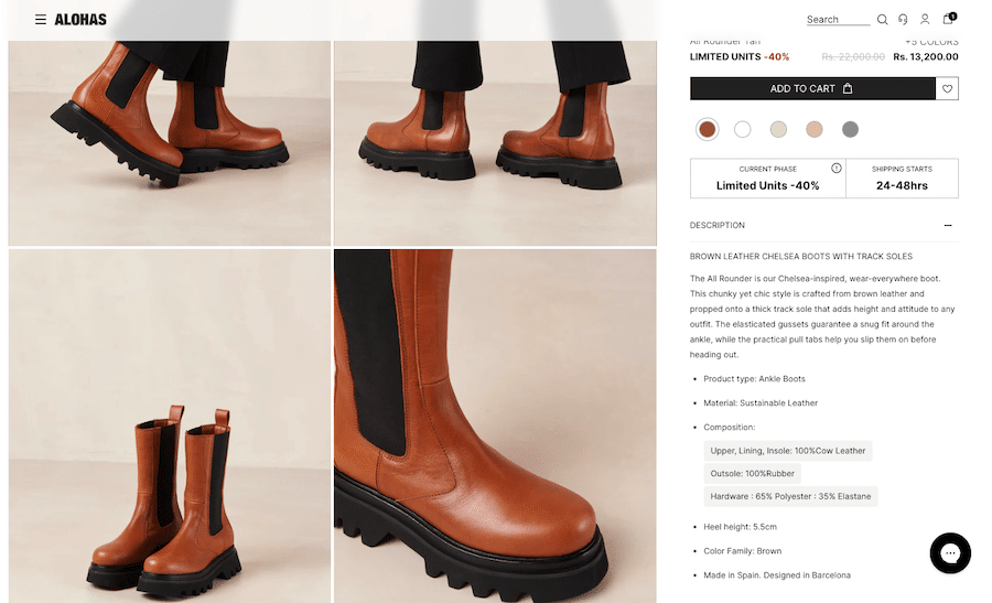
What truly sets Aloha apart is its inclusion of product reviews on the product page.
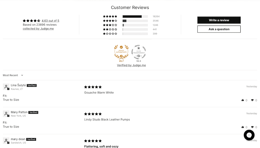
As you scroll down, these customer reviews serve as social proof, enhancing trust and confidence in the product.
7. Provide stellar customer support
The customer is at the center of your business. They’re the reason you exist, and they’re the reason you make money. If you want to build a successful ecommerce business, you must keep them in mind every step of the way.
One of the best ways to do this is by providing stellar customer support.
The first step is to make it easy for new customers to find the answers they need by adding a knowledge base or FAQs page. Include detailed descriptions of your products, along with tips on using or caring for them. You can also offer additional tips and advice on how best to style each item or what colors go well together.
In addition, make sure customers have an easy way to contact you if they need help. You can create a contact form on your website or even set up an email address specifically for customer inquiries.
If possible, invest in a live chat platform where you can talk directly with buyers about their needs. Live chat makes it easy for customers to get answers quickly without waiting for shipping time and return postage costs.
Over to You!
Conversion rate optimization considers the customer experience as a whole. Effective CRO is about knowing what works best to achieve conversion goals.
It can be tempting to throw money at the problem and latch on to the next shiny object promising better conversion results, but this approach is not likely to produce the best long-term outcome.
A more reliable solution is to sit down with your team and well-defined goals and develop a strategy for improvement that works with what is already in place. With some careful planning and thoughtful execution, you’re much more likely to see success in your conversion rates.
Additionally, you can give your customers what they want by testing A/B variations and making incremental adjustments.

