Khalid recently wrote a post on why most case studies suck. Well, it wasn’t actually that case studies that suck, but rather that the AB experiments conducted within these case studies are simply not valid. We also had an interesting discussion about in the Invesp linkedin and the Invesp facebook pages and tweeted about it as well.
The point of this long week debate came down to: process, process, process.

If you follow a sound CRO process and are careful about missteps when it comes to AB testing, you can achieve amazing results and have a successful program.
But for most companies, this is simply too hard.
Now there are some “easy” processes that you can follow to improve your site, but I’m at a point where I can say with confidence: experimentation and testing is best left to the experts.
Most people end up cutting corners, others end up claiming to reach a $97 million dollar in revenue although they have major flaws in their experiments. The process ends up becomes a footnote and not following specific AB testing guidelines is no problem.
Well, in this case study, I will walk you through our process as well as explain the results to close out our weeklong debate with a solid AB experiment and case study.

Company Background
Founded in 1902, this billion dollar retailer is one of the largest general merchandising retailers in the USA. This retailer sells products through their over 1,802 stores, or online through their digital properties. The focus of this test was on their online photo store.
Problem Description
Although the client had an extremely high volume of visitors to their online photo store, the conversion rate left much to be desired. Because this was a well-known retailer their average conversion rate was over 22% of over 1,000,000 visits. The average order value, however, was just $8.48 because digital prints do not cost much. There were two ways to complete the checkout process: ship to home or ship to store. For our client, shipping the prints to customer’s home was more costly.
We did a number of evaluations on their site, both qualitative and quantitative. We polled visitors and conducted a usability study to monitor their flow.
There were different paths that we identified on the site:
- Visitors that arrived through homepage but razor-sharp focused to purchase prints
- Visitors that arrived through homepage because of brand/store
- Visitors that arrived at a product detail page through an optimized keyword, and just purchased that particular product (if anything at all)
- Visitors who browsed multiple products, but were most likely not to buy anything at all.
The low AOV was indicative of the fact that visitors did not purchase or visit the breadth of products beyond digital prints. The way the company had positioned itself, however, was a quick digital shop, and not a personalized photo product shop.
Our objective was to increase AOV and conversion rates by:
- Showing more variety of products starting on the homepage
- Showing visitors how easy it is to place an order for digital prints
- Displaying offers/discounts more prominently
- Emphasizing the store’s value proposition to promote the wide breadth of customizable photo products offered
Hypothesis
By rearranging elements to enhance the value proposition and feature more products, you will increase average order value and conversions.
So, for this particular test, all other elements were simply rearranged to highlight the variety they offered.
The A/B test
The test was a bit challenging and went through three iterations. I’ll explain why we didn’t give up on this below.
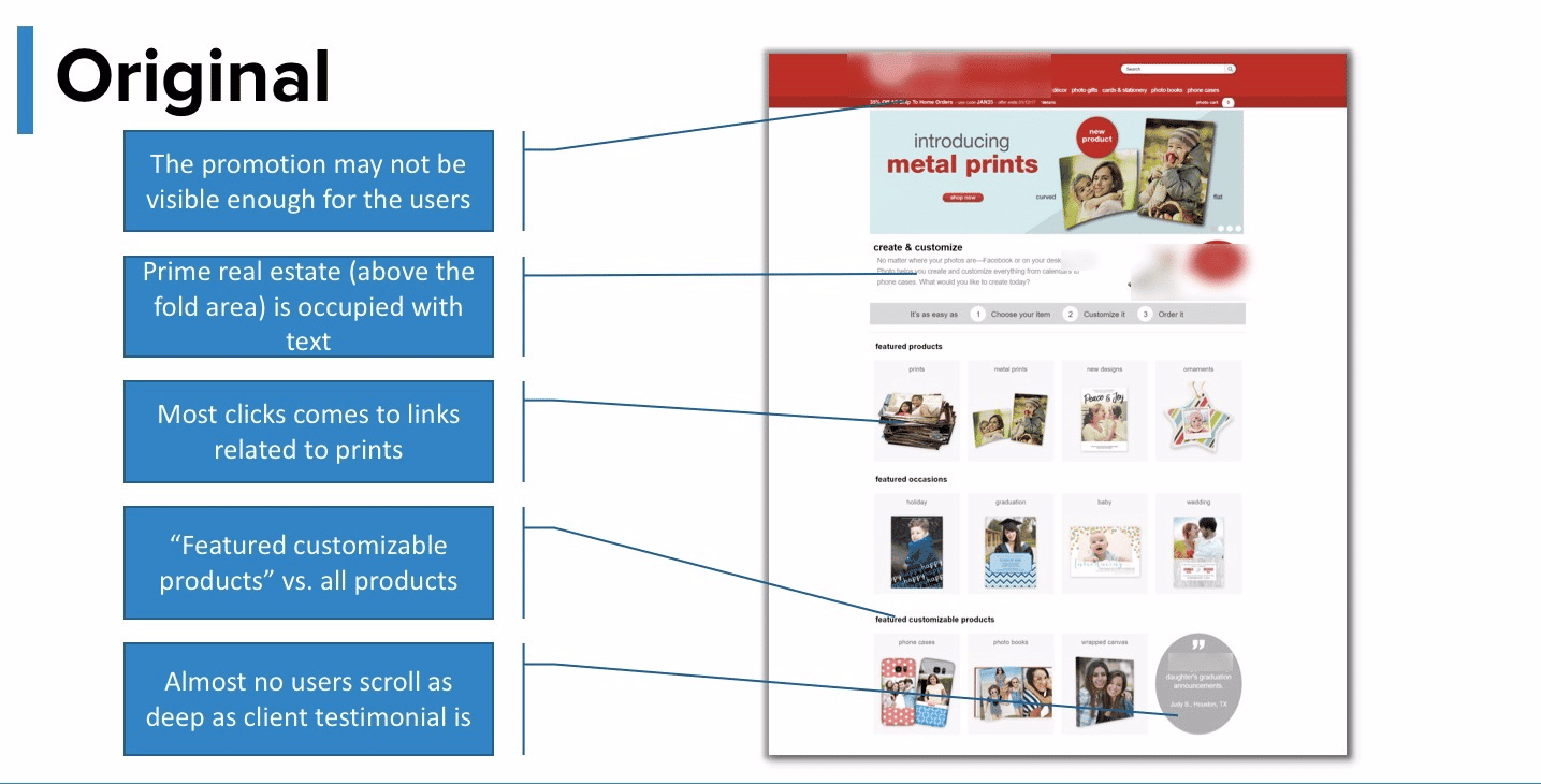
The variants (challengers)
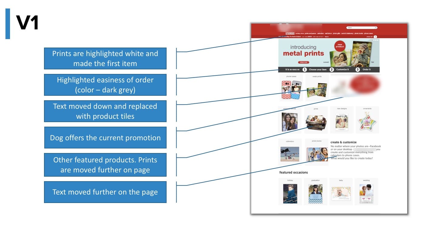
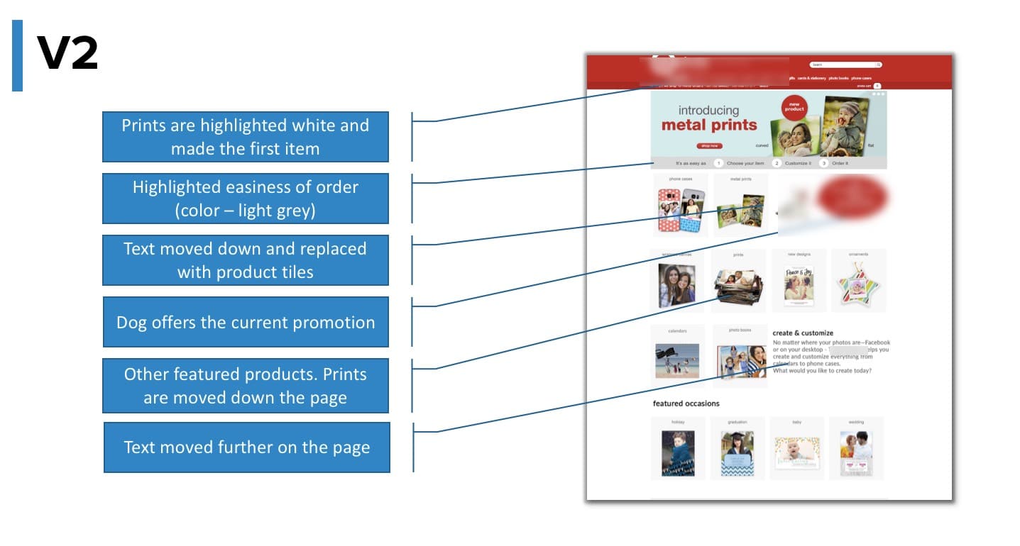
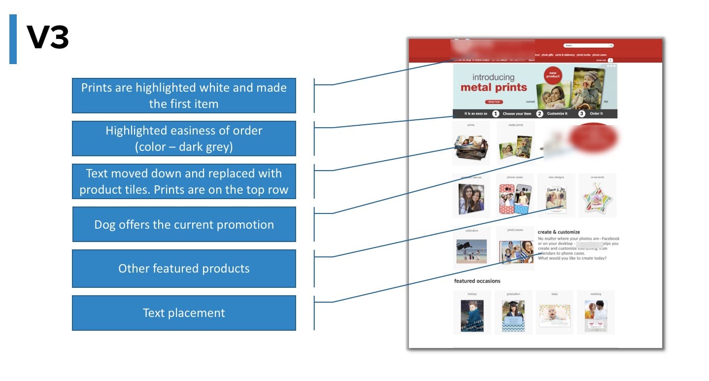
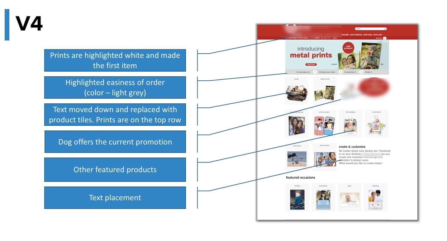
A/B test results
The first launch, the test ran for 11 days. The results were pretty inconclusive, with low significance levels:
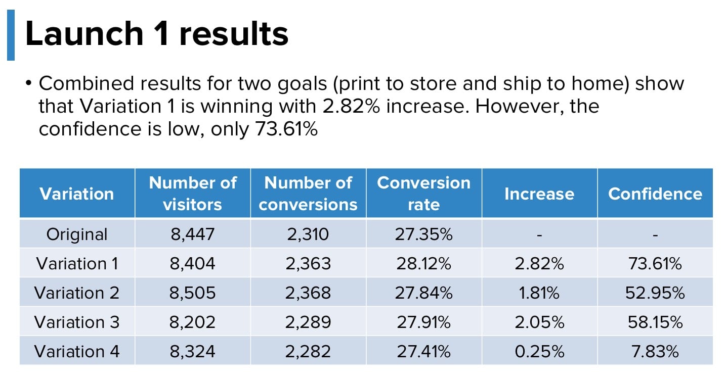
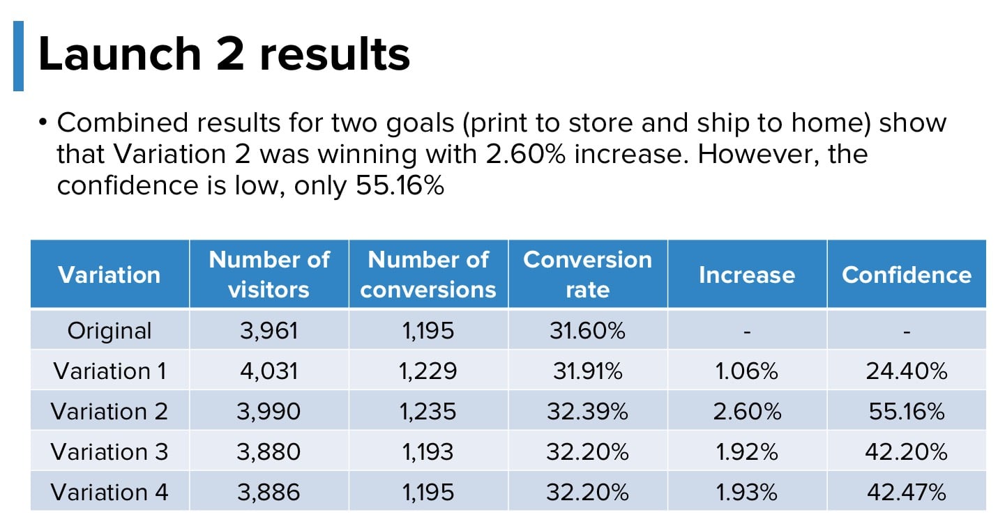
We decided to make a final iteration and launched the test for the 3rd and final time. Again, the changes were trying to address and solve a specific problem. When the impact was so little for the first A/B test, we went back to investigate why. With the second launch, the impact was even lower. The third AB test was our final attempt to see whether or not our hypothesis was even valid because otherwise, we would needed to determine a different hypothesis and solution for the test.
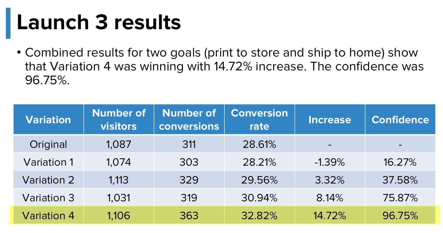
We finally reached results that made sense, had a high significance level and were validated through sample size.
Post-test analysis
Although first two iterations of the AB test were inconclusive, they showed that the changes we were making were slowly moving us towards an increase in conversions albeit with very little confidence. Another side effect of running the test was that the number of visitors navigating to the specialty photo products increased over 30%. The website overall average order value jumped to $10.50.
But why didn’t we give up on the test? Ultimately, we had identified a strong problem on the page. That is what drove us to iterate and find a better solution to that problem. Secondly, we saw small incremental increases, which showed us that the solutions were performing better, but still not at the level that we could conclude and required further improvements.
With the final iterations, the page was simpler and cleaner than it had ever been.
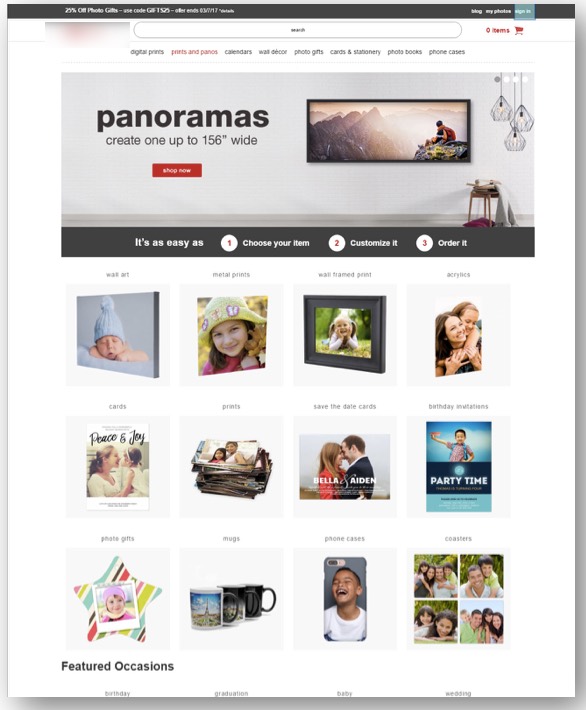
We succeeded in changing the overall value proposition and propagated it throughout the site in different ways. What was key in this test is we recognized a problem on the site, so what was critical was to change and iterate accordingly to the results with the best possible, most updated solution

