What role do images play in your conversion rate?
The quickest way to find the answer might be to check AB test results from around the web. But when you do, you find that it’s not an easy answer at all. If you search long enough, you’re likely to find as many results showing conversion rate reductions as those that show increases.
The other option is to run AB or multivariate tests yourself and see what works. But that’ll take a few weeks or months. And you’ll have to test every image you use. So you’re not likely to have an answer before the end of the year – or decade.
Here’s a quick and easy way to get an idea of the influence images exert on your conversion rates:
Imagine your website without images.
Now think about how that would affect your conversion rates.
Starting to get the picture? While it’s difficult to determine the exact effect of any particular image on conversion rates without specific testing, suffice to say that the vast majority of sites would have fewer conversions and lower rates if they had no images.
The cool thing is, if your starting point is no images, just about any image will do. Any picture that’s at least mildly relative to your message, not offensive, and properly laid out, will help break-up other content and make the whole page more appealing. If it’s a product page, any competent image of your product is better than none.
But this is about conversion rate optimization. And it won’t do to use images that merely “will do”.
Considering that CRO begins and ends with a focus on your customer – by making them feel at ease, highlighting your value proposition and offering the solution they seek – then your images should do the same.
To Every Image a Purpose
Every image on your site must have a role to play in your conversion path. If any of them don’t help your customers move along that path, replace them with ones that do.
Unfortunately, suitability for a purpose is just the start. A great way to get from New York to Pittsburgh is by car, so it’s clearly suitable for the purpose: to help you move along the path to Pittsburgh. But cars are not optimized for speed, cost or comfort, and other transportation modes do better on all fronts. Yet people will still use a car because of convenience.
Taking the ‘convenient’ way out with your website or landing page images, by merely making them serve a purpose, will not optimize your conversions.
Apparel manufacturers, distributors and retailers understand the importance of images better than most. But a random sampling of leading apparel sites shows the full range of conversion-oriented imagery, from using the most convenient, to taking every opportunity to address customers’ concerns and giving them as much information as possible towards making a conversion.
Each of the images below serve a purpose, but each one should help boost conversion rates more than the one before.
1. Most Convenient = Least Conversions?
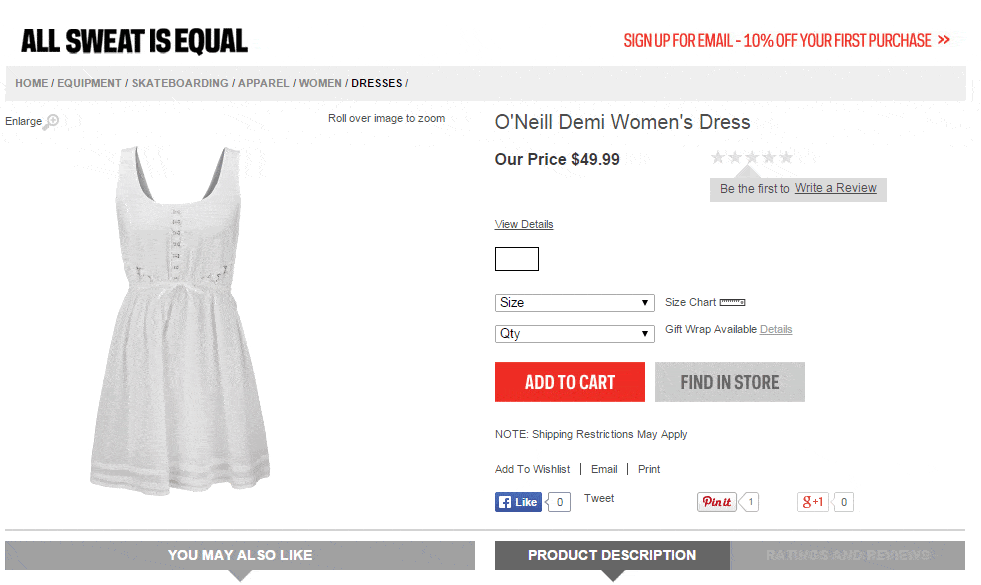
Sport Chek is the largest Canadian retailer of sports apparel and equipment. The Sport Chek product page below is like a textbook on conventional CRO best practices. It has a clear call-to-action, nifty cross-selling options, social-sharing links and a 10% Off incentive to surrender your email address. Boffo.
But can you imagine a less inspiring product shot?
2. Turning it Up a Notch
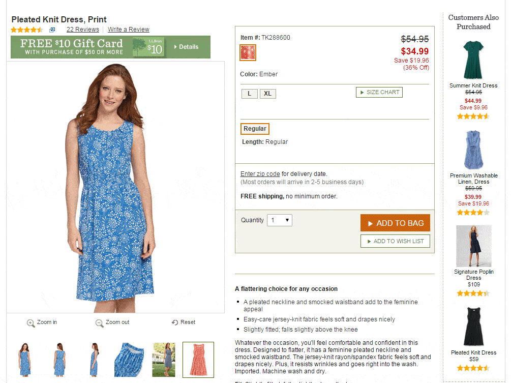
LL Bean takes their apparel images to the next level by actually putting a human being in the outfit. Even better, they offer shots from different angles so the customer has a clearer understanding of the overall look, which can only help them take the next step toward conversion.
3. Put it in the Real World
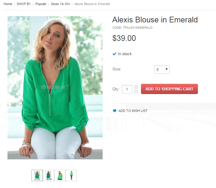
Australian women’s apparel retailer St Frock takes us further down the conversion path by placing the product in a realistic setting that helps convey more product personality and how it looks “in situ”.
4. Put it On Your Customer
The biggest difference between selling apparel online and in-store is the latter offers the customer the opportunity to wear the outfits and see how they look in a mirror. But even then the customer can’t know what the outfit will look like, feel like or how it behaves on the street. Online retailers have an opportunity to help the customer make that leap that stores don’t.
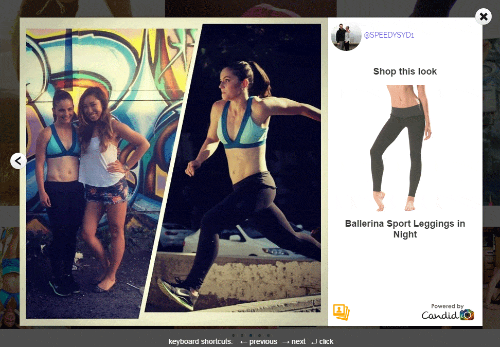
Bodypop.com offers product page imagery similar to the retailers listed above, but take a look at what customers get as a lead-in to the product page. Real people, wearing the apparel in real situations.
Bonus Benefit Alert: Not only do customer generated images like those used by Bodypop cost the company a fraction of what they would pay pro models, photographers and location scouts for similar images, they generate customer engagement, social proof and search engine optimization benefits.
When Your Product Isn’t Pretty
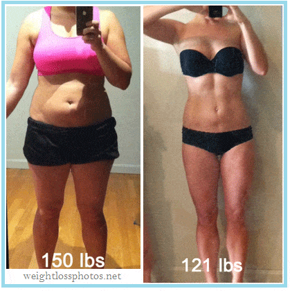
Anyone who feels the need to lose weight knows that it’s not easy. And looking at typical “before and after” weight-loss images can be just as difficult. Aside from figuring out which shots have been photoshopped, even the better looking ‘afters’ are not easy to look at because you have a hard time believing you can get such dramatic results.
It all brings into question the effectiveness of the standard before/after shot. Considering they are almost universally used on weight loss sites, you would think they are the ultimate conversion tool.
But do they do everything possible to help the customer understand the full benefit of the product and optimize conversions?
Don’t think so. So how do you improve on something that is so standard and so widely accepted that it’s difficult to imagine any other approach?
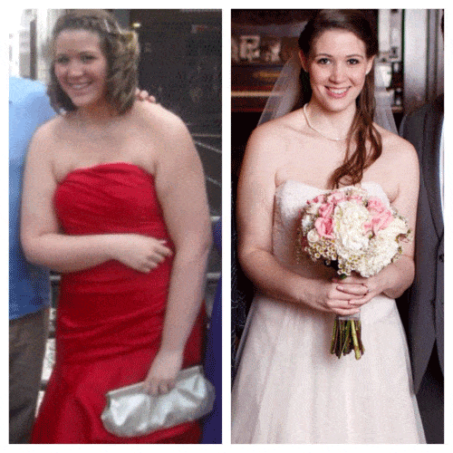
Think of the customer, think of her concerns and what will move her down the conversion path. What does she truly seek along the way? To lose weight? To have a bikini body?
Or to stop being the bridesmaid and be the bride?
Conversion optimization is more than calls-to-action, trust symbols, AB testing, etc.. It should be the sole focus of your website. It should exist in every image you choose. It should be everything you do as a business.
Source:
getcandid.com


