Too many e-commerce pages try to present too much information to the visitor without thinking of the appropriate placement, visitor eye flow and the visitors’ cognitive progression.
As a result, you end up with e-commerce product pages that have all the information the visitors need;but difficult to use because the information is unorganized. Conversion optimization is about anticipating the information that the visitor needs, and presenting that information to the visitor at the right time and in the correct placement and location.
This case study demonstrates how presenting information at the right time and the right location, as well as removing distractions,will result in more conversions. We have discussed other case studies where designing for cognitive progression increased conversion rates by 90%.
1. The company & Background
Established in 1999, our client was a major affiliate website that specialized in selling college textbooks. The website visitors represented two unique segments:
- College students who are looking for text books for a specific class which they are attending.
- Parents of college students who are looking to buy books for their children who are attending college.
While the two segments come to the website to essentially complete the same task, they behave differently. One of the most striking differences between the two segments is their use of technology and how price conscious they are.
Since our client operated an affiliate website, one of the main goals of their website layout and functionality was to drive visitors to college textbook retailers which paid the highest affiliate commission.
The product listings page of the website offered visitors the ability to compare prices for the same textbook from 30 to 50 different online bookstores. Since some of these bookstores paid higher affiliate commissions, our client used a “featured bookstore” widget in a prominent location on the page to display the prices from these higher paying websites (advertisers).
The challenge is that some of these ecommerce websites, while paying higher commissions, they did not offer the best prices on the book.
Since the website is an affiliate website, conversion does not take place on the website itself. When the visitor likes a book and clicks on the “Buy it Now” button, he is directed to the e-commerce website. There is nothing unique about this. Affiliates are at the mercy of the advertiser website and can only hope that the checkout process on the advertiser website works well.
For the purposes of this test, we considered a click from the affiliate website to the advertiser website (click-through) as a conversion.
2. Test hypothesis
Offering visitors a clear and easy way to buy the products with the lowest price will increase the website conversion rate.
3. Original design vs. challengers
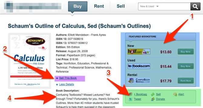
This image shows the original design of the product page:

Both qualitative and quantitative research conducted by Invesp indicated that the page suffered from 4 main problems:
- The featured bookstore widget confused visitors since some of the stores listed did not have the lowest price on a book.
- Asking the visitor who is ready to make a purchase about“selling a copy” of his book, caused confusion and cluttered the page
- Both analytics and heatmap data showed that visitors did not use the social share icons on the page.
- Qualitative research conducted by Invesp (focus group and one on one interviews) reflected that visitors were presented with too many competing product details. The most striking piece of information which visitors did not bother with was the product description. Visitors where relying on the ISBN number to identify if the book they are looking at is the correct one or not. Visitors are not reading these books for pleasure. They are buying them because they are a mandatory assignment for the class.
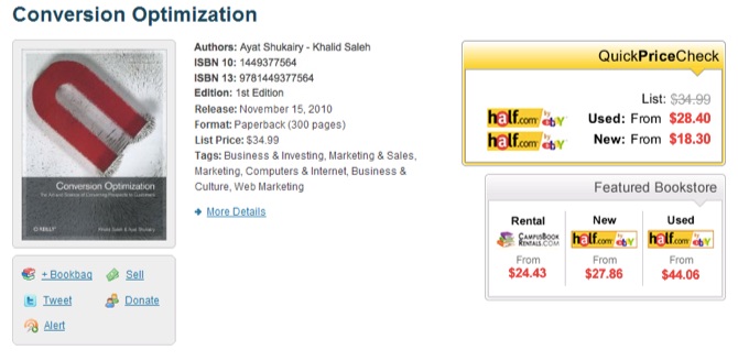
Having identified the top 4 problems on the page, the team produced the following designs to resolve the above problems.
Design challenger 1

The new design addressed each of the above 4 problems as follows:
- The featured bookstore widget remained constant, since it represented a significant revenue stream for the client, but introduced a new “Quick Price Check” widget which displayed the lowest prices for the book.
- Removed the “sell your book” from the buy page
- Changed the location of the social share icons so they are in a close proximity to the page main CTAs
- Did not display the product description on the page by default and instead allowed visitors to access the description by clicking on an HTML option which expanded to show display the text.
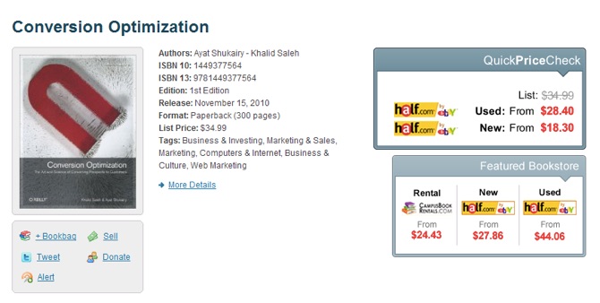
Design Challenger 2

The 2nd challenger was similar in design to first challenger however it used a different color for the “Quick Price Check” widget
4. Results
The test ran for a period of 3 weeks. Design1 won reporting 15.3% increase in conversions with a 98.8 confidence.
5. Marketing Insights
Whenever we conduct an AB or MVT test for our clients, the most important part besides the uplift for our client, are the actual learnings we gain from the test. The lessons from this test told us:
- Visitors to this site are price conscious, and need an easy way to filter and find the best prices.
- Visitors to this website are already familiar with the product they need, and do not need additional information that will only clutter and take prime real estate from the top portion of the page.
- Displaying secondary CTAs above the fold is distracting and causes FUDs in the visitor.
- Any element that is not conducive to conversion, should be removed from above the fold on the page.


