Breadcrumbs Navigation!
Imagine them as the trusty Google maps for websites, guiding your visitors through the digital maze and ensuring they never feel lost.
Within this article, we shall delve deep into breadcrumbs navigation. You will know —what they are, their necessity for every website, the various types found in the virtual realm, the advantages they bring to your site, and the golden rules for their seamless implementation.
So, without further ado, let’s embark on this enlightening journey together!
What is Breadcrumb Navigation?
Breadcrumb navigation is a type of navigational aid commonly used on websites to provide users with a hierarchical trail of links, displaying their current location within the website’s structure.
It offers a clear and intuitive way for users to understand where they are in relation to the homepage and easily navigate back to previous pages or sections.
Imagine you are exploring an online clothing store. You browse the homepage and then navigate to the “Men’s Clothing” category. From there, you select the brand filter and select a brand, and then move to choosing a particular product from that brand.
The breadcrumb navigation would appear at the top of the page and display a trail of links, such as:

Home > Men > A To Z Of Brands > Brand Name > Brand Product
In this example, the breadcrumb trail indicates that you’re viewing a specific style within the “hoodie” category. By clicking on any of the links in the breadcrumb trail, you can easily jump back to the corresponding page.
Typically, breadcrumb navigation appears at the top of a page, just below the header or main navigation menu. It is often displayed horizontally, with each link in the trail separated by a delimiter, such as a greater-than symbol (>), a forward slash (/), or an arrow. The horizontal layout ensures that the breadcrumb trail doesn’t take up excessive vertical space, allowing users to focus on the page content while having easy access to navigate backward if needed.
Does Every Website Need Breadcrumbs?
The decision to implement breadcrumb navigation on a website depends on various factors.
While breadcrumb navigation can benefit many websites, it may not be necessary or suitable for every situation.
Let’s explore the factors to consider when implementing breadcrumb navigation.
1. Website Structure:
Breadcrumb navigation is particularly relevant for websites with complex hierarchical structures. If your website has multiple levels of categories, subcategories, or sections, breadcrumb navigation can help users navigate through these layers more easily. It provides a visual representation of the website’s structure and aids in maintaining a sense of context.
2. Depth of Content:
Websites with deep content hierarchies can greatly benefit from breadcrumb navigation. When users need to traverse through numerous levels of content to reach their desired destination, breadcrumbs offer a convenient way to retrace their steps and navigate back to higher-level pages. This is especially valuable for e-commerce websites with extensive product categorization, news websites with multiple sections and sub-sections, or educational portals with diverse courses and modules.
3. User Tasks and Goals:
Consider the typical tasks and goals of your website visitors. If users often need to backtrack or explore different sections while accomplishing their objectives, breadcrumb navigation can enhance their experience. It provides a quick and intuitive means of navigation, enabling users to maintain their bearings and easily switch between different levels of the website.
Despite the benefits of breadcrumb navigation, there are instances where its implementation may not be necessary or appropriate:
1. Simple Navigation Structures:
If your website has a straightforward and shallow structure with few content levels, breadcrumb navigation might be redundant. In such cases, a clear and concise primary navigation menu or a back button may be sufficient to guide users through the website.
2. Single-Page Websites:
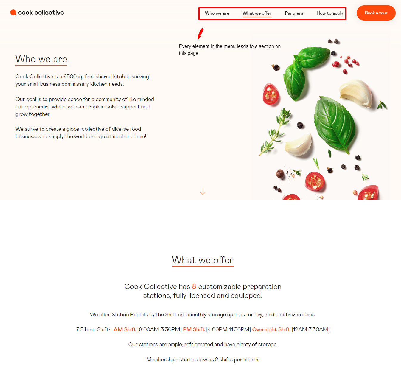
Breadcrumb navigation is typically not required for single-page websites where all the content is presented on a single page. Breadcrumb trails are unnecessary in this context since navigating between different pages or sections is unnecessary.
See this example from CookCollective;
3. Limited Screen Space:
On websites with limited screen space, such as mobile or responsive designs, implementing breadcrumb navigation may not be feasible or cause clutter. In these cases, it is essential to prioritize essential elements and consider alternative navigation solutions.
Types of Breadcrumbs for Websites
Breadcrumb navigation comes in various types, each serving a specific purpose in website design.
1. Location-based Breadcrumbs:
Also known as hierarchy based breadcrumbs, they reflect the user’s current position within the site hierarchy. They provide a trail of links showing the path from the homepage to the current page.
See this example on BestBuy:

In this example, the breadcrumb trail shows the user is currently on the wifi routers page.
2. Attribute-based Breadcrumbs:
Attribute-based breadcrumbs display filters or attributes that have been applied to the current page. They are commonly used in e-commerce websites or search result pages where users can refine their search results based on specific attributes.
See this example :
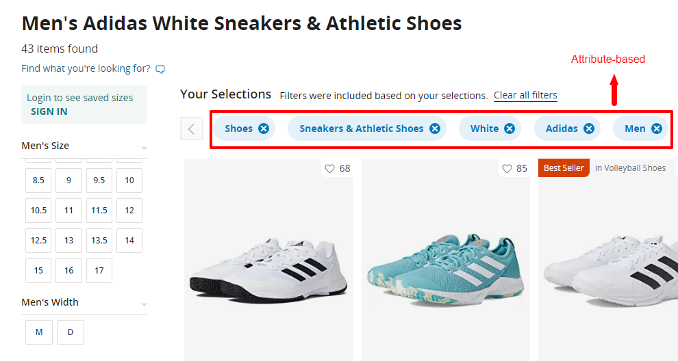
These breadcrumbs allow users to see the applied filters and easily modify or remove them to refine their search.
3. History-based Breadcrumbs:
History-based breadcrumbs show the user’s previously visited pages, forming a trail based on their navigation history. They are useful for quickly revisiting recently viewed pages or retracing steps within a browsing session.
See this example from Zappos:
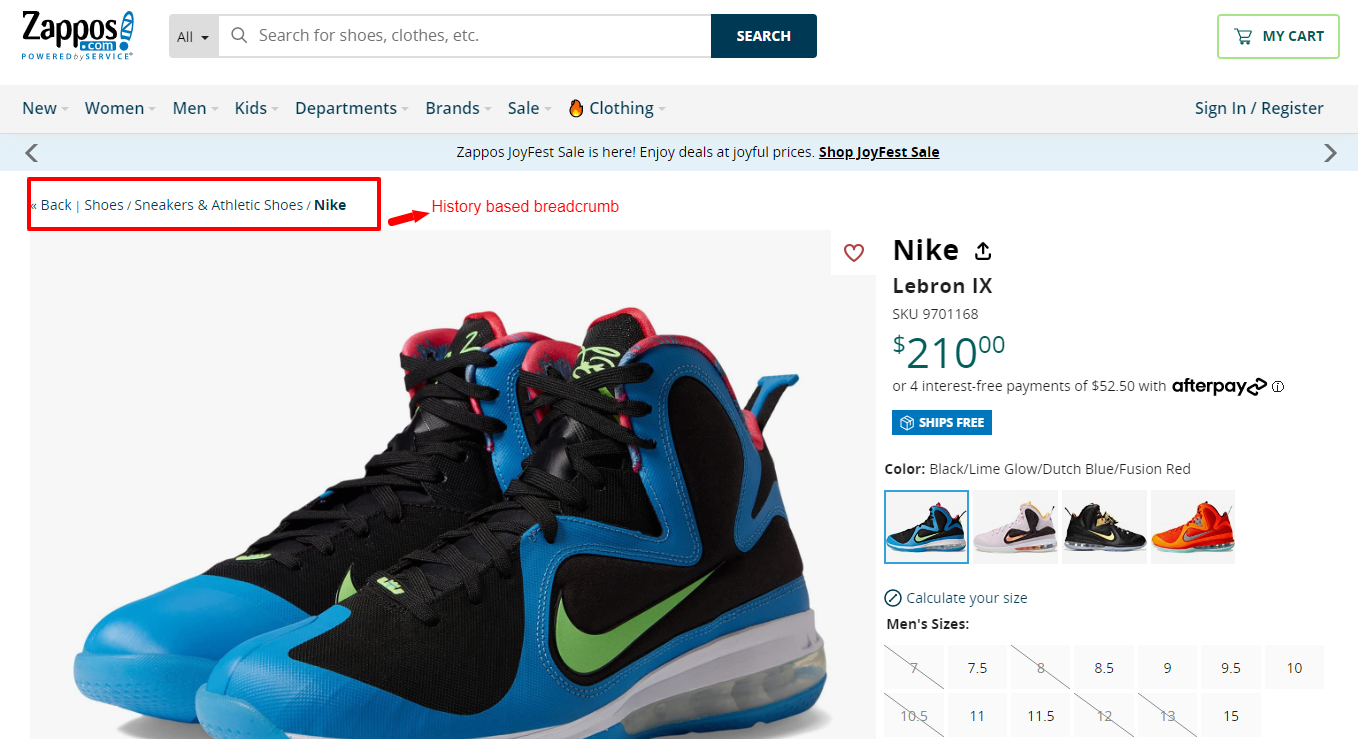
History-based breadcrumbs enhance the user experience by providing a quick and convenient way to navigate previously visited pages without relying solely on the browser’s back button.
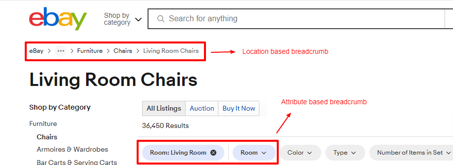
It’s worth noting that different types of breadcrumbs can be combined or customized based on the specific needs of a website. For instance, a website may utilize a combination of location-based and attribute-based breadcrumbs to provide users with both the contextual hierarchy and the applied filters.
By tailoring the breadcrumb navigation to match the website’s structure and user tasks, the overall navigation experience can be further enhanced.
Here’s an example from eBay:
Benefits of Breadcrumbs
Implementing breadcrumb navigation on websites offers advantages that contribute to improved usability, enhanced navigation, and even search engine optimization (SEO).
1. Improved Usability:
Breadcrumbs assist users in understanding the structure of a website and finding their way back to higher-level pages. They visually represent the website’s hierarchy, allowing users to orient themselves and maintain a sense of context. By knowing their current location within the website, users can navigate more efficiently and feel more in control of their browsing experience.
2. Enhanced Navigation:
Breadcrumb navigation enables users to backtrack or switch between hierarchical levels easily. If users explore a particular category or section, breadcrumbs provide a quick way to return to the main category or higher-level pages without relying solely on the browser’s back button. This saves users from getting lost or frustrated, especially on websites with complex structures or deep content hierarchies.
3. Search Engine Optimization (SEO) Benefits:
Breadcrumb links can contribute to search engine rankings by providing additional contextual information. Search engine crawlers can follow the breadcrumb trail and understand the website’s structure more effectively, resulting in better indexing and potential SEO benefits.
Also, Google alluded to this in an announcement they made.
‘To help mobile searchers understand your website better when we show it in the mobile search results, today we’re updating the algorithms that display URLs in the search results to better reflect the names of websites, using the real-world name of the site instead of the domain name, and the URL structure of the sites in a breadcrumbs-like format.’

Source: Google
10 Best Practices for Using Breadcrumbs
1. Provide concise and descriptive labels:
Use clear and descriptive labels for each breadcrumb element to reflect the hierarchy and content. For example, see this breadcrumb from Nordstrom.

2. Ensure breadcrumb links are clickable:
Make each element in the breadcrumb trail a clickable link. This allows users to easily navigate to any level in the hierarchy by clicking on the respective breadcrumb link.
See this example from FootLocker; the breadcrumb elements are clickable and highlighted in blue.

3. Maintain consistency:
Keep the placement and design of breadcrumbs consistent across your website. Consistency helps users develop a familiarity with the navigation feature, improving usability and ease of navigation.
4. Use proper indentation:
Visually differentiate the hierarchy levels in the breadcrumb trail by using proper indentation. This helps users quickly understand the relationships between different levels and the current page.
For example: Home > Products> Category> Subcategory> Product
Here it is on NordStrom’s website:

5. Implement responsive design:
Ensure that your breadcrumbs are responsive and adapt well to different screen sizes. Breadcrumbs should remain clear and easily readable, even on smaller screens.
6. Include a Home link:
Always include a “Home” link as the starting point in your breadcrumb trail. This allows users to return to the homepage easily or the main landing page of your website.
See this example from JD;

7. Avoid redundancy:
Exclude the current page from the breadcrumb trail to prevent redundancy and confusion. Users should be able to quickly identify their current location within the hierarchy without unnecessary repetition.
8. Use breadcrumb schema markup:
Implement breadcrumb schema markup, such as Schema.org’s BreadcrumbList, to enhance search engine visibility. This structured data helps search engines understand the breadcrumb navigation and potentially display it in search results.
9. Test and optimize:
Conduct usability tests to identify any usability issues with your breadcrumb navigation. Test the navigation on different devices and gather feedback to improve and optimize the user experience.
10. Consider user feedback:
Collect feedback from users regarding the breadcrumb navigation. This feedback can provide valuable insights into any pain points or areas of improvement, allowing you to continuously refine and enhance the breadcrumb navigation experience on your website.
The Problem With Breadcrumb Navigation
While breadcrumb navigation offers several benefits, there are potential challenges and drawbacks that need to be considered.
1. Limited Screen Space:
One of the main challenges with breadcrumb navigation is limited screen space.
Displaying breadcrumbs and other essential elements on smaller screens or mobile devices may become challenging.
In such cases, it may be necessary to prioritize other navigation elements or consider alternative navigation solutions to ensure a clutter-free and optimal user experience.
2. Complex Website Structures:
Implementing breadcrumbs may become less effective on websites with highly complex or non-linear structures.
If a website has numerous levels of hierarchy, multiple cross-references, or dynamically generated content, the breadcrumb trail may not accurately represent the user’s path or provide meaningful navigation cues.
In such cases, additional navigational aids or alternative navigation methods may be required to help users navigate the intricate website structure.
3. User Confusion:
Improper implementation or unclear labeling of breadcrumbs can lead to user confusion.
If the breadcrumb trail is not visually distinct or does not accurately reflect the website’s hierarchy, users may get confused about their current location or find it challenging to navigate back to desired pages.
Ensuring that the breadcrumb labels are concise, descriptive, and reflect the actual content hierarchy is crucial.
Final Thoughts
Breadcrumb navigation is a valuable addition to website design, offering benefits such as improved usability, enhanced navigation, and potential SEO advantages.
However, it is important to emphasize that breadcrumb navigation should be used as an additional navigational aid rather than relying on it as the sole navigation method.
Website designers should carefully assess their website’s structure and consider the needs and behaviors of their users before implementing breadcrumb navigation.
It is not a one-size-fits-all solution, and its effectiveness may vary depending on the complexity of the website and the browsing patterns of the target audience.
By evaluating these factors, designers can make an informed decision about whether breadcrumb navigation is appropriate for their specific website.
Furthermore, experimenting, testing, and iterating are essential when implementing breadcrumb navigation.
Designers should conduct usability tests, gather user feedback, and continuously evaluate the effectiveness of the breadcrumb navigation solution. This iterative approach allows for refinement and optimization, ensuring that the breadcrumb navigation meets the needs and expectations of users.


