Has it ever occurred to you that are completely clueless about why your customers leave your website without converting? Many a times even top retailers face similar situations where they manage to drive in heavy traffic but end up with low conversion rates. Conversion Rate Optimization (CRO) has gained so much popularity and over a period of time it has become one of the most important factor in revenue generation.
Surprisingly, you’re doing good if your conversion rate is around 2% – 5%. This means, however, on average, over 80% of your site visitors come to your website without taking any action. Devastating isn’t it? Imagine what could be your revenue if only you could convert at least 10% of your website traffic? That’s roughly 5 times you current ROI! Tempting right?
And while it is important to find the right techniques and strategies for your website, it’s equally important to determine the current conversion optimization mistakes that if mitigated can improve your conversion rates today.
Mistake #1 You Have Nothing Unique To Sell
You have an awesome product/service idea! But when consumers visit your website, they fail to connect with your website because you lack the Unique Selling Point (USP). You must figure out a USP factor that would make your brand or business stand out from the crowd. You are up against thousands of other brands that sell similar products. When they customers reach your website, there has to be something motivating them to buy from you.
Your USP must be able to deliver the essence of your brand where customers remember you for what you exist in the market amidst thousands of other companies producing similar products.
British Airways is one of the leading airlines in the world. Their USP ‘The World’s Favourite Airline’ is short, simple and something that can greatly influence a first time visitor to the site. (because everybody want the best and the most accepted brand). They have managed to carve a niche for themselves in the airline industry by reaching out to customers as being the world’s favorite.
Here are some tips to come up with a unique selling point for your business:
- Research your competitors to identify potential areas of differentiation
- Survey your customers to understand what motivates their purchase decisions
- Brainstorm ways your product/service could stand out and fill an unmet need
- Highlight your unique attributes prominently in messaging/branding
Further reading: Value Proposition: What is it, how to write one + modern-day examples.
Here’s an example of another value proposition that works:
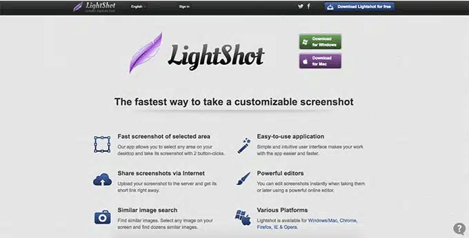
The main strength of this value proposition is it is clear and concise. Even if a visitor had never heard of Lightshot, it’s immediately clear what they offer.
Also, their emphasis on how convenient and easy it is to use their service helps them to stand out from their competitors.
Mistake #2 Your website Takes Ages To Load
If there’s one thing that can annoy your first-time visitors and regular customers is having a very slow website. Studies show that 47% of users expect a site to load within two seconds, beyond which they’re highly likely to leave your site. Slow loading time can be a major reason for websites facing a high bounce rate. Also,a second’s delay in page response costs 7% reduction in conversions. Lastly, you lose your ranking in Google which is something you don’t want to mess around with.
Some pro tips on how to improve website loading speed?
Tips:
- Evaluate your site performance regularly using tools like Pingdom and Google’s Page Speed Insights. Conduct stress tests and load tests to improve your server response time.
- Compress and optimize your image sizes without reducing their quality using io and combine your images into CSS sprites.
- Minimize your CSS/JS and HTML files
- Enable caching with advanced caching system and use a CDN to boost performance
Mistake #3: Your website design Sucks
As the saying goes, ‘first impression is the best impression’.
Studies show that nearly 66% of users believe that a good website increases a business’ credibility and are more likely to turn into potential prospectus.
Today, most businesses are truly considered genuine based on their online presence. Hence, broken links, cluttered images, poor design concepts, non-responsiveness, poor site navigation, misleading call to action buttons etc can turn off your visitors.
Example of poor website design:
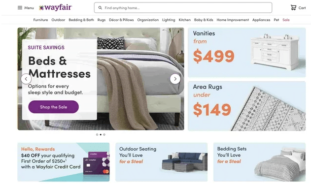
What it got wrong: Lack of visual hierarchy.
The problem with Wayfair’s homepage is that almost every element is the same size and color and has similar copy and icons. So users are being told to shop for beds and mattresses, vanities, area rugs, outdoor seating, and bedding sets at the same time. Rather than decide where to click first, some users might leave the site.
Tips to improve your website design
- Review web design best practices and ensure core elements like navigation, CTAs and layout are optimized.
- Ensure visual hierarchy on all of your web pages.
- Use A/B testing to experiment with new page layouts, fonts, colors and other design changes
- Seek regular feedback from users on design through surveys and user testing.
- Stay current on web design trends and implement responsive design
Mistake #4: No Focus On Landing Pages
Didn’t know that landing pages could drive traffic and increase conversions? If not, you’re not the only one who’s ignorant about how massively landing pages convert. Sadly, most marketers don’t understand what to avoid while setting up landing pages.
Another major concern among the marketers is that they don’t understand whether to optimize their current landing page or create a new one.
According to MarketingSherpa, 62% of B2B companies have less than 6 landing pages.
- The advantage of a landing page is that it focus on a single idea and hence it’s easier to drive traffic to a targeted page. That ways you get visitors perform one specific task instead of confusing them with too many informations or actions.
- Landing pages can be used to track your customer activity, closely.
- Since landing pages have all the predominant elements like the keywords, relevant images/videos, links and succinct content, it helps you boost your search engine ranking.
Tips to improve your landing page:
- Identify high-value user actions and create dedicated landing pages for each
- Follow landing page best practices like single CTA, relevant copy, clear messaging
- Use A/B testing to optimize page elements like headlines, images, calls-to-action
- Analyze landing page performance regularly and continue iterating
Mistake #5: You Lack Visually Appealing Images
Unlike the physical stores, the only way users can understand or virtually ‘feel’ your product is through images. Studies reveal that websites with images have 94% more views.
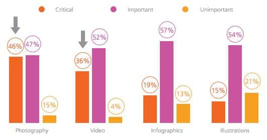
“As long as the image quality is high, say 1,500 to 3,000 pixels per inch for an image scanned from film, users will be able to see the necessary details to make an informed decision on their purchases”, says Eoin Townsend, Chief Product and Strategy Officer (Xtend Digital)
On the contrary, lack of images is one of the main reasons for abandonment. Hence, it’s important that you include images that appeals to the emotions of your customers.
Tips:
- Add bigger, high quality images with detailed views
- Provide 360 degree view of images
- Zoom in/out options
- Stick to real life images to humanize your website
Mistake # 6: Low Quality Content
When users visit your website, content plays the major role in engaging with your customers and letting them understand your product/service.
- Quality content helps you rank higher on search engines because Google checks for your content’s credibility, including its backlinks before it indexes your page.
- A well-written content decreases your bounce rates and people begin to trust your brand or decide to buy from your products.
- Above, users don’t think twice to share quality, interactive and interesting content.
Tips to improve low quality content:
- Perform content audits to identify thin, outdated, or poorly-performing content. You can use tools like Ahrefs, SEMrush, etc.
- Improve content with more research, data, analysis, original ideas, and actionable advice.
- Hire copywriters or optimize writing workflows to create content faster.
- Promote high-quality content through SEO, social media, and email marketing to increase your content’s reach.
Mistake # 7: Not Making Use Of ‘Error:404’
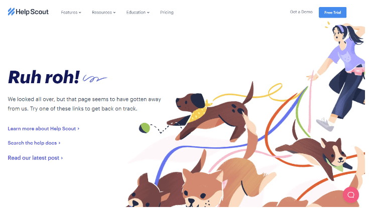
It’s quite natural for users to stumble upon a ‘404 error page’. But your creativity lies in creating a 404 error page that works for your benefit. Redirect users to your services and other posts so that visitors can continue to engage with your website without being frustrated and disappointed.
See this interesting example from HelpScout:
Tips to maximize your 404 pages:
- Customize your 404 page with branding elements, navigation and search bar
- Provide helpful content like popular links, related posts, contact info on 404
- Redirect 404 traffic back to relevant site pages so users stay engaged
- Use 404 data in analytics to identify frequently-broken links and fix them
Mistake # 8: Lack Of Trust Elements
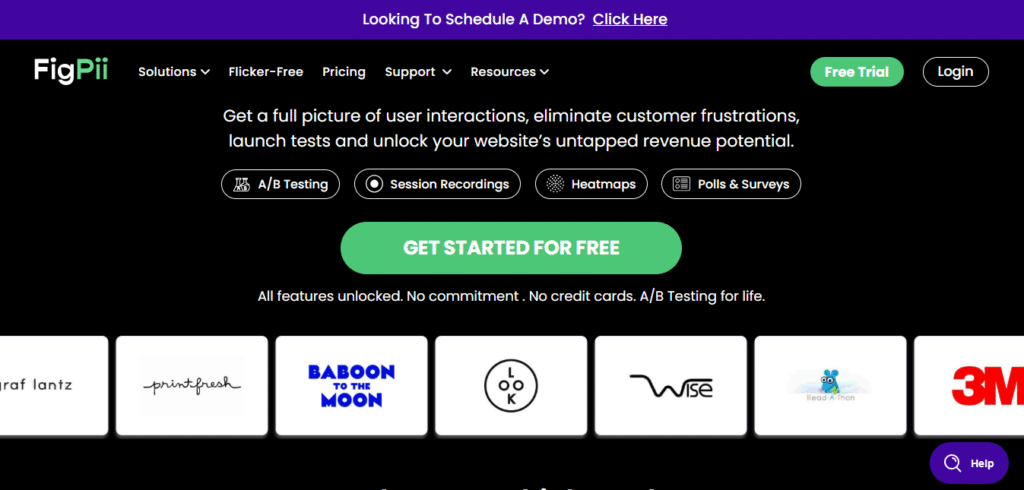
Your customers want to buy from you or use your service. But, how do they trust you? 73% of consumers think that online shopping is highly risky. This is because of the rising security threats that makes customers wary of your website.
The first set of trust elements users see on the Figpii website is examples of brands that use the tool.
Tips:
- Your website should be up-to-date
- Don’t forget to add security certificates/trust badges
- Display your contact details, prominently
- Be active on your social media accounts
- Provide suitable testimonials
- Add customer feedback/reviews
Mistake # 9: Lack Of Predictive Search Engines
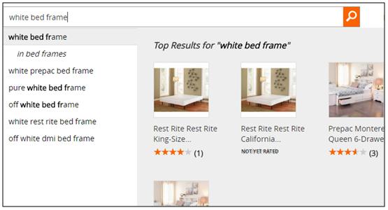
Your website search engine is a starter to encourage user engagement. And ever since 2004, predictive search has become an important element for improving conversions by 4.63%. Your search engine should be able to understand your user and help them to get to their product easily. An ideal predictive search features include,
- Use pre-populated keywords
- Recommend cross selling in your product recommendation
- Using images in search recommendations
- Auto correct features
Mistake #: 10 Your Checkout Page Is Complex
Customers can get frustrated when they have to fill a 3 page checkout form. The scary part is you could be missing out on 68% of potential customers during their checkout. And it’s very likely to lose them to your competitor. If your checkout system has several factors like those mentioned below, then definitely you’re committing a major blunder that can affect your conversion rates.
- Having them create an account
- Reflecting shipping charges at the payment
- Including unimportant fields
- No option to sign in as a guest or account creation via social media
- Failure of coupon codes
- Limited payment options
- Not mobile-friendly sites
Here are tips to improve your checkout experience:
- Simplify checkout flows with fewer fields, guest checkout and saved details
- Allow shoppers to checkout directly from the product page
- Remember customer details to pre-populate forms and reduce data entry
- Make checkout mobile-friendly and speed up page load times
Further Reading: 12 Mobile Checkout Best Practices For e-Commerce Websites
Mistake # 11: No Online Customer Support
Believe it or not, your site visitors can easily get lost just like in any brick-and-mortar stores. But unlike brick-and-mortar stores, customers find it difficult to communicate their needs in online stores.
According to Andersen Consulting, 62% of consumers prefer to buy from online stores powered with live chat support. Not only does it strengthen customer relationship but a live chat support can,
- Convert browsers into buyers in a cost-efficient manner
- Resolve customer complaints without any delay
- Achieve high customer satisfaction leading to increased conversion and average order value
Some tips to improve your online support:
- Implement live chat to immediately assist users navigating your site
- Provide multiple support options like phone, email, in-app messaging
- Monitor support conversations to identify frequent questions and pain points
- Link to helpful self-service content like FAQs, forums and tutorials
Mistake # 12: Generalized Marketing Strategies
Who wouldn’t love to be treated special? If your marketing strategies are generic and not personalized according to your customer base, then you aren’t gaining much out of your business. According to Invesp, 57% of consumers wouldn’t mind sharing their personal details for their benefits.
By sending personalised offers to customers based on their on their search history and previous purchase, you get them to convert. Make use of real-time personalization tools will help you modify your website and campaigns based on user experience. It greatly helps in customer retention and helps you focus on your targeted audience better.
Tips to improve your marketing strategies:
- Segment your email lists based on user behavior and attributes
- Personalize on-site messaging and offers based on past engagement
- Use progressive profiling to gather more customer data over time
- Test tailored calls-to-action and content against generic alternatives
Mistake # 13: Not Performing Any Kind Of A/B Tests
There are several ways to try out a single change. But if you don’t test your options, you never know which one works better. This is why it’s crucial for your website or campaigns to conduct A/B testing on a regular basis. Through A/B testing, you learn the tactics to convince your customers to convert. Some of the most popular A/B testing tools include,
- Figpii
- VWO
- A/Bingo
- KISSmetrics and
- Convert Experiment
Some tips to improve your A/B tests:
- Identify pages and user flows with high potential impact and volume
- Use A/B testing tools like Optimizely and Google Optimize to set up tests
- Start with simple element changes like headlines, button wording, layout
- Analyze results and double down on winning variants
Mistake # 14 Not Making Good Use Of Analytics
Analytics help you to measure, track and monitor your results. With the support of analytics, you learn your customer interests and customize your website elements based on their behavior. If not, you never know how your business is scaling. Online market can leverage analytics in order to measure your product specifications, social media activities, manage inventory, increase user experience, marketing etc.
Doing business based on a clear, thorough statistics shows you how you can optimize you website to increase conversions. Most importantly, analytics is important for major business decisions where you can’t go by just guesses.
Tips to improve your use of analytics
- Identify your key site goals and configure analytics tracking appropriately
- Review reports regularly to uncover opportunities and pain points
- Share insights cross-departmentally so all teams can optimize based on data
- Use analytics to guide your testing and personalization strategies
Further Reading: What marketers should know about Google Analytics 4
Mistake # 15 Non Mobile-Friendly Website
Did you know the mobile shopping recorded $771 million revenue on the 2016 Thanksgiving day?
If your website is not responsive / mobile-friendly, it’s the biggest mistake you could be doing right now. You could be losing 74% visitors who shops only through their mobile phones.
Still not convinced about your going mobile friendly? Google can penalize you for having a non-responsive site and it can also impact your ranking on a higher scale.
Because, you never know when your users want to shop using which device, creating a seamless shopping experience for them through responsive sites helps you retain mobile shoppers.
Tips to improve your site’s mobile friendliness:
- Audit site on Google Mobile-Friendly test and fix issues
- Implement responsive design to optimize for all device sizes
- Serve correctly sized images and reduce page weight for mobile
- Optimize checkout process and forms for touch input
Final Thought
Marketers tend to overlook most of these above mistakes because they don’t seem threatening in the first place. But over a period of time, such mistakes when not attended on high priority, can affect your conversion rates.
If you don’t act now, you could be losing out on a lot of customers. Hence, it’s important to keep in mind that customers have expectations and it’s our job to stop making mistakes and start maintaining a stellar conversion-friendly website to reap great profit.
FAQs On Possible Conversion Rate Optimization Mistakes On Websites
1. What affects website conversion rate?
There are many factors that can impact the percentage of visitors that convert into customers on a website. Some key elements that influence conversion rate include:
- Page speed – Faster loading pages encourage visitors to stay on the site and complete desired actions like purchases or signups. Pages that take too long to load lead to high abandonment.
- Design and usability – A clean, easy-to-use website design makes it simpler for visitors to find information and perform calls-to-action. Poor navigation, cluttered pages, confusing menus and hard-to-find buttons hurt conversions.
- Content quality – Compelling, useful content builds trust and gives visitors confidence in the brand. Thin or low-value content fails to engage users and persuade them to convert.
- Checkout/purchase process – Too many complicated checkout steps or a difficult purchasing process increases abandonment. Simplifying and streamlining this process improves completion rates.
- Mobile optimization – With increasing mobile traffic, sites need responsive design and mobile-friendly checkout to boost conversions. Non-optimized sites see high bounce rates.
- Trust factors – Elements like reviews, testimonials, certifications and secure badges increase user trust and likelihood to purchase. Lacking these raises doubt.
- Personalization – Generic content and messaging misses the mark. Customizing site experience based on user attributes and behavior encourages engagement.
2. Which of the following are typical causes of poor website conversion rate?
Typical culprits behind low conversion rates on websites include:
- Slow page load speeds beyond 3 seconds lead many visitors to abandon before pages fully load.
- Navigation that is confusing and makes it hard to find information is problematic. Unclear menus, buttons and links hurt conversions.
- An unattractive design or outdated aesthetic signals the site is not reputable and discourages purchases.
- Low-value content like thin articles, product descriptions lacking detail and copied text fails to build trust.
- Checkout processes with too many fields, mandatory account signups or lack of guest checkout options cause abandonment.
- Sites that are not optimized for mobile devices see high bounce rates from mobile visitors.
- Lack of elements that convey trust like customer reviews, certification badges, contact information causes hesitation.
- Generic messaging without personalization does not effectively engage each visitor and lead them to convert.
3. How do you identify where conversions are failing on a website?
Some techniques to pinpoint where the website is losing conversions include:
- Using analytics software to identify drop-off points in the conversion funnel. This reveals pages where visitors exit without converting.
- Conducting user testing to observe firsthand struggles and pain points of visitors trying to convert.
- Surveying visitors who don’t end up converting and asking why they did not complete the desired action.
- Analyzing click and scroll heatmaps to see which page elements visitors interact with and which they ignore.
- A/B testing specific pages and flows to determine which version converts better.
- Looking at micro and macro conversion metrics to catch issues impacting both overall and specific goal conversion rates.
4. How would you improve conversion rates on a website?
Some effective ways to boost conversions are:
- Optimizing page speed with image compression, minified code, and caching to improve load times.
- Simplifying navigation menus, page layouts and calls-to-action to reduce confusion.
- Improving design aesthetics through a unified style, appealing visuals and clear information hierarchy.
- Creating targeted landing pages focused on specific conversion goals.
- Producing higher quality content that engages and educates visitors.
- Reducing checkout form fields and adding guest checkout to ease purchasing.
- Displaying security badges, customer testimonials and money-back guarantees to build trust.
- Adding live chat customer support to assist visitors in real-time.
- Personalizing site content and messaging based on interests, demographics and behavior.

