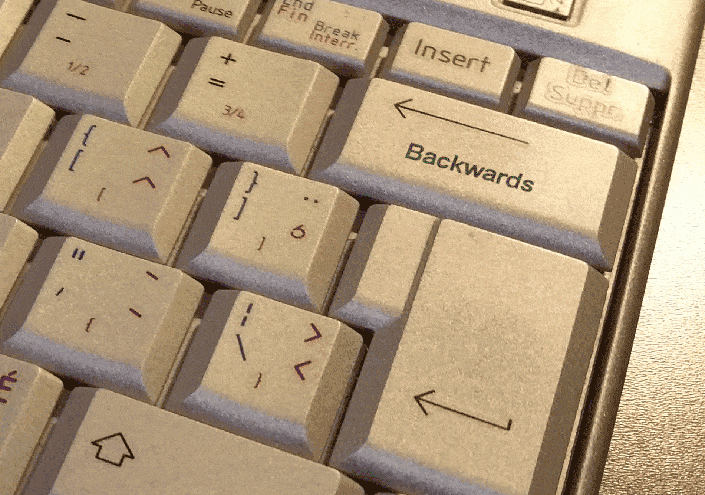
The thought of working backwards is counter-intuitive to most humans.
From birth, everything we learn and every example we are given about how to get from point A to point B, whether it be on an actual journey, or eating dinner, or building a house; tells us to start at the beginning, follow the right path and get to the end.
But that “straight line” approach to completing a task only works if we understand where we want to go: our goal.
Without knowing specifically where we want to be after completing a task, we will not likely use the best route to the get there and we’ll waste time and energy in search of it.
And, not knowing exactly what is the goal we seek, more than once we’ll think we’ve arrived when really we haven’t.
As an example, let’s look a travelling to a known place versus a vague location. If you wanted to go to New York City, you would go to the airport, or the train station, or get into your car, and then travel to NYC. The landmarks and people will confirm that you’ve reached your goal.
If, conversely, you wanted to picnic at an oasis in the middle of the Sahara Desert, you couldn’t use the same approach. The Sahara is a vast expanse and you’re not sure where to find an oasis. Even if you knew, what would be the best way to get there?
To answer all the questions, you’d need to determine exactly where you want to have your picnic. Then you would need to look for the airport or harbor nearest to that location. Then you’d need to find an airline or ship that could get you to the port in a reasonable fashion and at a good price, and then get yourself to the point of embarkation.
So you need to know exactly where you’re going – your goals – if you’re to have a good idea of where to begin and to know the best way to get there.
In other words, when the goal isn’t a known entity, like New York City or a finished bungalow, you need to start by defining the end of your task, your goal, and work backwards from there.
So how do you design your landing pages?
You don’t have to admit it, but most of us take the straight line, beginning to end approach to landing page design. We start with the graphic approach, and maybe add a catchy headline and content. Then we’ll bring in other elements like trust factors, testimonials and calls-to-action. After that, we’ll launch the page and begin testing the different elements to try to improve conversion rates.
Guess what? It works. Especially in the case of a product page, where the conversion goal is to get the visitor to “Buy Now”, you will very likely generate a decent conversion rate.
But What’s a Decent Conversion Rate?
There’s no better indication that we take the wrong approach to landing page design than the paltry conversion rates we consider acceptable.
2.5%.
Seriously?
Clearly, the destination we accept is not where we truly want to be.
If you design your landing pages from the headline to the CTA button, you’ll go where you’ve gone since you started optimizing. A vast conversion desert called 2.5%.
You really want a higher conversion rate. That’s your true goal, not a click on a CTA button, and that is where your landing page design must start.
Working Backwards Means Starting at the End
Starting with a conversion rate as the goal of your landing page design, it becomes the cornerstone on which you make every other design decision. But, unlike architectural cornerstones, you work backwards from your target conversion rate, your end goal, to set the entire structure, layout and content of your page. And, by extension, your adwords campaigns, SEO and any other digital marketing relating to the goal would follow your landing page design.
Think deeply about the goal. Start asking yourself as many questions as possible. The answers will help you design a landing page that is focused on a very specific goal.
- What information does the customer need to click on the CTA button?
- Do you need to show product details?
- Are customers looking for support?
- Is the customer logical or emotional?
- What customer pain points does the product solve?
Be Realistic
Bricks and mortar conversion rates are generally about 1,000% higher than online rates. If you decide you want to suddenly match offline rates with your online conversions, you’ll set yourself up to fail.
It’s not that it can’t be achieved, lots of online conversion rates are well into the double digits. But if you try to make the leap from 2.5% to 25%, the probability is very high that you’ll fall way short.
Realistic conversion rate goals should be more in line with your overall sales goals. If the plan is to increase sales by 10% this year, then set a target of an increase of 10% in your conversion rate. If your current rate is 2.5%, that means your conversion rate goal should be 2.75%.
And don’t forget, there are more ways to increase sales than increasing conversion rates. Online or off, conversion rates can plateau regardless of what you do. If not, we’d all have 100% conversions.
If a conversion rate does not work as a goal, think about designing your landing page around increasing average sales or encouraging repeat business.
Whatever the case, make sure you have the right goal in mind before you begin to design your landing page to reach it.


