Are you familiar with this scenario: you’re leisurely walking through a park when you spot a zigzag dirt trail intersecting the beautifully designed pathways.
This dirt trail, formed over time by numerous individuals veering away from the designated route, symbolizes the collective wisdom of users who have discovered a more efficient path.

Source: Reddit
Likewise, in online platforms, users forge their desired routes influenced by convenience, accessibility, and personal preferences.
Understanding desire paths and their potential impact on your website’s conversion funnel can unlock a wealth of benefits.
When you align your website’s navigation, content placement, and user flow with the inherent inclinations of your visitors, you can elevate the user experience, boost engagement, and ultimately drive conversions.
In this article, you’ll learn the definition and characteristics of desire paths, explore their benefits, and provide practical strategies to discover and optimize your users’ desired paths on your website.
Let’s get started.
What Is A Desire Path?
Desire paths in website conversion funnels refer to users’ routes and behaviors that don’t follow the planned paths set by marketers and website designers.
Just like in physical spaces where people create desire paths by seeking the most efficient routes, online desire paths form as users navigate websites based on their preferences and needs.
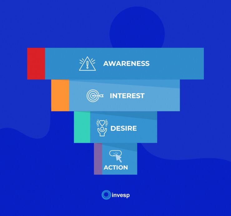
In traditional marketing, conversion funnels are often designed using the AIDA (Attention, Interest, Desire, Action) model, assuming users will move through the funnel in a linear and predictable way.

However, the reality is different.
Think about your online experiences—how frequently do you strictly follow a linear conversion funnel?
In reality, online desire paths are more varied. Users enter websites through different points like landing pages, search results, social media, or referrals.

Their journey involves exploring different pages, comparing options, and looking for social proof before deciding. Their path is influenced by their preferences, experiences, and immediate needs.
Benefits Of Implementing A Desire Path On Your Conversion Funnel
Understanding Your Site Visitors Better:
Incorporating desire paths in your website’s conversion funnel gives you valuable insights into visitors’ preferences, pain points, and behavior.
By analyzing their paths, you can better understand what resonates with them, influences their decisions, and how they navigate your website.
This knowledge helps you improve website design and content strategies, creating a better user experience.
User testing is an effective method to gain this understanding, and we’ll explore it in more detail later.
Better Focus on Ad Budget:
Recognizing and optimizing desire paths provides insights into the most effective advertising channels and touchpoints.
To do this is simple, you can launch a form or survey when you get a new lead and ask them where they heard about you. Take note of repeated platforms.
That’s where you should focus more of your ad budgets.
Aligning your advertising with users’ desire paths increases brand visibility to the right audience, improving ad performance and resource efficiency.
Word-of-Mouth Marketing:
A positive user experience on your website encourages users to share their satisfaction with others, leading to word-of-mouth marketing.
Implementing desire paths and creating a seamless, personalized user experience enhances customer satisfaction, boosts brand loyalty, and encourages users to recommend your website.
This organic promotion attracts more visitors and potential customers, amplifying your online presence and driving growth.
Enhanced User Engagement:
Understanding your site visitors better through desired paths allows you to create engaging and personalized user experiences.
Tailoring your content, messaging, and user journeys based on past preferences and behaviors captures their attention, keeps them engaged, and encourages interaction with your website.
Increased engagement leads to longer sessions, lower bounce rates, and more exploration of your offerings.
Improved Conversion Rates:
Desire paths offer insights into the actions and pathways that your users prefer, which leads to higher conversion rates.
Optimizing these preferred pathways and elements in your conversion funnel streamlines the user journey, reduces friction, and increases the likelihood of users completing desired actions, like purchasing or filling out a form.
Understanding the paths users naturally gravitate towards allows you to design an intuitive and persuasive conversion process, ultimately boosting conversion rates and driving business growth.
How To Find Your User’s Desired Path On Your Site.
User Testing:
Running user tests provides a close-range observation of how users interact with your website and offers valuable feedback for defining and refining your product, especially during development.
By conducting user tests, you can gain insights into user behaviors, preferences, and pain points, which are essential for understanding desired paths on your site.
During these tests, consider user behaviors that signify satisfaction, such as positive engagement, smooth navigation, and successful task completion.
Additionally, identify signs of frustration, such as repeated clicks, confusion, or abandonment of certain features. This feedback lets you fine-tune your website to align with user expectations and desired paths.
To set up a user test, consider utilizing tools and processes that facilitate the collection of valuable insights.
Various user testing platforms, such as UserTesting and UserZoom, offer features like click testing, tree testing, and survey capabilities.
These tools enable you to capture user interactions, gather feedback, and analyze the user experience.
When selecting participants for user testing, choosing individuals who match your target audience or ideal customer profile (ICP) is crucial.
This ensures that the feedback you receive is relevant and representative of the users you aim to attract and retain.
There are two types of user testing: moderated and unmoderated user testing.
It’s preferable to use moderated user testing, where you can observe how your respondents are carrying out their tests and can ask questions based on the visual cues you’re getting.
Here are some questions you can ask your user test participants about their tasks and identifying desired paths they prefer:
- Did you follow a particular path or sequence of actions during the task? If so, can you describe that path and why you selected it?
- Were there any alternative paths or actions you considered but did not take? If yes, why did you decide against them?
- If you were to complete the task again, would you take the same path or try a different approach? Why?
- Based on your experience using the [product/service], are there any alternative paths or actions you would have preferred to accomplish the task? Why?
- Can you think of any features or functionalities that would have facilitated a more streamlined or efficient path to completing the task?
- Are there any specific areas or steps in the current process that you found unnecessary or redundant? If yes, please explain.
- What factors influence your preferred paths or sequences of actions within the [product/service]? (e.g., ease of use, efficiency, familiarity)
- How important is it for you to have flexibility in choosing your path versus being guided through a predefined workflow?
- Are there any specific user preferences or customization options you would like to have regarding task execution within the [product/service]?
- How satisfied are you with the existing paths or actions for completing tasks within the [product/service]? Are there any pain points or areas of improvement?
- Are there any specific steps or actions within the current path that you found confusing, unnecessary, or time-consuming?
- Do you have any suggestions for improving the clarity, efficiency, or effectiveness of the existing paths for completing tasks?
Session Recordings:
Session recordings provide a way to observe user interactions on your website by watching replays of user sessions.
Analyzing these recordings gives valuable insights into user satisfaction and identifies areas for improvement. For example, if you notice a “rage click” – an instance where a user repeatedly clicks on an element without success – you can trace back their movement to understand what they were trying to achieve or where they encountered frustration.
With session recordings, you can identify technical issues that might be causing problems for your site visitors. You can also see which features users interact with the most, which elements they ignore, and which actions they frequently take.
Tools like Figpii offer session recording features that allow you to capture and review user sessions, providing valuable visual feedback on how users navigate your website.
Focus Groups:
Conducting focus groups involves gathering a sample size of individuals who match your ICP and engaging them in discussions about your website.
This interactive approach allows you to gain qualitative insights from users directly. During focus group sessions, encourage participants to share their thoughts on various aspects of your site, including navigation, content, and overall user experience.
Ask open-ended questions to stimulate discussion and gather feedback on how they perceive and interact with your website. Their input can provide valuable perspectives on desired paths, pain points, and suggestions for improvement.
Consider questions like:
- In your experience, what are the typical paths or sequences of actions you take when using [product/service] to accomplish a specific task?
- Have you discovered any shortcuts or workarounds to make certain tasks easier or more efficient?
- Have you ever deviated from the suggested or default paths within [product/service]? If yes, why did you choose to take a different path?
- Are there any tasks or actions within [product/service] that you find difficult, confusing, or time-consuming? Can you explain why?
- What improvements or changes would you propose to make the paths or actions within [product/service] more intuitive and user-friendly?
- Do you think [product/service] offers enough flexibility in selecting different paths or approaches to complete tasks? Why or why not?
- How important is it for you to control the sequence of actions when performing tasks within [product/service]? Can you explain your preference?
- Are there any specific features or functionalities you would like to see in [product/service] that would enhance the task execution process?
- Would you prefer a guided step-by-step approach or a more exploratory and flexible approach when using [product/service] to accomplish tasks?
- What aspects of the current paths or actions within [product/service] do you find helpful or effective in accomplishing tasks?
- Are there any specific pain points or areas for improvement that you have encountered while executing tasks within [product/service]?
- Can you share any success stories or examples where the paths or actions within [product/service] have worked particularly well for you?
One-On-One Interviews:
Conducting one-on-one interviews with recent purchasers allows you to gather specific feedback on their experience and gain insights into their journey through the conversion funnel.
By engaging with these individuals, you can understand their motivations, decision-making process, and the factors influencing their purchase.
This feedback can be invaluable for optimizing your funnels to improve the experience for prospective customers.
You can use similar questions from the focus group for a one-on-one interview.
Analyzing User Behavior Data:
Leveraging analytics tools that provide quantitative data on user behavior is crucial to gain a comprehensive understanding of desire paths and optimize your website’s conversion funnel.
By analyzing this data, you can uncover valuable insights into how users interact with your website, identify patterns, and make data-driven decisions to optimize the user experience and drive conversions.
One of the key advantages of using analytics tools is the ability to track and measure various metrics that are relevant to desired paths. Let’s explore some key metrics and their significance in understanding user behavior:
1. Bounce Rate:
Bounce rate refers to the percentage of users who leave your website after viewing only one page. A high bounce rate may indicate that users are not finding what they expected or that the page lacks relevance or engaging elements.
Analyzing bounce rates can help you identify potential barriers to desired paths take measures to improve engagement, and encourage users to explore further.
See our video on how to identify bounce rates in Google Analytics 4 and how to calculate it.
2. Time on Page/Session Duration:
This metric measures users’ average time on your website or individual pages.
A longer time on page or session duration mostly signifies higher user engagement and suggests that users find value in the content or features provided, but that may not always be the case.
That’s why these metrics on their own don’t tell the full story; you need to interview users and find out what’s happening on those pages.
If you can’t do that, consider setting up a survey that triggers when users are about to leave, asking about their experience on those pages with longer session duration.
By analyzing time on the page, you can identify areas of interest and assess whether users spend enough time engaging with key elements that contribute to desired paths.
Here’s how you can find the time on page metric with Google Analytics 4.
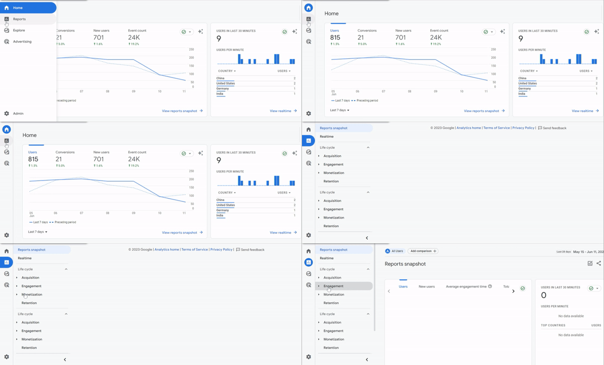
Go to reports, click on engagement, select pages and screen, and navigate toward average engagement time (it’s been renamed).
You can also click on landing pages and navigate toward average engagement time per session.

3. Conversion Rate:
Conversion rate measures the percentage of users who complete a desired action, such as purchasing, filling out a form, or subscribing to a newsletter.
Understanding the conversion rate at various stages of the conversion funnel allows you to identify points of drop-off and optimize the user journey.
You can identify areas needing improvement by analyzing conversion rates, such as optimizing landing pages, simplifying checkout processes, or providing clearer calls-to-action.
To see the conversion rate in GA4, you need to mark events as conversions or set up conversion tracking in your GA4 property. Once you have done that, the conversion rates will be automatically populated and can be added to your reports.
See our article on what marketers should know about Google Analytics 4.
Here’s how you can view the conversion rate in GA 4 explorations.
You can create a new exploration report and add dimensions and metrics.
Add the Session source/medium dimension and the Total users, Sessions, Conversions, User conversion rate, and Session conversion rate metrics. You can then build your report and visualize the user and session conversion rates.
When you harness the power of analytics tools, you can make data-driven decisions to optimize the conversion funnel and align it with desired paths.
Here’s how analyzing user behavior data can facilitate this optimization process:
1. Identify Pain Points:
Examining metrics like bounce rate and time on pages and merging them with session recordings, you can pinpoint pages or elements that may be causing user frustration or confusion.
This allows you to address pain points, refine the user experience, and guide users along desired paths more effectively.
2. Optimize User Flow:
Analyzing click-through rates and conversion rates helps you understand which pathways users are most likely to follow to achieve their goals.
By identifying the most successful paths and optimizing the user flow accordingly, you can reduce friction and streamline the journey, making it easier for users to navigate toward conversion.
Optimizing Navigation and Information Architecture:
Intuitive navigation and well-organized information architecture are crucial in facilitating desired paths on your website.
When users can easily navigate and find the information they need, they are more likely to engage with your content, complete desired actions, and ultimately convert.
Here are some best practices for optimizing navigation and information architecture to guide users along desired paths:
1. Clear Navigation Menus:
Designing clear and user-friendly navigation menus is essential for helping users find their desired paths.
Use descriptive labels that accurately represent the content or sections they lead to. Organize the menu items logically, considering user expectations and mental models.
Limit the number of menu options to avoid overwhelming users, and consider using drop-down menus or submenus to categorize related content.
Additionally, ensure that the navigation menu is easily accessible and consistent across all website pages.
2. Search Functionalities:
Implementing a robust search functionality is crucial for users who have specific information or products in mind.
A well-designed search feature lets users enter keywords and quickly find relevant content.
Ensure that your search function provides accurate results, offers filtering options, and supports features such as autocomplete or suggested search terms.
Additionally, place the search bar prominently within the header or main navigation area where users expect to find it.
3. Information Hierarchy:
Organize your content in a clear and logical hierarchy to guide users along desired paths.
Use headings, subheadings, and formatting techniques to visually differentiate sections and make it easier for users to scan and comprehend the content.
Consider the user’s mental model and arrange information to align with their expectations.
By presenting information in a structured manner, you can help users navigate smoothly and find the content they need.
Optimizing navigation and information architecture enhances the user experience and guides users through desired paths.
Here are some benefits of implementing these best practices:
1. Improved Findability:
Intuitive navigation and well-organized information architecture make it easier for users to find the content or products they seek.
This reduces frustration and helps users quickly locate desired information, increasing engagement and the likelihood of conversion.
2. Reduced Cognitive Load:
Clear navigation and information hierarchy alleviate the cognitive load by providing users with a clear understanding of the website’s structure.
Users can easily comprehend how different sections and pages are connected, making navigating and following desired paths easier.
Final Thoughts
Designing your website and important pages around your user’s preferred desire paths tremendously impacts your business and conversion rate.
Failure to do this only means you’re not offering the best user experience possible on your website.
And it’s a given that the more positive the user experience, the increase in your conversions and returning customers.
If you follow the steps and tips in this article, you’re well on your way to creating amazing desired paths for your site visitors.


