Today product finding is on of the basic functionality and a key factor of success in e-commerce websites, which is why search usually doesn’t fulfill complex need among users. Search Engines like Google have changed the search user experience to the next level – where it understands the user and adapts in order to suggest what the user is looking for, corrects spelling mistakes, and displays related results as well.
81% of the internet users use Google for search, and have that kind of search user experience in their mind while visiting ecommerce sites. Up to 30% of visitors will use the site search box, and they all are looking for specific products that they don’t see upfront when they land on the website. In today’s article, we will discuss how to design and implement new search trends to e-commerce websites.
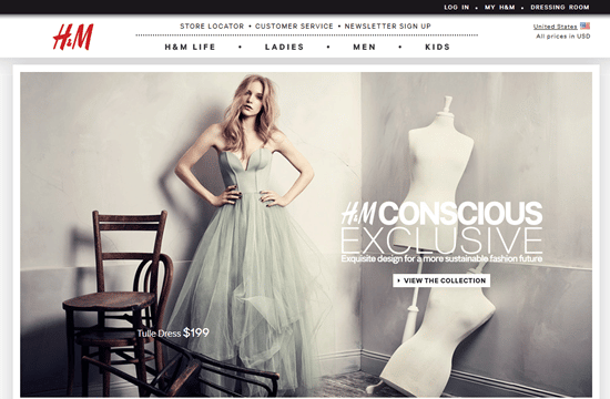
You would amazed that website like H&M do not have search and there are many more. It could be a business decision but H&M is like JCP, Burlington Coat Factory, and other similar kind of site. They all have search functionality on their websites and setting user experience to expect it on similar sites. But that’s likely a business decision.
Position of Search Box
The search box should be placed in a prominent position on the page where user can easily find it.
“There is a standard for search boxes to be placed in the top right of websites. Creating familiarity here speeds up the shop and reduces customer thinking time. Keep it simple and easy to find.”
– Depesh Mandalia, Head of Conversion & Product at ticket.com

3M has search box at right top which is the most commonly place to have the search box.

Best buy have search box at top left after the logo but still very prominent.

Walmart search box is not at the top left/right but still very prominent to find.
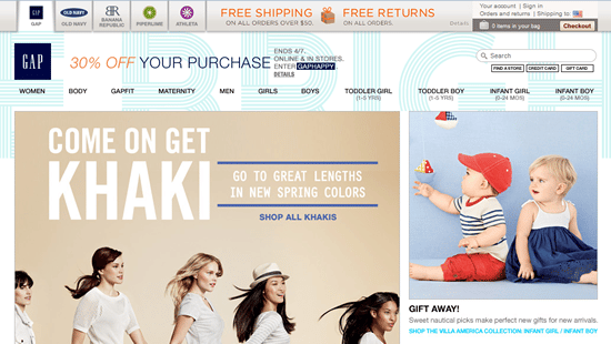
In gap website it is not very prominent and mixing with the background text they have used
Auto Complete / Search Suggestions
Google has made enhanced the user experience of search through auto completion or search suggestion when user has entered few characters in the search fields. This speeds up the search, and helps users avoid misspelling etc.
In my experience, autosuggest provides a real boost to search conversion rates. In a usability test I ran, we found that users actually relied upon site search autosuggest and autocorrect to know the correct spelling of words for them. Make sure that your site search solution is up to scratch, and that you still provide search results for common misspellings, just in case.
Matthew Curry, E-commerce manager at Lovehoney

Text based auto suggestion that can help user find products quickly they are looking for.
Use image in auto suggest if possible
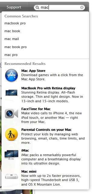
In this example Apple.com use both text base and with image search suggestion. Having images in auto suggest can help them to quickly see the product they are trying to search.
Faced search
Faced search has become the de facto standard for e-commerce businesses, especially with clothing retailers. User perform simple search, redirected to the search page where they can narrow the search by clicking on links or check boxes. This most commonly used technique and easier than advance search where you have limitation to display the fields on the page.
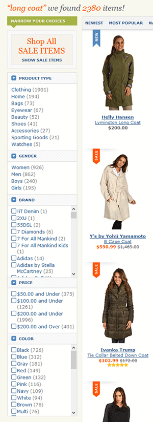
Some tips on faced search:
- DO order facts & values based on importance
- DO leverage the tool to show & hide facets and values
Search is one of the basic functionality of the website and it can be more effective tool for uplifting the conversions and helping user to reach beyond what they are seeing on the website. Sometime you can’t categorize all the products and can’t fit everything in left navigation widgets. Search is the useful tool when you have wide range of the products.


