Disclaimer: This section is a TL;DR of the main article, and it’s for you if you’re not interested in reading the whole article. On the other hand, if you want to read the full blog, just scroll down, and you’ll see the introduction.
- Every good e-commerce website should have a clear path from discovery to purchase.
- To make the most of visitors landing on your website, there are multiple triggers, patterns, and opportunities you need to take advantage of.
- Write better product descriptions — Your website’s product pages are the front door to your store and the most important part of your customer journey. That’s why it’s so important to make sure they are well-optimized for conversions.
- Provide reviews for your product — Reviews help people feel more comfortable about buying from your store — knowing that other customers have been happy with their purchases.
- Make sure you’re using the right images to showcase your products — You want to make sure that every image on your site is professionally taken and edited so that it looks great on any device — large desktop screens, small mobile phones, and everything in between.
- Make sure the buy button is easy to find — the buy button is the most important button on your product page, make sure it’s easy to find, not written with a text but in button form.
- Keep navigation simple, clean, and consistent — A great way to increase brand trust is by having a clear navigation system on all website pages. It should be easy for users to find what they’re looking for without getting lost along the way.
- Display trust signals — One of the most important elements of any online purchase is trust. Your customers need to know that they can trust you and that you won’t take their money or sell them a product that isn’t what it seems.
- Encourage social sharing of your content and products — Social sharing is one of the most effective ways to increase traffic to your website. Nine in 10 marketers say a benefit of social media marketing is increasing site traffic.
- Improve your site speed — One of the most critical aspects of your eCommerce website is site speed. It can affect your bounce rate and lead to a lower conversion rate and this is because site visitors don’t have the patience to wait for your site to load fully.
- Include user-generated content — User-generated content is a great way to engage with your customers and help them feel more comfortable about buying from your site. This type of content is also an excellent tool for building trust, as it shows that other people are buying from you and enjoying their purchases.
Here’s A Longer And More Detailed Version Of The Article.
Any good ecommerce website should have a clear path from discovery to purchase; let’s be honest, a user’s path to conversion is far from linear.
There are multiple patterns, triggers, and opportunities that you need to take advantage of during each visitor’s journey to get the best results.
Eventually, everyone wants to achieve a good conversion rate and increase sales. To do that, the first thing you should always do is look at the top of the funnel: The visitor’s experience before they buy.
So how can you apply this strategy? Let’s dive into eCommerce CRO strategies that can be applied to your ecommerce business.
1. Write better product descriptions.
Your website’s product pages are the front door to your store and the most important part of your customer journey. That’s why it’s so important to make sure they are well-optimized for conversions.
People don’t just buy products; they buy solutions to their problems. Therefore, you need to provide a clear description of how your product will solve their problem.
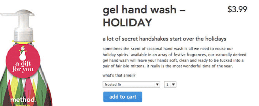
Hence, the best way to write a product description is by highlighting the benefits of each feature – as shown in this example from Method Home describing their gel hand wash.
(Source)
It points out that apart from your hands becoming soft and clean, their soap will raise your holiday spirit.
Your product descriptions should also resonate with your audience. They should be written like a conversation between you and your customer.
Start by addressing them personally (using their name or “you”) when describing the benefits of the product or service being sold.
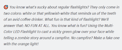
For instance, here’s how Think Geek begins the product description of an LED Flashlight:
(Source)
Here are some more easy ways to make sure your copy hits all the right notes:
- Write with the customer in mind
- Use powerful phrases and words
- Include all the relevant details about a product in the body text. This includes the materials used and dimensions, colors, weight, etc.
- Use bullet points to break up large blocks of text and make it easier to scan through information quickly.
- Include images of each item so customers can see what they’re buying before clicking “Buy now” or “Add to cart.”
- Don’t use jargon that only makes sense to people in your industry. If you’re selling bookshelves, don’t mention “shelving” unless you’re talking about bookshelves specifically!
Additionally, adding mini-stories to your presentation will help customers forget that they are being sold to. It is also important to incorporate motivational and persuasive words, as well as humor.
2. Provide reviews for your products.
If there’s anything I need to see more in many ecommerce business sites, it’s customer testimonials.
Reviews help people feel more comfortable about buying from your store – knowing that other customers have been happy with their purchases.
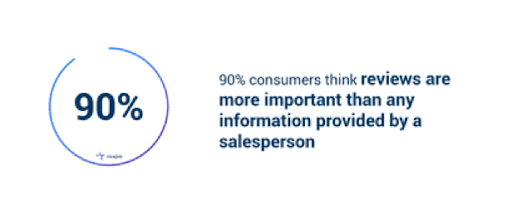
If you look at the statistics, 90% of customers deem reviews as more important than any information provided by a seller.
(Source)
And 80% of customers are less likely to purchase a product with no reviews. Among Gen Z shoppers, this number is 92%.
Here are some quick tips to showcase reviews for your products:
- Displaying product ratings on the product page
- Displaying reviews from third-party sites (e.g., Yelp)
- Displaying reviews from social media channels
- Displaying star rating
Here’s an example of how Amazon uses star ratings and comments on product pages to build trust:
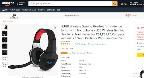
(Source)
Another example is Customer quotes – as used by HelloFresh:
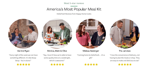
(Source)
On their landing page, Hellofresh selects positive customer feedback and asks permission from the customers before featuring them.
Note that it’s important that the reviews you show are genuine – not just positive ones – because they’re an indicator of whether or not people find value in what you offer.
Plus, if you can provide negative feedback on things like shipping times or customer service performance, it will help inform shoppers about any potential issues before they place their orders.
3. Make sure you’re using the right images to showcase your product.
The top of the funnel is the first step in your conversion process, and it’s crucial to get this right. It’s the point when you introduce your product or service to potential customers and make them aware of what you do.
To achieve this, you need to use the right images for your product.
And you need to use them correctly — not just any stock image or photo will do for your eCommerce store.
You want to make sure that every image on your site is professionally taken and edited so that it looks great on any device — large desktop screens, small mobile phones, and everything in between.
Here are some tips to get your product images right:
- Use lifestyle photos to show how your products can be used in real life (or, even better, by real people).
- Show off your products in action — don’t just show the product in a static image.
- Use close-up photos of your products where possible – showcasing their unique features and benefits
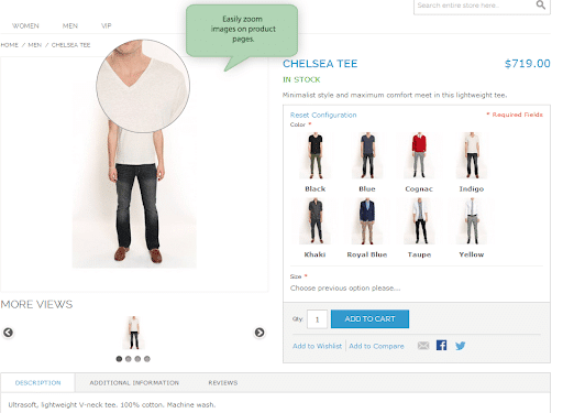
(Source)
Pro Tip: When it comes to image sizes, maintain consistency. A good starting point for the sizes is between 1200px and 1600px. Having enough detail will help customers zoom.
4. Make sure the buy button is easy to find.
If you’re selling a product or service on your website, chances are you have a “Buy” button.
It’s your most important call to action. It’s an opportunity for you to make money. It’s the gateway for your customer to take the next step toward becoming a paying customer.
If someone lands on one of your product pages but can’t find their way back up to the top of the page where they might convert, they’re going to leave ASAP. This applies especially if they have a long scroll ahead of them before they reach your CTA.
Even research suggests that placing the buy button in a prominent location, like to the right of the content, improves performance.
5. Keep navigation simple, clean, and consistent
A great way to increase brand trust is by having a clear navigation system on all website pages. It should be easy for users to find what they’re looking for without getting lost along the way.
The best way to do this is by having a navigation bar at the top of every page with links to every section of your site (such as the home page, product category pages, and blog).
Most retailers believe that a horizontal navigation menu lets users quickly see where to navigate from the homepage. As per Eyetracking studies, a horizontal top-page menu makes it easier for customers to navigate. And when you keep the menu clean and clutter-free, it gives viewers a more pleasing visual experience.
Here’s an example from Trading Depot, a site that sells home appliances and accessories:
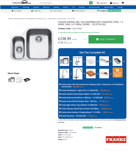
(Source)
However, if your site has several subcategories, a vertical menu would be a better choice.
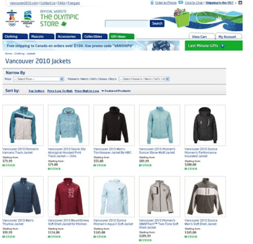
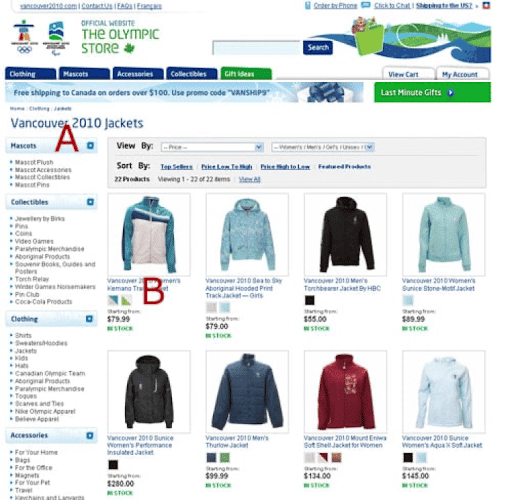
For example, The Olympic Store saw a 7.74% increase in conversions after improving navigation and using a vertical menu.
Here’s what the original menu looked like:
(Source)
The improved vertical menu shows all subcategories – giving easier access to other products.
(Source)
6. Display trust signals.
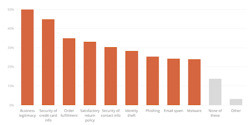
According to statistics, half of the customers have abandoned a cart due to concerns regarding business legitimacy.
(Source)
Not just that, 49% of customers see a lack of trust badges as fraud.
One of the most important elements of any online purchase is trust. Your customers need to know that they can trust you and that you won’t take their money or sell them a product that isn’t what it seems.
To create that feeling of reassurance, you want to display trust signals like:
- Testimonials and customer reviews
- Trust badges and seals
- Social proof (number of followers/likes)
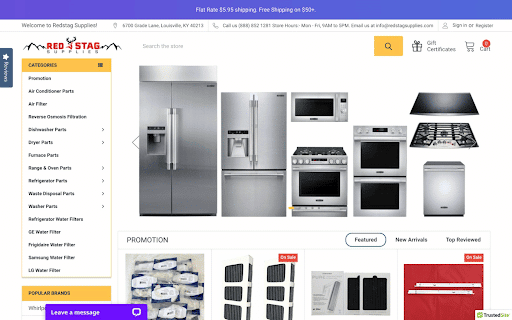
Have a look at how Red Stag Supplies showcases its physical address in its site header, together with a contact email address, business hours, and a contact number.
(Source)
Here’s another example:
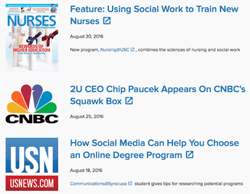
Education SaaS company 2U uses expert social proof that lends credibility to its homepage.
(Source)
7. Encourage social sharing of your content and products.
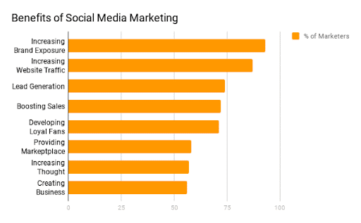
Social sharing is one of the most effective ways to increase traffic to your website. Nine in 10 marketers say a benefit of social media marketing is increasing site traffic.
(Source)
The good news is that it’s not difficult to integrate social share buttons on product pages — all you need are some simple tools and a little bit of time.
For instance, if you visit the Entrepreneur site and scroll through an article, the social sharing buttons will appear at the top right of the screen.

(Source)
It lets readers share the article when they are ready, even if they haven’t completed reading it.
If you look at the Medium platform, they use social sharing buttons at the top and bottom of their posts. Readers can tweet a small selection of text if they choose.

(Source)
This allows you to get social shares from the post’s beginning to the end and customize tweets throughout.
8. Improve your site speed.
One of the most critical aspects of your eCommerce website is site speed. It can affect your bounce rate and lead to a lower conversion rate.
For instance, Pfizer Media Lab was able to reduce the bounce rate by 20% by making its site faster.
Before that, they noticed that 15 of their sites were loading very slowly. One site even took 21 seconds to load. They put together a speed budget and made sure that any new images or functionality adhered to it, which resulted in sites loading 38% faster and bounce rates reduced considerably by 20%.
But how can you improve your site speed? Here are some strategies that will help you improve your site speed:
- Choose a fast hosting provider
- Use a content delivery network (CDN)
- Optimize images
- Defer non-essential Javascript
- Reduce the number of HTTP requests on your page
9. Include user-generated content.
User-generated content is a great way to engage with your customers and help them feel more comfortable about buying from your site. This type of content is also an excellent tool for building trust, as it shows that other people are buying from you and enjoying their purchases.
You can create user-generated content with reviews, testimonials or even just product photos taken by customers. If someone has taken time out of their busy schedule to share their experiences with your products, then they’re likely to be happy to share on social media too!
For instance, Mountain House, an e-commerce business that sells freeze-dried foods the brand was able to increase its conversion rate by 13% by adding UGC in strategic places.
They created and showcased images on the main category pages, resulting in a conversion rate lift.
You can also have a look at the picture shared by the activewear line Outdoor Voices on Instagram, which was taken by one of their customers:

(Source)
The idea is to highlight how customers use your product in their everyday lives. When users see your product in action, it makes it easy for them to imagine themselves using it.
Final thoughts
Maintaining a competitive edge in eCommerce is difficult.
This is where ecommerce conversion rate optimization comes in.
There are so many different elements and players that one small thing can make a big difference to the bottom line. We’ve found that incorporating CRO strategies into your website from the very beginning is essential to growing sales.
Ultimately, it’s important to remember that you should use the information from these case studies as food for thought. There are no set rules when it comes to eCommerce CRO. You need to adapt your strategy to suit your particular site and products.

