There’s no question that ecommerce is here to stay. The current number of online buyers in the U.S. is estimated to be around 256 million, and it is projected to reach 291.2 million in 2025.
All this goes on to show that it’s never been more important to focus on optimizing your ecommerce customer journey – to help you rise above your competition and convert as many leads as possible.
Some key areas you should focus on include website layout, content creation, product pages, and more. We’ll cover how to optimize these areas and more in this article.
1. Target your segments.
Imagine if you could walk into a store, and the salesperson would immediately approach you and say, “Hey, I know what you’re looking for. Let me show it to you!” It would be pretty awesome, right? That’s exactly the experience you want for your customers when they come to your online store.
Knowing how to target your segments is essential to optimizing your ecommerce customer journey. Targeting allows you to present the most relevant content and products to your visitors and increase their likelihood of converting (buying).
To target your ecommerce customer journey, start by evaluating the actions and features available on your website.
An easy way to do this is to map out the steps a user takes when they visit your site, with each step being one page or section of your site.
This will help you see where there are opportunities to cut out any unnecessary steps or pages and make sure that the actions available on each page are useful and relevant to what users are trying to accomplish at that point in their journey with you.
You can also use various methods to segment your audience (location, behavior, or demographic).
Once you’ve identified the ideal segments for your business and marketing strategy, the next step is to create content specifically targeting each segment.
There are three key elements you should consider when creating content for specific segments:
- Know how active they are: Are they new visitors or returning ones?
- Understand where they’re in the funnel: Are they looking at products or ready to buy?
- Determine their intent: Do they need information, are they looking for reviews, or do they want a good deal?
Let’s say, for example, that one of your segments is “first-time purchasers.” These people might need a bit of extra guidance and reassurance during the buying process.
You could create a special page on your website just for them. Maybe you call it “First-Timers Guide” or something like that. This page will outline all the steps involved with shopping at your store: choosing an item, shipping options, returns policy information, etc.
By offering content that speaks directly to each segment’s needs, you’ll be able to optimize your ecommerce experience and ultimately improve conversions more effectively.
For example, H&M segments customers based on primary school, back-to-school, and university students to run targeted ads.
Look at this ad specifically targeting university students:

It works because it promises a discount for budget-friendly university students.
You can also segment your targets by birthdays and run personalized email campaigns like Sephora.

The brand does it by adding a field on the sign-up page for their customers’ birth dates. They then offer incentives to customers who sign up on birthdays or at other times.
This type of targeting allows you to convert more customers by presenting them with the most relevant content and products.
Here’s a quick overview of simple steps that you can use to get started with targeting today:
- Identify who your segments are
- Decide which segments will see which content
- Set specific goals for each segment
- A/B tests different messages for different segments
- Analyze your results and improve
2. Create a cohesive user experience.
A cohesive user experience flows naturally, where each step is a logical extension of the previous one, and the action feels more like a natural progression. It considers every element of the experience, from aesthetics to design to content. And it makes your audience feel comfortable and understood.
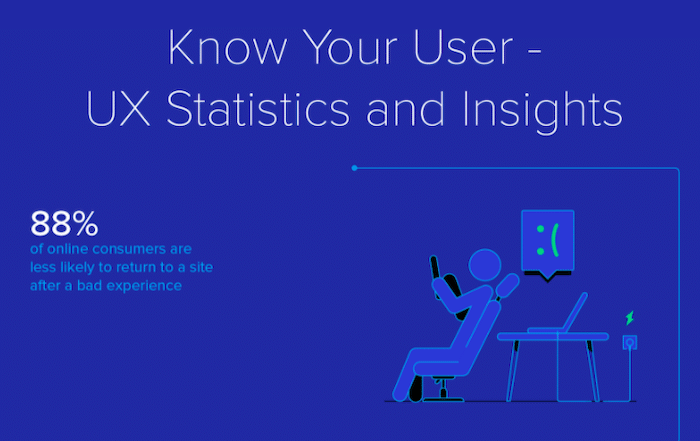
Looking at the statistics, 88% of users said they were less likely to return to your site if they had a bad user experience.
When you’re shopping online, it’s important to have a seamless experience from the first moment you’re on a site.
For instance, Just Eat offers a helpful search function that lets clients find all restaurants that can probably deliver food to their homes in no time. The filters are also helpful for finding the take-out you want.

It can be frustrating when there are broken links, inaccurate sizing charts, and out-of-stock items that you need to use a coupon code to get. Even worse is when your package arrives with the wrong item in it, or you have to call customer service to straighten out an issue.
These things can cause customers to lose trust in the site’s ability to deliver what they expect, and they may never return. That’s why it’s so important for companies to work on creating a cohesive user experience to optimize their ecommerce customer journey.
When customers know what they want and how much they’ll spend on it before they click “Add To Cart” or make a purchase decision, they are more likely to complete the transaction without hesitation or question.
This results in less time spent on customer service calls and more time focusing on sales growth initiatives like product development or marketing campaigns.
Start by nailing down your brand guidelines. Do you have a branding document that outlines your logo usage and color scheme? If not, that’s your first step.
If you do have a style guide but have since changed colors or added new ones, it’s time to update that guide. Whatever colors are in your style guide should be represented throughout your entire website experience – from page background to buttons to text color to link color to hover states. You don’t want users to click through pages only to be surprised by jarring color changes in unexpected places.
Aside from the color, here are some other things you should pay heed to:
- Typography: The font you use on your home page should be used across all of your pages. This creates consistency and makes it easier for users to recognize your site.
- Layout: Each page should have a similar layout so users don’t have to relearn the navigation structure of your site every time they go to a new page. This will keep them focused on exploring your site instead of figuring out how to navigate it.
- Language: The language you use in buttons, menus, and other user interface elements should be consistent throughout your site as well. For example, if you choose “Contact us” as your primary navigation label, make sure all of your other calls to action use the same phrasing (e.g., “We’d love to hear from you”).
Here are some other things you should look out for in order to create a cohesive user experience:
- Delays or dead ends in the buying process
- Unnecessary steps or information requests
- Inconsistencies in usability between devices
- Incomplete product details
- Cluttered website or product pages with too many features and elements
- Complex navigation
3. Inject your unique selling proposition.
Creating a unique selling proposition (USP) for your e-commerce business is a crucial step to take as you plan it out. To successfully sell something online, you have to define what makes your product or service special – and then communicate that to the right people in a way that will entice them to buy.
Including your USP in your ecommerce customer journey will help buyers understand what makes you different and why they should buy from you.
In fact, your USP should be included in all of your marketing materials and website content, especially on your homepage and product pages. You can also use it to boost your SEO ranking by incorporating keywords that are valuable to your target market into the text.
Examples of different types of USPs:
- Unique attributes: Physical characteristics, such as size, weight, or color
- Differentiation: Special features or benefits not offered by competitors
- Price: Unbeatable prices or value-added services
- Experience: Years of experience or expertise with a product or service
Have a look at Bee’s Wrap’s selling proposition. The ecommerce business produces sustainable food wraps made from organic cotton and beeswax.

The USP promotes the brand as an option for single-use plastics and as a workaround to the issue of plastic pollution.
The company’s USP capitalizes on environmentalism while also underscoring its certification as a B Corp and Green America business.
4. Be mobile-friendly.
The ecommerce industry is snowballing, with mobile commerce leading the charge. In fact, statistics suggest that 52% of customers are less likely to engage with you if you have a bad mobile site. At the same time, 67% of mobile users state that they are more likely to purchase from you if your site is mobile-friendly.
With this in mind, ecommerce marketers should take steps to ensure that their customers have a great experience when shopping on their websites via mobile.
Making your site’s design responsive is the first step. A responsive website adjusts its layout based on the screen size it’s being displayed on – meaning that no matter what device your customer is using, your site will fit on their screen perfectly. Your site’s usability should not be affected by which device it’s being viewed on; for instance, all buttons should be large enough for touchscreen users to press easily.
Here are some more ways you can help your customers enjoy a seamless mobile shopping journey:
- Be mindful of the user interface (UI)
- Design your site with mobile-specific preferences in mind
- Make it easy to search
- Mobile checkout should be just as easy as desktop checkout
- Allow your customers to save cart items or wish lists
- Provide a variety of payment options
- Offer free shipping (or indicate shipping costs upfront)
- Include product reviews and rating systems
- Make images and CSS as light as possible
- Use a large and readable font
- Avoid using too many pop-ups
- Use social media to drive traffic and engage with your customers.
5. Use trust indicators.
When a shopper visits your e-commerce website, they’re in the mindset of buying. But that doesn’t mean that buying is easy. In fact, the process can be difficult for many customers. If the customer journey doesn’t meet their expectations, you may find yourself losing conversions and revenue.
Luckily, there is an easy way to optimize your customer journey and increase conversions. It’s called trust indicators – and it works.
Trust indicators are elements of your website that help decrease friction and increase trust during the customer journey.
Trust indicators can take many forms, including:
- Customer reviews – One study found that about 95% of customers read reviews before actually buying from a store. Customer reviews provide social proof, helping new shoppers feel confident that they’re making the right choice by purchasing from you.
- Security seals – Displaying third-party security seals like VeriSign or TRUSTe can help reassure shoppers that your website is safe and secure – and that giving you their credit card information is a smart choice.
- Social media icons – When customers see logos for sites like Facebook or Twitter on your site, it helps them see that you have a presence on social sites.
- Toll-free numbers – Toll-free numbers can provide potential customers with convenient access to service agents and help them feel more comfortable placing orders online.
- Community involvement – displays how you give back to the larger community (e.g., charity donations).
- Money-back guarantees – assurances that you’ll refund a customer’s money if they’re not satisfied with their purchase.
The more trust indicators you have on your website, the more likely visitors will buy from you. (And it goes without saying – more sales equals more revenue!)
6. Create a smooth and seamless checkout process.
When a customer decides to buy something from your online store, you want them to get through the checkout process as quickly and efficiently as possible. The easier it is for them to check out, the more likely they are to finish the process and make the purchase.
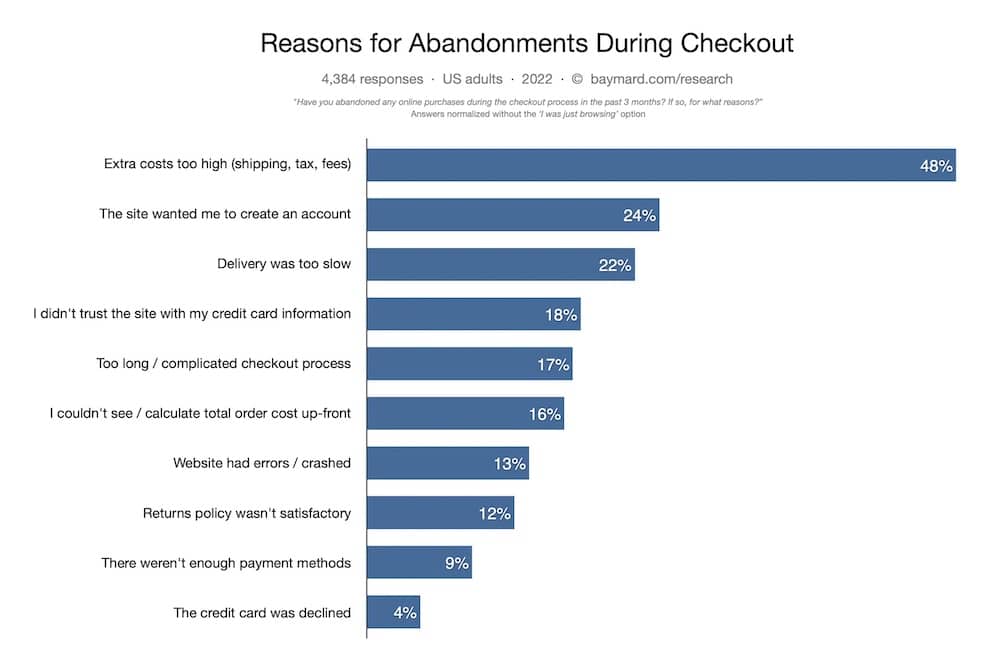
According to statistics, 17% of customers say that they abandon a cart during checkouts as the process is too long or complicated.
So, how do you create a seamless checkout experience? For starters, don’t make your customers fill out unnecessary fields or expect them to create an account before placing an order. This can be off-putting for some shoppers because it’s too much work for them to do on a computer or mobile device.
Look at Zara’s simple, short, and self-contained checkout process, for instance:
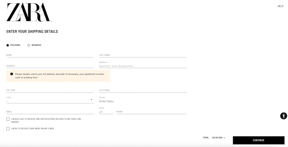
The form fields are minimal, and there are no navigation bars, pop-ups, or ads that distract the shopping customer. The best part? It allows you to checkout as a guest as well, eliminating the need to create an account with Zara.
Here are some more ways to ease the checkout process for your customers:
- Streamline the checkout process – You should keep the number of steps involved in checking out as low as possible while still allowing your customers to pay securely. If you offer a guest checkout option, then this can be useful for new customers who don’t want to create an account on your website just yet.
- Minimize distractions during checkout – The last thing you want is for your customer’s attention to be pulled away from completing their purchase and back onto other products when all they want is to place their order and leave. Keep any extraneous information or links out of the way so that it does not distract them from placing their order.
- Offer multiple payment options – While most people will have no trouble paying with a credit card, some individuals prefer not to use cards online, so offering PayPal or other payment options can help these people complete their purchases without any roadblocks.
- Save card details – Let customers save their card details so that they don’t need to enter them again each time they buy.
- Offer free shipping – Or at least free shipping if a customer spends a certain amount.
- Offer guest checkout – Don’t force them to create an account. Let them check out as guests, too (this is also good for security).
In addition, if there are multiple pages involved or the page doesn’t load quickly enough, some shoppers might even abandon their carts altogether.
Needless to say, this is extremely detrimental to your business because it means you’ve lost out on a potential sale from someone ready and willing to buy from you.
7. Include social proof in the checkout process.
Psychologist Robert Cialdini introduced the concept of social proof in his book Influence: The Psychology of Persuasion.
He explains that people often look to others to determine what behavior is normal or appropriate in any given situation. The power of social proof is so great that it’s now considered one of the six “weapons of influence,” along with reciprocity, commitment and consistency, liking, authority, and scarcity.
Social proof is the reason why people like to buy products that are trending on Amazon or have lots of positive reviews – why would they want something no one else likes? Why should they buy from a brand no one else trusts?
As per a survey, 93.4% of customers trust online reviews when dealing with unfamiliar retailers.

When someone sees others doing something, they’re more likely to follow suit. This is because we are social beings, and we tend to look for validation from others before making a decision. That’s why influencer marketing works so well – the audience sees a trusted source using or promoting a product and decides it’s worth buying themselves.
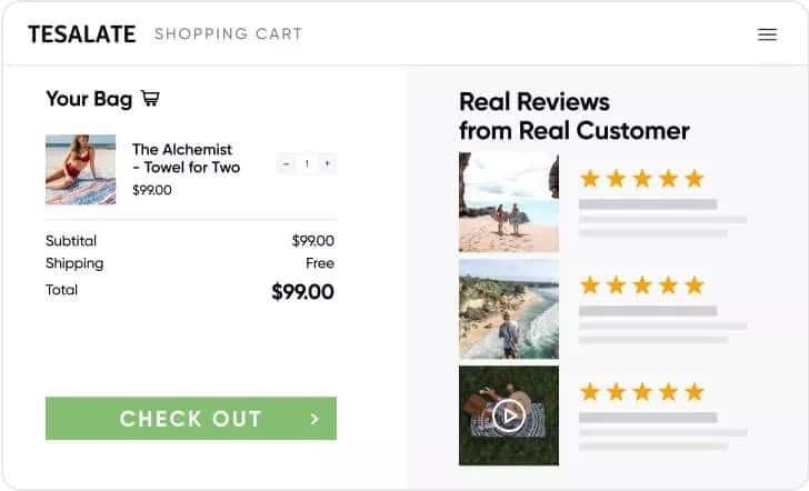
For an ecommerce company, adding social proof during the checkout process will help convince customers that your product or service is trustworthy and that they should complete their purchase right away.
There are many different ways to leverage social proof in your marketing strategy:
- Customer testimonials
- Press mentions
- Case studies
- Awards won
- Celebrity endorsements
- Social media engagement (likes, etc.)
- The number of customers who use your product or service (e.g., “Over 1 million users”)
For example, this brand shows its customers positive reviews on the checkout page to convince clients of their dependability.
8. Use high-quality product images and videos.
A prospective customer lands on your site browse the product catalog, puts some items in their cart, and then goes through your checkout process to complete the purchase.
In reality, the path to purchase is rarely that straightforward. It’s common for customers to navigate away from your site before completing a purchase, and there are many reasons why they might do so – including not finding exactly what they’re looking for.
This is where high-quality product images and videos come in.
In one Etsy survey, 90% of online buyers stated that photo quality is the most vital factor in an online sale.
What’s more, according to Google, as many as 55% of customers utilize videos for purchase decisions.
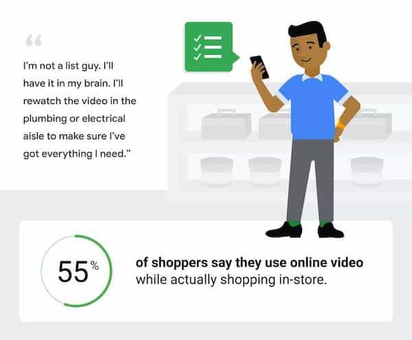
By investing more time and resources into creating strong visual content for your products (and making sure it shows up in relevant places throughout their customer journey), you can help prospective customers find what they’re looking for, convert more visitors into customers, and ultimately ensure a better overall experience with your brand.
As you develop your product images and videos, keep these three tips in mind to ensure that your visual content is doing its job:
- Make sure the videos are easy to find: Your customers should be able to find a video for every product on your site. If you don’t have videos for all products yet, prioritize by creating them for the top products based on what’s generating the most revenue for you.
- Make sure the videos play immediately when clicked on: This is key to keeping people engaged – they want to watch now, not wait or download anything.
- Keep the videos short: They should be long enough to engage and educate but not so long as to overwhelm or bore your audience. Videos longer than 90 seconds tend to lose people’s interest, so focus on highlighting what makes each product unique and why someone would want it in their lives.
In addition, bigger and more prominent product images can also increase a site’s sales.
According to a case study, when the Czech Republic-based e-commerce retailer Mall.CZ increased the size of its product images. It experienced a 9.46 percent increase in sales on those pages.
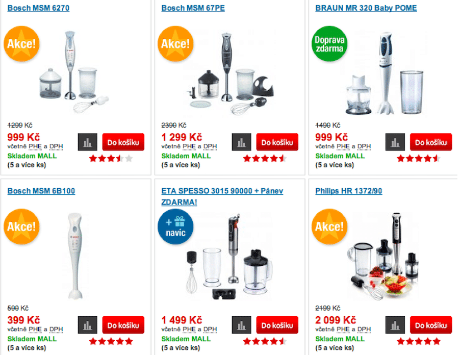
Showing as many angles of your products as possible is a must, but don’t stop there. Consider showing video clips that show how your products work or seeing them in action.
If you’re selling a pair of shoes, for example, have someone walk around in them. Customers will appreciate the extra effort and are more likely to buy from you.
Turn Your Visitors Into Customers With a Seamless Ecommerce Customer Journey!
The ultimate goal of any e-commerce website is to have an optimized customer journey that encourages visitors to make purchases.
To do this, your e-commerce site should offer a smooth, intuitive, and engaging experience on their site that makes it easy for customers to find what they are looking for.
There are many ways to improve and enhance the customer journey, such as simplifying your product images or service descriptions or increasing your site’s conversion rate with simple copy changes.
Moreover, one of the essential components of creating a successful customer journey is having an easily navigable site.
Without a site that is organized and without any distractions, it will be harder for users to find what they are looking for – and that means lost sales. If you are working on your ecommerce site, take the time to ensure that your user experience is streamlined and easy to use.

