Most conversion rate optimization (CRO) strategies follow the same formula: tweak an element (like color, size, or copy), run A/B tests, and optimize based on the results.
While these CRO techniques work, they can also be difficult to pull off. Plus, since most of your competitors are already using them, they give no real competitive edge.
But what if you could boost conversions using lesser-known tactics many businesses overlook?
In this post, discover nine underrated yet highly effective conversion rate optimization strategies that can help you stand out and drive better results.
1. Implement smart live chat prompts
According to statistics, 63% of consumers are more likely to return to a website that offers live chat. When used strategically, live chat can be a conversion machine. The trick is using smart prompts to engage website visitors at the right time with the right message.
Think of it like a luxury retail experience. Imagine walking into a high-end boutique. The sales associate doesn’t bombard you, but the moment you seem unsure, they step in with helpful suggestions. A well-timed live chat prompt does the same thing online, helping visitors overcome doubts and make confident buying decisions
Here’s how you can use AI-powered chat prompts to boost conversions:
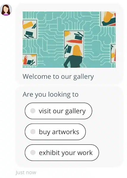
- Trigger prompts based on user behavior. Use behavioral triggers to personalize chat interactions and engage visitors when they perform an action on your site. For example, if a visitor spends over 60 seconds on the pricing page, your live chatbot can instantly ask, “Hey there! Do you need help finding the best plan for your needs?”
Look at the example below. The live chatbot isn’t asking a generic “Would you like to chat today…” question. After analyzing the customer journey, it asks relevant questions to push the lead further down the sales funnel.
- Offer instant discounts or perks at key moments. Make your live chat act like an in-store salesperson who offers exclusive deals when customers hesitate. For example, let’s say a customer hovers over the checkout button but doesn’t proceed. You can instantly trigger: “Psst… Want 10% off your first order? Here’s your code: WELCOME10!”
- Turn objections around. Prepare your chatbot to anticipate objections and trigger responses that will make the visitor reconsider. For example, if a visitor spends a long time on the pricing page without buying, your chatbot can ask to share a case study and encourage visitors to buy from you. You can trigger a response like, “I see you’re checking out our pricing. Wondering about ROI? Here’s how customers saved $5,000+ annually using us!”
Pro tip: Keep all your conversations and prompts personalized. Your messages should sound natural and friendly, not robotic. This means, rather than saying something like “We offer 24/7 customer assistance. How can we assist you?” You should say. “Hey! Got a quick question? I’m here to help.”
2. Add trust signals near CTAs
Imagine you’re about to make a big purchase online—maybe a premium software subscription or an expensive skincare product. You’re almost ready to buy, but a little voice in your head says, “Is this legit? What if it doesn’t work?” That hesitation is exactly what trust signals can help eliminate.
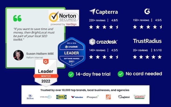
Placing trust elements right next to the call-to-action (CTA) is an even bigger game changer. They reassure users at the most crucial moment—when they’re deciding whether to click “Buy Now,” “Sign Up,” or “Request a Demo.”
Here are some high-impact trust signals to add near CTAs and why they work:
- Money-back guarantee: Reduces the fear of risk.
- Customer reviews and star rating: Work as social proof that builds credibility.
- Security badges like SSL and payment protection: Addresses concerns about fraud.
- Client logos and media mentions: Validates expertise and reliability.
Create urgency and scarcity with credibility: Leverage phrases like “Only X spots left” work better when paired with legitimacy.
Pro tip: Make sure you run A/B tests to determine which trust signals work the best for your business. After all, not all industries respond the same way—test guarantees vs. customer testimonials vs. badges to see what works best.
3. Optimize microcopy for clarity and persuasion
Microcopy refers to the small bits of text in buttons, form fields, error messages, and tooltips—like “No credit card required” and “Instant access, no long-term commitment.”
An actionable microcopy that addresses users’ needs and pain points can reduce friction and encourage them to trust your brand.
For example, instead of vague CTAs like “Let’s Go!”, using “Start Your Free Trial” tells the users exactly what happens next.
Zapier does this well by giving users an explicit choice in their signup process. Instead of a single, generic CTA, they offer two clear options: “Start Free with Email” or “Start Free with Google.”
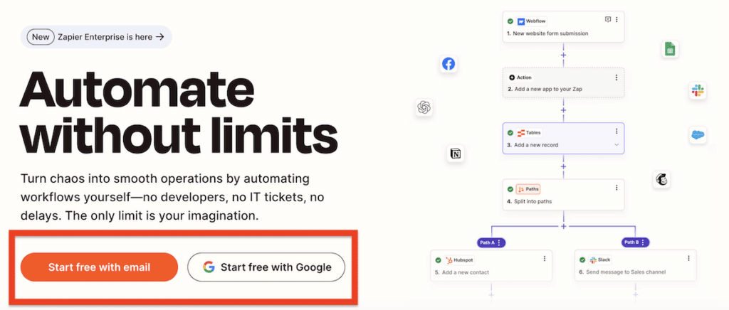
By catering to different user preferences, Zapier reduces friction and increases the likelihood of sign-ups.
Here are some more examples of using microcopy to convert visitors into loyal customers:
- Use social proof in microcopy. For example, instead of “Sign Up”, try “Join 250,000 marketers using our tool.”
- Turn anxiety into reassurance at the checkout. Many users hesitate at checkout. Leverage trust signals like “Secure checkout—your information is safe” to boost confidence.
- Personalize and add a conversational touch. Instead of robotic CTAs like “Submit,” use personable language to appeal to your audience.
4. Improve site speed
You might already know that there is a direct relationship between site speed and search engine rankings.
As per Google itself, faster sites get a boost in the SERPs.
However, research shows that improve in site speed can increase conversions.
- A Shopzilla study found that faster-loading pages increased conversions by 7-12%
A Firefox study found that improving site speed led to a 15.4% increase in conversions.
This is why even a one-second delay in loading time can cost Amazon $1.6 billion in sales.
But how fast should your website be? According to a survey done by Akamai:
- Nearly half of web users expect the site to load in 2 seconds or less
- Users tend to abandon a site that doesn’t load within 3 seconds.
- 14% of users will switch to another site and 23% will stop shopping altogether if confronted with a slow site.
This is to say that consumers prefer fast sites (which is why Google prefers them too).
Yet, most conversion rate optimization tactics tend to ignore site speed despite its obvious advantages.
Improving site speed is a whole other topic, but for starters, here are a few simple things you can do to reduce page load times:
- Switch to a faster host
- Use a content delivery network (CDN)
- Compress images and use browser caching
Pro tip: Don’t neglect mobile users. Since more than half of internet users use mobile devices to browse the internet, make sure you optimize your mobile site as well.
5. Design every page for just one purpose
This might sound like obvious advice but you’ll be surprised to see how many businesses still ignore it.
Every page on your site must have a single purpose that matches its headline. For instance, if you are designing a page to capture emails, it should only capture emails and not encourage users to install apps or buy products.
The idea here is to get the message across quickly and make it easy for users to understand and engage with your website.
For example, take a look at FigPii’s—conversion rate optimization platform—homepage
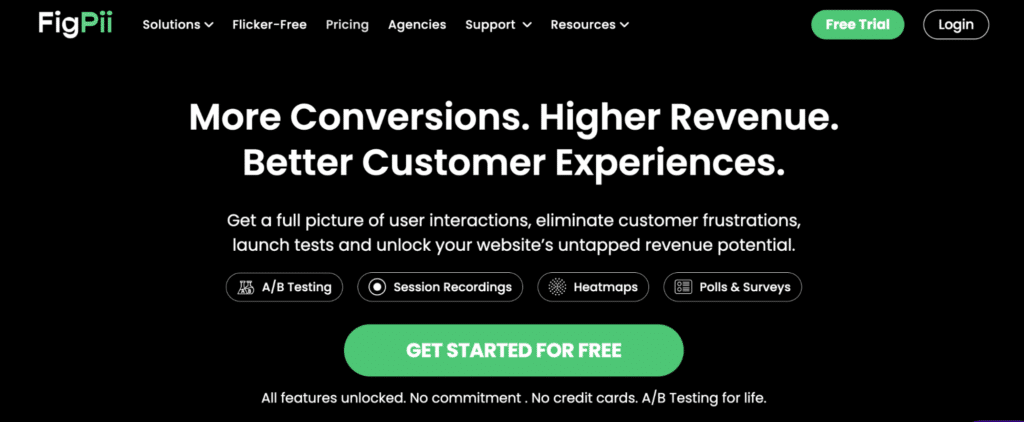
“More Conversions. Higher Revenue. Better Customer Experiences” — the sole purpose of this page is to get you to sign up on their website by giving you a free trial.
They provide all the information to entice you. If you go to the bottom of the page, they again ask you to sign up.
Only this time they say it differently—by showing how one of their features works. But the message is essentially the same “Get started for FREE.”
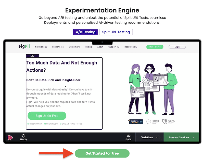
Notice that there are no other forms on this page. They’re not asking you to contact them, send them a tweet, or get in touch with a sales rep. The page is singularly focused on getting your email address for a free trial.
6. Keep your best content above the fold
“Above the fold” is the area that is immediately visible when you first land on a site without scrolling. As any UX designer will tell you, this area is crucial for conversions.
According to research by the NNGroup:
- Web users spend 80% of their time looking at information above the fold.
- The average difference between how users treat above-the-fold vs. bottom-of-the-fold content is 84%.
Yet, it has now become common to use “hero images” in web design.
This full-screen, albeit high-quality images completely cover the above-the-fold area without doing much for your conversions.
Here is an example from the Tatamagouche Brewing Company:

While they might look nice, they push important content below the fold and take up space without doing anything to promote your product.
Notice how Amazon keeps all the important information above the fold?
In this case, the phone’s specs, reviews, and the buy button are visible without scrolling the page:
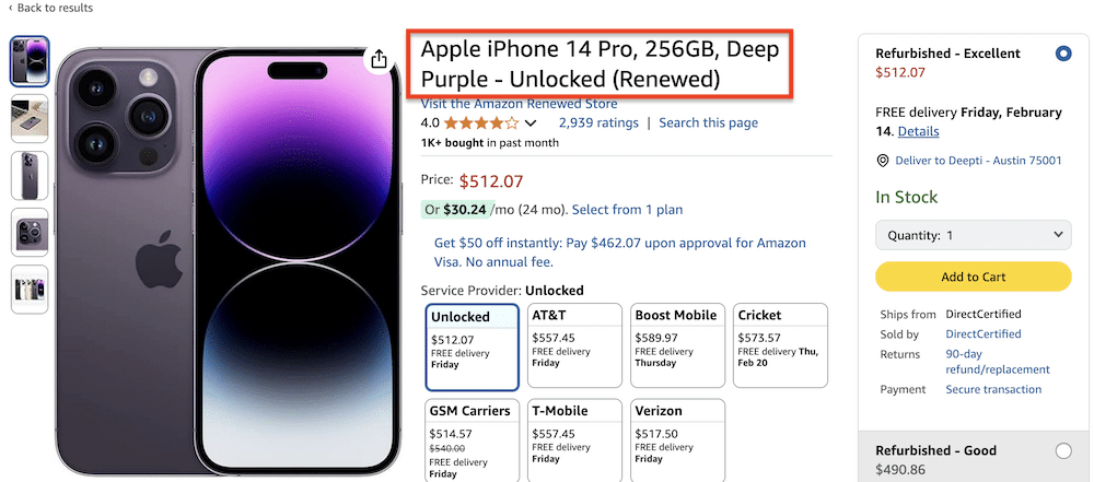
Make sure the above-the-fold area of every page of your website is not filled with clutter and contains a unique value proposition that explains exactly what the page can offer.
7. Use more dynamic pop-ups
I’m sure you must have seen one of these before:
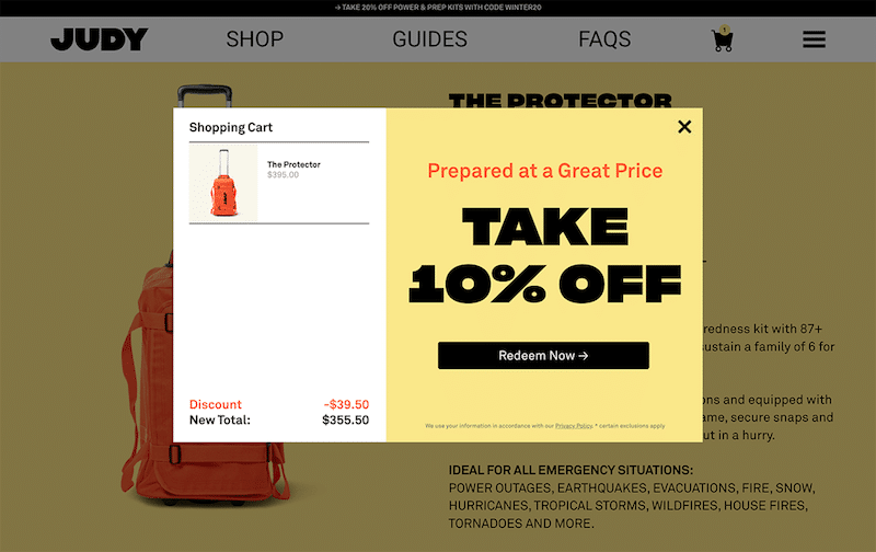
While pop-ups are everywhere, most simply give you an offer and ask for your email.
Instead of asking for a visitor’s email in exchange for a free ebook, you can get a lot of traction from pop-ups if you focus on creating a more interactive experience.
For example, pop-ups that change over time are more effective. Groovehq, for instance, managed to double their email subscribers to 50,000 in 6 months by using an interactive pop-up.
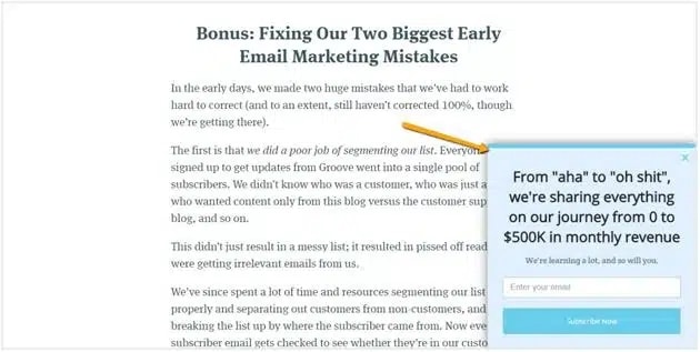
Alternatively, adding a yes/no option in the popup can also do wonders for your business.
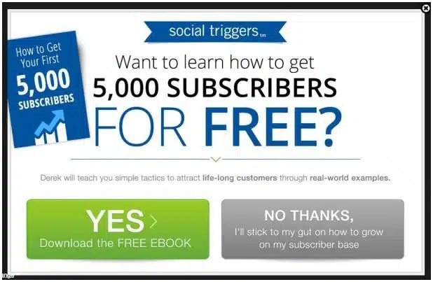
8. Reduce the number of fields in forms (especially mobile forms)
This form on Oracle’s website has 10 required fields including phone number and address.
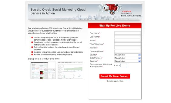
Forms like these can easily put users off.
In most cases, fewer fields in forms = more conversions.
This isn’t just common sense; it’s backed by a considerable number of case studies.
For example, Expedia increased revenues by $12M simply by removing a field and creating a more seamless checkout process.
Your focus should be on minimizing friction and giving users a seamless experience by using as few fields as possible. As a general rule of thumb, anywhere between 3-5 fields is the sweet spot.
You can achieve this by removing all the optional fields and asking only information that you need.
For instance, there is no point in asking the address if you’re never going to ship anything to the prospect. In most cases, you can get away with only an email address.
In case your business requires more than 5 fields, consider splitting the form into multiple steps. StartupInstitute takes advantage of this:
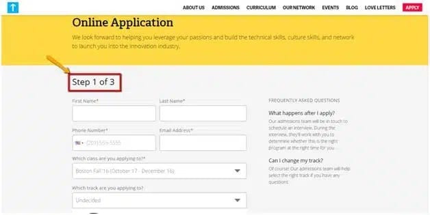
Always keep your end goal in mind – generate leads and convert visitors.
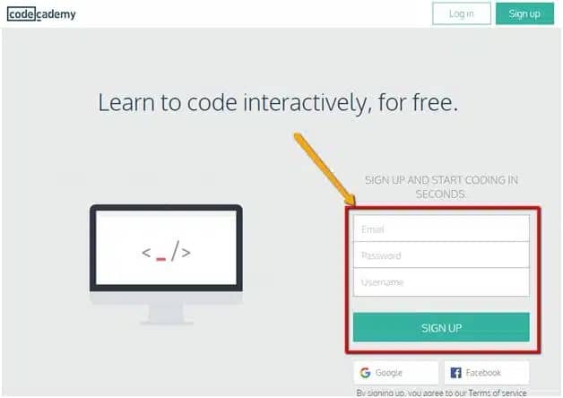
Codeacademy has one of the best homepage forms.
9. Make your CTAs stand out
A lot of marketers tend to underestimate the importance of CTAs. Your call-to-action needs to be catchy and must have a well-thought-out design. It is based on your CTA users will decide whether to sign up with your business or not.
A study found that 61% of B2B marketers struggle to generate high-quality leads mainly because they fail to optimize theır CTAs.
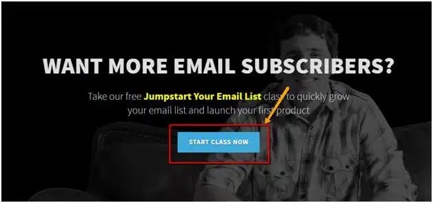
Make sure your CTA stands out with color, button shape, and button copy. Don’t just make your CTA say ‘Submit’. The copy should tell the users what’s exactly going to happen when they click the button.
For example, VideoFruit’s homepage CTA says ‘Start Class Now’
Freshbooks does something similar—it uses strong copy (“Try it free for 30 days”) and a large, green button that stands out against the blue background of their landing pages.

Also, notice the microcopy telling users that they won’t need a credit card to sign up—another tactic that will boost your average conversion rate.
Conclusion
There you have it. Nine underrated yet effective conversion rate optimization tips that will boost your conversion rate. As a general rule lead generation comes down to reaching your target audience, traffic, relevance, clarity, and fewer distractions.
When you have these things sorted out, implement some of the conversion rate optimization techniques mentioned above to boost sales and improve your conversions.

