Creating compelling and visually appealing ecommerce product pages is key to turning mere visitors into buyers and, eventually, loyal customers.
These pages aren’t just about showing off your products—they need to grab attention, build trust, and evoke emotions that drive customers to hit “buy.”
From high-quality images to evocative and detailed descriptions and emotional triggers, each element helps convert prospects into paying customers.
In this guide, we’ll share strategies that will tell you how to create effective e-commerce product pages.
1. Clear and High-Quality Product Images
Customers immediately notice product images when they land on your ecommerce product pages. Images are their primary visual reference since they can’t physically touch or try the product.
This is why high-quality images can significantly influence a customer’s decision to purchase.
Here are some ways to incorporate the best quality product images to encourage site visitors to make the final purchase:
Multiple Angles and Zoom Features
Customers want to see your product from every possible angle. This helps them get a comprehensive view and reduces uncertainty about what they’re buying.
For example, Amazon often showcases products with images from the front, back, sides, close-ups, and even 360-degree views of specific features.
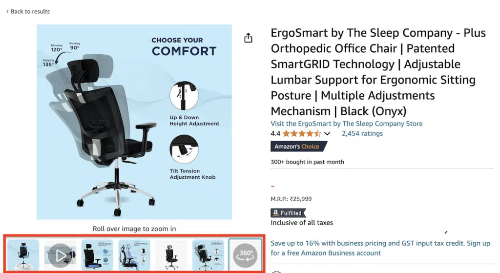
This is especially important for items like clothing, electronics, and home decor, where details matter.
Pro tip: Include at least 3-5 images per product. Make sure to cover all critical aspects and features. The zoom feature is also crucial—it allows customers to inspect the product in greater detail.
Incorporate Lifestyle Images
Lifestyle images show the product in real-life situations. Instead of just a plain background, these images show the product used by a person or placed in an environment that reflects its actual use.
For example, IKEA showcases its furniture in beautifully staged rooms, helping customers visualize how it would look in their homes.
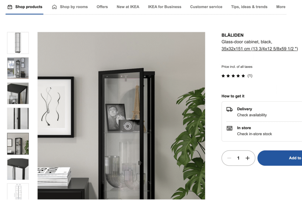
Pro tip: Include at least one lifestyle image to help customers imagine using the product. This is particularly effective for fashion, furniture, and outdoor gear.
Image Optimization for Faster Loading
While high-quality images are essential, they shouldn’t slow down your site. Slow-loading pages can frustrate customers and lead to higher bounce rates.
According to an old Google study, 53% of mobile users abandon sites that take longer than three seconds to load. This trend will likely become even more glaring in 2024, showing the importance of optimizing images without compromising quality.
Here are some tips to optimize your images:
- Use tools like TinyPNG or JPEGmini to compress images to reduce their file size without losing quality.
- Use the WebP format when possible for better compression than JPEG or PNG.
- Use lazy loading, which delays the loading of images until they come into the user’s view, improving page speed.
2. Compelling Product Descriptions and Titles
Product descriptions and titles are more than just words on a page—they’re your chance to convince potential customers to make a purchase. They should be clear, informative, and engaging, telling customers what your product is about and what makes it useful to their cause.
In fact, studies show that 87% of consumers consider product content an essential factor in their decision to purchase a product.
Writing Persuasive Product Descriptions
Rather than just listing out the features, a good product description points out the benefits those features bring to the customer.
For example, instead of saying a jacket is “waterproof,” explain how it “keeps you dry and comfortable in even the heaviest downpours.” This approach connects with the customer emotionally, making the product more appealing.
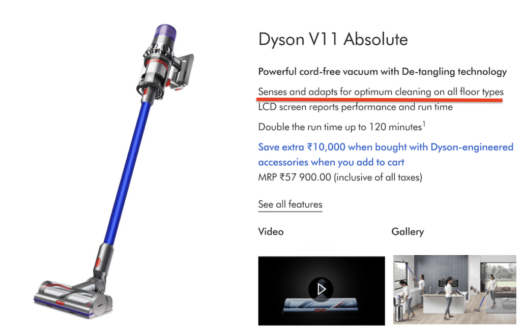
Here are the most prominent tips to consider when writing your product description: Focus on Benefits: Explain how the product solves a problem or improves the customer’s life. For instance, Dyson emphasizes that its vacuum cleaners “Sense and adapt for optimum cleaning on all floor types,” which speaks directly to the user’s needs.
- Use Bullet Points: Break down complex information into easy-to-scan points. This improves readability and helps customers find key details quickly.
- Create a Story: Paint a picture of how the product can be used in real life.
Creating Effective Product Titles
A well-crafted product title can improve both click-through rates and search engine rankings, especially since it’s the first thing your customer will read about your product.
Make sure your product titles have these key elements:
- Clear and Descriptive: Your title should immediately tell the customer about the product. Avoid jargon unless it’s something your target audience searches explicitly for. For example, instead of “Ultimate Super Shiny 3000,” a better title would be “Professional Hair Dryer with Ionic Technology.”
- Keyword-Rich: Include essential and relevant keywords that customers are likely to search for. For example, if you’re selling running shoes, make sure to include “running shoes” in the title along with specifics like “men’s lightweight” or “women’s waterproof.”
- Concise and Relevant: Keep it short and to the point. Long titles can be overwhelming and may get cut off in search results. Aim for a title that’s around 50-60 characters.
- Specifications: If the product has key differentiators, like size, color, or model number, include those in the title. For example, “Samsung 55-inch 4K UHD Smart TV” gives the customer a clear idea.
3. User Reviews and Ratings
User reviews are an integral part of an ecommerce product page—9 out of 10 customers check them before making a purchase decision.
Reviews help build trust, provide social proof, and give new buyers the confidence to purchase, especially when buying online where they can’t physically see or touch the product.
But how will you encourage your customers to leave reviews? Here are some ways:
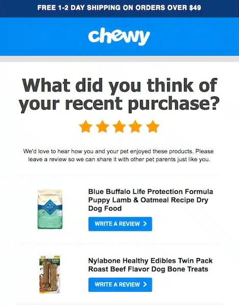
- Ask for Reviews: After a customer receives their product, send them a follow-up email or in-app notification asking for a review. Timing is key—ask while the product is still fresh in their minds. Here’s an example:
- Incentivize Reviews: Offer discounts, coupons, or loyalty points to customers who leave a review. Ensure this is done ethically, without pushing for positive reviews, so it remains trustworthy.
- Make it Easy: Simplify the review process by allowing customers to leave a quick star rating or a brief comment. The fewer steps, the more likely people are to leave a review.
Pro tip: Once you receive your customers’ reviews, place them where they can’t be missed—right below the product title or description. If your reviews are hidden in a separate tab, people might not see them.
4. Call to Action (CTA)
While the description and images draw in visitors, the CTA nudges them to take action—whether adding an item to their cart, buying it immediately, or signing up for a waitlist.
Since it’s crucial to your sale, you must place it strategically and make it visually striking and persuasive.
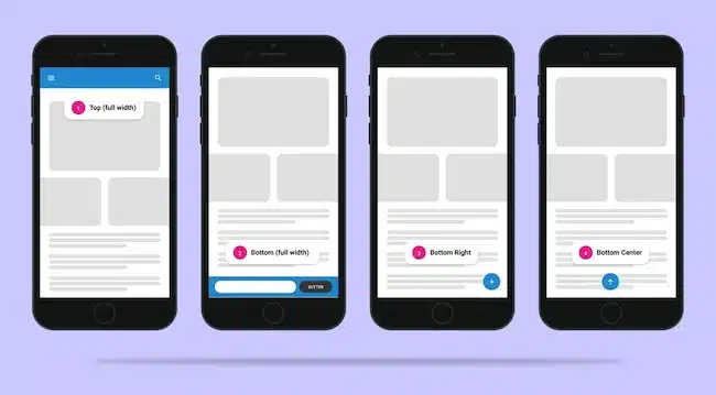
Consider these two best practices for placement:
- Above the Fold: Ensure the CTA is visible without customers needing to scroll. Place the “Add to Cart” or “Buy Now” button next to or under the product image and description.
- Sticky CTA on Mobile: With so much traffic coming from mobile devices, it’s essential to make the CTA accessible even as the user scrolls. For instance, many e-commerce sites use a sticky “Add to Cart” button on mobile, which stays visible at the bottom of the screen while the user browses product details.
When designing the CTA button, use contrasting colors that stand out from the rest of the page. If your website is primarily neutral tones, go for a bold color like orange, red, or green for your CTA.
At the same time, the button needs to be large enough to be noticed but not so big that it looks out of place or obnoxious.
Finally, The wording should create a sense of urgency or excitement. Instead of the generic “Submit” or “Buy,” try something more engaging like:
- “Add to Cart” (simple and clear)
- “Get Yours Now” (creates urgency)
- “Only a Few Left – Buy Now” (leverages scarcity)
For example, Etsy uses phrases like “Buy it now” or “Add to basket” to encourage immediate action, and Booking.com uses urgency with CTAs like “Only 2 rooms left!”
5. Highlight Pricing Information, Discounts, and Offers
Customers want to know exactly how much they’ll pay. Confusing pricing, hidden fees, or surprise costs at checkout can drive customers away and lead to cart abandonment. On the other hand, transparent pricing details create trust and keep people on your site longer.
Combining transparent pricing with discounts, free shipping offers, or deals upfront helps them make their purchase decision even faster.
That’s why both your pricing details and offers should be easy to spot on your product page, typically next to the product title or CTA button. They should be in a bold, readable font.
Pro tip: Show the original price crossed out next to the discounted price to attract attention. It gives customers a sense of urgency and value.
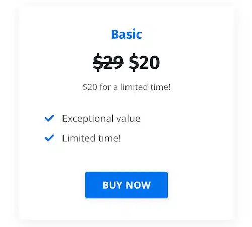
For example, if your product was originally $50 but is now $35, display it as “$50 $35.” This simple visual cue can drive up conversions.
6. Emotional Triggers
People don’t just buy products—they buy the feelings that come with them.
Emotional triggers allow you to tap into your customers’ emotions and motivate them to buy from you. They play a crucial role in creating that connection, building trust, and encouraging impulse buying.
Here are critical emotional triggers you can incorporate on your product pages:
Scarcity and Urgency
People don’t like missing out. Creating a sense of urgency can push customers to act quickly before the opportunity slips away.
How can you use it?
- Limited Stock: For example, you can display, “Only 3 left in stock—order soon,” to indicate that only a few items are left in stock and prompt immediate action.
- Limited-Time Offers: Use flash sales or countdown timers on discounts to create a sense of urgency.
Trust and Security
Customers need to feel safe when shopping online. If they trust your brand, they’re more likely to buy.
Here are some trust and security signals you can incorporate into your ecommerce product pages:
- Secure payment badges
- Customer reviews
- Trust badges (like “Money-Back Guarantee” or “Free Returns”)
- Transparent policies (for example, clear return policies)
Belonging and Social Proof
Humans naturally crave acceptance and want to feel part of a group. Social proof, like reviews, user-generated content, and customer testimonials, gives customers the feeling that others trust and like your product.
In addition to customer reviews, you can display the number of people who have purchased the product or show real-life photos from customers.
Desire and Aspiration
Many customers buy products because they envision themselves living a better or more desirable life with them. That’s why triggering aspiration is a great way to compel your ecommerce website visitors to buy from you.
You can do this by showing how your product enhances their lifestyle.
How will you trigger it? To allow your customers to visualize themselves using your product, you can use lifestyle images, stories, or product videos showing people using it.
Joy and Fun
People are drawn to products that bring them happiness, excitement, or entertainment.
How will your product pages in your ecommerce store inspire joy and fun? You can do this by showing how fun or enjoyable your product is through imagery or playful copywriting. You can also bring joy to the online shopping experience with vibrant product visuals and engaging content.
Did you know
- The average abandonment rate of shopping cart is 65.23%
- The average conversion rate of E-commerce store is only 2.13%
- The higher the average order value the lower the product page effectiveness rate is
- For website with AOV less than $50, the effectiveness rate is at 25%.
- For website with AOV above $2000, the effectiveness rate is at 4-5%
Most Important features that influence the Buyer’s Decision
| Features | %age |
| Free Shipping | 73% |
| Free Returns | 70% |
| Special Sales and Discounts | 62% |
| Discount Coupons | 56% |
| Rewards and Loyalty Points | 46% |
| Time Limited Deals | 43% |
| Buy More, Save More | 34% |
| Free Gifts | 31% |
21 Steps to Effective e-commerce product pages
- High Quality Product Images
- Multiple view Images of Single Products
- Product Zoom Feature
- Consumer Reviews
- Create Killer product copy
- Offer product customization when possible
- Free Shipping
- Highlight Discounts
- Show Similar Products
- Product Demo Videos
- Social Media Buttons
- Email a Friend Button
- Live Chat Feature
- Have Clear Call to Action
- Maximize Trust Factor
- User-Friendly Navigation
- User Friendly Fonts
- Use Emotional Triggers
- Remove Unnecessary Elements
- Building customer confidence
- Product search function
Your Turn to Create Product Pages That Engage Customers!
As we’ve seen, creating a winning ecommerce product page for your online store goes beyond listing items for sale. It’s about connecting with your customers emotionally, building trust, and giving them all the information they need to make confident purchasing decisions.
You need to incorporate high-quality images, persuasive and informative descriptions, clear CTAs, and emotional triggers like scarcity and social proof. These elements help you enhance the buyer’s shopping experience and boost conversions.
These strategies will go a long way in setting your product pages apart and help drive lasting customer loyalty.

