The priority for an online E-commerce store is to create a frictionless experience for all its customers. But if your target is to get more conversions, a frictionless experience isn’t enough. You also need to use persuasion throughout your conversion funnel.
From the moment a customer first comes in contact with your brand to the post-purchase stage, you need to weave persuasion into the customer experience.
In this post, I’m going to show you how you can use persuasion at every stage in the E-commerce conversion funnel to increase your conversion rates.
Pre-purchase stage
This is the stage before your customers have decided to buy from your site. At this point, they are merely “visitors”, not users, customers or subscribers.
Your objective here is to push these visitors further down the conversion funnel. This means either capturing their email, getting them to sign-up, or turning them into paying customers.
Let’s look at some ways you can use persuasion principles in this stage:
1. Give something away (Principle of Reciprocity)
The principle of reciprocity is a psychological principle based on the idea that we as humans feel obligated to pay back to those who do something for us.
When you visit a an ice cream shop, you’re offered to taste the samples before you actually buy a flavor. Accepting that small offer makes you more likely to go ahead and buy because you feel you should return the favor.
You’re highly unlikely not to buy the ice cream once you have tasted more than a few samples.
How can an online store apply principle of reciprocity?
Consider an example: Warby Parker famously earned the loyalty of its customers by giving them the option to try multiple frames before they pay for the ones they like to keep – reinforcing the principle of reciprocity.
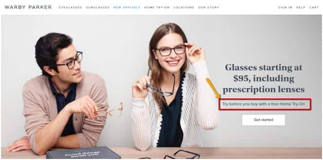
Clearly, not every business can pull this off. It just works for Warby Parker. However, there are plenty of other ways you can apply the principle of reciprocity to your online store. For example, Amazon uses this principle by making a concession like free shipping on big ticket items.
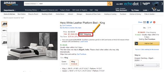
If you really need to buy a bed, it is likely you will buy from amazon because of this free shipping.
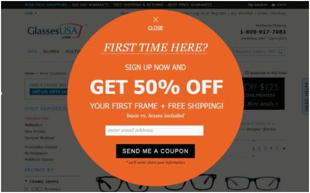
Another way you can use this principle is by offering a free guide or a coupon when prospects visit your website.
For example, GlassesUSA offers first-time customers a coupon for signing up for the newsletter.
2. Use a customer friendly design (Principle of Likability)
The idea behind the likability principle is that humans are more likely to be persuaded to perform an action by those who we consider “likable”. Ever bought a product just because your favorite celebrity endorses it? Of course you have!
This does not mean you will need a celebrity to praise your site. If you can make your ecommerce store more likable to your audience with great design and by closely relating to your customers, you’re on your way to making more conversions and profit.
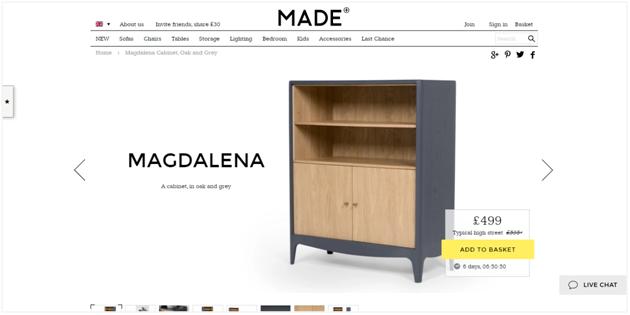
Made.com uses a beautiful minimal design that makes you love the website. This also helps cement the perception that you are buying a “premium” product, and hence, willing to pay a premium price.
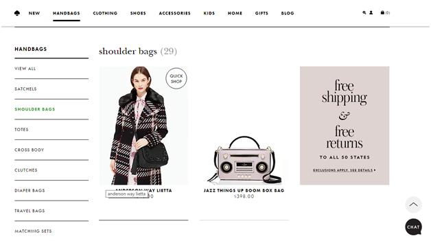
KateSpade.com is the another example of how to design a website that will likely appeal their target audience – mostly women in this case. Notice the gender-focused colors they use in their design.
3. Show that others love your products (Principle of Social Proof)
Social proof is the psychological phenomenon whereby your prospects are influenced by the actions of others and are likely to take the same action. Ever walked into a crowded restaurant thinking the food is probably good since so many people are already eating there? If everyone is paying for it, it can’t possibly be too bad, right?
That’s social proof for you. We form opinions based on the actions of other people.
User reviews do a great job at building up social proof. A consumer study found that 90% of consumers read online customer reviews to determine if the local business is good. For example, product reviews on amazon.
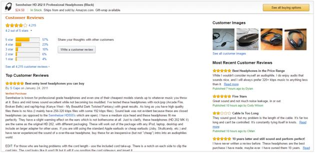
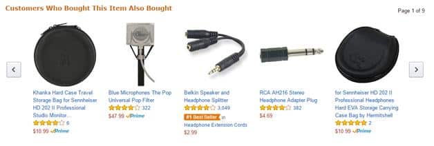
Amazon also lists what other customers have bought apart from that product. This is really useful because people usually look for other suggested items because they are similar to what they have already chosen.
Just goes to show, we tend to trust people with similar interests, so we assume whatever they have bought would be something we might like.
Purchase stage
This is the stage when customers are just about to make the purchase decision and pay for the product at the checkout page. The most important thing here is to convince customers that whatever decision they’ve taken is right, and that they won’t have any trouble paying for and receiving the product.
Let’s look at some ways you can use persuasion in this sense:
1. Convince customers to buy by creating a sense of scarcity (Principle of Scarcity)
Scarcity is a phenomenon when a product or service is in limited availability (or perceived as such), it becomes for attractive to the buyer.Just like the traditional economic way where less supply drives up more demand.
Scarcity triggers FOMO (Fear of missing out), a well-studied psychological phenomenon.
When people think they might miss out on something, they immediately act to get it.
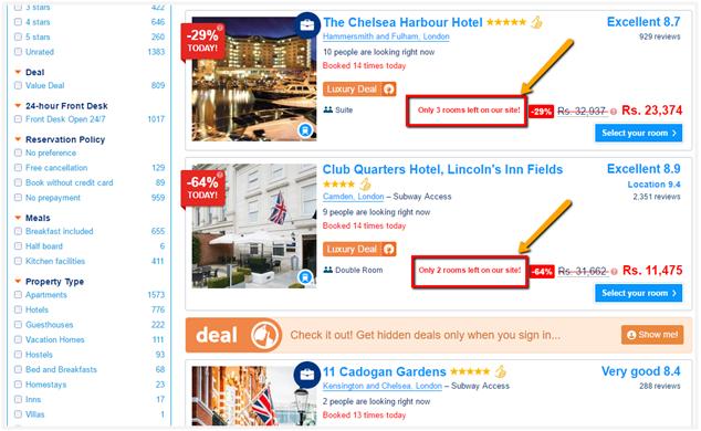
Hotels.com makes use of this by showing the number of rooms left at a particular hotel. The user thinks she should go and book this hotel before it get fully booked.
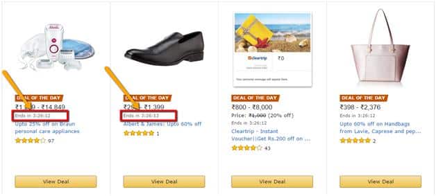
Amazon also makes the use of scarcity and FOMO in its lightning deals.
2. Send them emails with coupons (Principle of Reciprocity)
Your customers spend a considerable amount of time choosing what to buy, signing up for your site, then adding the product to the cart. But when they get to the checkout stage, they see an unexpected charge (such as shipping) and abandon the cart. In fact, one of the top three reasons that people abandon their carts is related to pricing.
For customers who have abandoned their carts, send them emails with some discount coupon code to entice them to come back. After all, they have put in the hard work of choosing what to buy; the least you can do is reciprocate their effort by giving them a discount.
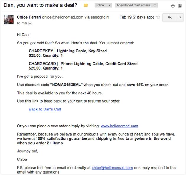
NOMAD does this really well. They send you an email with a 15% discount with a great copy. It is personalized and comes from a real person.
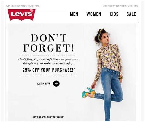
Similarly, Levi’s offers customers a 25% off coupon when they abandon a product in their cart:
3. Use a consistent design in checkout process (Principle of consistency)
The principle of consistency states that people are more likely to take action on things that is more familiar to them. It says that we human beings have a deep need to be seen as consistent. When we make a promise to someone, we do everything in our power to fulfil that commitment, hence consistency.
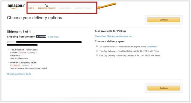
Amazon’s structured checkout design is a great example of consistency. People are used to their design and hence are more likely to buy.
Post-purchase stage
At this stage, since the customer has already purchased your product(s), your chief goal is to engender loyalty. You want them to come back again and again to push up your customer LTV.
Here’s are some ways you can use persuasion principles in this stage:
1. Maintain same branding for all post-purchase communication (Principle of Consistency)
Keep consistency throughout your brand. Whether it’s the copy, newsletters or design, you want your customers to think that yours is a strong, cohesive brand experience.
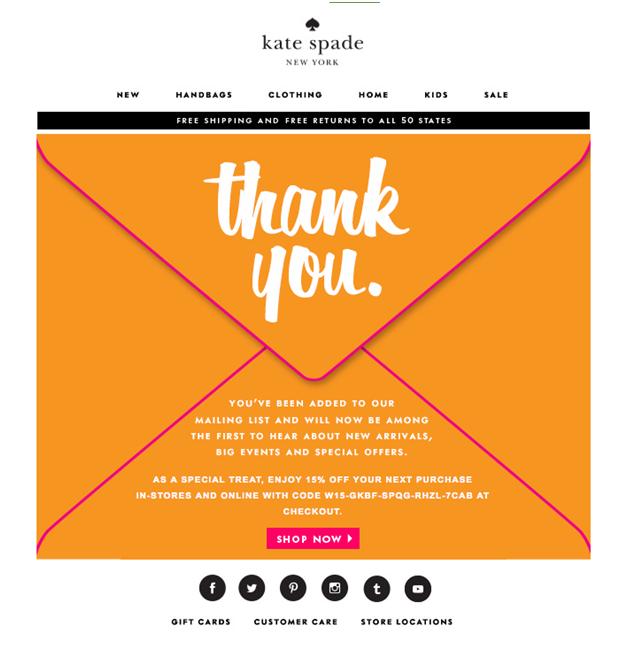
For example, KateSpade keeps a similar design across all mediums. This is how their welcome email looks like:
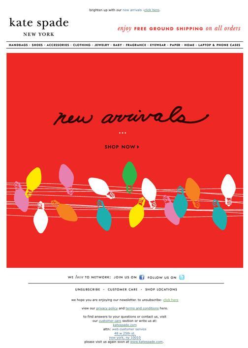
The bold colors are used in their newsletter:
Their contest emails:
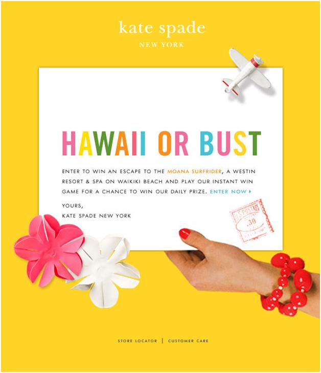
And even their cart abandonment emails:
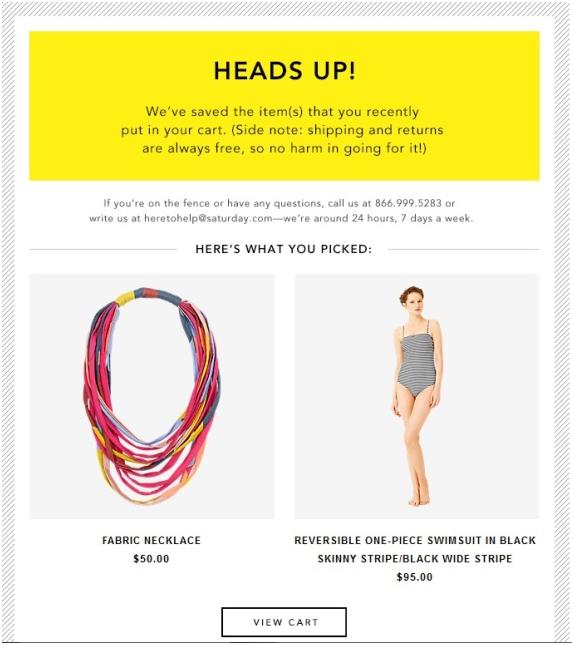
This creates a cohesive brand experience which can do wonders for your brand and brand loyalty.
Over to You
The goal of any business is to make money. Persuasion can be a very power tool when used correctly at the right time. These principles have been used by marketers and businesses for decades. When used right in the E-commerce funnel, they can increase conversion rates, turn visitors into fans, and improve customer loyalty.

