A well-known fact in conversion optimization:
To guide your customers on their buying journey, you need to serve them with relevant content.
In other words, this means that you have to know the exact type of content that interests your users.
Now, how do you do that? How do you know the exact type of content that is going to resonate with your users?
Well, there are many ways to find out. But one of the most effective ways is to visualize visitor engagement on your website.
This is where heat maps come in handy.
Heat maps are a color-coded representation of your visitors’ interaction with your page designs. There are four main types – eye-tracking, click maps, mouse tracking, and scroll maps – of heat maps usually used in conversion optimization.
In this article, we will shed some light on one type of heat map that helps know how far users are scrolling on your site. That type of heat map has a name. It’s called a scroll map.
After reading this article, you will understand what a scroll map is, how it works, and the benefits of using scroll maps on e-Commerce websites.
So, let’s get started…
What is a scroll map, and how does it work
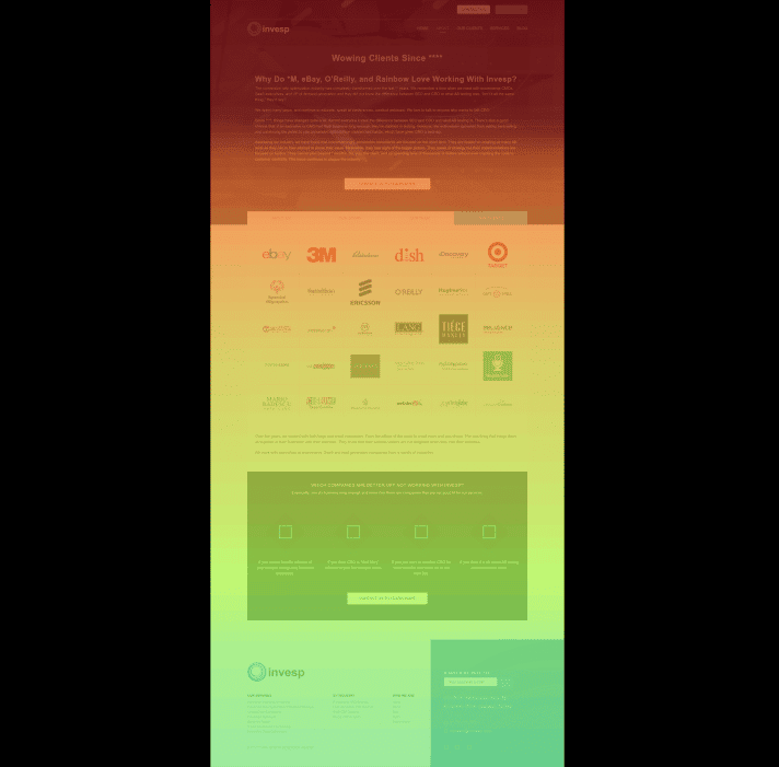
A Scroll Map helps you evaluate how far users on your website have scrolled down.

It’s similar to the heatmap except that it shows the scrolling activity of your website visitors rather than their mouse movements – scroll maps are considered to be one of the various types of heat maps.
Using scroll maps, you can learn about your website’s heat zones from top to the bottom of a page. The hottest colors on a scroll map indicate the sections most viewed on your page instead of the most clicked or tapped elements of your website.
The scroll map consists of three main components: peaks, troughs, and layout grid.
Peaks signify where people stop reading (at least for a while) after scrolling past it. Troughs represent places where people stop reading due to poor user experience (for example, too many ads, navigational issues). A layout grid divides the page into columns so you can measure the scrolling activity of each column.
Benefits of using Scroll Maps on eCommerce Websites
Scroll Maps effectively identify how much users scroll down on a web page where they have variations in page layouts, information density, or visual interest.
We suggest trying scroll maps once your website has more than 10% scroll depth. It is also recommended to use scroll maps after a redesign when looking for weak points and analyzing how people react to changes.
To find out more about how scroll maps can help you optimize your eCommerce UX, continue reading:
1. Find out where you’re losing visitor attention
Scroll maps also show where users lose interest. This type of user insight allows for better call-to-action placement, more interesting popups, or even an increase in scroll depth to include things users didn’t know they wanted.
If scroll maps can show you how far down the page your visitors are reaching, then it’s safe to say that it can show you the exact parts of your content that your users are missing. In other words, it can give you ideas about whether or not to remove that content.
Overall, scroll maps allow you to create a more effective and targeted site with less fluff. They let you identify how long your content is being read by most users and help you pinpoint any poor scroll areas where user interest may be below.
In addition, scroll maps will also suggest sections that are too short or not relevant enough to read (both of which could be removed from the page). The visualization tool scroll mapping will help you pinpoint scroll areas that convert and emphasize in your marketing efforts.
2. Spot the illusion of completeness
Many reasons may cause your visitors not to scroll down to the bottom of the page. These reasons include long loading time, no clear directional cues, weak content above the fold, complicated security requirements, tiny clickable areas, and a lot of white space between content blocks.
One of the reasons people don’t scroll is that there is a visual barrier that makes them think that content above the fold is complete and there’s no need to scroll down. This visual error is known as the illusion of completeness, false bottom, or the logical end.
ALSO READ: The Illusion of Completeness: How to break this fatal UX design mistake
White space, huge blocks, hero graphics, back-to-top arrows, and line breaks are the main culprits that cause the illusion of completeness.
Using scroll maps, you can see if your website is giving visitors the assumption that there’s nothing underneath the fold. When you analyze your scroll maps, and you see that most visitors are not viewing content lower down the page, there’s a possibility of a false bottom on that particular page.
3. What’s the right content length for your webpage
If you are one of the people who often wonder whether to create long or short content, you need to do a scroll map analysis.
Your website’s scroll maps can show you how far down visitors are scrolling – and that can give you an idea of how long your copy should be.

In other words, scroll maps eliminate the guesswork as they show you the exact point where readers are dropping off on your site.
People will always read what interests them – it doesn’t matter how long the copy is. So if you find out that your visitors are not reading all of your content, then the copy you are using might not be that interesting.
4. Discover if users see your most important content
Users see the above-the-fold content before they start to scroll. But if you have some of the most important content below the fold, are your users seeing it? That question can only be answered accurately using scroll maps.
So if you have important content that you want your users to view, it’s important to make sure that it is placed higher on the page to get seen. As you place your most important content above the fold, make sure that you place it in a way that world across devices.
One other thing you should do is to consider how your visitor’s device impacts their willingness to scroll through your website – so it’s vital that you examine the scroll map data broken down by device.
Sometimes when users scroll on your page, it’s easy to think that your content interests them or your page is lengthy.
But sometimes it could be because they can’t find what they are looking for on your website.
Rather than guesswork, try to use scroll maps and find out whether these users are interested in your content or not.
In other words, a scroll map can show you the exact areas on your landing page that people are interested in.
5. Know if your page gives an excellent cross-device experience
Over the years of doing conversion optimization, we have realized that visitor behavior on mobile and desktop is never the same. That means that you should make sure that your website is optimized for different devices and browsers.

Most optimization best practices advise that you should make your mobile pages shorter than the desktop ones. They also state that mobile content has to be scannable and easy to use.
But you don’t always have to follow best practices. It’s always important to analyze your scroll map data and learn about the visitor behavior on your site.
Supplement your scroll maps with user session replays
To get better conversion insights, it’s best that you combine scroll maps with session replays of your users.
Scroll maps alone can never show you the why behind a user’s behavior. Yes, they have an excellent data mine, and they can show you significant issues on your website, but still, you need to know the reason why visitors are not scrolling down.
For this reason, we recommend that you use scroll maps along with other conversion research techniques such as session replays.
ALSO READ: Using Session Replay Videos to identify Conversion Problems on a Website
Session replays are video recordings that show you how your users interact with your site. You can think of them as user testing without scripted tasks and audios, as they allow you to see what users do on your site.
Just by seeing videos of people going through your site, you can uncover conversion bottlenecks and any other usability issues that can be used to formulate a hypothesis for testing.
A combination of scroll maps and session replays will show how fast users scroll and where they are failing to complete the desired action.
If you have noticed that one of your landing pages has a high bounce rate, it’s worth setting up a heat map (such as a scroll map) and session replays for further investigation. That will enable you to uncover usability problems such as low scroll rates, rage, or error clicks if any.
Conclusion
If you use scroll maps you won’t have to guess where to place your important website elements for maximum engagement. These types of heat maps can show you the exact areas, on your site, where users are paying attention or ignoring. Scroll maps are super powerful if they are used along with session recordings – a combination of these two conversion tools will tell you the what and the why in terms of visitor behavior on your site. If you need one platform that has both heat maps and session recordings in one place, you can try FigPii.


