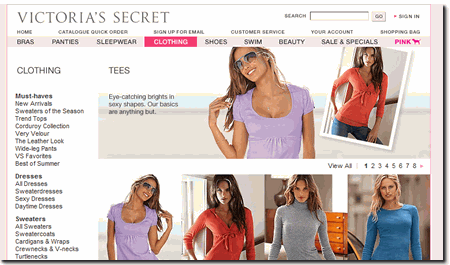
Did you ever click on a PPC ad for Victoria’s Secret? You do not have to explain to me, I know that you wanted to get a gift for your wife or girlfriend. But maybe you are doing a conversion rate optimization project and you are clicking on that Victoria’s Secret ad again, but this time to do some research on increasing your landing page conversion rate? Victoria Secret’s targets a specific gender with their landing page, and creating gender specific landing page is the latest trend in landing page design.
Let’s go back to that Victoria’s Secret ad. You’ll notice that the landing page is designed with the female audience in mind in order to entice them to make that purchase right then and there. But that’s obvious, right? I mean Victoria’s Secret has a target market of women 18 – 34, so it’s no surprise that they cater mostly to that group. Gender specific targeting is not a novel idea in traditional advertising. Nivea is the first to profile clients on ATM machines to display specific gender related ads. How can such an idea be accomplished with landing pages? And what implications would gender specific targeting have on a landing pages?
Are there companies that are trying to create online gender specific campaigns?
HP launched an e-mail campaign that personalized each ad for the individual that received it; male or female. Other companies are turning towards giving their client’s the convenience to log in to the site and adjust the settings to meet their specific mood, gender, and preferences.
Creating gender-specific landing pages is no different. In order to capitalize on your target market, you must address their needs, wants, and preferences through the ads and landing pages you create. Gender specific targeting is taking your landing page to the next level.
But there are a few considerations you need to keep in mind:
1. Know your market: Invest the time necessary to understand the demographics of your market. Only when you do so will you be able create the landing page that will fit your market criteria. Don’t blindly decide that 90% of your clients are males; and only address them. If you do, you may be losing a lot of potential business. Through market surveys and site analysis techniques do the research, understand the breakdown of your customers, and decide who you will be targeting through your landing pages. Once you do so you can determine whether creating a gender specific landing page works for you. Also, a great way is to test with various landing pages to see what works and what doesn’t. So targeting a gender may be wise or a disaster for your business; but after thorough research and testing with a single landing page you can determine that without creating damage to your company.
2. Create Personas: Once you’ve understood your target market, you must develop personas that the target the most complex of your target customers. This will help you develop landing pages that are more personalized in nature because you begin to envision the personas and sell to them rather than the masses. So, if you are Bose, (Bose.com) selling high end sounds systems, you will most likely develop male personas for your site. If you are selling genealogy software on the other hand, then your personas will be predominantly woman. Disney trying to sell a family vacation on their site will most likely develop a male as well as a female persona for the father and mother in the family. Remember that you should always create a landing pages to satisfy your primary personas. These personas are created to make you visualize someone when creating every element of your site; a real-life representation of your clients.
Company x may have a target market of predominately men. They will create a landing page to satisfy John and Ronald; their primary personas. These personas were created with in order to envision someone when creating the website; a real-life user-interface experience. Rather than marketing to the large masses of men and their distinct personalities out there. John’s personality, lifestyle, life, ambitions, and goals are much different than Ronald’s. They each represent the most complex of personalities that purchase from company x; if you satisfy them, you satisfy hundreds of men with less complex traits. The commonality between John and Ronald is that they both like to purchase from company x.
3. Copy: When creating copy, you need to begin to understand what language will appeal to your market. If you are addressing a female in your copy, you need to use words that would appeal to her specific personality traits (that is determined through the persona you create) but also address the fact that she is a woman. Woman generally like long copy. Men on the other hand generally like short copy pages.
It is probably true that on the whole, women are more collaborative, men more competitive. Women are more likely to engage with students in active learning, men more likely to keep a distance through lecturing.
What does that mean for your landing page? Generally, men are more competitive, so the landing page must answer questions such as: what is in this for me? Or how can you help me. Whereas, women are generally more humanistic in nature, so the landing page should answer questions such as: how did your product or service help others? How many clients do you have?
Remember, it’s not always the case that women are humanistic and men are competitive; you need to always refer back the personas created. Although the persona you created may be a female, she may have characteristic traits that were found in many of your women customers such as competitiveness and spontaneity.
4. Design: Similar to the copy, the design of the landing page must appeal to the target audience. Victoria’s Secret targets females ages 18-34, although they do not all have the same personality traits and preferences, they are able to construct pages that will appeal to that entire age group.
Remember, the entire purpose of personas is to create hypothetical individuals with complex personalities that encompass all the rest of your market. Because by satisfying your personas; you can satisfy everyone. So if you create a gender specific page targeting Jane, a 34 year-old stay-at-home mom and Hannah, a 50 year-old construction worker; your page needs to address them BOTH, and they are VERY different. Although Hannah is a female, because of her profession and being around men constantly, she is and always has been tom boyish. So, your site design needs to address this aspect. Making a site filled with images may appeal to Jane, but not to Hannah; you need to find a middle ground. But don’t dismiss Hannah’s femininity either; she’s still a woman.
5. A note about the ad: In addition to constructing your gender-specific page, you also need to construct an ad that will appeal to your target market. Remember that the content, picture, or headline of the ad must be echoed in your landing page to avoid confusing your potential client.
Tell me what do you think? Have you considered creating landing pages that target specific gender? What are some of the challenges in doing so?


