This was the hypothesis used by the Etsy team when they were building an infinite scrolling feature on their website:
“Changing the pagination to ‘infinite scroll’ on the search results page, will increase items viewed and eventually purchases, as this is easier for the user.”
But after running the A/B test, the results surprised the team to the extent that they thought there was a bug or something. After doing some quality assurance, they were horrified to realize that the results were valid.
Instead of increasing conversions and enhancing customer experience, the test showed negative results.
The number of favorited items decreased, the conversion rate dropped by 22% and users stopped using the search box to find items. Users were viewing and not acting.
Infinite scrolling on Etsy’s website had failed in every major way. Without further ado, they had to revert back to their default design technique: pagination.
Although infinite scrolling failed for Etsy, there are some eCommerce websites that find this design pattern more beneficial to their bottom line. If you love digging around as much as I do, you will bump into eCommerce sites that do an interesting job with infinite scrolling.
So what does this entail? Does it mean that infinite scrolling is not for every e-commerce website? How do you know if it’s best or bad for your eCommerce website? Why do other eCommerce websites prefer not to use the infinite scrolling technique? Is it because it has too many setbacks that outweigh the benefits?
Continue reading this article to learn more about the definition of infinite scrolling, the pros and cons of this design pattern, and when you should consider implementing it on eCommerce sites.
A brief discussion around Infinite Scrolling
When we talk about ways to boost visitors’ session duration, engagement, page views, usability (fewer clicks typically means better usability) on an eCommerce website, how many of you think of implementing the infinite scrolling technique?
I’m pretty sure that only a handful of people would think of it.
Not so long ago, users had no choice but to reload pages to progress from one piece of content to the next. The UX design best practices did not encourage creating a site with information appearing below the fold – the section of the page underneath what is displayed on the screen.
But that’s all changed now.
Today everyone is scrolling. If you’ve used Social Media platforms such as Facebook, Pinterest, Twitter, LinkedIn, or Instagram, you have an idea of what infinite scrolling is.
Some UX designers refer to it as endless scrolling or continuous scrolling because it is exactly that.
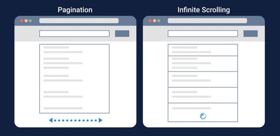
The working principle of this technique is to vertically scroll through a massive chunk of content with no sight of the website’s footer tab. The content continuously loads as the user keeps on scrolling down the page.
Perhaps due to the wider adoption of mobile phones and tablets, the infinite scrolling trend has become more popular and many web companies are using it.
This design pattern makes it easy for both mobile and desktop users who are in the mood for browsing and exploration.
Well, just like any other UX design patterns, infinite scrolling has its strengths and weaknesses, so before you decide to implement infinite scrolling on your eCommerce site, you need to make sure that the benefits outweigh the setbacks.
Having said that, here’s are the pros and cons of infinite scrolling:
The pros
- It’s great for mobile devices. It’s easier to browse on a touchscreen smartphone than to click on small next page links.
- It helps to hold a user’s attention. It’s easy to keep readers engaged by giving them more and more information as they keep scrolling. Having a “see more” can actually distract users and break the experience.
- It works well if you want to display large amounts of data. If your website has a lot of information, infinite scrolling allows you to show that more content at once.
- Information can be updated in real-time. Infinite scrolling does well in updating real-time information instantly. This is why you see Social Media websites preferring to go with this technique.
- Your page speed doesn’t get affected. Just because it constantly has to load more content at a time, this doesn’t mean that infinite scrolling will slow your page speed. With infinite scrolling, you can still expect your page speed to be as fast as a traditionally formatted site.
- Retain users. There’s a high chance of retaining a user since all they have to do is to scroll. It’s much more of a subliminal call to action.
- According to infinite-scroll.com, if this design format is used correctly ((like with their WordPress plug-in), SEO is not jeopardized, navigation is improved, and accessibility is maintained.
The cons
- It’s harder for users to search for a specific type of information. If a user is looking for a specific piece of content, they might get frustrated by having to scroll and scroll before they see what they are looking for.
- Your site won’t have a footer. Most websites that do not use infinite scrolling have important information placed on the site’s footer and this has resulted in visitors developing a habit of viewing the bottom of the webpage for more valuable information about the company. But since there’s no reaching the bottom of the page with infinite scrolling, new visitors might be confused about where to find the site’s Blog, Contact or About Us page.
- It uses JavaScript. This is not yet problematic, but developers may get nervous about the future of infinite scrolling in terms of performance on Google rankings.
- It’s not easy to skip irrelevant content. The fact that you can’t skip all the irrelevant information you come across can be very annoying sometimes. Users are forced to read and scroll through pieces of information that is unrelated to what they are interested in.
- It’s difficult to bookmark or to return to a specific segment of the page (this is the detriment that Facebook seems to have capitalized on).
- It’s not easy to implement Analytics in an infinite scrolling site. Adding a Google Analytics code into a page doesn’t guarantee you much insight, you also have to implement a custom solution.
Now that you know what infinite scrolling is all about, let’s take a deep dive into this magical design pattern in the eCommerce space.
Infinite Scrolling on eCommerce sites: A tale of two stories
Have you ever noticed that most eCommerce websites do not display products linearly on a never-ending page (infinite scrolling).
Instead, most eCommerce websites tend to use pagination or the load more button. Is it because they are better at improving the user experience than the infinite scrolling technique?
I don’t think so.
I understand that some marketers are of the belief that it is illogical to load a lot of products at once and assume that the users will view each and every product. Besides, it is easier for users to return to a specific page that the item is on than it is to gauge where the item is positioned on an endless page.
If you think about it, their argument really holds water.
With this argument in mind, how then do you incorporate infinite scrolling on an eCommerce website and make sure that it accomplishes a positive user experience?
I had a discussion with Ayat on this topic, and her suggestion was:
“When you think of adopting infinite scrolling you need to understand the people using your site by tracking how deep they are getting with the scrolling. This is why I recommend that e-commerce sites that have infinite scrolling should also include a load more functionality that helps track how deep people are going on those category pages. If you’re not able to understand how visitors are interacting with the site, you’re kind of defeating the purpose of creating that experience.”
In other short, she suggests integrating infinite scrolling and a “load more” button at the end of a preloaded list, which, when clicked, loads more content onto the page. As you can tell, Ayat’s approach to infinite scrolling on eCommerce websites is a cautious one.
What I like the most about her hybrid approach (infinite scrolling + “load more” button) is that it gives users the choice to either view more and more products at once or not. It also allows users to access the website’s footer –thus addressing one of the major design drawbacks of infinite scrolling.
This integration approach is at play on Express.com. The only difference is that Express integrates infinite scrolling, “load more” and the “view all” buttons. The load more or view all buttons are also located at the end of the preloaded list:
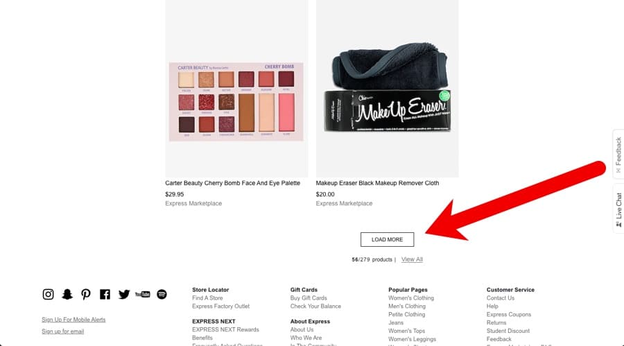
But once you click on the view all button, infinite scrolling is activated.
Placing the “load more” or “view all” buttons at the end of the preloaded list creates a positive experience by empowering to choose what works for them. It is still infinite scrolling, but the hybrid solution is used to control the amount of content that loads.
Although it’s not an eCommerce site, Google’s image search is also a good example that highlights the integration of infinite scrolling and the “load more” button:
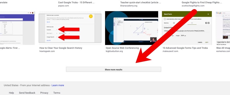
When you use Google to search for images, the infinite scrolling is automatic at first but after loading a certain number of items, you will have to click on that show more results button to view more content. This maintains the interface while limiting the load on the server.
Now that you have empirical evidence that infinite scrolling can work on eCommerce websites, let’s take a step back and look at what really made Etsy fail drastically (You still remember the Etsy story right?).
So here is how their control and variation versions looked like:
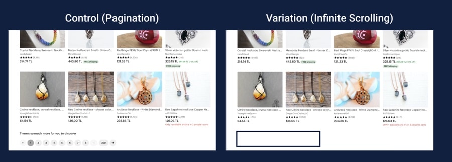
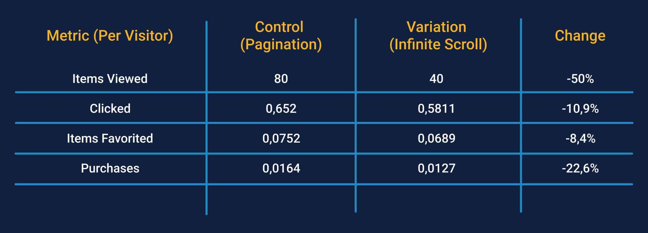
As you can see from the above image, the infinite scrolling variation was destroyed. From the items viewed, clicked, favorited, and purchased, it performs all dismally against the control (pagination).
When asked why infinite scrolling was disastrous for Etsy, Dan McKinley, the company’s the-then principal engineer said this:
“We thought that it was obvious that more items, faster was a better experience. There is a lot of web lore out there to that effect, based mostly on some findings Google’s made in their own search…My point is not that infinite scroll is stupid. It may be great on your website, but we should have done a better job of understanding the people using our website.”
Looking at this response. It’s clear that the Etsy team made one of the deadliest sins in the world of A/B testing. And that is implementing a hypothesis that is not backed by user research. Theirs was just an assumption that: “We thought that it was obvious that more items, faster was a better experience.”
Unlike what Etsy did, you first have to conduct thorough user research to know exactly what will work for users. Even after having conducted adequate research, it is incredibly important to keep a close eye on how users behave by watching session replay videos.
So, is infinite scrolling for every eCommerce website?
Having seen two examples of mega eCommerce websites that have two different tales to tell when it comes to infinite scrolling, do you think this design format is for every website?
There are many valuable reasons that point out why you should use infinite scrolling on your website, just as there are many reasons that suggest otherwise. Infinite scrolling has some good and bad in and for itself.
So, to cut to the chase: infinite scrolling can work on an eCommerce website but it’s certainly not for every site.
But you have to be extra careful before you implement it on your site. For eCommerce sites that sell hundreds of products, a combination of infinite scrolling and that load more buttons as suggested by Ayat will work.
So including search filters is also another alternative you might want to consider. Take a leaf from Twitter’s infinite scrolling design book:
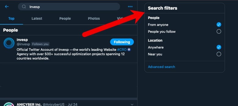
Twitter uses infinite scrolling and it avoids frustrating users by using an advanced search function that allows users to filter their searches so as to quickly find the specific information they are looking for.
Conclusion
It’s an open secret that infinite scrolling works well on those types of websites that display large amounts of highly visual content such as images and videos. This is why social media giants like this design pattern. But if you are to use it on your eCommerce site, I’d rather suggest that you begin by conducting user research and testing your hypothesis. You don’t want to repeat the same mistake that Etsy made when they just implemented without validating their hypothesis.

