So many landing pages, so little time. They come at you from your email box, web browser and search results. It’s so bad that we tune most of them out. At least I do.
So I thought I’d ‘stop and smell the roses’ (or is it ‘cow chips’?) of the landing pages that come my way to see what best practices are used, where I think pages could be improved and what optimizers might consider for their next round of AB tests.
Let’s Call it ‘The Good, The Bad and The Study’
The glut of landing pages makes it impossible to discuss them all. Below is a random cross-section of examples from one morning’s worth of PPC ads.
This is an unscientific review. You’ll note that these landing pages are quite different from each other and that’s a good thing. It means that some are scant on conventional best practices, but hopefully they are so in search of new paths to the customer’s heart. It makes it difficult to review each page from a single checklist. Besides, landing page design and optimization is still an art. And who wants to read a scientific art review?
Hopefully the points covered will at least serve to get you to look at these and other landing pages more critically, arrive at your own conclusions and use them to improve your testing and results.
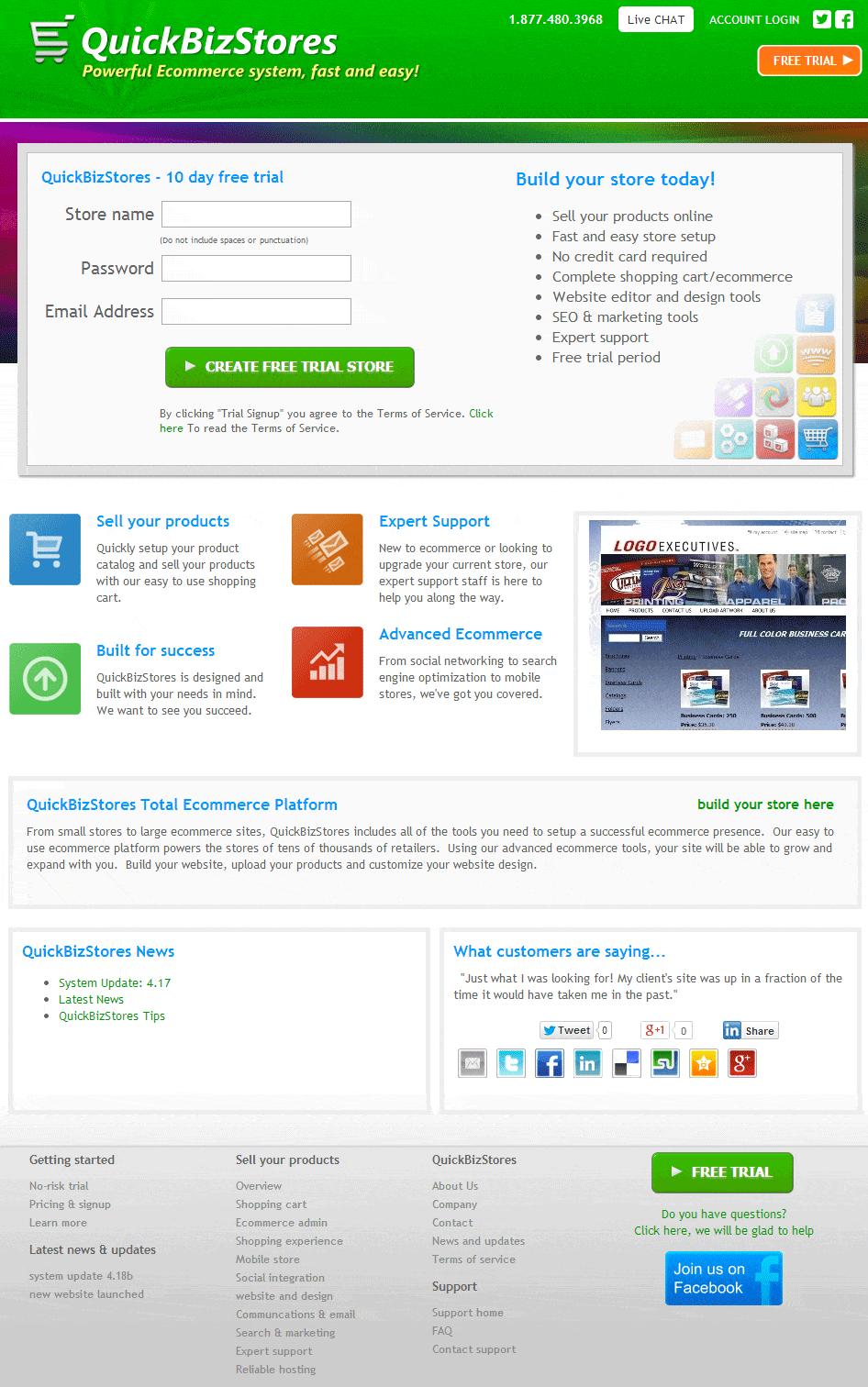
The Good: Lots of highly visible calls-to-action for a Free Trial. This tells you the designers took the time to define a clear conversion goal for the page and they are going for it. CTA buttons appear twice above the fold and once below. They get support from a variety of easily scanned, bulleted copy that is generally benefit-driven. The product is for those who do not have the time and/or inclination to set up a complex ecommerce system, so the designers have wisely left the tech talk for later.
The Bad: What? We’ve hardly met and you want my name and address? And if I give it to you it means we have an ‘agreement’? What kind of customer do you think I am? The sign-up form in the top left, a spot where most people start their scan of a web page, is misplaced. Customers have not yet received enough information to answer the questions and concerns they have before they are ready to go to second base.
AB Test Suggestion: Move the ‘QuickBizStores Total Ecommerce Platform’ paragraph to above the sign-up form window. It’s short enough that the form, copy and portfolio animation (is that what it is?) will still be above the fold, but the customer gets the chance to be wooed by a little copy before being asked to enter into a relationship.
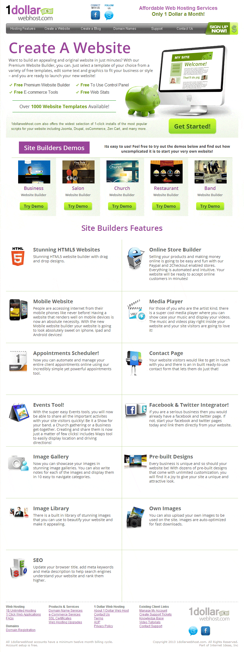
The Good: Well designed with good, benefit-driven content. A lot of information is conveyed above the fold, but the design doesn’t seem too busy. It helps that the information is parceled in a number of different devices, including the headline, image (especially the piggy bank), paragraph, bullets,
text box, etc..
The Bad: Once you go below the fold, it’s like you’re in a parallel universe where CTA buttons don’t exist. It’s good that the designers expand upon and add to the information delivered above the fold. But regardless of how good it is, asking visitors to scroll back up the page to take the call to action forces them to take a step backward at a moment when they may be ready to take the ultimate step forward to become a customer. It’s good to have a CTA button on hand should it be needed.
AB Test Suggestion: Try adding testimonials, social proof or at least a brief portfolio/customers section. Calming the customer’s fears, uncertainties and doubts, especially for an offer that many may find ‘unbelievable’ (free website, $1 dollar hosting), makes more sense here than on most other sites.
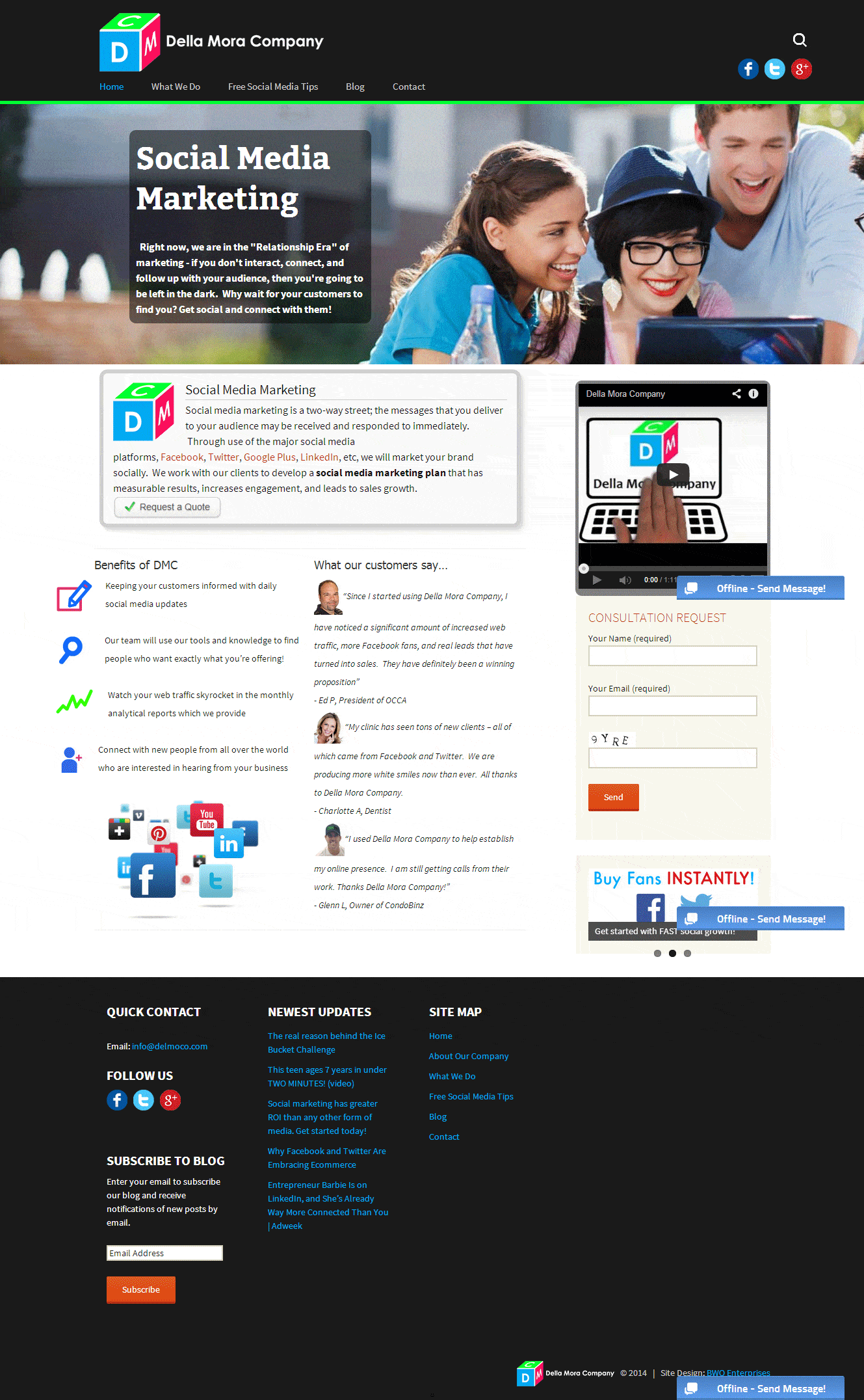
The Good: The ‘good’ in this page is that it is not terrible. Relatively clean design – even if some of the elements struggle to remain aligned in the standard ‘twentyt hirteen’ WordPress theme. Good effort to include conversion-boosting components, including big imagery, testimonials, a short entry form, video and bulleted benefits.
The Bad: Where’s the call to action above the fold? Yes, if you look closely you’ll spot it – or them; there are multiple, competing calls to action – but they should be ‘bonk-on-the-head’ obvious. In this case, the CTA that’s above the fold, (a white button on a white background) is the least noticeable main element on the page. Tsk, tsk.
AB Test Suggestions: Must stick with the CTA buttons on this one. First, try a color, any color other than white, for the ‘Request a Quote’ button. Second, try copy that implies a benefit on the “Consultation Request’ CTA button. Or at least something other than ‘Send’.
YP.ca (Yellow Pages)
While I’m not sure how big the companies are in our first three examples, they’re not likely to be on par with Apple and Microsoft and not as likely to have access to the same design and conversion optimization resources. While Yellow Pages is also not Apple or Microsoft, they were huge long before most of us could fathom the idea of a computer hardware or software company. In any case, we should see some higher-end design and conversion tactics here.
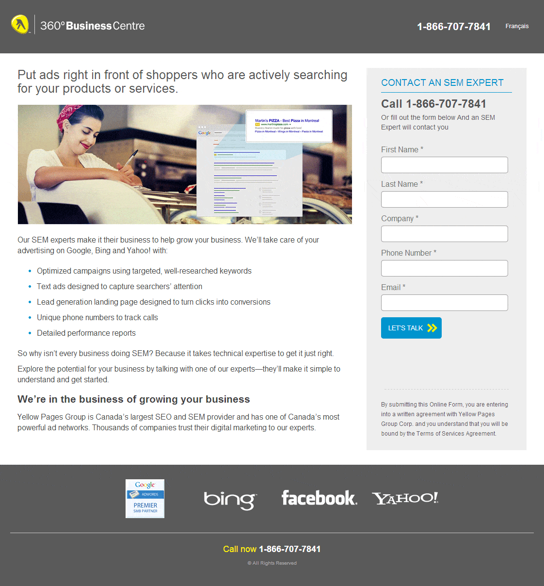
The Good: This is the only one of our examples to prominently feature direct contact information above the fold. But that’s it. While there’s nothing really wrong here, there’s also nothing remarkable.
The Bad: The call-to-action button. On a page headlined “Put ads right in front of customers who are actively searching for your products or services’, which is a fairly exciting prospect, the CTA reads ‘Let’s Talk’. Let’s talk? Talk shmalk. I want to do what it says in the headline. And I want to ‘Get Started Today’ or ‘Build My Business’ or ‘Turn my Website into a Customer Magnet’ or at very least ‘Get a Free Consultation’, but ‘Let’s Talk’? Nah, I don’t want to do that.
AB Test Suggestions: Get rid of the fine print below the CTA. Don’t even test it. Just get rid of it. No one wants to ‘submit’ and/or be ‘bound’ – at least not on a Yellow Pages site.
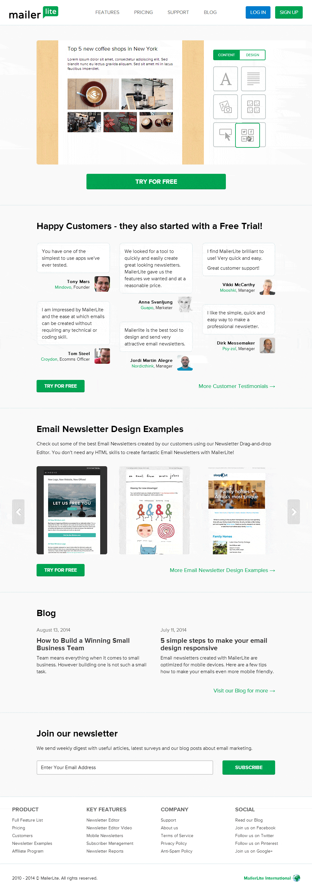
The Good: Just about everything. Within 10 seconds of landing, I know how easy the product is to use, that I can try it for free and that the company has ‘Happy Customers’ – who started with that same free trial. And the site does all that in 10 words. It’s simple and brilliant.
The Bad: The site needs to be a heck of a lot more brilliant to make sure no visitor has even a single question about the product, the company or anything to do with either one. Why? Because there is no telephone, email or contact information of any sort on the landing page. Check it out. The words ‘Contact’, ‘Call’, ‘Telephone’ and/or ‘Help’ do not exist on the landing page, nor do the terms ‘Get in Touch’ or ‘Customer Service’ or anything like them. Nowhere. Not even in the footer menu. Good way to ruin a good thing.
Oh, wait, in what must be the most glaring example ever of ‘two peoples separated by a common language’ (mailerlite.com is UK-based), if you have a question on MailerLite.com you must click the ‘Support’ link in the navbar. Then, suddenly, you have more contact information than you know what to do with:
- A nice, quick query form
- An email address
- Separate US and UK telephone numbers
- A ‘Knowledge Base’
- Two ‘customer service’ people
- The founder of the company
- Even a mailing address in Lithuania
Yet not the faintest sign of any of it on the landing page. Brilliant.
AB Test Suggestions: You have three guesses.
OK. That’s my two cents – and some extra change – on these web pages. I would love to get your feedback.

