Disclaimer: This section is a TL;DR of the main article, and it’s for you if you’re not interested in reading the whole article. On the other hand, if you want to read the full blog, just scroll down, and you’ll see the introduction.
- If you do a quick google search, you will see 1000s of results that show articles that discuss how to optimize your landing page.
- As much as it might have been spoken about a lot, we seem to forget to mention one important aspect of landing page optimization. Which is optimizing based on where visitors are coming from.
- A website visitor from social media and a visitor from organic search doesn’t have the same need and shouldn’t be shown the same landing page.
- Landing page optimization is about a seamless and flawless user experience on all browsers, devices, and sources.
The Golden Rule Of Every Landing Page
- Good persuasive copy isn’t written in an overly “sales-focused” manner. But it is written in a way that truly speaks to a visitor as an individual – no matter where the visitor is coming from.
- Most brands fail to do this on their landing page because all they do is talk about themselves or use company-centric language to explain what they are all about.
- If you’re not even able to speak your audience’s language, your landing page tells them that you don’t care about them and just want their money.
Visitors Coming From Social Media
- Sending traffic from your ad to your homepage is one of the deadly sins of landing page optimization.
- When visitors click through your ad, they expect to see more of what they saw in the ad.
- A disconnect between your landing page copy and the design of your ad will make you lose important conversions.
Visitors Coming From A Podcast You Appeared On
- Most people make the mistake of sending traffic from their podcast appearance to their site’s homepage.
- If you want high conversion rates from that particular traffic, then you need to create a customized landing page designed specifically for the traffic arriving on your landing page.
First-time vs. Old visitors
- As you optimize your landing pages for different traffic sources, you might also need to consider that traffic in terms of first-time visitors versus old visitors.
- There is always a significant difference between what works for first-time visitors and those who have visited your page two to three times in the previous 8 weeks.
- Whether the visitor is new or old, your landing page should act as the brand representative.
Here’s a longer and more detailed version of the article
Landing page optimization is not something new.
If you do a quick google search, you will see 1000s of results that show articles that discuss how to optimize your landing page.
Some of these articles date back to the days before popular social networks such as Whatsapp, Twitter, and Instagram were created.
That’s really an indication of how old this topic is.
But the conversation about landing page optimization is far from being over.
As much as it might have been spoken about a lot, we seem to forget to mention one important aspect of landing page optimization.
Which is optimizing based on where visitors are coming from.
Just step back and think about this for a minute:
Does a visitor who comes from social media have the same needs as someone coming from a guest post you wrote? Does she need the same type of information? Are the same CTAs going to work for both groups?
Clearly, the answer is no. Even if you’re showing the same product/service but the way you should approach these visitors should be different.
Most of the visitors coming from social media usually don’t have an intent to buy (top of the funnel). So you should approach them differently from those coming from organic or the guest post you wrote.
You are more likely to lose potential customers if you are using one landing page to address all types of visitors. It’s okay to have more landing pages – according to Hubspot, the more landing pages you have, the more opportunities you have to convert site visitors into leads.
Think about this: If we spend much time optimizing landing pages for different devices and browsers, don’t you think optimizing landing pages based on visitor sources should be mandatory?
Landing page optimization is about a seamless and flawless experience for users on all browsers, devices, and sources.
If you strategize your landing page based on visitor expectations, where they are coming from – you are more likely to witness an increase in conversions.
Before we get into different tactics you should consider when optimizing landing pages for different sources, let’s begin by looking at the golden rule of every landing page.
The Golden Rule of Every Landing Page
You probably have heard this a thousand times: good persuasive copy isn’t written in an overly “sales-focused” manner. But it is written in a way that truly speaks to a visitor as an individual – no matter where the visitor is coming from.
Once a visitor lands on your page, your page has to show the visitor:
- That they are in the right place
- That the site/company is trustworthy
- The product/service they need
- The info they need to stay and read/skim
- Where they should sign up or buy.
Most brands fail to do this on their landing page because all they do is talk about themselves or they use company-centric language that explains what they are all about.
The problem with this approach is: your target customers don’t care about you or your company. They care about themselves. And they want the company they give their money to care for them, too.
So, simply put: If you’re not even able to speak your audience’s language, your landing page is essentially telling them that you don’t care about them and that you just want their money.
Having said that, now let’s look at how you can optimize your landing pages for visitors coming from different sources.
Visitors coming from Social Media
One of the deadly sins of landing page optimization is to send your traffic from a social media ad to your homepage. If a visitor clicks on your social media ad, they are expecting to see more of the ad information on the page you’re directing them to. It’s a well-established principle that digital ads are far more likely to drive conversions when combined with complementary landing pages.
A disconnect between your landing page copy and social media ad will certainly make you lose conversions. There has to be a consistency between what you use to draw their attention and what you’re going to use to convert them.
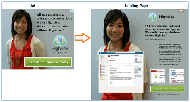
For instance, let’s take a look at the perfect example above from Highrise, how the color, typography, and visual design are matching from one point to another. There is a consistency in what the ad is promising, as well as the design they have used to make it look familiar to the visitor.
While we are here, it’s also important to note that your landing pages are optimized for the mobile market. Over and over again we have noticed that brands only optimize their social media ads for mobile users and forget to do the same on their landing pages. Tell you what, there’s nothing more annoying to a mobile device visitor than clicking on an ad that takes them to a hard-to-read landing page.
If you are actively targeting people on mobile, make sure your landing pages are as effective as your ads – or you will lose conversions.
The post-click landing page should be designed as a natural extension of the ad clicked. Each element on the page should notify the visitor they’ve landed at the right place, and that the offer they wanted is only a CTA click away.
Visitors coming from a Podcast you appeared on
Getting that podcast appearance can be a good thing for your personal brand. But it becomes sweeter when you can actually get serious traffic from it.
Most people make the mistake of sending traffic from a podcast appearance directly to their home page. You’re smart, don’t be like them.
If you want to have high conversion rates from that particular traffic, then you need to create a customized landing page designed specifically for the traffic that will be arriving on your landing page.
This particular landing page should not just be like any other landing page. But it should have the same feel as you did on the podcast you appeared on.
For instance, folks at Industrial Strength Marketing Podcast have an episode where they talk about a free guide for “7 Reasons Industrials and B2Bs Need Responsive Websites.” They also have a dedicated landing page for this particular episode:
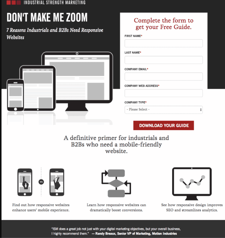
This same principle should also be applied when you write a guest post. I know you won’t have landing pages for every guest post you write. But if you regularly post about a certain subject, you should consider having a customized landing page.
Visitors coming from a Comment section
The principle for this landing page is similar to the one above.
When dropping a comment on a website’s comment section, I’ve seen many people also adding a link that redirects visitors to a certain customized landing page.
I know. Having a customized landing page for every site you drop a comment on is unrealistic. But if you have landing pages for the sites you comment on the most, you can quickly orientate people after they’ve clicked your link.
Visitors who click on your email signature
Where do you usually send visitors that click on your email signature?
Most people direct visitors to the homepage. It’s not bad, considering that the person clicking on your email signature already knows about you.
But that doesn’t mean that you can’t be creative enough to get personal by introducing who you are and what you are really passionate about.
Use this opportunity to add a more personal—and bottom-of-funnel—touch to your communication.
Thank you landing pages
A thank you page is the page your visitors, leads, and customers see right after filling out and submitting a form on a landing page/web page. Think of it as a page rich with opportunities to apply basic upselling psychology.
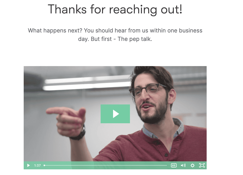
Wistia has one of the best “Thank you pages” I’ve ever seen. Wistia knows how to use creativity to get someone excited to hear from them. I mean, once you submit a form requesting to talk to their sales, this is what you will see:
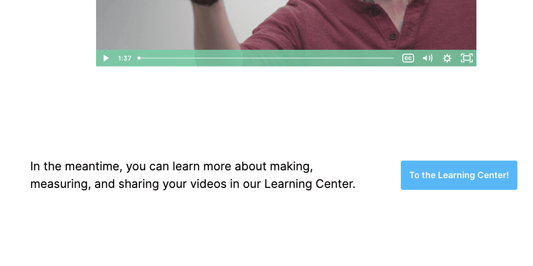
Just below that video, they also invite your prospects to learn more about their product:
Give your leads every opportunity to self educate and look around after they convert (like displaying your site’s navigation menu) and they will love you for it.
Visitors who have just subscribed or signed up
When building your subscription flow, you can customize the pages that appear to subscribers as they sign-up. You can also control where your new subscribers are directed once they complete the sign-up process and exit out of the subscription pages.
Where do you send your visitors after they have signed up to your email list?
I know for a fact that most marketers don’t put much thought into their post-sign-up pages. In a way, most post-subscribe pages don’t serve much of a purpose except to confirm that someone has successfully opted in.
A well-crafted post-sign-up page should take full advantage of the momentum that the visitor has at that moment.
When a visitor successfully opts into your email list, you can use your post-signup landing page or maybe use a popup to drive more op-tins:
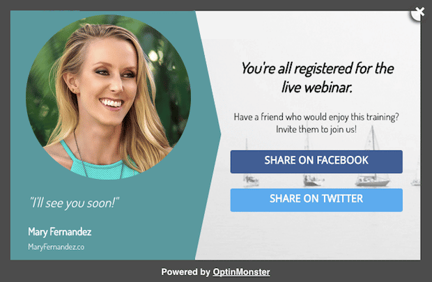
The way to create a snowball effect is to invite new subscribers to share your opt-in page with their friends. You can include social media sharing buttons to make this easy for your users.
Visitors who land on the 404 error page
Okay, you might be thinking ‘isn’t a 404 page just an error page?’, and you’d be correct, but it could be the first page that your visitors land on when they try to visit your site.
Who said visitors who land on your 404 error page should leave annoyed and frustrated?
We have a whole article on this blog that talks about increasing conversions on 404 error pages. In that article, I mentioned that a strong 404 page is not only on-brand but is actually a place to put brand voice on display. This can be done through humor, an interactive element, or even just by simply being helpful and human.
Check out this humorous Gong 404 error page:
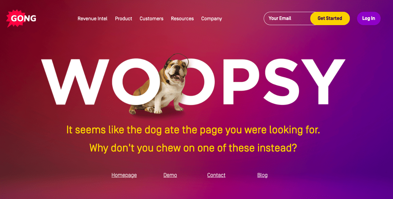
Gong’s error page is quite humorous. The page also offers a solution that can help visitors out of this dead-end.
First-time vs. Old visitors
So as you look to optimize your landing pages for different traffic sources, you might also need to think about that traffic in terms of first-time visitors versus old visitors.
In our experience optimizing landing pages for different brands across different industries, we have noticed that there is always a significant difference between what works for first-time visitors and those who have visited your page two to three times in the previous 8 weeks old visitors.
A few facts about first-time visitors:
- First-time visitors are strangers to your business.
- It is the most underperforming group with a conversion rate significantly lower.
- At the awareness stage, they are not ready to make a purchase decision.
- It is the most expensive type of visitor on your site, as shown by your traffic generation spend.
- They have unique information and messaging requirements.
A few facts about old or returning visitors:
- They know about you.
- They are more likely going to take the desired action you want them to take on your page.
- It’s much easier to convince them to make a purchase since they are way past the awareness stage.
- Your copy needs to be persuasive.
Whether the visitor is new or old, your landing page should actually act as the brand representative. Your first-time visitors are not even sure if you will deliver what you promise on your landing page. Returning visitors have already shown interest by coming back to your page, all they need is a little nudge to make the purchase.
So it’s important that your brand representative (landing page in this case) establish trust for the first-time visitors, and provide a compelling offer for old visitors.
Here are some landing page elements that can work for both old and new visitors:
1. Add Testimonials
Newcomers will never trust your business if no one recommends it. In fact, all visitors (new and old) are naturally skeptical any time they venture onto a company website, which is why it’s important that your landing page reflects positively on your business.
One way you can do this is by inserting some customer testimonials on your landing pages. A customer testimonial (even a short quote) goes a long way to build trust.
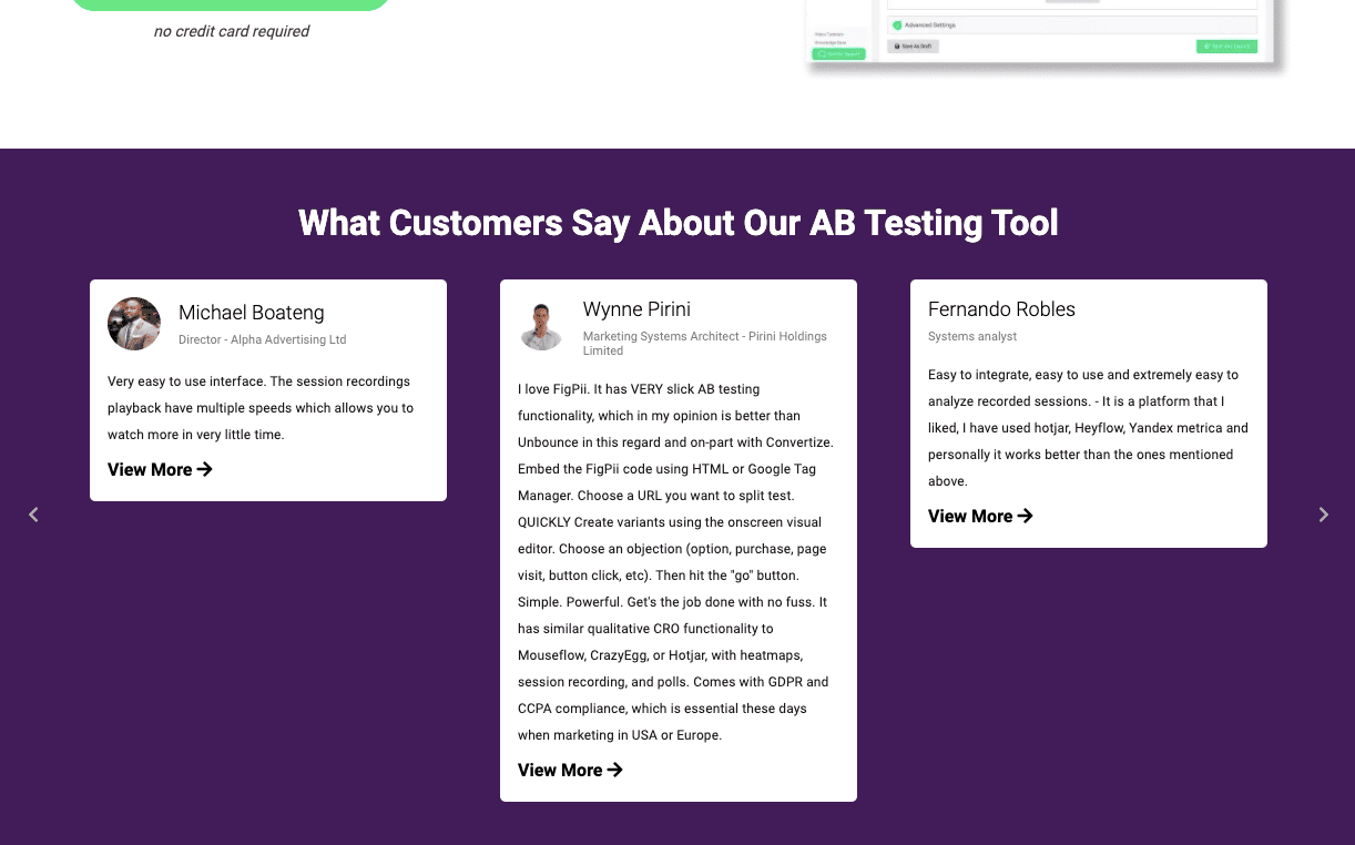
The landing page of FigPii is a perfect example. The testimonials on the page leave a good impression on your potential customers.
But you have to be extra careful with testimonials – they can make or break your conversions. Testimonials have to be real and they should always contain real people not characters from stock photos.
2. Provide Social Proof
Displaying social proof quells fear and makes people feel more confident about taking the same action. One way of showing that is by displaying the number of customers who have purchased the product or the number of people who have downloaded your asset.
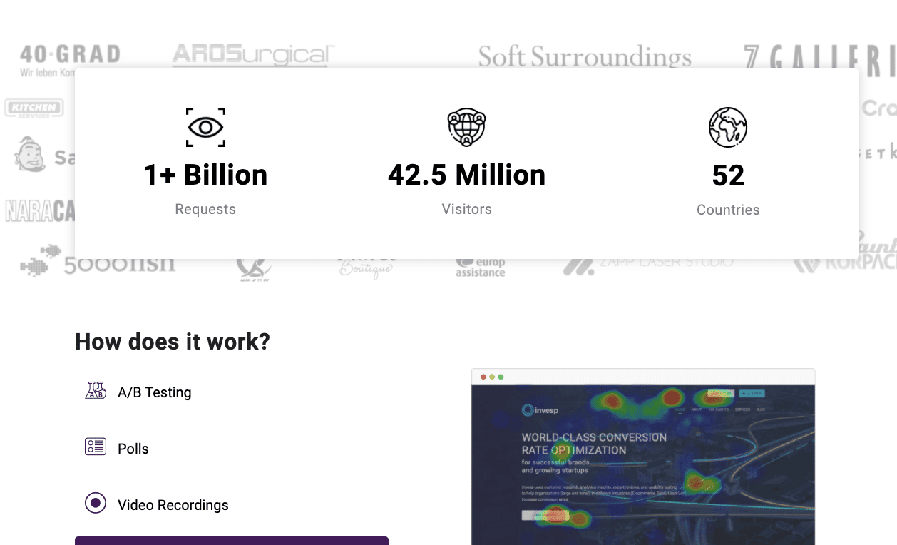
FigPii displays social proof by showing the number of countries, and the number of visitors recorded using the CRO platform.
3. Display Certification Logos
This has always been a classic tactic to garner the trust of any kind of visitor. If you have associations or partnerships with trusted companies in your space that are relevant and well-known then display them.

This is particularly important if you are asking for payment or identity information.
In our experience, the best way to turn a visitor into a buyer is to understand the moments of struggle that have led customers to consider hiring our products. You also have to understand their emotional and social needs.
To do that, you need to interview customers in a particular way about their Jobs-to-be-Done (#JTBD). This way, you bring them back to that very moment they thought about purchasing your product.
#JTBD framework drills down into the minds of the customers and helps you see the emotional and social needs that trigger customers to make a purchase. As you talk with customers about their JTBD, you will start to hear what words customers use to describe their own struggle.
You can then use these words to craft your landing page copy as if it were a mirror. So when a new visitor reads your copy, they will see themselves.
If you want to learn how to conduct a JTBD interview, we’ve uploaded a whole recording of it on our Youtube channel, be sure to take a listen.
Conclusion
Looking at the above tactics, it’s easier to think that it’s impossible to have all those kinds of landing pages, right? However, this shouldn’t come as a surprise to any brand. Most brand decisions you make are based on where your business is coming from. Optimizing your landing pages based on visitor sources definitely increases conversions, and it also increases the relatability and personability of your business’ online presence.

