You can lose visitors when your website becomes difficult or clunky to use on mobile devices.
Picture this: billions of users scrolling, tapping, and swiping on their small screens, presenting an enormous business opportunity. But here’s the catch: capturing their attention and, more importantly, their conversions on those tiny screens can be challenging.
How can a business increase website conversions on small screens?
That’s where mobile optimization steps in.
In this article, we’ll discuss the principles of mobile optimization and some of the best practices to make your brand shine on mobile devices – along with examples of brands mastering the art of mobile engagement and conversion.
Key Principles of Mobile Optimization
Mobile-responsive website design
A responsive web design adapts to whatever device the user is viewing it on.
The content appears differently depending on how much screen real estate you have available on your phone or tablet. This means that your site will look good no matter what device you use to visit it.
Here’s how it works:
- Fluid Grids: Responsive designs use fluid grids that automatically adjust the layout and content based on the screen size. This ensures that elements like text, images, and buttons scale proportionally.
- Flexible Images: Images are coded to resize and scale down without losing quality or breaking the layout, maintaining a visually pleasing appearance on all screens.
Mobile-adaptive website design
Adaptive design takes a more targeted approach by creating distinct layouts for different devices and screen sizes. It provides a tailored experience for each type of user device.
Here’s how it differs from responsive design:
- Device Detection: Adaptive designs use server-side or client-side techniques to detect the user’s device and serve the appropriate version of the website.
- Customized Content: Each version of the website is optimized for the specific device, often with different layouts, images, and features to enhance the user experience.
Amazon does it really well.
Visit their desktop website, and you’ll come across a feature-rich interface with nearly countless product listings and navigation options.
On the other hand, their tablet or mobile website appears minimal compared to their desktop site.
Here’s how Amazon’s website appears on your desktop, tablet, and mobile phone:
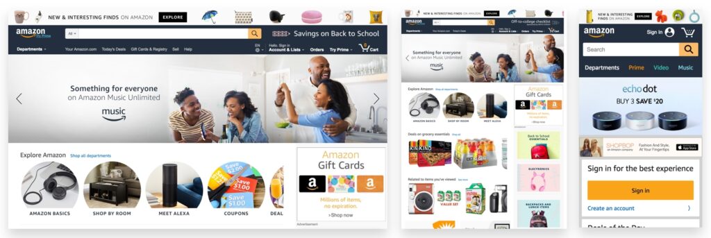
You’ll notice that the mobile website also has larger touch targets, ensuring you get to shop comfortably regardless of the device size.
Page load speed optimization
A study by Google suggests that when page load time grows from 1s to 3s, the risk of bounce increases by 23%, or 90%, if it climbs from 1s to 5s.
Naturally, slow-loading pages can frustrate your visitors as well as Google, resulting in high bounce rates and, eventually, low conversion rates.
On the other hand, fast page load speed is like the golden ticket to the digital universe where both website visitors and Google share a rare moment of harmony.
Here are some quick tips to help you optimize the page load speed of your mobile website:
- Image Optimization: Compressing and resizing images for mobile screens will help you achieve higher page load speed. Brands often use responsive image techniques to serve appropriately sized images based on the user’s device.
- Minimizing HTTP Requests: Reducing the number of HTTP requests by combining files, such as CSS and JavaScript, can speed up page load times. You can achieve this through minification and bundling techniques.
For example, Google’s mobile search page is a model of minimalism. It minimizes the number of requests, resulting in rapid load times even on slower mobile connections.
- Leverage Content Delivery Networks (CDNs): CDNs distribute content across multiple servers worldwide, reducing the physical distance between the server and the user. This leads to faster content delivery.
- Caching: Implementing caching mechanisms allows frequently accessed content to be stored locally on the user’s device, reducing the need to re-fetch data from the server on subsequent visits.
- Reducing Redirects: Excessive redirects can add extra HTTP requests and delay page loading. Minimizing or eliminating unnecessary redirects can improve load times.
- AMP (Accelerated Mobile Pages): Implementing AMP, a Google-backed initiative, can help create ultra-fast loading pages specifically for mobile users. These pages are optimized for speed and performance.
Mobile-friendly content
Mobile-friendly content is a key principle of mobile optimization.
This means it’s important to ensure the website content is easy to read, interact with, and navigate on a mobile device.
Here are some key considerations when optimizing your website content for mobile devices:
- Make sure your text is readable.
- Use legible fonts, appropriate font sizes, and ample line spacing.
- Break up long blocks of text with subheadings, bulleted lists, and other visual elements.
- Provide ample white space around images so they don’t detract from the text or break up the flow of reading.
- Use clear navigation menus that are easy to read on smaller screens.
- If your content includes contact or sign-up forms, use input elements that are easy to tap and fill out on touch screens.
Mobile-friendly navigation
Keep your website navigation straightforward for mobile devices.
You don’t want your mobile users to feel like they’re playing a scavenger hunt just to find what they’re looking for.
The more accessible users find what they’re looking for, the better their chance of staying on your site and converting into customers.
The best way to do this is by using dropdown menus or tabs so your visitors aren’t forced to scroll all the to the bottom or through multiple pages or links before finally finding what they’re looking for.
Here are some tips to align your site navigation design with your mobile site:
- Clear and Minimalistic Menus: Mobile screens have limited space, so your navigation menu should be concise enough to fit that space. Go a step further by using recognizable icons or labels for your menu items.
- Thumb-Friendly Design: Your navigation elements, like buttons and links, should be large enough and well-spaced to accommodate touch input with thumbs. This avoids frustration that can occur with accidental taps.
- Streamlined Navigation Paths: Simplify the user’s journey by minimizing the steps required to access content or complete tasks. Avoid unnecessary pop-ups or interstitials that can disrupt navigation.
- Search Functionality: Include a prominent and functional search bar, allowing users to find specific content quickly. Implement auto-suggestions to assist users in their search.
- Intuitive Back Button: Add an easily accessible “Back” button, so your users can navigate back to the previous screen or step in their journey.
Instagram’s mobile app is a champ when it comes to user-friendly navigation.
They’ve got big, easy-to-tap buttons at the bottom for stuff like your feed, search, notifications, and your profile.
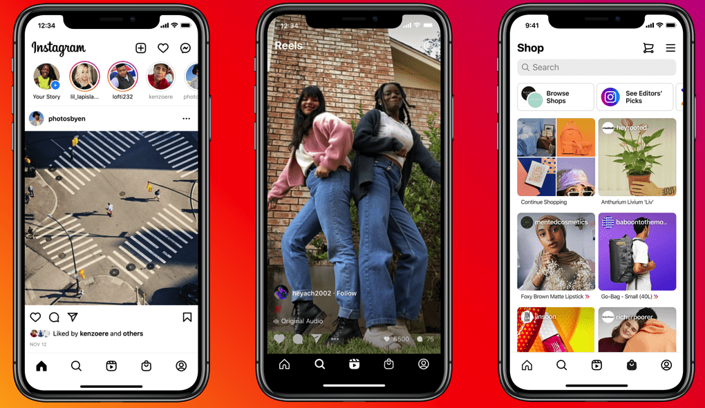
The best part? The app keeps things simple, so you can scroll, like, comment, and share without any fuss. And if you’re searching for something or someone, that search bar is right at the top with suggestions to help you out.
When you’re uploading a picture or a video, Instagram lets you know how it’s going with progress indicators.
All in all, it’s a great example of how to make mobile navigation a breeze.
Implementing mobile SEO best practices
Mobile SEO is an integral part of the overall mobile optimization process. With over half of internet searches now being conducted on mobile devices, it’s imperative that your website is optimized for these users.
We’ve already touched upon some essential parts of mobile SEO, including creating a mobile-responsive design, adding mobile-friendly content, and optimizing page speed.
Here’s a list of some more key strategies for mobile SEO:
- Optimize for Local Search: If your business has a physical presence, you might want to optimize your site for local search. Use local keywords, create a Google My Business profile, and encourage customer reviews.
- Mobile-First Indexing: Google predominantly uses the mobile version of a website’s content for ranking and indexing. So, make sure your mobile site has the same content and metadata as your desktop site.
- Mobile-Friendly URL Structure: Use clean and user-friendly URLs that are easy to type and remember on mobile devices. Avoid lengthy, complicated URLs.
Techniques for Increasing Conversions on Your Mobile Devices
Using mobile-friendly CTAs (Call-to-Action)
When you’re trying to get your visitors to convert – which you most likely are – the CTA button is an integral part of your website design.
For the uninitiated, a CTA helps you direct the users to take action on your site by clicking, downloading, or buying something.
Something that will help you compel your visitors into taking the intended action is clearly one of the most important parts of your website. It goes without saying that you can’t neglect optimizing your CTAs for mobile devices.
First and foremost, you have to place your CTAs prominently where users can easily spot them. They shouldn’t have to go out of their way to find a simple CTA.
Aside from the placement, the buttons should also be large enough so that your website visitors can tap them without accidentally clicking other elements.
Look at the CTA buttons in this example below, for example:
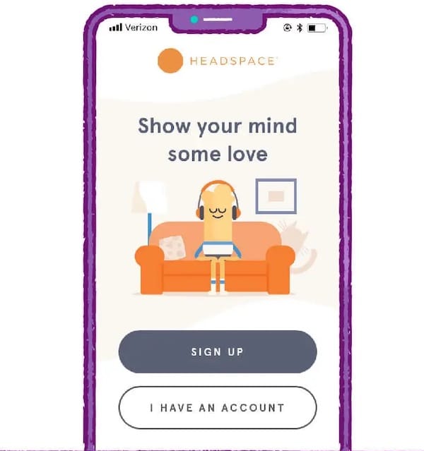
Other than this, if your CTA involves filling out a form, keep it concise and minimize the number of required fields. Mobile users are less likely to complete lengthy forms on small screens.
Streamlined Checkout Process
There are no two ways about it: If you want potential buyers to complete the buying process on your mobile site, you have to make your checkout process as smooth and fast as possible.
In addition, if the customer needs help or assistance during the checkout process, ensure they have easy access to live chat or email support to help them complete their purchase.
One way to make the checkout process easier is by introducing one-click or express checkout options. You’ll just have to store user information securely for future transactions, and they’ll be able to complete their purchase with minimal effort.
For new visitors, you can offer the guest checkout option to let them check out without having to create an account with you.
Look at Etsy’s guest checkout option, for instance:
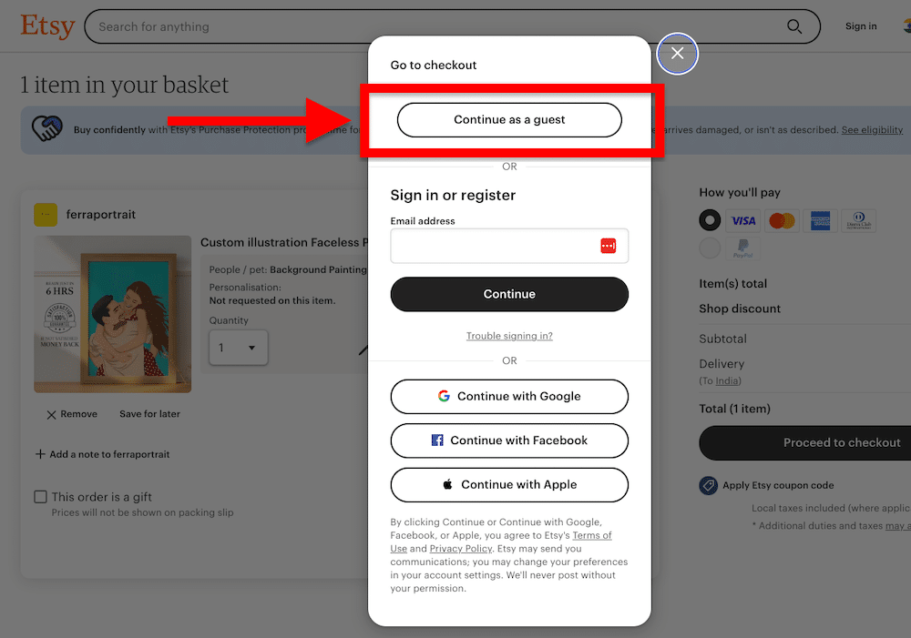
If your checkout process has multiple steps, you could also use progress indicators to guide users through each step. This helps users understand where they are in the process and how much more is left.
Here are some more tips to streamline and optimize your checkout process:
- Mobile-Friendly Payment Forms: Design payment forms that are optimized for mobile screens. Use touch-friendly input fields and make it easy for users to enter payment information.
- Address Auto-Fill: Implement address auto-fill functionality to simplify the process of entering shipping information. Users can enter their postal code, and the system can auto-populate the rest of the address.
- Clear Return and Privacy Policies: Clearly communicate return policies, shipping fees, and privacy policies during the checkout process. Transparency builds trust and encourages users to proceed with their purchase.
Offer mobile-specific incentives
Suppose a considerable part of your audience uses mobile devices to browse your website. In that case, it makes sense to offer incentives that cater specifically to mobile devices — like gift cards or discounts.
Mobile-specific incentives will encourage and make it easy for users to avail of your offers.
You could also offer promotions and coupons that are exclusively available to users who access your platform through mobile devices.
Another way to entice your mobile audience is by sending targeted push notifications with special offers, discounts, or time-sensitive deals. This strategy can also help you re-engage users who abandoned their carts or previous customers who haven’t shopped with you in a while.
What’s more, you can add gamification elements to the mix to make the user experience more engaging. To entice your audience, you can offer rewards, badges, or points for completing mobile-specific tasks or actions.
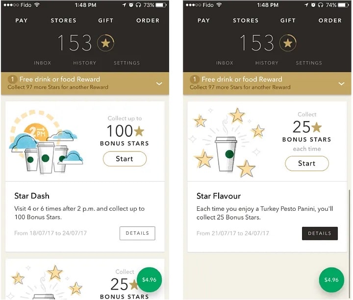
For example, let’s take a page out of Starbucks’ playbook.
Starbucks gamifies its mobile app experience by rewarding customers with stars for their mobile orders, which they can exchange for drinks or food later on.
A/B testing for mobile
To design and optimize your website, keeping your visitors’ preferences in mind, you have to first understand how they’re using their phones and tablets to browse your website in the first place.
A/B testing is one way to discover how potential customers react to different features and layouts, and it impacts your conversion rate. It can also help you pinpoint potential problems before they become serious issues that can harm your bottom line.
How do you go about it?
Here are some tips:
- Testing Objectives: Before the main process, you need to know and define your testing objectives. Make sure to determine which website metric you want to improve – it could be your click-through rates, form submissions, or sales.
- Test Elements: Identify the elements you want to test. You could test your website layout, color scheme, button placement, or wording of your mobile content. A/B testing includes making changes to one version (A) while keeping the other version (B) as a control.
- Randomized Testing: Assign users to the A and B groups randomly to minimize bias. Once through with randomizing, use credible A/B testing tools to conduct the tests.
- Sample Size and Duration: Determine an appropriate sample size for your tests and the duration the test will run. You might want to run your tests for a longer duration to gather statistically significant results.
- Analysis and Iteration: After collecting data, analyze the results to determine which version performed better in terms of conversions. Implement the changes from the winning version and continue iterating to improve further.
Put your most important information above the fold
If you’re wondering what exactly above the fold is about – it’s basically everything you see as soon as you land on a website without the need for scrolling.
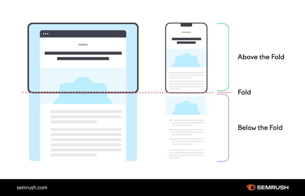
This area often has limited space, so you can’t use it to convey everything you want. For this reason, you’ll have to pick the MOST important information to go above the fold.
You could add your key messages, the most important CTAs, or crucial product details in this visible area of a mobile screen.
Another important element that goes above the fold if a concise and compelling headline that can communicate your USP or main offer succinctly. This headline should be visible without users needing to scroll down.
Your turn now to optimize your mobile site!
Mobile devices are now one of the major gateways to the online world. Looking at the sheer number of mobile users, mobile optimization is no longer a choice but a necessity if you want your business to thrive (and who doesn’t want that).
In this article, we explored some tried and tested strategies to help you engage your mobile site visitors and significantly improve conversion rates.
These mobile-specific techniques include adding mobile-friendly CTAs, streamlining checkout processes, offering mobile-specific incentives, A/B testing, and placing essential information above the fold.
And these are just some of the few practices. You can do much more to optimize your website for mobile devices. Nonetheless, it’s a good starting point.


