Editor note: If you are looking to get more information on the design of call to action buttons, we highly recommend reading our complete guide to effective CTA buttons.
Website owners are often surprised by how giving visitors easy to locate options, and often repeating a “Call to Actions” multiple times on a page, can lead to significant increases in conversions.
The Problem
Our customer, Fulcrum Gallery, a company that specializes in selling of art pieces online, was facing major conversion issues. Our analytics assessment pointed to several areas, which we can focus on: the homepage, product pages, checkout process, etc. The conversion optimization team noticed that the website suffered from a high checkout abandonment rate. Analytics showed that the cart page had high exit and bounce rates as well. The team identified the cart page as one of the initial pages to work on.
Conversion Framework Analysis
Let’s go through the test.
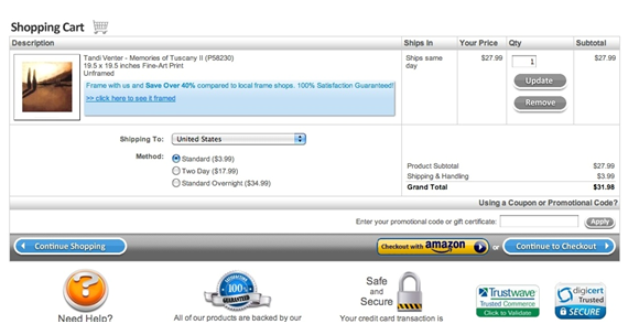
This is what the original cart looked like prior to making any change to it:
The initial Conversion Framework assessment pointed out multiple issues on this page.
FUDs (Fear, uncertainty, and doubt) is one of the main elements we evaluate during a Conversion Framework assessment of any page. The FUDs element is broken down into over 70 sub elements that we analyze on any given page. FUDs vary from one page to the next based on the type of page. The FUDs visitors face on the main homepage are different than those on the cart page. On the main homepage, a visitor is wondering if they landed on the right website or if the website has what they are looking for. On a cart page, the visitor is wondering if she is making the right purchase decision or if her items are going to arrive on time. One of the sub- elements of FUDs is “webpage element clarity and balance.” With element clarity and balance, the most important elements of a webpage should be highlighted and they must designed and placed in a way to draw visitor’s attention. When evaluating the “webpage element clarity and balance” on Fulcrum’s original cart design, we noticed that the “Continue to Checkout” button, which is the most important element on the page, is not placed in a way to draw a visitors’ attention.
The “Continue to Checkout” button was placed along a gray bar, which takes away from the visual draw of that element. The “Continue to Checkout” hadalso the same size and look as the “Continue Shopping” button. Finally, the “checkout with Amazon” button was placed next to the “Continue to Checkout” button had a better visual appeal. The “checkout with Amazon” button color stood out very clearly on the page.
Hypothesis
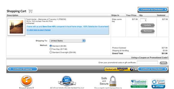
Prior to changing the size and the look of the “Continue to Checkout” button, we decided to simply place the button above the cart, thus drawing customers’ attention to it. The hypothesis was: Adding a second “Continue to Checkout” button on top of the cart will increase conversion rates.
Is it possible for two CTAs on the same page, which essentially have the same function, to increase conversion?
Here is the new design of the cart page:
The Results
The results were quite exciting. Our customer saw a 20% increase in conversions from this simple change.
Conversion Optimization Insights from the test
Why did adding an additional “Continue to Checkout” button increase conversions?Introducing a top “call to action” did a few things:
- The top call to action is highlighted and appears as an important element on the page.
- The top CTA draws customers’ attention to both “Continue to Checkout” buttons since it is a top element and the eye is accustomed to the look and feel of it.
- For customers with multiple items in their cart, they don’t have to scroll down to start the checkout process since the “Continue to Checkout” button is now located on the top as well.
Lesson learned: if you want your visitors to take a course of action, place the corresponding CTA in an obvious and clear manner for them to find it.
This particular customer’s cart went through many changes. Follow the Invesp blog (@invesp) to learn more about conversion increases through optimization and testing on Pii.


