We have discussed what personas are. We’ve also talked about the difference between market segmentation and personas. I’ve eluded throughout my previous blogs the reasons behind developing personas. But I want to take a closer look at why every site and business should create personas to represent their target markets.
Did you ever notice how great it feels to explain your business or an idea you believe in to a friend, a co-worker, or even a client? When I sit face to face with a person and talk to them about our services, there is enthusiasm, focus, and most importantly real examples. I can anticipate what questions they will have. I can give more examples when I feel they did not understand what I am talking about. I know when to continue and when to stop by seeing the person, knowing what will grab their attention, and reading their facial expressions for signs of confusion.
But too many times the copy on many websites lacks that because it is catering to the masses, not to one single person. We are trying to please thousands of people who land on our website. And the result is dull copy that only satisfies a low percentage of the thousand visitors. The idea of creating personas for a website will eliminate talking to empty air. Instead, your copy and design are created to talk to a specific set of people.
Last week, I sat with David, an owner of small business franchise opportunity. I had spent sometime looking at David’s website. Although the site was getting close to 10,000 targeted visitors a month, none of them were converting. When I looked at the site copy, I got bored with it too quickly. Although his product or service normally would appeal to someone like myself in my line of business, I had no desire to continue reading through the copy. If he wasn’t a client, I would have clicked out of that site right away. When we discussed where he had gone with this copy, he said that he was trying to generalize the content as much as possible in order for him to incorporate the entire target market. Little did he know that by doing this, he had singled out everyone within his target market.
When a site is created for the masses, it lacks focus. But if you are creating for a particular person, imagine how easy it would be to lead your target visitors through the conversion process. Imagine that conversation, and how quickly your words would flow, because you know exactly who you are talking to. Imagine the focus with which you can appeal to this person by understanding their personality, likes and dislikes, social status, family life, name, style, geographic location, etc.
I decided to search for women’s clothing. There are all these “new” sites that are springing up. Now, these sites have positives and negatives to them. But some define the market a bit more, which really gives them more focus. Whereas others are generic, and can turn off many.
I typed in women’s clothing. The second result was Venus. Honestly, I’ve never heard of this company.
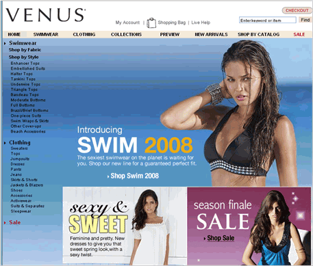
The first image that pops up is a swimsuit. The focus of the site is not solely swimsuits, rather women’s fashions in general. But that right away would get me to click out because I have no interest in swimsuits. I quickly scan to find the clothing on the site and I have two options on the top navigations: clothing and collections. I like to see collections so I clicked there.
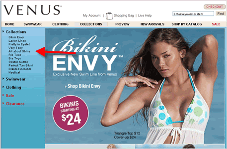
I was extremely disappointed at this point. What happened to the clothing? I guess this really is a swimsuit based website, because I thought for collections I would get an option to see clothing collections, not swimsuits. The site is also banking on sexy clothing and sex appeal which to me felt cheap. I felt like this site offered cheap items for cheap prices just because of the poses of the models. With Victoria’s Secret this can work because of the brand recognition. But for a site like this that is fairly new, they would probably be better off by toning down the sexiness.
I eventually checked the clothing, and they did have a wide selection. But if they were trying to sell women’s clothing, which is what I originally search for, there market obviously does not include me, a Caucasian female in late twenties. The homepage and collections page did not give me the impression that they had decent clothing because of the great emphasis on swimwear.
So I decided to go for the first result: Newport News.
From just glancing at this page, looking at the models, accessories, pieces of clothing they offer, it seems that they are targeting a younger, trendier market. They are also offering 60% off certain items and the prices already are fairly cheap in price. It seems like Newport News has identified their niche market. But what are they doing to draw that market in. Do they know the exact triggers that will impact their consumers’ buying decisions? Are they wording things in a way that will appeal to all the members within the target market? Of course, if I knew their conversion rate, I would be able to tell you if they are able to do that. I don’t have that information. But looking at their site generally, it seems that they have done a decent job trying to appeal to that same market in several different ways, which can easily be done with personas.
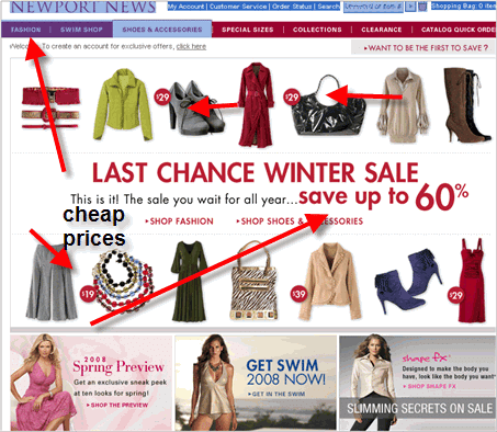
They have many options, including but not exclusive to swimwear. They have a promotion going on. And they are displaying a wide range of items for fairly cheap prices. On the top navigation there is the option for “collections.” Since I like to see collections like I displayed with the Venus site, I decided to click on that tab.
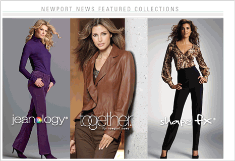
They have 3 different collections. I was interested in the “together” option.
They gave me so many different options to choose from. How do I like to shop? By choosing together combos they’ve come up with? By category? Or maybe I have an occasion I need to attend? On the lower navigation across the screen they even offer pictures of “together” fashions they’ve chosen. This could clearly be an appeal to the various types of shoppers, and personalities that visit their site.
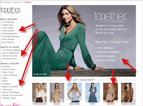
Despite some glitches on the Newport News site, they’ve appealed to me way more than Venus. I know probably 10 other people who range in personality, age and race that love to shop from Newport-News. Has Newport-News created personas? Probably not. The site can use a bit more direction and fine tuning. But have they thought of who generally they are targeting and how they would appeal to those people in different ways. Definitely.
Newport-News can easily fine tune the site to appeal to their market more heavily by creating personas. They have a starting point. Which is why making sure you appeal to everyone in your niche is crucial. The best, and most effective way to do so is through the creation of personas.

