Shopify product pages are an essential part of your store’s SEO strategy. They’re also the primary way that customers find products in your store.
Well-designed ecommerce product pages can help you increase sales, improve conversion rates, and rank higher in search engines.
On the other hand, a poorly optimized ecommerce product page will do the opposite. It can decrease traffic from Google and other search engine results pages and make it difficult for people to find what they want.
In this article, we’ll review some tips for optimizing product pages so they’re more likely to appear in search results and convert visitors into buyers.
What Is Product Page Optimization
Product page optimization is improving the layout, content, and user experience of a product page on an e-commerce website to increase the chances of converting visitors into customers. This involves analyzing and improving various elements on the page, such as the product title, description, images, pricing, reviews, and call-to-action buttons.
The goal of product page optimization is to make it easier for visitors to find and understand the product, and to encourage them to make a purchase. Alternatively, it’s all about making your customers’ online shopping experience worth it.
This can be achieved by making the product page visually appealing, providing detailed and accurate information about the product, showcasing its benefits, addressing common concerns and objections, and making the buying process as smooth and frictionless as possible.
Product page optimization is a key part of e-commerce marketing and can significantly impact an online store’s conversion rate, customer retention, and revenue.
1. Optimize Shopify Product Pages for SEO.
SEO is one of the significant components of your ecommerce product page optimization. But it can be a bit overwhelming.
Here’s everything you can do to create a well-branded product page:
A. Keyword research
Searching for relevant keywords is a critical part of any search engine optimization strategy. They help you increase your website’s visibility in search engines and drive more traffic to your site.
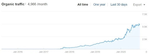
For example, look at this case study that highlights the success of an online store that supplies heating elements and towel rails across the UK.
The company significantly increased its organic traffic by 500%, from 1000 visits per month to 5k visits per month, saw 3x ROI, and had a 350% increase in organic sales.
(Source)
Their strategy involved conducting keyword research to find new ways to create, optimize, and rank category pages for target keywords.
If you’re new to SEO, keyword research can feel like one of the most intimidating aspects of the process. However, it doesn’t have to be complicated or overwhelming – with a bit of knowledge and planning, you can also elevate your search engine rankings.
Here are some tips on how to do it:
- Identify the Right Keywords: The most common mistake that people make when performing keyword research is to use the wrong keywords. You want to find keywords that are relevant to your products and that people actually search for, so make sure you really understand your target audience.
- Use Google Keyword Planner: Google’s Keyword Planner is an excellent starting point for identifying popular long-tail keywords for any given topic or niche. You can use it either by entering a single keyword or by entering a group of related keywords (for example, “women’s clothing”). It will return a list of related phrases with search volume estimates and competition scores based on Google’s algorithm.
- Perform Competitive Analysis: Once you have your list of keywords, it’s time to perform competitive analysis! This will help you determine which ones are likely to be the easiest to rank for and which ones are just too competitive at this time in your industry.
Once you’re ready with your keywords, incorporate those keywords in your product page title, meta descriptions, and product descriptions.
That said, avoid stuffing them! Make sure your product descriptions appear natural and engaging.
B. Optimizing product titles and descriptions
We’ve already covered the importance of keyword research.
Now it’s time to implement that research by incorporating them with your product titles and descriptions.
The first thing to do when optimizing product titles and descriptions is to include keywords relevant to your products in both places. This will help Google know what your page is about and increase its chances of appearing at the top of search results when someone types in that keyword.
For example, if you’re selling a white tee shirt, include keywords like “white t-shirt,” “v-neck tee shirt,” or even something like “women’s white t-shirt v-neck tee shirt small medium large XXL”.
Secondly, your product titles should be descriptive enough to appear in search engines when someone searches for them.
For example, avoid using keywords like “White T-Shirt” or “iPhone Case” because those words are too generic and could push your content down on the search results page. Instead, use titles like “Women’s V-Neck Tee Shirt White Small.”
C. Using headings and subheadings wisely
Ensure that your headings and subheadings reflect what users want to know about your products, not just what they may be looking for by mistake.
For example, if you have a table listing several product features, don’t use an H2 heading like “Features” or “Product Features” because these aren’t very descriptive.
Instead, use more descriptive headings like “Sleek Style,” “Vibrant Colors,” and “Comfortable Ergonomics.” This will help customers quickly understand the content of each section of the page and make it easier for Google to determine what your page is about.
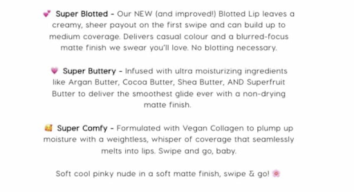
Let’s talk about Colorpop’s product headings and subheadings, the Shopify store that sells amazing makeup and skincare products.
(Source)
They’ve got a fantastic way of describing their products using headings and subheads, which makes it easy to understand what each product does and why it’s so great. And they not only describe their products in detail, but the subheads also make their descriptions scannable and easy to read.
It’s like a cheat sheet for beauty products!
D. Image optimization
Regarding SEO, images are one of the most effective ways to boost a page’s rank on Google. That’s because, in addition to providing visual context for a product or service, images can also help your website rank higher in image search queries.
Initially, it might appear time-consuming and challenging to optimize your Shopify product page for SEO. But if you do it right, your efforts will pay off big time.
Here are some tips for image optimization to optimize Shopify Product Pages for SEO:
- Use High-quality images
- Optimize image titles
- Use descriptive image names. For instance, 2012-Ford-Mustang-LX-Red.jpg., is a good description for the image below.

(Source)
- Optimize image alt tags.
- Create an XML sitemap for your Shopify store.
E. Internal and external linking
An e-commerce website specializing in health supplements boosted its monthly organic traffic from 5,033 to 17,129, and its sales revenue skyrocketed from $17,122 to $92,119.
How did they do it?
By improving their internal links and building external authority, that’s how.
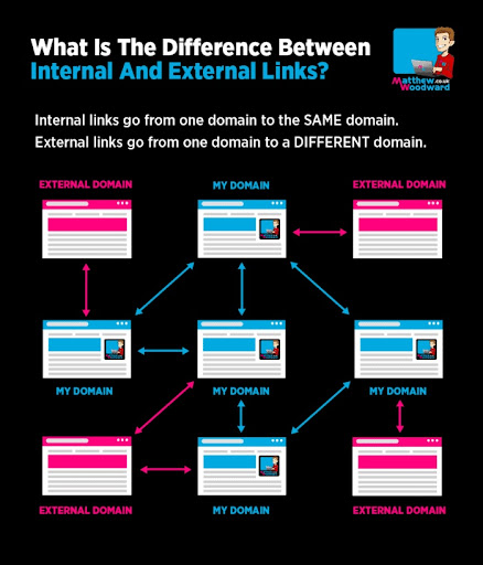
For the uninitiated, internal linking is the practice of linking to related pages on your own website. It helps search engines understand the relationship between different parts of your site and to improve SEO rankings.
On the other hand, external links are links that point to other websites. They can be internal links to other Shopify stores or external links to other websites. They allow people who visit your site to learn more about related topics without leaving your site.
(Source)
When done correctly, both internal and external linking can increase user engagement and conversions, which in turn increases sales for your store!
But how to do it correctly?
First and foremost, use descriptive anchor text that clearly describes what the linked page is about.
And when linking to other websites (aka external linking), link to high-authority external websites relevant to your products. This helps search engines determine the relevance and quality of your website.
SEO tools to optimize your Shopify product pages
Shopify already has built-in SEO features that make optimizing your product pages for search engines easy.
Some popular options include SEO Manager, Plug-In SEO, and Smart SEO.
However, if you want to take things a step further, there are some great tools that can help you automate the process and get more traffic from search engines.
Here are some of them:
- Google Keyword Planner: Google’s keyword planner can help you identify relevant keywords to include in your product pages. Optimizing your pages for these keywords will improve your search engine rankings and drive more traffic to your site.
- Google Search Console: With Google Search Console, you’ll get access to valuable insights into how your product pages are performing in search results. You can use this information to identify areas for improvement and make changes to your pages accordingly.
- SEMrush: SEMrush is one of the most popular SEO tools that can help you identify keywords and track your rankings in search engine results pages (SERPs). Armed with this data, you’ll be in a better position to optimize your product pages and improve your search engine visibility.
- Moz Pro: This is another popular SEO tool to optimize your product pages. Some of its key features include keyword research, site audits, and backlink analysis, which can help you identify areas for improvement.
2. Optimize Product Pages for Conversions.
When it comes to product pages, the devil is in the details.
Product pages are the key to converting visitors into customers, so getting them right is essential. If people can’t find what they’re looking for or if your product descriptions are unclear and confusing, they’ll be less likely to buy from you.
On the other hand, if your product pages are well-written and informative, shoppers will be more likely to make a purchase.
Here’s everything you can do to optimize your product pages for conversion:
A. Creating clear and compelling product descriptions.
The first step to creating compelling product descriptions is understanding the role of copy in conversions.
Copywriting is about more than just writing words on a page.
Copywriting is about making things happen:
- Getting visitors to take action.
- Persuading them to buy from you.
- Helping them understand why your product or service will solve their problem.
Here are some tips for creating clear and compelling product descriptions that will help you convert more visitors into customers:
- Use bullet points in between. Bullet points make it easy for readers to scan through and absorb the most important information about your product. They also make it easier for search engines like Google and Bing to understand what your page is about.
- Tell them what they get: Don’t just talk about how amazing your product is – tell people what they get when they buy it from you (e.g., “Get this premium t-shirt with free shipping!”). This will increase trust and encourage them to click on the “Add To Cart” button.
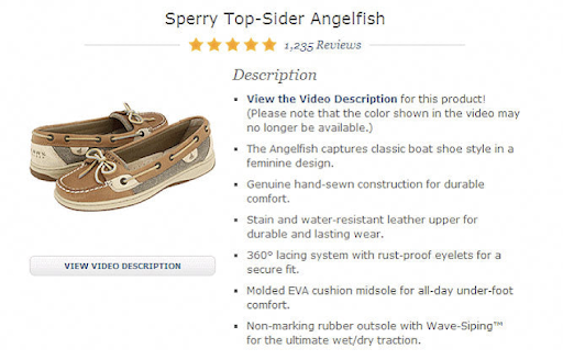
Here’s an example from Zappos. They described each technical detail of the pair of shoes and its benefit clearly.
(Source)
And instead of mentioning the quality of the product directly, each bullet point gives an impression of the product’s quality.
- Use social proof: People love reading testimonials from other people who have purchased or used your product before making a purchase decision themselves.
- Use visual language: “Show, don’t tell” is the way to go when it comes to writing product descriptions. Use words that help customers visualize what the product looks like feels like, and how it works. For example, instead of saying, “This t-shirt is made of 100% cotton,” write, “This t-shirt is made from soft fine cotton that feels great against your skin”.
Don’t forget to add a CTA button at the end of each paragraph to encourage customers to buy now!
B. Using high-quality product images and videos.
A shabby presentation will likely put off potential customers from your product page.
And statistics confirm this statement.
As many as 75% of online shoppers depend on product images when deciding whether to buy a product or not.
The best way to take good photos is to use a tripod, a DSLR camera, and natural light. Take your photos from different angles – side views, top views, and so on – so that you can show different parts of the product in detail. Don’t forget to include closeups of any details that might be relevant for your customers.
A good photo editing tool can help you make adjustments like adjusting white balance or adding filters to make your photos look more professional. You can also use Photoshop or other tools like Snapseed or Lightroom if you’re comfortable with them.
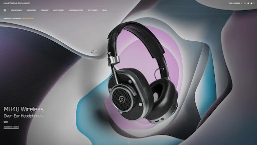
Look at Master & Dynamic’s product page, for instance.
The brand sells premium headphones and speakers with a sleek and minimalist design. Their product pages feature large and crisp images that showcase their products from different angles and in different settings. They also use videos to demonstrate how their products work and sound.
(Source)
Additionally, show the product in use. If it’s clothing or accessories, show people wearing the items. If it’s food or drink, show people eating or drinking it. If it’s a tech gadget or household appliance, show someone using it in real-life situations (e.g., cooking dinner).
C. Implementing user reviews and ratings.
User reviews and ratings are essential for any ecommerce store that relies on conversions. They help convert visitors into buyers by demonstrating credibility, trustworthiness, and social proof.
An A/B test showed that adding a review star rating summary at the top of the product description page increased the conversion rate by more than 15% and boosted revenue per session by 17%.
This means combining visual and textual feedback can have a powerful impact on your sales.
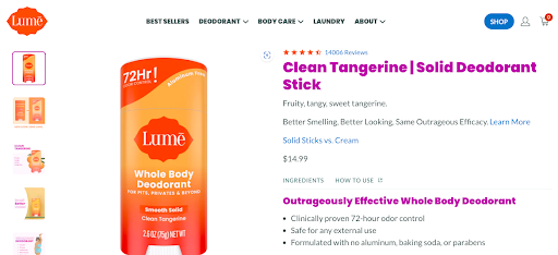
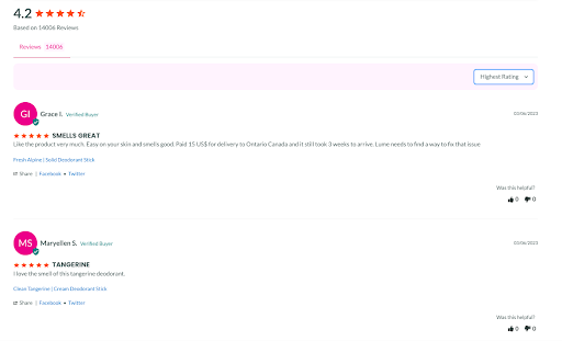
Lume Deodorant does it really well.
To build trust, they showcase review badges on their collection pages and a review widget on their homepage that displays the average rating and number of reviews for each product.
(Source)
User ratings and reviews also have another essential use case aside from showing off how much people love your products. That is, they can also help you understand what customers want from you and how they feel about using your product.
Once you’re privy to customer feedback, you can create better products.
Now, how do you go about collecting authentic reviews?
The first thing you need to do is set up your product page with a review section. You can do this by adding a “Write a Review” link right below the “Add to cart” button on your product page.
Next, you’ll want to encourage customers to leave reviews by including social proof, such as testimonials and reviews on your website. You can also incentivize them by offering discounts or coupons for leaving reviews.
In addition, make sure that each review is unique and written in a genuine way. Don’t let people leave fake 5-star reviews just because they want a discount or coupon code.
D. Using persuasive calls to action.
You’ll need a clear call to action to increase your conversion rates on Shopify.
How will your visitors know what to do unless you tell them to?
Do you want them to add something to their cart? Or buy something right away? Or do you intend to share a free ebook with them?
You just have to place simple CTA buttons stating “Buy Now” or “Add to Cart” to encourage visitors to take the required action.
That said, placing CTAs isn’t nearly enough. They have to be persuasive enough to make the buyers want to click on them.
Here are some tips to help you create persuasive call-to-action buttons:
- Use action verbs that convey a sense of urgency and excitement. For example, instead of “Order Today,” use “Claim Your Offer Before It’s Gone.”
- Use numbers and symbols to catch attention and highlight the value or benefit of the product. For example, instead of “Save Money,” use “Save 50%.”
- Use colors that contrast with the background and match your brand identity. For example, if your brand color is blue, use a bright orange or yellow button to stand out.
- Use size and shape that make the button easy to see and click. For example, use a large and rectangular button that fits well on mobile devices.
- Use placement that follows the natural eye movement and flow of the page. For example, place the button above the fold or near the product image or price.
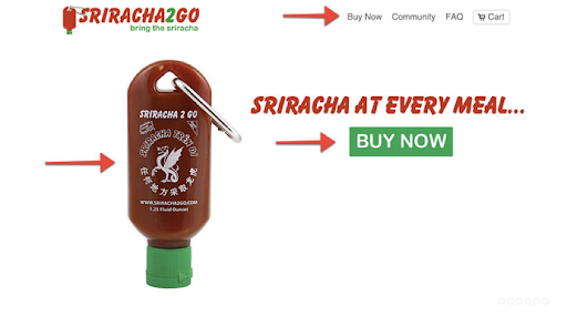
Here’s an example from Sriracha 2 Go storefront. Isn’t it compelling you to click this “Buy Now” button?
(Source)
Now you know just where to click. You know what the product appears like, its benefits, and how to buy it by glancing above the fold.
Don’t forget to test different variations of your CTA buttons to see which ones perform better. You could use a tool like FigPii to run A/B tests.
E. Simplify the checkout process.
It’s easy to get caught up in the fancy bells and whistles of your Shopify product page. You often try to make it as fancy as possible.
After all, it is the first thing that a visitor will see when they come to your site.
But if your checkout process is too complicated, customers might get confused and even frustrated. This can lead to abandoned carts and missed sales opportunities.
First and foremost, keep your page neat with enough information and necessary graphics. This can overwhelm visitors and make them feel like they are being sold too hard. Use bullet points instead of paragraphs for easier reading and comprehension if possible.
Here are some more simple tips to simplify the checkout process on Shopify:
- Create a popup-style cart that shows the product details, shipping options, discount codes, and payment methods on one screen.
- Add a progress bar to show how far along someone is in the checkout process.
- Remove unnecessary fields from the checkout form.
- Allow first-time buyers to purchase without creating an account.
F. Provide free shipping and discounts.
Free shipping is the holy grail of ecommerce – it drives consumers to make impulse purchases. On the other hand, the lack of free shipping can be a deal breaker for customers who might otherwise buy your products.
Even if you don’t offer free shipping, it’s essential to offer a discount on shipping costs so that buyers feel like they’re getting a good deal.
In addition to free shipping and coupons, there are other ways you can attract new customers with your Shopify store. One way is through discounts and sales events. Offer limited-time discounts on select products or bundle items together for special discounts (e.g., buy two, get one free).
You can also offer “flash sales,” where certain products will only be available briefly before they sell out. This creates urgency in shoppers who may want those items before they disappear forever.
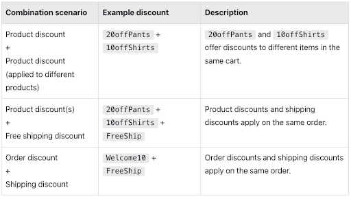
Here’s a list of some free shipping and discount combinations you can offer:
(Source)
Tools to optimize your Shopify pages for conversion
As a Shopify store owner, you want to make sure that your customers are experiencing the best possible experience when they visit your site. You want them to be able to easily find what they’re looking for and make a purchase without any hiccups.
The last thing you want is for them to leave your store without making a purchase because the page wasn’t optimized for conversion.
And while we discussed all the tips and tricks you could implement to optimize your pages for conversions, your job will get easier with some Shopify tools.
Here are some tools that will help you optimize your Shopify product pages:
1.FigPii
Since your goal is optimizing your Shopify product pages, you must first understand your user behavior. After all, how else will you improve your pages until you know what needs improvement and how your users are behaving?
And that’s where FigPii comes into play. FigPii has a suite of conversion optimization tools that help you analyze and experiment with your pages.
Take FigPii’s heatmaps, for instance. Heatmaps are visual representations of where your visitors click, scroll, and hover on your product pages. They help you identify what elements attract attention, what areas cause confusion, and how to make your pages more engaging.
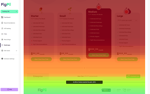
Another tool that FigPii offers is A/B testing. You can use FigPii’s easy-to-use interface to create and run experiments on your pages without coding. For instance, you can test different variations of your product images to see which ones drive more clicks and conversions.
FigPii also offers session replays and polls. With session replays, you can watch your visitors’ mouse movements, clicks, scrolls, form inputs, and more. They help you uncover usability issues, bugs, and friction points that prevent conversions.
On the other hand, polls will help you ask questions about their preferences, satisfaction, expectations, and more. This will help you understand their needs, motivations, and objections.
And when you use these tools in conjunction, you’ll gain insights into how your visitors behave on your product pages and what changes you can make to increase conversions.
2.OptinMonster.
With features like popups and exit-intent campaigns, OptinMonster is the perfect tool to help you improve your Shopify pages for lead generation and conversions. It also includes lead-capture forms that can help you convert more visitors into customers.
OptinMonster also provides analytics and insights into how your campaigns are performing – again, a handy feature to assist you with your conversion strategy.
3. Unbounce.
Unbounce is a landing page builder that can help you create high-converting Shopify pages.
It includes features such as A/B testing, dynamic text replacement, detailed analytics, and conversion-focused design templates. All these features together will help you make data-driven decisions to improve your Shopify conversion rates.
3. Optimize Product Pages for Speed.
Optimizing Shopify product pages for speed is the surest way to improve your conversion rates.
A slow page is detrimental to your Shopify store. A slow page can cost you serious money.
As many as 82% of shoppers say slow page speeds impact their buying decisions.
And that’s just the beginning. If your site isn’t optimized for speed, you could be losing even more business than you thought possible.
The good news is that optimizing Shopify product pages is relatively easy and inexpensive. It takes some basic testing and optimization skills, plus a bit of patience.
Here’s how you can do it:
A. Choosing a fast-loading Shopify theme.
When shopping for a theme for your Shopify store, finding one that loads quickly is crucial.
As statistics suggest, page-loading times can cost you sales and frustrate visitors.
Here are some of the best Shopify themes that speed up your site’s load time:
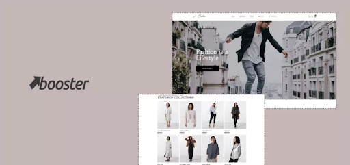
- Booster: Booster is a zero-dependency theme that also markets itself as the fastest Shopify theme. Some of its most prominent features include smart upsells, currency converter, countdown timer, social proof popups, and more. Booster has an average 79-speed score.

(Source)
- Turbo: Designed with speed and efficiency in mind, Turbo boasts two unique features that help to make Shopify sites faster to load and navigate: predictive prefetching and instant page transitions. It also has a rich selection of layouts, sections, and settings.
- Shoptimized: This Shopify theme focuses on increasing conversions using proven psychological triggers and sales boosters. Its key features include a scarcity timer, urgency countdowns, dynamic checkout buttons, trust badges, and more.
- Flex: It offers flexible customization options, along with features like advanced mega menus, sticky headers, quick product view, color swatches, video backgrounds, and more.
- Plak: Plak claims to be one of the fastest Shopify themes. You also get features like advanced filters, product tabs, sticky add-to-cart buttons, currency converter, newsletter popups, and more. It also has an SEO-friendly structure and a mobile-friendly design.
These are only some of the few options. When you explore, you’ll get to choose from hundreds and thousands of Shopify themes.
Here’s how to find the fastest Shopify themes available, so you can make sure your product pages are optimized for speed:
- Look at the response time in Google PageSpeed Insights. This tells you how long it takes a browser to receive all the resources it needs to render a page, including images, style sheets, and scripts. If a theme has a high load time, you’ll want to avoid it.
- Check out Pingdom Tools’ Website Speed Test. This will give you detailed information about how quickly each element of your store loads on different browsers and devices. The site also provides an overall score based on these tests, so you can see which themes are really performing well when it comes to speed.
- Check out ThemeForest’s speed test tool. It gives you an idea of how fast each theme loads across various browsers and devices.
B. Optimizing images and videos for speed.
Images and videos are a key component of your Shopify product page, but they can also be a drag on your page speed.
If you have a slow-loading product page, you’re losing sales. If it takes too long to load, visitors might get frustrated and leave before they see what they came for.
That means it’s important to optimize images and videos on your Shopify product pages for speed.
Here are some quick tips to optimize images and videos for your Shopify store:
- Compress and merge images: Use tools like TinyIMG or Crush.pics to reduce the file size of your images without losing quality. You can also merge multiple images into one using CSS sprites or image maps to reduce the number of HTTP requests.
- Use SpeedSize AI-Image Optimizer: This Shopify app offers one-click integration with the SpeedSize AI media optimization platform to make all media ~99% smaller with no visible loss in quality. It also delivers your media from SpeedSize’s CDN (or your own) for faster loading times.
- Disable theme features you don’t use: When you edit or customize themes, file sizes can increase and affect your store speed. If you think that something in your theme is slowing down your store, it’s best to disable theme features that you don’t use. It could be animations, sliders, popups, etc.
- Consider using a system font: You might be tempted to use custom fonts to add style and personality to your store. But they can also slow down your page loading time. To optimize your store speed, consider built-in system fonts, such as Arial, Helvetica, Times New Roman, etc.
C. Minimizing HTTP requests and file sizes.
Shopify stores have many pages with a lot of products, and that means a lot of HTTP requests. Your browser has to process each of those requests before it can show you the page you want to see.
The more HTTP requests there are, the longer it takes to download all those files. And if any of those files are large, like video or images, then it will take even longer for the page to load.
This is why it’s so important to reduce the number of HTTP requests on your web pages.
You don’t necessarily have to minimize the use of images, but there are other things you can do to minimize file sizes and speed up your store’s loading times.
First and foremost, reduce the number of installed Shopify apps. A large number of apps on the Shopify store automatically add some CSS/JavaScript files to your store. These files increase the number of HTTP requests and slow down your site loading time. You can uninstall or disable any apps that you don’t use or need.
Here are some more tips to minimize HTTP requests and file sizes:
- Perform lazy image loading: Images will only load when they are visible on the screen, rather than loading all images at once. This reduces the number of HTTP requests and improves your site speed. To implement this feature, you can use apps like Lazy Load by PageFly or Image Optimizer by Booster Apps.
- Perform code minification: Code minification entails removing unnecessary spaces, comments, and characters from your CSS and JS files. This reduces the file size and makes them load faster. You can use tools like Minifier.org or CSS Minifier to minify your code.
- Use fast and reliable hosting: Your hosting provider plays a vital role in your site speed. If your hosting server is slow or unreliable, it will affect your site performance and user experience.
- Download a responsive and fast theme: Choose a theme that is responsive so that it adapts to different screen sizes and devices. You should also choose a theme that is optimized for performance, meaning that it has minimal features and code that can slow down your site.
The Bottom Line: Make Your Shopify Product Pages Shine and Sell
The next time you launch a product onto your Shopify store, take the time to set up an optimized product page.
It’s more than just throwing a picture up and writing a description – it’s about optimizing the page’s elements to draw in as many potential customers as possible. The background copy and images need to hook your audience and direct them to the “Buy Now” button.
Your optimized pages will help you build an enhanced customer experience, which will ultimately translate into greater revenue for your business.

