A golden rule to conversion optimization is crucial to understand before you begin any optimization effort: What works for one site may not work for yours (even if they’re in the same vertical). This is key for many reasons because once you understand this rule, reckless copying off competitor sites will stop, and many blogs or books that give all the “conversion” secrets will be appropriately deemed useless. There is never a one-size-fits-all in conversion. There are best practices, sure, but never assume that there are single answers. Take something as simple as “CTA” above the fold: a well-known “best practice.” So many other details go with this: text on CTA, elements surrounding CTA, location “above the fold,” look and feel of CTA, etc.
One key component to conversion, which is also many times lost amongst our customers, is catering the site to the target market. Who are your current customers, who are the customers you would like to get, and what do they like? In today’s world, the CEO’s decision trumps numbers and statistics, although they define the needs and wants of the market.
The Problem
Our customer, GoSection8, offered one of the largest rental-listing services for the Section 8 housing market. Visitors to the site have two options to subscribe: a free membership option and a premium paid membership. GoSection8 was unable to maximize premium memberships for their site successfully. Our analytics assessment pointed to several areas that we can focus on: the homepage, signup page, rentals page, and property listing page. The conversion optimization team noted that users opted out of premium membership and chose free membership instead. Analytics showed that the signup page, which displayed the plans available to new users, suffered from higher than normal exit rates, and most visitors simply chose free membership. The team identified this page as one of the initial pages to work on.
Conversion Framework Analysis
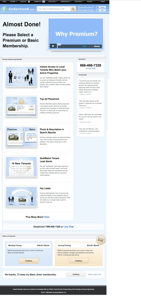
The original page design looked like this
The initial Conversion Framework assessment pointed out multiple issues on this page.
Trust is the first element we evaluate during a Conversion Framework assessment of any page. The Trust element is broken down into over 70 sub-elements we analyze on any page. Trust is evaluated from the moment the visitor enters the site until they leave (and likely remains until they receive the service or product they purchased). Customers who browse the website and end up on a signup page are generally more interested and invested. A good percentage of them could be at the “Purchase Decision” stage of the buying stage process. However,the visitor is wondering if they are making the right decision in trusting this company and if they will really get the service/product they are purchasing. Trust sub factors are especially strong when a customer is making a monetary investment, although these factors still play a role even with free accounts and signups.
The video and the lack of a clear CTA immediately catches the eye and can be described as “low hanging fruits” on the signup page for GoSection8. The video is taking prime real estate and is pushing the CTA way below the fold. Is the video that effective? The numbers are clearly telling us it is not because the conversion rate is dismal.
Sub-elements of Trust also include “Benefits above the fold” and “Concise benefit list,” both of which point to the importance of presenting the customer with information rather than video. Another sub-element includes “Congruency of the site page.” Congruency is important throughout the site and on each page. It refers to the overall flow of the page, achieving the goal the page is intended for. While videos may have benefits in certain situations, they must be used sparingly. Our previous work shows that videos perform especially well with proper and persuasive information. In this case, the video distracts from the overall goal of the signup page and fills an important space, and its stats show it is causing high bounce and exit rates. So rather than presenting the visitor with a concise and congruent message (i.e., benefits) on the signup page, the visitor is presented with the video and is expected to watch it to learn about membership benefits.
Additionally, in order to establish trust, a customer must see what they should be doing next on the page, and where to go. “CTA Placement” above the fold is a key element of trust. If a customer arrives and is presented with a video and an ocean of copies and no clear, immediate next action, it is likely they will leave the page.
Hypothesis
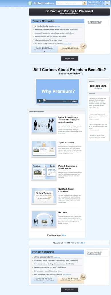
In the first iteration of working with the signup page, the team had a simple hypothesis to test: “Removing the video and replacing it with benefits and a CTA will increase sign-ups.”
Here is the new design of the top section of the page:
The Results
The results were staggering.
Our customers saw a dramatic uptick in paid sign-ups. There was an 88.46% increase in conversions from this change.
Conversion Rate Optimization Insights from the test
Why would removing and replacing the video with clear benefits and CTA increase conversions? Was there something wrong with the video? Our changes did a few things:
1. Visitors arrive knowing exactly what the offer is and move beyond the “fluff.”In this case, the fluff is the video.
2. A clear action and giving visitors a roadmap of what to do next is key to increasing persuasion.
3. The video took prime real estate and could be replaced with more actionable and important elements.
Lesson learned
If you want your visitors to take a course of action on your site:
• Remove videos from the very top of the page and place them lower on the page.
• Place the corresponding CTA in an obvious and clear manner for them to find it.
• Make the most important action on the page (the paid account) the most important element.
This particular customer’s site and this signup page went through many changes. Follow the Invesp blog (@invesp ) to learn more about conversion increases through optimization and testing on Pii.


