It’s true.
Visitors who complete purchases, subscribe to plans, or hire your services, do so because they are laser focused on accomplishing a task to fulfill life and business goals.
This sharp focus makes visitors see and engage with only limited sections of your page, depending on their goals at each visit.
Related to unintentional blindness, change blindness, and selective disregard, a phenomenon called selective attention is responsible for this behavior.
Find out more on this human behavior, how it may affect your site conversion rates, and how to address it to increase conversions.
What Is Selective Attention Psychology?
Selective attention is our coping mechanism to process the information around us.
With the massive offer of sensorial stimuli in the world, our brain became adapted to filter what is important at each moment. And just ignore the rest.
Per second, on average, our eyes receive 10,000,000 bits (the smallest possible piece) of information, but the conscious brain can only process 40 bits per second. You can see below the enormous difference between the data available around us and the amount our brain is able to process.
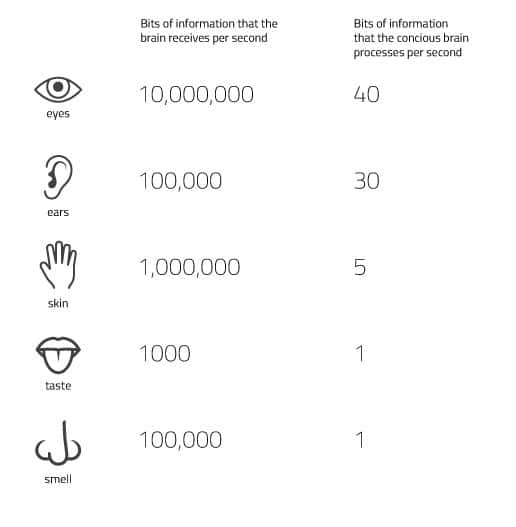
This ability to focus keeps us alive and smartly productive.
With limited resources of attention, we learned how to channel our senses to both perceiving threats in the environment and finishing tasks faster to let our brain free to focus on new projects.
Let’s try it out. With a quick glance over the website below, what can you see?
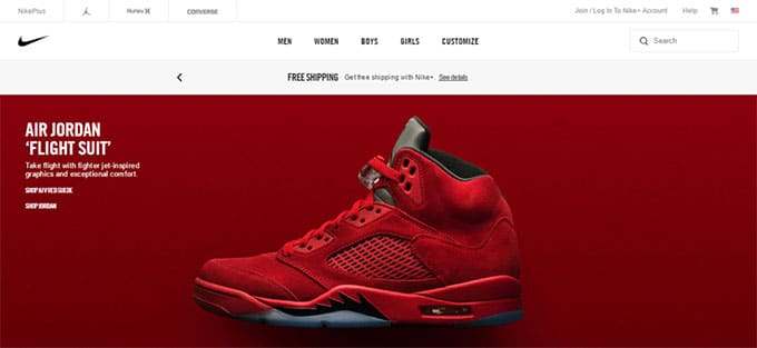
A glance probably gives you just the image of the shoe, and the name of it, in white, at the upper left of the hero image.
But if you had a task in mind, let’s say you were looking to buy black shorts for playing football, your focus would be on the task and less on the prominent red on the page.
In this case, you would probably first look at the top of the page, right side, to find a search bar. The upper-right corner is still where 17% of visitors expect to find search.
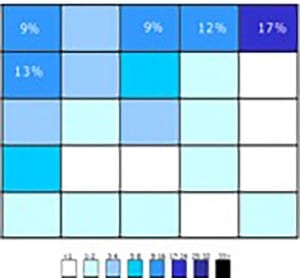
This is selective attention. You focus on the important elements that help you accomplish a task. All other elements get ignored because they would just distract you and slow you down.
The gaze plots below show how visitors focus on information relevant to the task they want to complete.
Each dot in the glaze plot shows parts of the page where visitors fixed longer to read the text or see the details of an image. The larger the dots, the longer the fixation. Long fixations may be a sign of interest or, alternatively, a sign of confusion. The lines between the dots represent the saccades between the fixations. During the eye movement, which is extremely fast, visitors can’t register any visual data.
With the task of just “take a look at the page,” you can see participants did not waste time, or focus, on too many things.
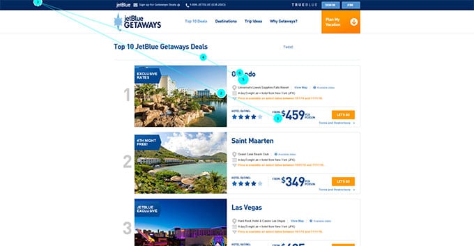
Image source: NNGroup
But when asked to find out “to which places do these getaways go,” participants focused on the titles of the sections:

Image source: NNGroup
The focus switched to the images of the packages when participants were asked “which place looks the nicest to you?”

Image source: NNGroup
When scanning websites for information, visitors have an aim. With a goal in mind, they don’t pay attention to all elements on page, they rather focus on the useful elements for the task, so the brain can process just useful information.
Before reading on, watch the following video to understand what we mean.
Source: The Invisible Gorilla
Half of people watching this video also missed the guy crossing the screen dressed as a gorilla in the experiment conducted by Christopher Chabris and Daniel Simons. Participants were asked to watch the video and keep a silent count of the number of passes made by the people in white shirts. The gorilla spends nine seconds on the screen, but as people focused on counting the passes they could not see the disruptive intrusion.
If the experiment didn’t work for you, try again. But now that you know about the gorilla, he might be all you can see in the video. You’ll be waiting for the gorilla to show up. So, you can test this experiment using the video below on a loved one. Remember: ask them to keep a silent count of the number of passes made by the people in white shirts.
This shouldn’t be surprising. We do this all the time. We like to think we absorb all stimuli around us, but the truth is we wouldn’t even see a ghost close to us. When Tony Cornell, a parapsychology researcher, dressed as a ghost and walked across the stage of a movie theater, only 50% of the audience saw anything of the ghost appearance, and many could not describe it accurately, as an effect of in attentional blindness.
Just to have an idea of how much we miss around us, you can check the beginning of this video, for an experiment on how people see works of art, from The Van Gogh Museum Eye-tracking Project. You can follow where the participant focuses, and identify how much is left out. You can also check how the eyes focus on the task that needs to be accomplished.
To recap, selective attention means:
- We have limited resources to process sensorial stimuli, so we focus our attention to what matters most at the task we are currently performing.
- When visitors already know the location of elements they need on a website, they disregard other elements of the page.
- When visitors have expectations on the layout of a webpage, they focus on specific sections of the page and overlook other parts.
- If visitors think an item of the page seems useless based on its rough appearance, as perceived by peripheral vision, they ignore the item (in other words, visitors suffer from banner blindness).
You can check visitors’ selective attention as you follow the eye movement of the participants in this eye tracking on Delta.com. As participants accomplishing different tasks, you can see how the focus changes depending on the task and how much is ignored on each page.
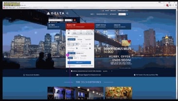
Image source: Eye Tracking on Delta.com
How Can Selective Attention Affect Conversion Rates
If visitors ignore essential links, navigation paths, and sections of a page, you can tell it will be hard for them to convert.
Here are a few of the common ways visitors ignore information on your page.
1. Banner Blindness
As visitors focus on accomplishing a task on a website, they naturally ignore elements that look like ads. Mainly, banners.
The brain expects to find ads on banners, and understand those ads as a distraction from completing a task.
So, banners get ignored frequently. In general, over 70% of visitors tune out online banner ads. This affects your conversion rates on PPC ads, of course, but also on your pages, if you display content in banner-looking designs.

Image source: tobiipro
2. Right Rail Blindness
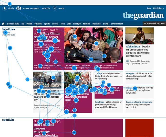
As visitors are familiar with finding ads on the right column on websites, and we read from left to right, right rail blindness came into play.
For the most part, visitors ignore information displayed on the right side of the pages. With the raise of mobile screens, the right column is even on the verge of disappearing.
This can affect your conversion rates because people may ignore important information you display on the right side, even if it doesn’t look like a banner.
3. Change Blindness
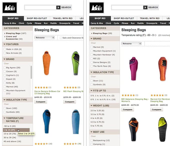
Visual changes usually catch visitors’ attention. However, if the transition between changes has any type of interruption, visitors might ignore the changes, as the brain replaces the new visual field by a mental representation of the old field.
The interruptions could be page flickers, page reloads, blinking of the eyes, and saccades between gazes, to name a few.
Over 90% of visitors can detect changes with no visual disruption, but when the screen flickers, rotates, or a push notification comes along, then changes go by unnoticed.
This affects your conversion rates, for instance, if visitors can’t easily see the fields they need to re-enter to complete a form, if visitors can’t be sure about the progress or change on page after clicking on buttons and links, or if visitors can’t realize filtering options are working well when options change after reloading (as the image below shows).
4. Search Behavior
Website visitors can either follow a search or navigation dominant behavior.
Search dominant visitors will go straight to the search bar and ignore most other forms of finding information and products on your site.
Navigation dominant visitors will try the menus and links to go through the options in your site and usually ignore the search functionality.
Each predominant behavior can affect your conversion rates. If a search dominant visitor can’t quickly find the search on your site, they will leave without converting. If a navigation dominant visitor can’t make sense of your menus and navigation, they will also leave before converting.
You can see below visitors used menus and navigation, and completely ignored the search box on the top right side.
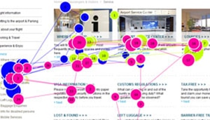
Image source: Usability
How You Can Work Around Visitors’ Selective Attention to Increase Conversion Rates?
The better you understand your website visitors, the better you will address selective attention to optimize your site for conversions.
Your site works well when visitors can successfully find what they need and successfully ignore everything else.
Here are a few ways you can increase conversion rates by helping visitors focus on the right elements on page.
1. Conduct Usability Studies
You need to understand:
- your visitors’ goals when using your site
- your visitors’ behavior when using your site
You can choose the usability method that makes more sense in terms of time and resources available, but make sure the results bring the right data to analyze why your visitors arrive at your site, and how they browse and convert.
You can follow the steps in this roadmap to guarantee an effective usability study.
Depending on the goal of your study, you can find excellent insights by conducting polls.
2. Focus on Visitors’ Goals
Once you find out your website visitors’ goals, you need to make it easy as possible for them to accomplish their goals.
- Make sure the site design highlights paths for both search and navigation dominant visitors.
- Assess if the information architecture on your site makes sense for your visitors. Change it if you see a different structure could help them find the right information faster.
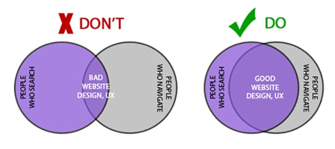
Image source: Cludo
3. Declutter and Use White Space
To help your visitors focus on the right information, you should:
- Reduce clutter and noise.
- Make a smart use of white space.
Cluttering has a proven effect on change blindness. As this study shows, change detection decreases as the number of icons increase on screen.
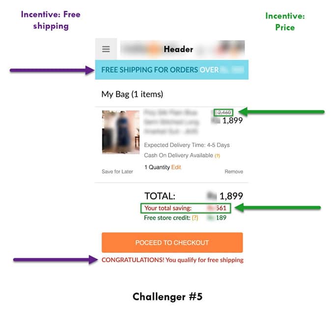
You can check our case study on how decluttering and highlighting incentives increased conversions by 13.98% on product pages and 17.75% on cart page. Clutter on these pages was preventing visitors from recognizing the incentives and converting.
4. Be Careful with Banners and Right Column Content
As banners get frequently ignored, be careful when adding banners to your site, or banner-looking content.
- If you have essential information to display on a page, think twice if you really need to design it in a banner format. Anything resembling a banner won’t get much of visitors’ attention.
- Avoid using banner-looking content.
- Assess how your visitors use the right column on your website with usability studies. Adjust the content you display on this column according to users behavior on your site.
- If you do have banners, make sure they are positioned away from crucial content your visitors need on each page.
- Inside your banners, choose images that convey useful information to visitors.
- Use emotional targeting. Almost half of US adults between 39-45 believe online ads could be improved if the messages were funnier or spoke more to audience values. The same goes for content on your page. Make it emotional, so visitors spot what they need.
5. Use Functional Animation
Functional animation is a great way of drawing visitors’ attention and explaining changes on the interface.
- Make sure your animations have a purpose. After conducting your usability studies, you will be able to evaluate if a transitional animation could help on a specific attention issue your visitors might be facing.
- Choose animations that help your visitor in accomplishing the task they want to on your site. Animations that distract visitors from their goal won’t be well received.
- Be careful when using animation, because animations with no functional purpose can quickly get annoying.
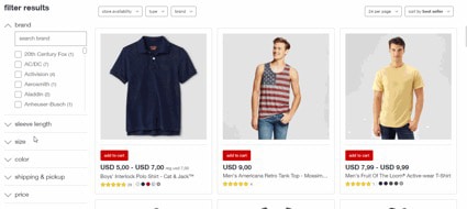
Target.com uses a subtle animation on search results, with a turning arrow and a sliding down menu for filtering product options. This subtle change is enough to help visitors in searching and detecting change in the menu.
6. Use Visual Hierarchy
Once you understand your visitors’ goal on your page, you can better organize content to help guide visitors in accomplishing tasks on your site. Visual hierarchy organizes information, so visitors can quickly detect what section, link, or button on site they need to focus to fulfill their goal.
- Consider F-shaped and Z-shaped reading patterns.
- Pay attention to elements that affect visual hierarchy:
- Size
- Color
- Contrast
- Alignment
- Repetition
- Proximity
- White space
- Texture
- Style
- Test your visual hierarchy with the blur technique.
Panike.com, a Portuguese Bakery, uses visual hierarchy to display their menu.
7. Use Pop-Ups and Modal Windows
Finally, pop-ups and modal windows are a surefire way of guiding visitors’ attention to accomplish their tasks and engaging with your site.
- Define the purpose of the pop-ups and modal windows. They should serve the general purpose of helping visitors accomplish their goal on your site, drawing attention to the tasks that visitors are performing.
- Some of the best practices for modal windows include:
- size
- location
- clear instructions on buttons
- clear close option
- descriptive title
- As with other attention grab techniques, be careful when using pop-ups. As a form of advertising, they get a horrible reputation. Around 70% of internet users classify popups as intrusive and the most widely disliked type of ad.
- As annoying they might be, pop-ups and modal windows help increase conversions.
Walmart.com uses a modal window for cart content, after visitors click on “Add to cart” on product pages.
Conclusion
At first, selective attention seems an awful barrier to visitors converting on your site. If visitors are ignoring content on your page, how could they ever convert?
But this behavior is also good news.
If you learn how to direct visitors’ attention to fulfilling their goal on your site, selective attention is an ally on getting more conversions.
Just gather data and insights on your visitors’ behavior and you will be to better guide them in completing tasks on your site.

