Prof Sheen Iyengar of Colombia University is one of the world’s leading experts on the psychology of humans when it comes a choice.
She conducted experiments early in her tenure that were groundbreaking. She set up a tasting table at a grocery store, offering visitors a taste of an assortment of 24 different jams. 60% of the shoppers stopped by and took a taste. But then she set up a table with just 6 flavors. A lesser amount of 40% of shoppers stopped by and took a taste.
But the kicker was that 30% of those who stopped the 6-choices table ended up making a purchase, vs. a measly 3% of those who stopped by at the table with the larger assortment.
This study “raised the hypothesis that the presence of choice might be appealing as a theory,” Professor Iyengar said last year, “but in reality, people might find more and more choice actually to be debilitating.”
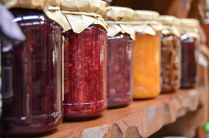
Over the years, versions of the jam study have been conducted using all sorts of subjects, like chocolate and speed dating.
What’s the point of this? While companies try to push a number of different products at customers and site visitors, however, research proves simple is better. When humans are confronted with too many choices, they will be unhappy with their selection or unable to make a choice. According to Hoa Loranger:
“Humans have limited capacities for processing information and often choose the path of least effort, even though an alternative path would result in better outcomes. Users often take shortcuts and may appear lazy, but their actions are ways of protecting themselves from information overload and fatigue.”
Think about the last time you went to a restaurant, if the menu is too big (like Cheesecake factory), you take forever to make a decision, and you may just revert to something you’ve already tasted before. Where is the fun in that?
The abundance of choice is often “more limiting” to the consumer than having a controlled number of choices, which makes the decision and precision in the choice easier.
“Feeling overwhelmed by number of potential options often leads to inertia.”
We’ve all experienced this online. Think of the last time you shopped at an e-commerce store and were presented with an insane number of options. For instance, if you’re looking to buy a pair of shoes and even know in your head what kind of shoes you want to buy,
Even if you have a ballpark idea of what you want, you will likely find hundreds of options on a specialized shoe website.
You may even veer off what you are searching for in the first place – get frustrated and leave.
Is Abundance of choice ever a good thing?
Well, in case you haven’t noticed already, humans are very interesting creatures, and there is really a right answer when it comes to how people think.
As the renowned American psychologist Barry Schwartz says in his paper ‘Tyranny of Choice’
“As the number of choices we face increase, the psychological benefits we derive start to level off… Some of the negative effects of choice… begin to appear and rather than level off, they accelerate.”
What’s clear is when humans are confronted with many choices, their expectations rise, which likely results in dissatisfaction.
Schwartz points out some results of too many choices:
- People end up selecting something good enough instead of the best option
- Expectations are much higher, which results in greater disappointments
- You pay more attention to what others are doing with more choices, rather than deciding what’s best for you
How many times have you made a decision about something when presented with many options, and then looked back regretting and maybe thinking you could have done better? It happens all the time. Like the last time I booked a hotel on Orbitz I thought, but what if I chose that other hotel?

“Make the decision less painful: Use simple design, give shoppers time to decide, provide choice shaping information.”
When you have too many options to choose from, you will make choice and then start to feel that you could have done better. You might feel poorly about the choice you made because you will always think you could have made a better choice because there were so many options available. In the end, it will be like a domino effect. Triggered by the abundance of choice leading to high expectations finally followed by dissatisfaction.
Barry Schwartz also says something similar in his interesting Ted Talk. He talks about buying a pair of jeans. He states that when back in the day when so many options of jeans were not available and almost everyone used to buy the same kind of pair, they used to walk out relatively happy. Though the jeans may not have fit well, they were not dissatisfied because not too many options were available.

But now, with hundreds of kinds of jeans made available to us, we almost never are happy. Because we know we could have done better. We literally had hundreds of jeans to choose from.
Simplicity Over Abundance in Online World
We ran a qualitative study for customers visiting a client site selling home goods and stationery items. One of the questions we asked visitors who intended to leave (exit intent) what was the source of their dissatisfaction with the site that ultimately prompted them to leave? The said the product selection was too limited.
After reading all of these studies by professors Schwartz and Iyengar, this perplexed us. Visitors then want to see a great breadth of a product but get overwhelmed and likely dissatisfied with too few options.
So what’s the solution?
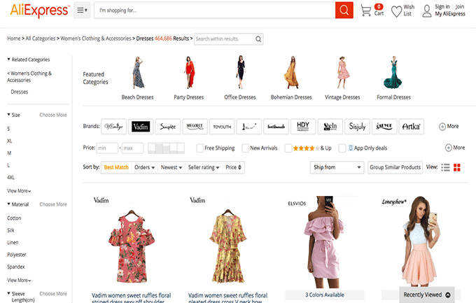
Consider a site like aliexpress.com for women’s dresses, the results come back with 464,868 choices. Talk about a breadth of product. But this can cause grave dissatisfaction because of the abundance of choice is magnified with endless options. In a physical world, the space available to showcase any products is limited. But virtual world is infinite, and the number of products that can be displayed is endless.
I consider my experience shopping at a store with a limited product like Ann Taylor, vs. going to a store like Marshalls with too much product. My experience at Ann Taylor is always more positive.
And the jam study findings reaffirm my feeling and this state that our human brains, both off and online, can’t deal with too much choice. The excess choice ultimately leads to anxiety, and the brain begins to focus not on what it has, but instead on what it doesn’t have. The greater the sacrifice, the more dissatisfaction is felt.
Let us also see how the abundance of choice works in SaaS industry.
The industry standard is to have between 3 and 4 packages on the pricing grid. Many SaaS pricing pages have that number and tend to highlight one of the plans as “most popular”.
What becomes clear is that it’s not the number of plans that matters [abundance of choice], but the amount of information that a person has to consider.
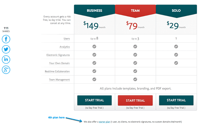
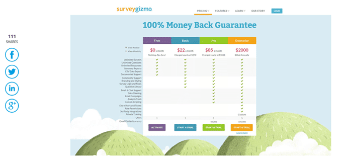
If we see the pricing package for both the websites, one offers 3 plans and the other 4 plans. BidSketch purposefully presents its users with only 1 factor to consider, number of users. In contrast, Surveygizmo used to give its users 15 factors. According to information overload theory, choosing a plan at Surveygizmo will be more overwhelming than choosing a plan at BidSketch because of the number of options present.
Less is more
Benjamin Scheibehenne, a research scientist at the University of Basel in Switzerland, said it might be too simple to conclude that too many choices are bad, just as it is wrong to assume that more choices are always better. It can depend on what information we’re being given as we make those choices, the type of expertise we have to rely on and how much importance we ascribe to each choice.
Mr. Scheibehenne recently co-wrote an analysis, to be published in October in The Journal of Consumer Research, examining dozens of studies about choices. One problem, he said, is separating the concept of choice overload from information overload.
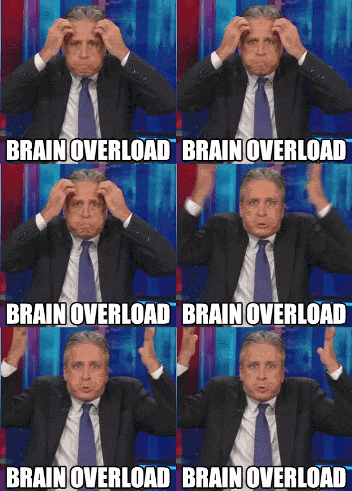
Gif source: Tenor
In other words, he said, how much are people affected by the number of choices and “how much from the lack of information or any prior understanding of the options?”
As per the 401[k] pension fund study, if more fund options are offered, fewer people participate. And the highest participation rates are among those employees who are automatically enrolled in their company’s 401(k)’s unless they actively choose not to.
This is a case where offering a default option of opting in, rather than opting out doesn’t take away choice but guides us to make better ones.
Sometimes, it’s a good thing
Having discussed the perils of the abundance of choice, sometimes too much of choice can be a good thing too.
We have discussed hundreds of pairs of jeans to too many dresses on the website to choose from, but have we ever actually walked out of a website or an actual store without buying anything because we had too much of choice?
Sometimes we actually walk into a place because it offers a wide choice. Like various kinds of cheeses at a deli. For cheese lovers, they likely go because they are offering a huge choice of cheeses.
“Help customers to identify the dominant option in the choice set:
This could mean making it easier for users to eliminate “inferior” options in the choice set (review ratings, bestseller tags, and filters).
This could mean designing products for distinct segments so that users would not need to make complicated trade-offs between products.”
Simplicity or abundance of choice doesn’t revolve only around the number of products or services to choose from, but also comes into picture while choosing the specifications of the product or a particular service.
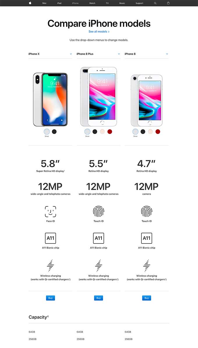
For example, the iPhone remains to be an extremely popular product despite the fact that there are many mobile phones out in the market which are cheaper, have bigger screens and a lot more features. That is because Apple has simplified the decision-making process by providing the users with exactly what they need, without too many frills. Of course, there are some users who like the complexity of the technology, but a lot more people have proven to like the simplicity and easy to use technology. And that’s the reason Apple dominates the market.
When you have an abundance of choice, there are ways to make the decision easier for your visitors:
- Filtration: Providing visitors a way to find precisely what they need allows for a better experience, without losing breadth of choice.
- Anchoring: is when an initial piece of information is used to make subsequent decisions (reg vs. sale price). Incorporating anchoring in the choices visitors have, helps them make decisions.
- Frame and account: is how our decisions are shaped based on language 5% fat vs. 95% fat free. By suggesting different variants to the language on the variety of products you can help visitors make a better decision.
- Prospect theory: is about how we evaluate options and make decisions. Visitors will estimate in a biased and unlikely way the perceived likelihood of all the options. The way you order the products considering intent can have a tremendous impact.
- Loss aversion: losses have more than twice the psychological impacts of equivalent gains. This is one of the biases that can come from prospect theory. Visitors will tend to give more weight to small probabilities to guard against losses.
- Endowment effect the feeling of ownership you have once you’ve been given something. Promotions and incentives can help move visitors through to the next stage.
The Balancing Act
Too much of choice is a bad thing, but it’s not bad all the time in some cases.
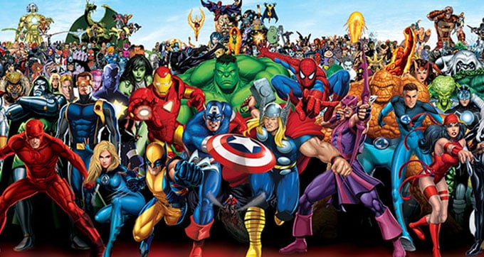
Image source: Superheroes
Increasingly the studies are proving that more options always lead to fewer actions and conversely fewer options lead to more actions being taken.
But it has to be about finding the middle path. We can take away a lot of knowledge from the above-mentioned studies to understand how this concept works the best for conversion rate optimization.
- You can eliminate too much of choice on the webpage by providing just one clear call to action button, which calls for just one desired action from the user.
- Making the outreach personal and relevant, and by not sending emails with too much information.
- By reducing the number of products or services that are displayed per page.
- By using some of the psychological tactics to help decipher through the abundant choices.
“Does choice overload always occur? Of course not. Does it affect all people, in all domains of decision making? Of course not. Does it matter how options are organized and arrayed? By all means, yes. Does adding options improve decision making by making salient features of alternatives that might otherwise be ignored? Sometimes, yes. But sometimes it has a perverse effect, by making salient features of options that ought to be ignored.”
While talking about simplicity over abundance of choice and while explaining why simplicity is better, let me briefly tell you about decision fatigue, and why it affects the human psychology in terms of making choices.
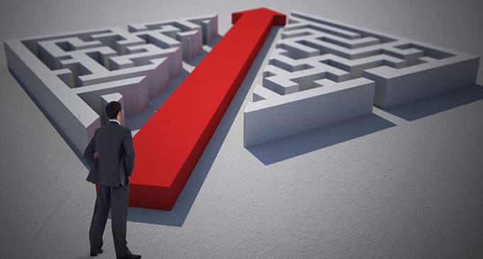
Image source: Intech
Decision fatigue is when we start taking shortcuts as we exhaust our mental energy. Research suggests that humans have a limit on how many active, deliberate decisions they can make in a certain time period. The more we exhaust that reserve, the more likely we are to look for shortcuts.
There was a study conducted to prove this point. Researchers analyzed more than 1,100 decisions made by court judges. They found that as the day went by (and judges made more decisions), judges were becoming more likely to take shortcuts when deciding which prisoners to release before their official sentence was over.
Result?
Prisoners who appeared at the start of the day received parole about 65% of the time. Those who appeared late in the day received parole less than 10% of the time. Put simply, as judges got tired they used the least-risky option and allowed only a small number of prisoners out.
Conclusion
Ultimately If people have a strong preference for a particular product, the choice won’t overwhelm them. They will simply choose their favorite option.
Human beings have limited energies for processing information and more often than not, choose the path of minimum effort, even though an alternative path would result in better results. Users often take shortcuts and may appear disinterested, but their actions are ways of protecting themselves from information overload and fatigue.
All decisions people make require mental effort. As technological advancements proliferate, so does the amount of work required to make good choices. Every decision, large or small, costs us time and effort.
And in the end, as Mr. Scheibehenne said:
“It is not clear that more choice gives you more freedom. It could decrease our freedom if we spend so much time trying to make choices.”


