The value of conversion rate optimization (CRO) in helping businesses achieve their goals is undeniable.
This growth in CRO adoption spans multiple industries, driven by businesses recognizing the pivotal role of user experience in revenue growth and customer retention.
This article will explore two fundamental areas that CRO specialists eagerly test and optimize: site search and navigation.
Both site search and navigation play a crucial role in the user journey and significantly influence conversion rates.
Our analysis will delve into the strengths and weaknesses of each element, their impact on shaping user experiences, and their ability to guide users effectively toward desired conversion points.
What Is Internal Site Search?
Internal Site Search, often referred to simply as site search, is a functionality implemented on a website that allows users to conduct specific searches within the website’s content.
It is a search bar or box prominently placed on the website, enabling visitors to enter keywords or phrases related to their interests or the information they seek. The search function then scours the website’s database or index, presenting relevant results as a search results page.
This feature enhances user experience by offering visitors a more direct and focused way to find relevant information or products within the site.
It complements the traditional navigation structure, which may only sometimes cater to some users’ specific needs.
With internal site search, users can quickly and efficiently access desired content, reducing the time and effort spent manually navigating multiple pages.
What Is Website Navigation?
Website navigation refers to the hierarchical structure and interactive elements facilitating user movement and exploration throughout a website.
The system of links, menus, buttons, and other elements enables visitors to navigate and access different pages, sections, or content within the website.
Effective website navigation is fundamental to user experience (UX) as it directly impacts how easily users can find the information or products they seek.
A well-thought-out navigation system should be intuitive and user-friendly, providing clear paths to various website sections.
Site Search and CRO
Significance of site search functionality on a website.
An efficient site search feature on a website is crucial for enhancing user experience and overall visitor satisfaction.
When users arrive at a website, they often have specific goals or information they seek. Site search offers them a direct and convenient way to find relevant content, products, or services without navigating through multiple pages manually.
This convenience significantly improves the user experience, as visitors can quickly access what they need, leading to higher satisfaction levels.
An efficient site search feature understands user queries, even with typos or variations in phrasing, and returns accurate results. It saves users time and effort, making their interactions with the website more enjoyable.
Furthermore, a well-implemented site search can help users discover content or products they might not have found through traditional navigation alone, increasing the website’s overall value to them.
Site search plays a vital role in boosting user engagement on a website. When users can easily find what they’re looking for, they are more likely to spend more time exploring the website’s content.
Their interest and trust in the website grow as they engage with relevant information or products.
Moreover, an efficient site search feature encourages visitors to delve deeper into the site, reducing the bounce rate – the percentage of users who leave the website after viewing only one page.
Improved engagement and reduced bounce rates signal to search engines that the website provides valuable content, potentially leading to better rankings and increased organic traffic.
From a conversion rate optimization (CRO) perspective, a well-optimized site search can significantly impact the website’s performance. Delivering highly relevant search results makes users more likely to find products or information that meet their needs.
This increases the likelihood of completing a desired action, such as making a purchase or submitting a lead form, and enhances the chances of repeat visits and customer loyalty.
Enhancing user experience and increasing conversions with effective site search.
A well-optimized site search feature is designed with the user in mind. It considers user behavior, preferences, and language, providing a seamless search experience.
Advanced features like autocomplete, suggested search terms, and filters refine the search process, empowering users to find relevant results quickly.
As users feel more in control and can effortlessly find what they seek, their overall experience on the website becomes positive and satisfying.
An intuitive site search also helps users discover related or complementary products and content, encouraging further exploration.
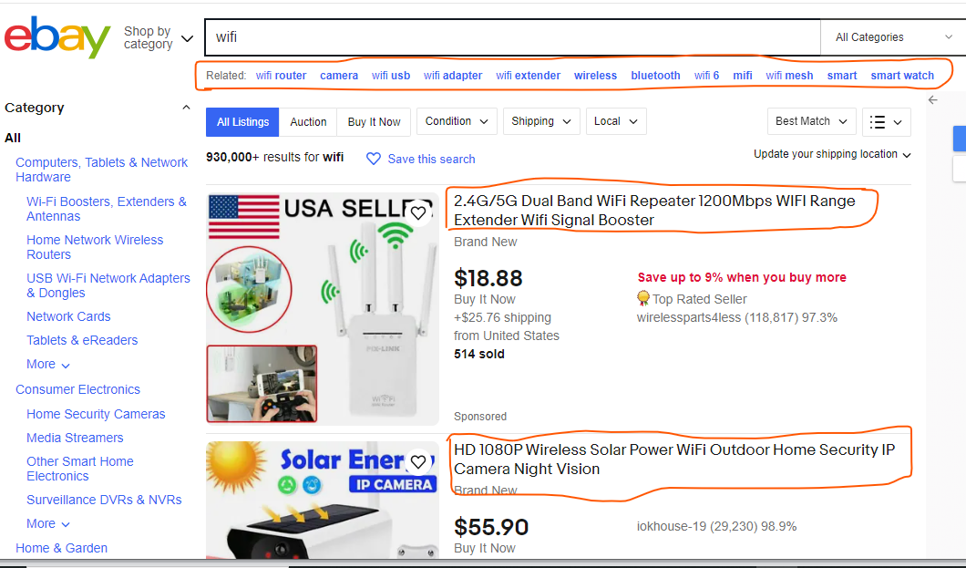
See this example from eBay. The search term is Wi-Fi; the first result fulfills the search criteria. The second result is something different but a related product under the search; they offer you the option to search for related terms.
This dynamic and personalized experience leaves visitors with a favorable impression of the website, increasing the likelihood of return visits and word-of-mouth recommendations.
When visitors find it easy to locate products or information through the site search, it streamlines the path to conversion.
A streamlined and efficient search process removes potential barriers that could deter users from completing their desired actions. Consequently, conversion rates improve as users can readily find and purchase products, sign up for services, or access relevant content.
Moreover, a positive experience with site search contributes to developing customer loyalty.
Users with a seamless and satisfactory experience are more likely to return to the website for future needs.
Additionally, they may become brand advocates, recommending the website to others and contributing to increased organic traffic and conversions.
Challenges users face without a good site search.
Users can encounter various challenges that hinder their experience and satisfaction without a good site search functionality.
When the search feature fails to understand user queries or delivers irrelevant results, it can frustrate visitors and push them to seek information elsewhere.
This can result in lost opportunities for the website to engage users effectively.
Poor site search can also lead to a subpar user experience, causing users to abandon their search and leave the website prematurely. This contributes to higher bounce rates, which affects user engagement and has implications for search engine rankings and organic traffic.
Inadequate site search functionality can lead to higher bounce rates, as users may quickly leave the website if they cannot find what they’re looking for.
Frustrated by the lack of relevant results or difficulty in refining their search, users may perceive the website as unhelpful or unprofessional.
Also, user frustration can tarnish the overall brand perception, impacting the likelihood of repeat visits and conversions in the future.
Dissatisfied users may share their negative experiences with others, potentially leading to negative word-of-mouth publicity.
Navigation and CRO
Role of website navigation in guiding users toward conversion points.
Intuitive website navigation plays a vital role in guiding users toward conversion points seamlessly.
When users arrive at a website, they are typically looking for specific information or seeking to complete a particular action, such as making a purchase, signing up for a service, or submitting a form.
An intuitive navigation system anticipates these user needs and presents clear pathways to the desired conversion points.
Through well-labeled and strategically placed navigation menus, users can quickly identify the relevant sections or categories related to their interests.

This menu from Etsy is clean and well-labeled. It shows the primary categories from which any user can start locating items of interest.
If you move your mouse to any of the categories on the menu, it expands and shows subcategories, which can help users find items quickly.
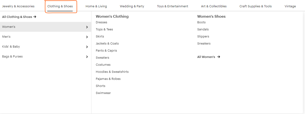
This ensures they do not get lost or frustrated while trying to find the content or actions they seek.
Intuitive navigation reduces the cognitive load on users, enabling them to focus on their primary goal—converting—without distractions.
Navigation serves as a roadmap for users as they navigate through a website. It guides them along predetermined user journeys, leading them from the entry point to the ultimate conversion destination.
Each step in the navigation flow is carefully designed to provide users with the information they need at each stage of their decision-making process.
Effective navigation facilitates a logical progression from general information to more specific details, supporting users in their exploration of products or services.
It encourages users to interact with the website, discover additional offerings, and build trust in the brand.
By aligning navigation with user expectations and behavior, websites can shape user journeys that lead naturally toward conversions, making the path to conversion both intuitive and persuasive.
Importance of intuitive and clear navigation for a positive user experience.
Clear navigation menus are essential for creating a seamless user experience. A well-structured and prominently displayed main menu provides users with an immediate understanding of the website’s content organization.
It presents a concise overview of available sections and categories, allowing users to make informed decisions about where to find the information or products they seek.
Moreover, clear navigation menus enable users to switch between different sections of the website effortlessly.
Users can explore multiple aspects of the website without feeling lost or disoriented. This ease of movement throughout the site enhances user satisfaction and keeps them engaged with the content or offerings.
User-friendly navigation removes barriers and friction that might otherwise hinder the user’s exploration of the website.
When users can easily find what they need, they are more likely to stay engaged and explore further.
In contrast, a confusing or convoluted navigation system may frustrate users, leading them to abandon their journey and seek alternatives.
A user-friendly navigation system incorporates features such as breadcrumb trails, back buttons, and clear calls-to-action, empowering users to easily retrace their steps or progress to the next stage of their journey.
Additionally, a well-designed navigation experience fosters a positive perception of the website and the brand, increasing the likelihood of repeat visits and conversions.
Common navigation mistakes that lead to drop-offs and decreased conversions.
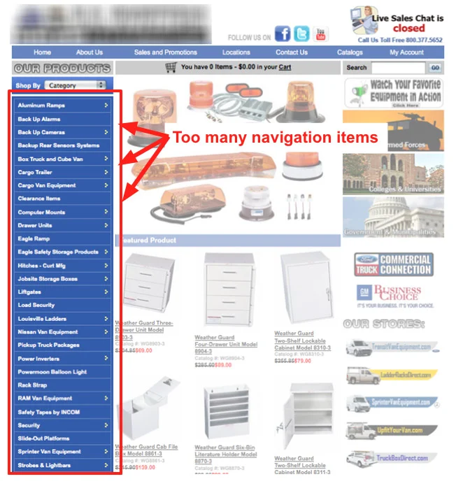
1. Cluttered Navigation: Too many menu options or submenus can overwhelm users, making it difficult for them to find what they are looking for.
See this example:
2. Unclear Labels: Ambiguous or vague navigation labels confuse users, leading them to click on the wrong links or abandon the search altogether.
3. Hidden Navigation: Hiding navigation elements, especially on mobile devices, can frustrate users and hinder their ability to access essential sections of the website.
Hamburger menus are examples of hidden navigation;
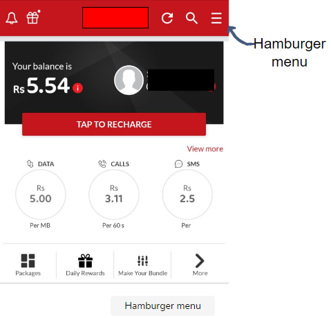
To retain users and improve conversions, website owners should implement the following best practices for navigation:
1. Simplify Menus: Keep the main menu concise, grouping related items together and prioritizing the most critical sections.
2. Use Clear Labels: Ensure that navigation labels are descriptive and straightforward, accurately representing the content or actions they lead to.
3. Prominent Search Bar: Include a visible search bar on every page, making it easy for users to initiate a site-wide search.
4. Consistent Navigation: Maintain consistent navigation elements across the website, minimizing user surprises and confusion.
5. Mobile-Friendly Design: Optimize navigation for mobile devices, employing responsive design principles to provide a seamless experience.
By addressing these navigation pitfalls and incorporating user-centric design principles, websites can enhance user experience, reduce drop-offs, and ultimately increase conversions.
A Comparative Analysis: Site Search and Navigation
Side-by-side comparison of benefits and limitations of site search and navigation in CRO.
| Aspect | Site Search | Navigation |
| Strengths | – Efficiency: Allows users to find specific information quickly. | – Familiarity: Users are accustomed to standard navigation patterns. |
| – Precision: Delivers highly relevant results for user queries. | – Structured: Provides a clear hierarchy and organization of content. | |
| – Personalization: Can offer tailored suggestions based on behavior. | – Consistency: Maintains the same navigation elements throughout. | |
| – Discovery: Helps users find related content or products. | – Orientation: Provides a sense of location within the website. | |
| – Enhanced UX: Reduces user frustration and improves satisfaction. | – Broad Accessibility: Usable for all users, regardless of tech-savviness. | |
| Limitations | – Technical Challenges: Requires proper implementation and maintenance. | – Limited Search Capability: Users may not find specific items easily. |
| – Language Dependency: Understanding user intent in different languages. | – No Personalization: Lacks the ability to provide tailored suggestions. | |
| – Database Issues: Incomplete or outdated data may impact results. | – Higher Learning Curve: This may require users to familiarize themselves with navigation. | |
| – Dependency on Query Quality: Poorly formulated queries lead to irrelevant results. | – Complexity with Large Websites: This may become overwhelming for vast sites. |
Site Search: Site search’s strength lies in its ability to cater to users with specific needs. Offering highly relevant results and personalized suggestions streamlines the user’s journey to desired conversion points.
When users know exactly what they’re looking for, site search can efficiently lead them to make a purchase, sign up, or access specific content.
However, site search limitations may arise when users struggle to articulate their queries correctly or when the website’s database is not well-maintained, resulting in less satisfactory results.
Navigation: Navigation excels in guiding users through the website’s structure and content hierarchy.
It ensures a cohesive user experience by maintaining consistency and familiarity with standard navigation patterns.
When users are browsing or exploring a website with a broad range of content, navigation effectively supports them in discovering relevant information.
However, navigation’s limitations come into play when users seek specific content or products, as it might not offer the precision and personalization that site search can provide.
Scenarios where site search might outperform navigation and vice versa.
E-commerce Websites: Site search shines on e-commerce platforms, where users often have specific products in mind. With an efficient site search, users can directly search for product names, specifications, or attributes, leading to quicker purchasing decisions.
Content-Rich Websites: For websites with extensive content, site search becomes valuable. Users seeking specific articles, resources, or information can directly search using relevant keywords, bypassing the need to navigate through numerous pages.
Personalization and Recommendations: Site search can incorporate personalized recommendations based on user behavior, driving conversions by suggesting products or content tailored to individual preferences.
Scenarios where navigation might outperform site search in leading users to conversions:
Browsing and Exploration: When users are in an exploratory mindset and unsure of what they are looking for, navigation provides an organized path to discover relevant sections and content.
Branding and Familiarity: Well-structured navigation contributes to brand identity and recognition. Users who are familiar with a website’s navigation are more likely to trust the brand and navigate confidently to desired conversion points.
User Education: On websites with complex services or offerings, navigation can help educate users about different options and features, guiding them toward the most suitable conversion paths.
Best Practices for Site Search Optimization
1. Prominent Placement: Place the search bar prominently on your website, preferably at the top or in the header, where it is easily visible and accessible to users.
See this example from Etsy. The search bar is at the top of the website (most likely the first thing anyone sees).

2. Clear Design and Labeling: Ensure that the search bar is visually distinct with a clear label, inviting users to enter their queries.
See this example from eBay:

3. Auto-Suggest with Autocomplete: Implement autocomplete functionality to provide real-time suggestions as users type, helping them find relevant search terms faster.
By anticipating and offering relevant search terms, autocomplete helps users find the information they seek faster. It also reduces the chances of spelling errors or irrelevant search results, ensuring a smoother and more efficient search experience.
4. Refine Search Results: Offer filtering options such as categories, product attributes, date ranges, etc., to help users narrow their search and find the most relevant results.
See this example:
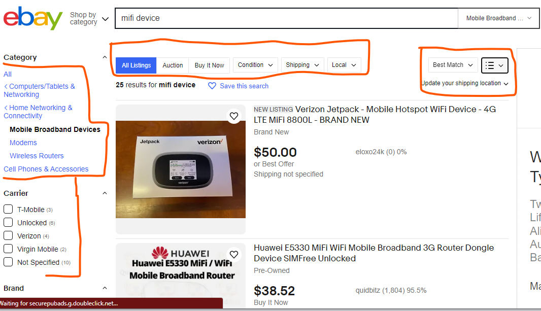
5. Sorting Options: Provide sorting options (e.g., by relevance, price, popularity) to empower users to organize search results according to their preferences.
By applying these filters, users can find precisely what they are looking for. Sorting options allow users to organize search results to align with their preferences, enhancing the overall user experience and increasing the chances of conversions.
6. Error Handling: Set up friendly error messages for misspelled queries or no search results, guiding users to refine their searches effectively.
7. Mobile Optimization: Ensure that the site search is fully responsive and optimized for mobile devices to accommodate the increasing number of mobile users.
8. Search Tracking and Analytics: Implement search tracking to gather data on user search behavior and analyze search queries to identify trends and popular content.
Strategies for Optimizing Navigation
1. User-Centric Approach: Understand your target audience’s preferences and behavior to design navigation that aligns with their needs and expectations.
You can do this by going through heatmaps on your site, or you can go through your competitor’s site and observe for design patterns across all of them.
2. Simplify Menus: Keep the main navigation menu concise and focused, avoiding clutter by grouping related items.
See this example from ASOS. Their menu is straightforward.

3. Clear Labeling: Use descriptive and straightforward labels for navigation items, ensuring users can quickly identify the content they are seeking.
4. Logical Hierarchy: Organize navigation elements in a hierarchical structure, prioritizing the most important sections and arranging them in a logical order.
5. Prominent CTAs: Incorporate clear and compelling call-to-action buttons in strategic locations to guide users toward desired conversion points.
See another example from ASOS:

6. Consistent Layout: Maintain consistent navigation elements across all pages to provide users with a familiar and seamless experience.
7. Breadcrumbs: Implement breadcrumb navigation to help users understand their current location within the website’s hierarchy and easily backtrack if needed.

8. A/B Testing: Test different navigation layouts and elements through A/B testing to identify the most effective design for driving conversions.
The Role of Intuitive Design and Logical Hierarchy in Navigation Optimization:
Intuitive design and logical hierarchy are fundamental to navigation optimization.
When users can effortlessly find what they need, it enhances user experience and engagement.
An intuitive design considers user behavior and expectations, ensuring that navigation elements are placed where users expect them to be.
Logical hierarchy presents content in a structured manner, making it easier for users to explore related sections and discover relevant information.
Both intuitive design and logical hierarchy reduce friction and cognitive load, leading to increased user satisfaction and improved conversions.
The role of clear and compelling CTAs in guiding users toward conversions.
Effective call-to-action (CTA) buttons use persuasive language and design to encourage users to take specific actions, such as “Buy Now,” “Sign Up,” or “Learn More.”
By standing out visually and being strategically placed, CTAs guide users toward conversion points.
Well-crafted CTAs provide clarity and urgency, motivating users to act and simplifying the path to conversion.
Here are some examples of effective CTAs:
- “Start Your Free Trial Now”
- “Get 50% Off Today Only”
- “Download the e-book.”
- “Join Our Exclusive Membership”
- “Subscribe for Updates and Special Offers”
Each of these CTAs clearly communicates the value proposition and encourages users to take immediate action, driving conversions.
Utilizing breadcrumbs for easier navigation and understanding of the website’s structure.
Breadcrumb navigation provides context by displaying the user’s current location within the website’s hierarchy.
It offers a trail of links, typically separated by arrows, showing the path taken from the homepage to the current page.
Breadcrumbs make it easy for users to understand the website’s structure and navigate back to previous levels or sections with a single click.
This context and ease of use reduce the chances of getting lost, increasing user confidence and satisfaction.
Breadcrumbs contribute to a positive user experience by:
1. Orientation: Users know where they are within the website and how the current page relates to the overall structure.
2. Navigation Aid: Breadcrumbs act as a navigation aid, allowing users to backtrack to previous pages without relying solely on the back button.
3. Efficiency: Breadcrumbs save time and effort, especially on websites with deep hierarchies, by providing a direct path to parent or category pages.
4. Consistency: Breadcrumbs offer a consistent user experience across the website, enhancing familiarity and usability.
Final Thoughts
Site search and navigation both elements contribute uniquely to the user journey and the conversion process. If you want to see your conversion rates go up, you need to optimize both of these elements to make the user experience more enjoyable.
Doing this is setting yourself up for success.


