Ask for the sale. It’s basic sales practice. Unless you are McDonald’s, your customers will not likely line up to spend their money with you. Don’t expect the customer to make a buying decision purely on the merits of your offer. Ask for the sale.
In advertising, asking for the sale is known as a call to action. It’s the third step in the basic model for most advertising:
- Highlight a problem
- Present a solution
- Call to action
Here’s a simple example in ad copy:
Got a nasty headache? Aspirin relieves headache pain fast. Buy some today.
But, regardless of the fact that a call-to-action is fundamental to any other sales and advertising, most of us don’t seem to fully grasp their importance for converting customers on the web. CTAs remain one of the weakest elements of digital marketing and ecommerce.
3 Tips for Improving Your Digital Marketing Results with Your Calls-to-Action
- Add Calls-to-Action Throughout Your Digital Marketing Elements
Emails, web pages, Facebook pages, even your blogging and social media posts; each one can be a vehicle for your CTAs.Invesp hosts regular free webinars to help ecommerce and lead generation sites learn more about conversion optimization. Until recently, the calls-to-action to register for the webinars led directly to the branded GoToMeeting page. Nice, but empty of CTAs for Invesp’s products, even though the visitor was there to register for an Invesp event.Now, while the end registration page is still there, the webinar CTA’s lead to a landing page that features Invesp’s CTA’s. - Have Multiple CTAs for the Same Content
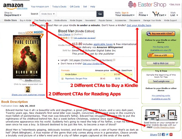
Calls-to-Action are not one-size-fits-all devices. Among other variables, they must be relevant to the customer’s persona; where customers are in their buying cycle; the customer’s state of mind; all of the above; any combination of the above and any number of other factors. It’s almost impossible for a single call-to-action to work in all those scenarios.This means you will likely enjoy more success in getting your customers to click if, at least in some cases, you use different CTAs for the same content. Change the wording, colours, size, shape of your CTAs; whatever is required to compel different customers to take action. The first graphic below shows a good example of this from Amazon. - Make CTAs Distinct From Each Other
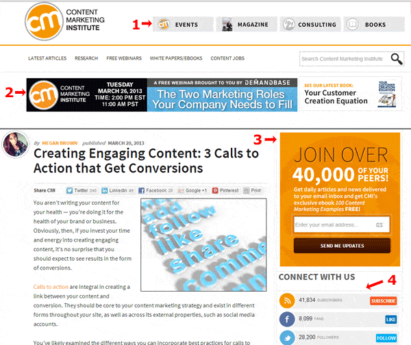
Calls-to-action can take many different forms. Even the menu items on your navbar are really CTAs. Problems arise when customers can’t distinguish between CTAs, or at least groups of CTAs. Too many of the same or similar CTAs causes confusion and hesitation, which could be lethal to your conversion rates.Have you ever landed on a site with too many items on their navbar? Or too many similarly colored CTA buttons that make it too difficult to determine which one is the one is right for you?Check the graphic below of a web page from Content Marketing Institute for a great example of differentiating your CTAs to improve comprehension – and conversions. There are at least 15 CTAs in the graphic, but CMI has done a great job of varying their CTA styles to make each CTA group distinct. In addition to the navbar, there are 4 other styles of CTAs (I’ve numbered them).
We shouldn’t beat ourselves up for not being good at asking for the sale on the web because we’re all still learning how to do it. But, as we pay more attention to our calls-to-action, we’ll get better, and so will our results.


