


For the love of landing pages, let’s turn them into high-converting machines for our websites.
Who wouldn’t love landing pages? Helpful to visitors and great allies to companies, landing pages drive targeted traffic to your website, bringing in qualified prospects in search of the solutions you and your company offer.
A website can increase leads by 55% by increasing the number of landing pages from 10 to 15. However, generating leads is still the top marketing challenge. The median conversion rate for lead-generation pages across industries ranges from 2.6% to 6%. So, there is still room for improvement.
In the right sense of the term, a landing page is any page on a website where visitors land after coming from an external traffic source. But dedicated landing pages, or specific campaigns, are designed with one goal and a single call to action in mind. These standalone pages serve a different purpose than the pages on your website, as they are designed to drive targeted traffic to the content our prospects need. These visitors arrive at your page after clicking on an ad or link.
Dedicated landing pages guide visitors to specific content, not down the rabbit hole to figure things out for themselves.
This resourceful nine-step guide will help you design landing pages that address your visitors’ needs and engage them to opt in to our offers. You can find clear definitions, examples, and actionable insights all along the way, from crafting to testing your pages.
Step 1. Start Designing Backward: First, the End Goal
When designing a landing page, your first step is to define its end goal Take a few minutes to jot down:
- Why do I need this landing page?
- What is the primary goal of this page?
- What is the main action I want visitors to take on this page?
- Why is this visitor’s action important to our company?
At this step, you should figure out your main goal for creating the landing page or, as I would like to call it, the soul of your page.
In finding this goal, you should account for both sides involved. You have to take into account your interests as well as your visitors’ concerns:
- What do I want to accomplish by creating this page?
- What do my visitors want to accomplish by visiting this page?
You want visitors to convert on the landing page, maybe by filling out a contact form, providing a credit card number, or an email address, and so on.
Sounds like a good plan, but there is a catch. Online visitors do not follow a script.
Your future leads, as strange as it might sound, did not wake up thinking: “Oh, today I feel like becoming a customer of an unknown online company. I can hardly wait to spend loads of money and tons of my time with people I’ve never seen before.”
Nope.
They woke up with an ever-growing list of problems to solve.
Your visitors come to your landing page to solve one or more of their problems. When they click on your ad, they do not want to download a book, start a course, or share personal information. Their goal is to address a pressing need.
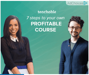
So, when future leads come across an ad about creating a profitable course or learning new skills, they click on it and follow through to learn more about how to make a profit teaching or how to master a new in-demand skill. Their concern is addressing their needs.

What are some of the common business goals for designing a landing page?
- Email capture: By capturing the visitor’s email, you can keep the conversation going and convert them into customers later. Email capture landing pages typically include an offer in exchange for contact information; for instance, you can offer a useful webinar in exchange for an email address.
- Free trial sign-up: A landing page might explain the benefits of an online product or SaaS (Software as a Service), prompting visitors to sign up for a free trial.
- Lead capture: Generating qualified leads is also one of the goals of landing pages, unlike the leads generated by a regular website contact form. Because the offer on a landing page is tailored to a target audience interested in the topic, these leads already show interest in the solution your company provides.
- Segmenting promotional offers: You can use your landing page for different promotional offers, for example, to generate coupon codes and advertise different products.
Our guide will mainly help you design landing pages for email capture, qualified lead capture, and free trial sign-up.
Actions to Take on Step 1
To determine the end goal of your landing page, consider your buyer personas. Answer the following questions:
- Who do you intend to reach with this page?
- Why do you want to start a conversation with these people?
- What will get their attention?
- Why would they be interested in your landing page offer?
- Where can you find them online (to place your ad)?
- What are you going to sell to them in the end?
- Why would they want to buy your product or hire your service?
Step 2. Creating the Offer
Now that you have defined your landing page’s main goal, let’s move on to creating an outstanding offer to attract the right visitors.
As you consider your target audience, you can craft the most suitable offer to raise your future leads’ interest in your products and services.
You should figure out an offer that is manageable to create, interesting enough to be worth exchanging for personal information, and exceptional enough to qualify you as someone who can help visitors in their quest to find solutions.
Some of the popular offers on landing pages are:
- comprehensive guides in e-book formats
- e-courses in email, video, slides, or podcast formats
- whitepapers on recent industry trends and facts
- benchmark reports
- research and studies reports
- newsletters with exclusive content
- checklists
- scorecards
- auditing lists
- Excel spreadsheet templates
- online workshops
- webinars
- consulting meetings
- free trial sign-ups
- coupon codes
Actions to Take on Step 2
To define and create the offer, you can:
- map your customer journey to find what offers best suit each stage, you can go over a mapping template as well as your analytics and CRM info.
- Conduct polls and surveys to better understand what your visitors are looking for.
Step 3. Crafting the Copy
You now have a clear goal and an outstanding offer. It’s time to write engaging copy to show your visitors how lucky they are to have found your offer.
Copy on the landing page should address the problem your visitors are looking to solve. The words should explain your offer, of course, but you must frame them in terms of benefits for visitors.
To structure your landing page, you have three types of copy: the headline, sub-headline(s), and body copy.
The headline
The headline is the first copy the visitor will see. As you may already be aware, your page visitors have a short attention span. You have less than 10 seconds to tell your visitors what your page is all about.
Your headline is your main ally in quickly informing visitors about your offer.
An effective headline gets your point across concisely and clearly, explaining your offer directly to visitors and addressing their interests. To create your headline, you need the information you gathered about your visitors in step 2, when you created your offer.
Let’s see some of the headlines in our samples of landing pages.
Take a look at the headlines below. Without the hero image and the rest of the copy, can you understand what they are offering?
- Outline your sales page [Courtney Johnson]
- Total Retail’s 2016 Salary Benchmark Report [Total Retail]
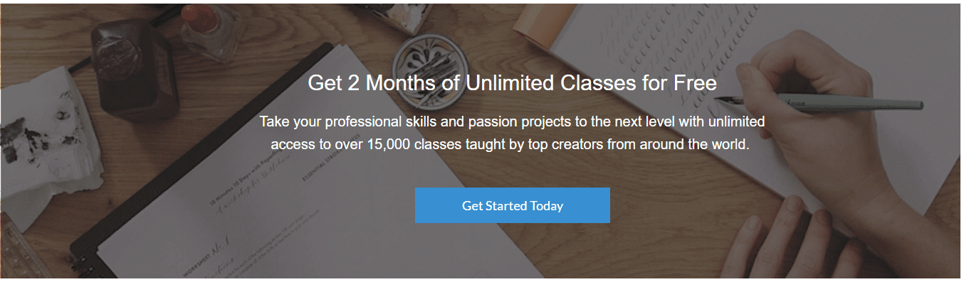
- Get two months of unlimited classes for free [Skillshare]
- 7 steps to launch your own profitable online course [Teachable]
- Create your course today [Thinkific]
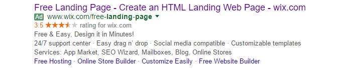
- Free landing page [Wix]
- Ready for better videoconferencing? [Zoom]
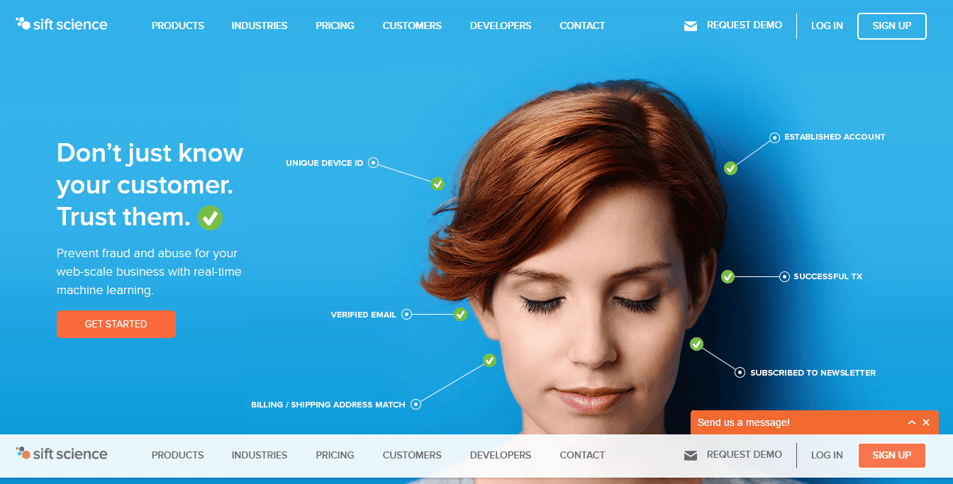
- Don’t just know your customer. Trust them. [Sift Science]
If you can understand these offers, then they are clear, effective headlines. For Sift Science, you need more context to recognize the offer, but all other headlines are straight to the point.
Make sure your headline presents your offer and a benefit to visitors. Thinkific, for instance, offers a tool to “create courses” that is easy and fast to use, so the visitor can finish preparing the course “today.” Skillshare offers unlimited classes for free. The same benefit Wix offers for creating landing pages.
Skillshare and Wix also use the exact same headline in their ads and on their pages. As much as possible, keep the same headline for your ad and your page so visitors recognize they’ve arrived at the right place as soon as they land.


When crafting the headline, the landing page’s goal will help you define what to say to your visitors. Your headline should bring your USP (Unique Selling Proposition), but keep in mind this proposition should permeate the whole page as well.
Subheadline(s)
After you gain visitors’ attention with your clear headline, the subheadline comes in to explain more about your offer.
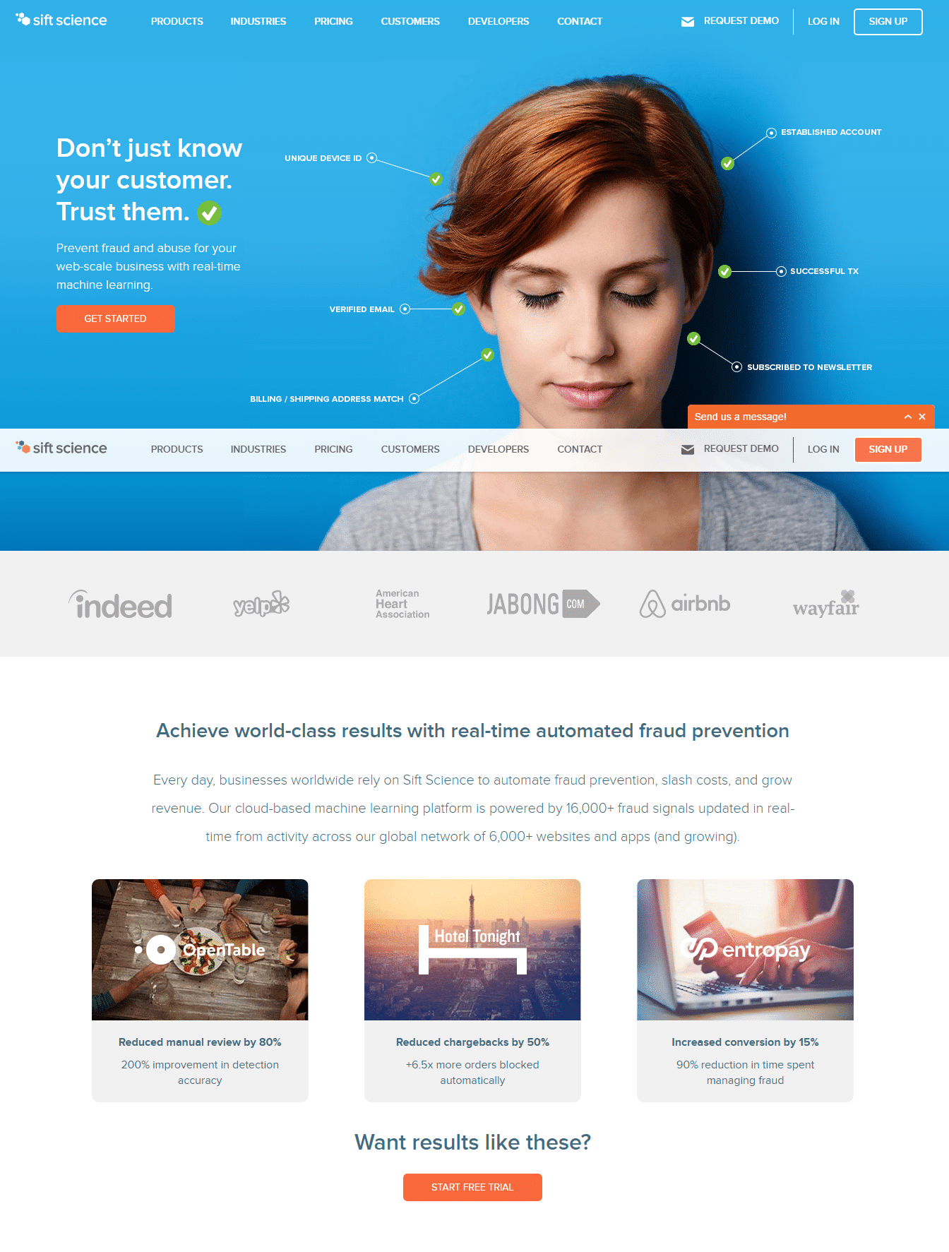
At Sift Science’s page, while the headline conveys a benefit, “Don’t just know your customer. Trust them,” the offer is not quite clear without the subheadline “Prevent fraud and abuse for your web-scale business with real-time machine learning,” accompanied by the hero image with a checklist of features.
For the salary benchmark report offered by Total Retail, the headline is simply the title of the offer, while the subheadline sets an initial question to grab visitors’ attention and signal a pain point.
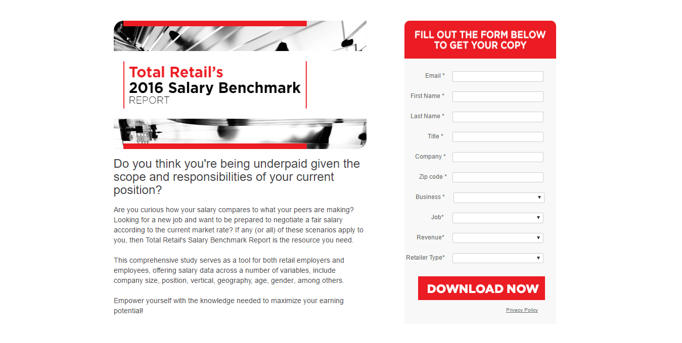
After the initial question (“Do you think you are being underpaid given the scope and responsibilities of your current position?”), They paint the scenario by asking further questions (“Are you curious how your salary compares to what your peers are making?”).
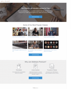
Skillshare uses the subheadline to specify the number and types of classes it offers. With the subheadline, visitors find out they will have access to over 15,000 classes to improve professional skills and passion projects:
Body Copy
After the headline introduced your offer and its benefit, and your subheadline clarified and specified it, you need to provide more details to visitors.
Your body copy should naturally answer the questions visitors might have about your offer in terms of benefits and features.
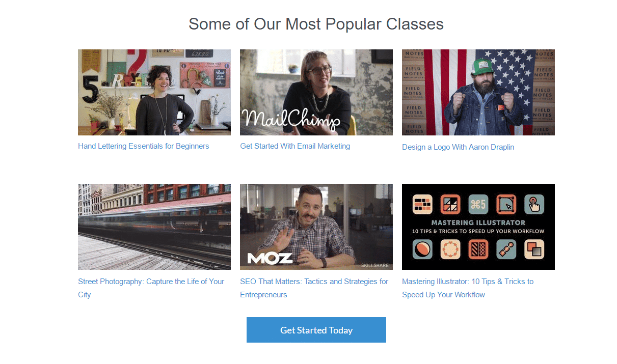
On the Skillshare page, visitors readily understand they will have free access to many classes, so their natural follow-up questions are “What type of classes?” “What will I learn?”
The page answers these questions by showing some of their popular classes, with video thumbnails and the names of the classes:
Next, visitors will wonder, “How will I learn on this platform?” The page answers this question with bullet points that also address “why should I join the platform?”
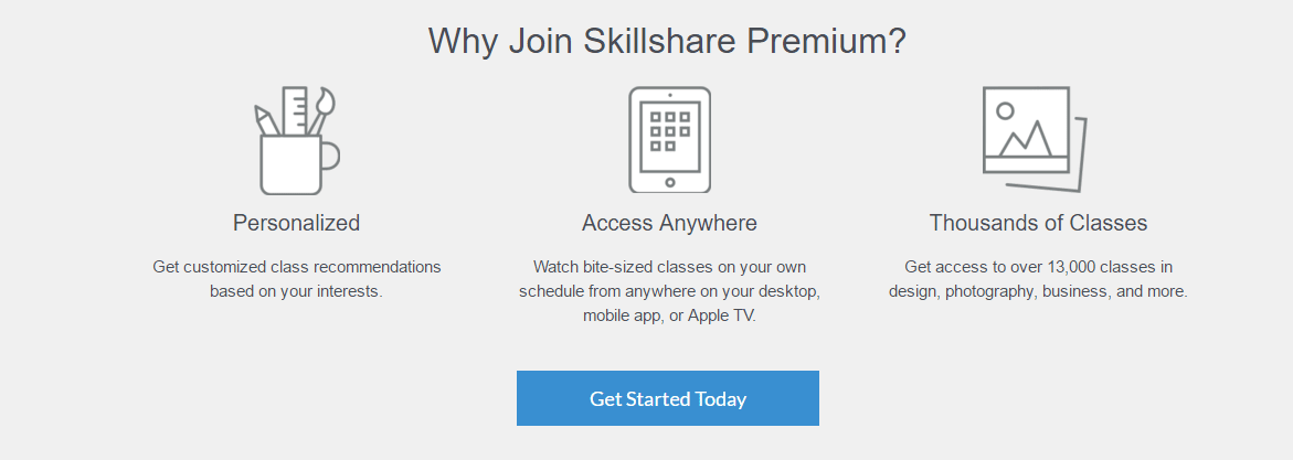
This last section of the page highlights the platform’s benefits and features. At this point, visitors recognize they will have a personalized experience as they navigate and choose from the huge library of classes. Visitors also find out that they can access the classes from multiple devices.
There is a slight inconsistency in the page because the closing argument above mentions “over 13,000 classes,” while the subheadline mentions “over 15, 000 classes.” These contradictions and typos are bound to happen, so always make sure you proofread your copy before launching the page.
For the body copy of your landing page, define the following structure:
- Supporting argument
- Closing argument
To organize the arguments:
- Create bullet points
- For each bulletin point, add benefits and features
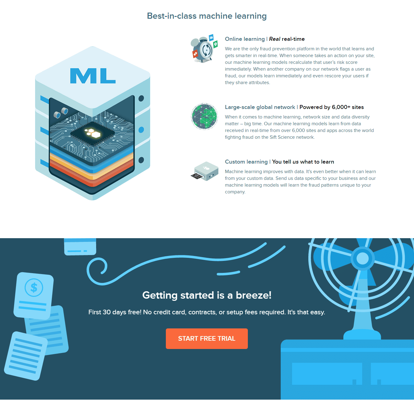
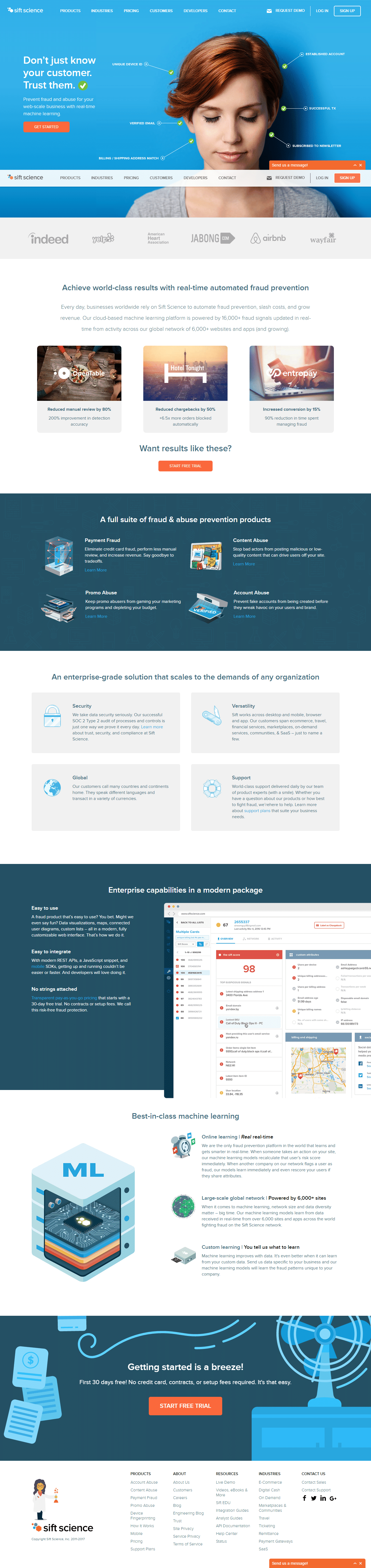
Let’s see how Sift Science presents body copy on their landing page. Their page has six sections with benefits and features. The first section shows visitors the results they can achieve by using their software.
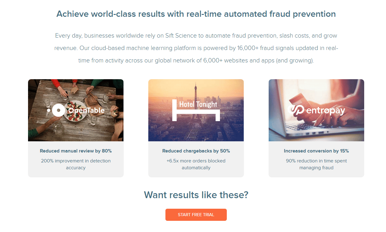
Following the results section, comes a section highlighting product features with explanations of benefits.

A new section on features is followed by a section highlighting benefits as “easy to use” and “easy to integrate.”
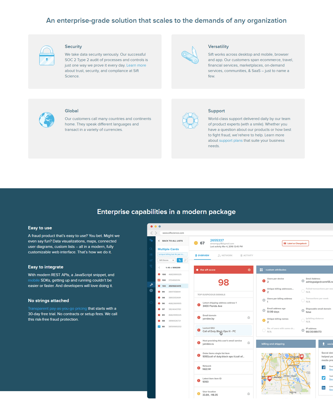 A new section on features specific to machine learning comes before the closing argument, “Getting started is a breeze!”
Long vs Short Copy Landing Page
Sift Science’ landing page feels long with all six sections, plus the area above the fold. But it makes sense. The goal of the page is to get visitors to sign up for a free trial. The product is complex, and the offer demands visitors’ commitment. The page should provide comprehensive, but not overwhelming, information on benefits and features.
Total Retail’s report, on the other hand, has a short landing page. No problem, though. It is still a complete page with a headline, a subheadline, a supporting argument, and a closing argument. Once visitors identify the problem painted by a series of questions, the page reinstates the solution: “Total Retail’s salary benchmarking report is the resource you need.” The next paragraph reinforces why the report is a great solution by providing a supporting argument. The last paragraph closes the argument with an interesting benefit provided by the report.
This short landing page is designed to offer a free report. There is no need for extensive explanations as Sift Science’s offer requires.
Landing page gurus still debate the merits of different lengths of copy. Some believe that using more copy allows you to better explain the product or service. Others believe that short copy, by reducing the risk of losing your visitor, is better.
There is no single answer to the debate. However, there are a couple of general guidelines that you should consider.
Short copy is usually better for giveaways or free offers. If visitors want what you are giving away, they don’t want to read too much — they want the freebie. If they don’t want it, they will not be interested in reading long copy anyway. Long copy works better if you are selling something, particularly big-ticket items. Visitors want to know as much as they can about something before they part with their hard-earned dollars.
Actions to Take on Step 3
To produce engaging copy for your landing page, you should:
- Define a clear structure, with a headline, subheadline(s), supporting argument(s), and a closing argument.
- Check if the headline helps visitors understand your offer as soon as they land on the page.
- Aim for a headline that presents your offer + a benefit to visitors.
- Create your USP (Unique Selling Proposition).
- Find the right words to use. The right words are the same your prospects and customers use to talk about their problems and the solutions they want. Listen to your prospects and customers to find copy that converts.
- Check the vocabulary benchmark for your industry.
- Use bullet points for benefits and features.
- Decide whether to use long or short copy based on your page goal and the type of offer.
- Edit and proofread to make sure information is coherent and consistent throughout the page.
- Remember to add meta descriptions and keywords. While these are not exactly copy on your page, they help visitors and search engines to recognize your offer.
Step 4. Wireframe all the Elements
With a clear goal, the right offer in hand, and copy already set, it’s time to wireframe the layout of your landing page.
The wireframe guides you in defining the elements your page will have, the number and types of images, as well as the number and types of copy. While at the wireframe stage, you can move elements around, determining if the layout feels too crowded with images or text.
The elements you should consider including in the layout are:
- Headline
- Subheadline
- Hero image
- Form
- Additional images
- Call-to-action button
- Above-the-fold mark
- Benefits and features
- Client testimonials
- Media mentions
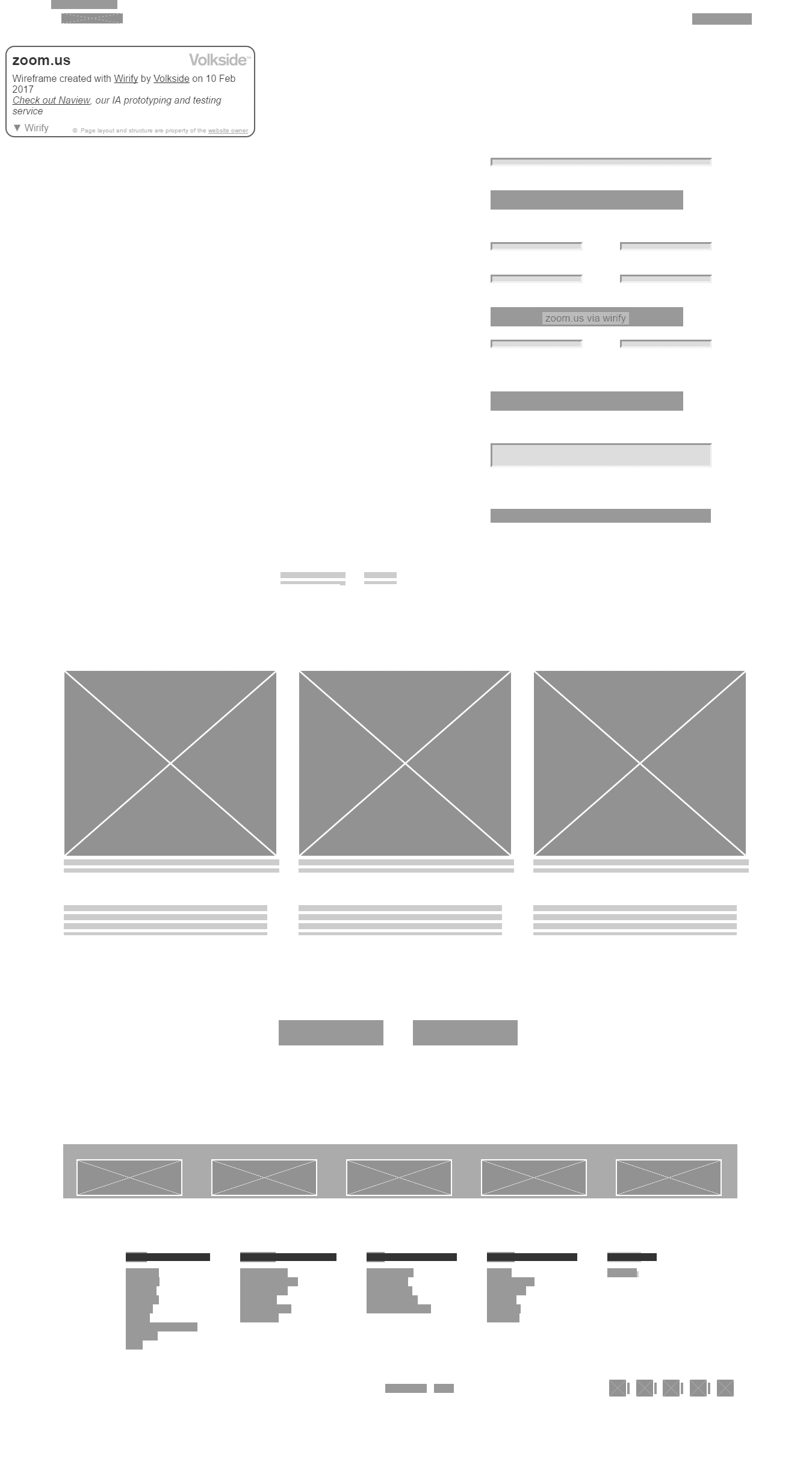
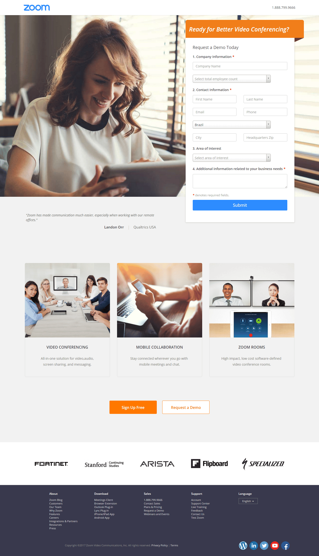
For Zoom.us, the wireframe of their landing page shows a large blank space for the hero image, a form above the fold on the left, three images highlighting benefits, and two more call-to-action buttons at the bottom, followed by client logos and the footer.
Remove Navigation Links
As the landing page’s central purpose is to generate leads, the more focus on the call to action, the better for achieving higher conversion rates.
In general, wisdom tells us that navigation links should be removed from your landing page, both at the top and in the footer. You can see Zoom.us chose to maintain the links at the bottom of the page. These links could distract the visitor from the main call to action.
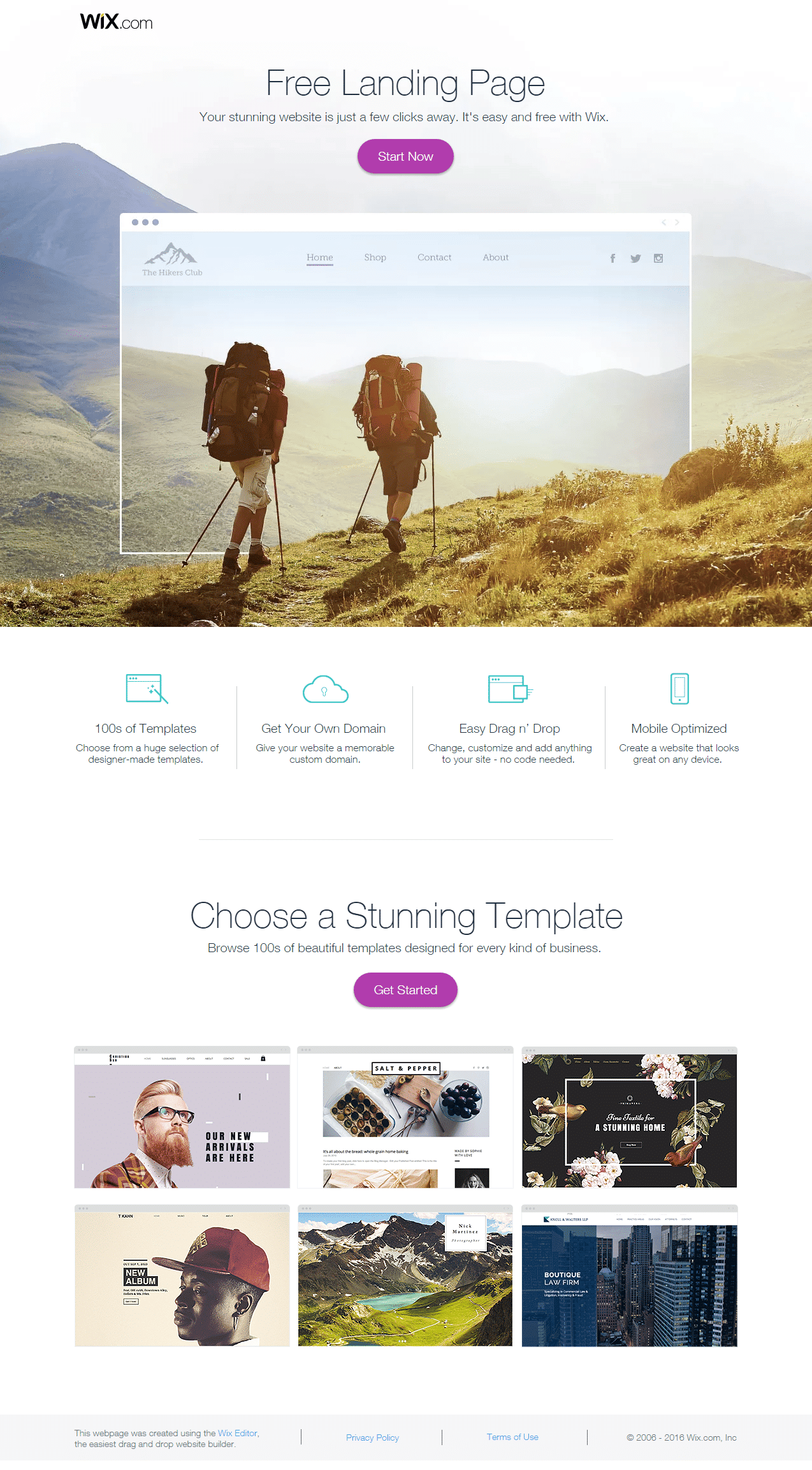
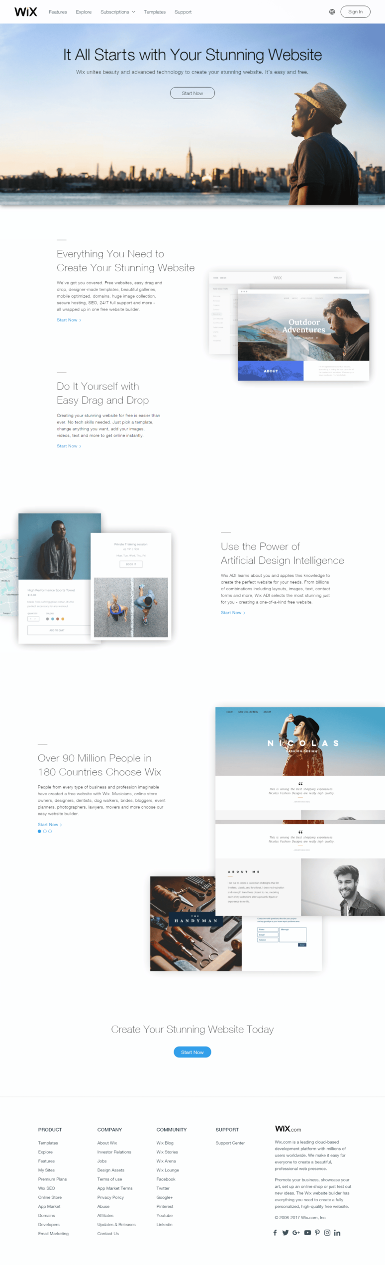
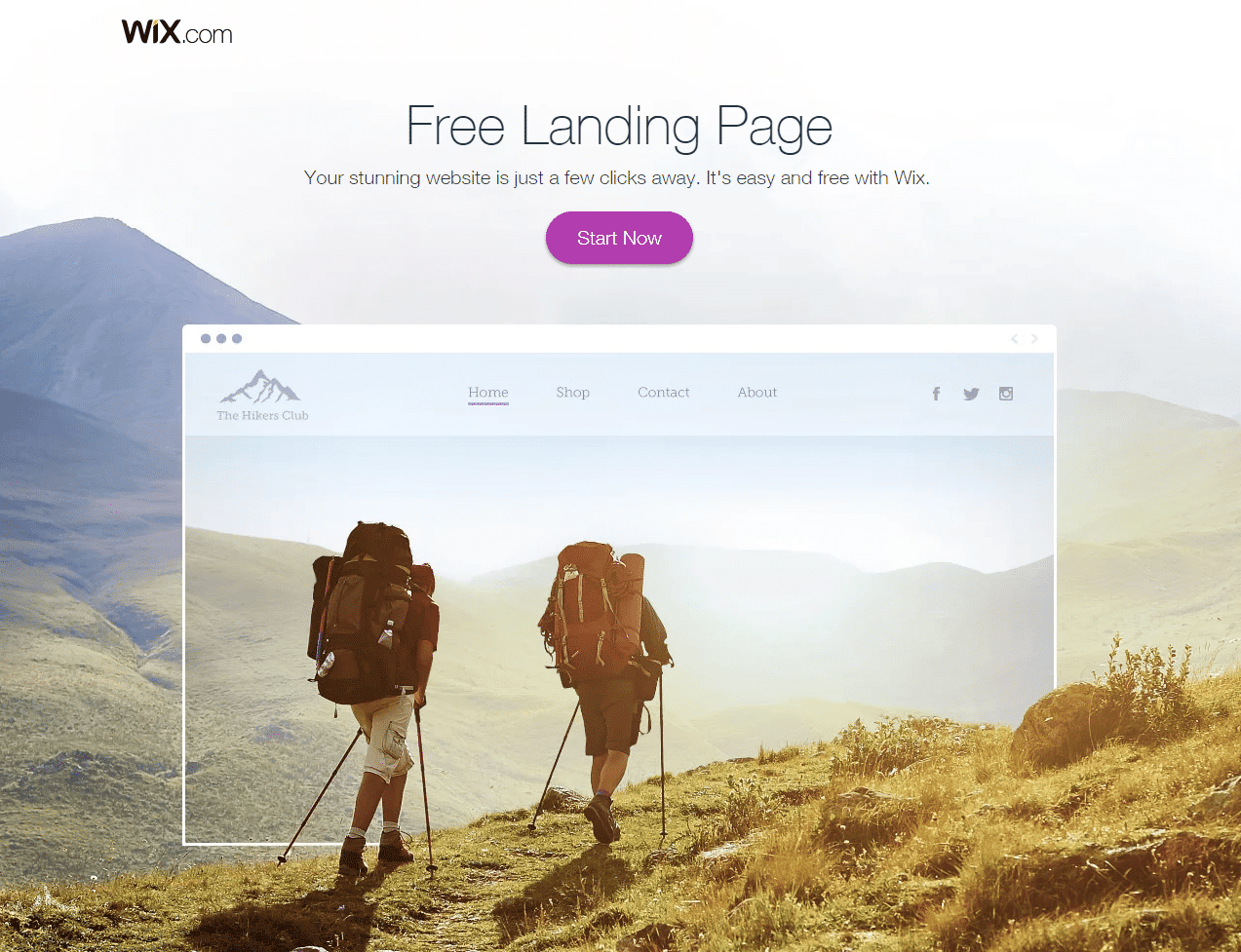
Wix.com, on the other hand, created a landing page free from navigation bars. When you compare this page to their homepage, you can see the navigation links at the top. The homepage serves different purposes, as it should, while the landing page focuses on offering their product, as promised by the ad: “free landing page creator.”
Keep Scent from Ad to Page
As you create the wireframe for your landing page, you should also work on maintaining the scent from the traffic source to the landing page. As the visitor clicks on the ad, the experience upon arriving at the landing page should be as seamless as possible. Color, layout, and wording should match between the ad and the landing page.
A landing page’s design should match the related promotional creative as much as possible. If a user clicks on a PPC ad: “10% off lawn mowing service,” they expect to see the same headline on the landing page. If the user clicks on an ad featuring a blonde model in a red cashmere shirt, they expect to see that same blonde model when they arrive at the landing page.
Wix.com sets the tone with the “free landing page” headline.
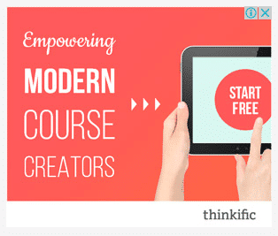
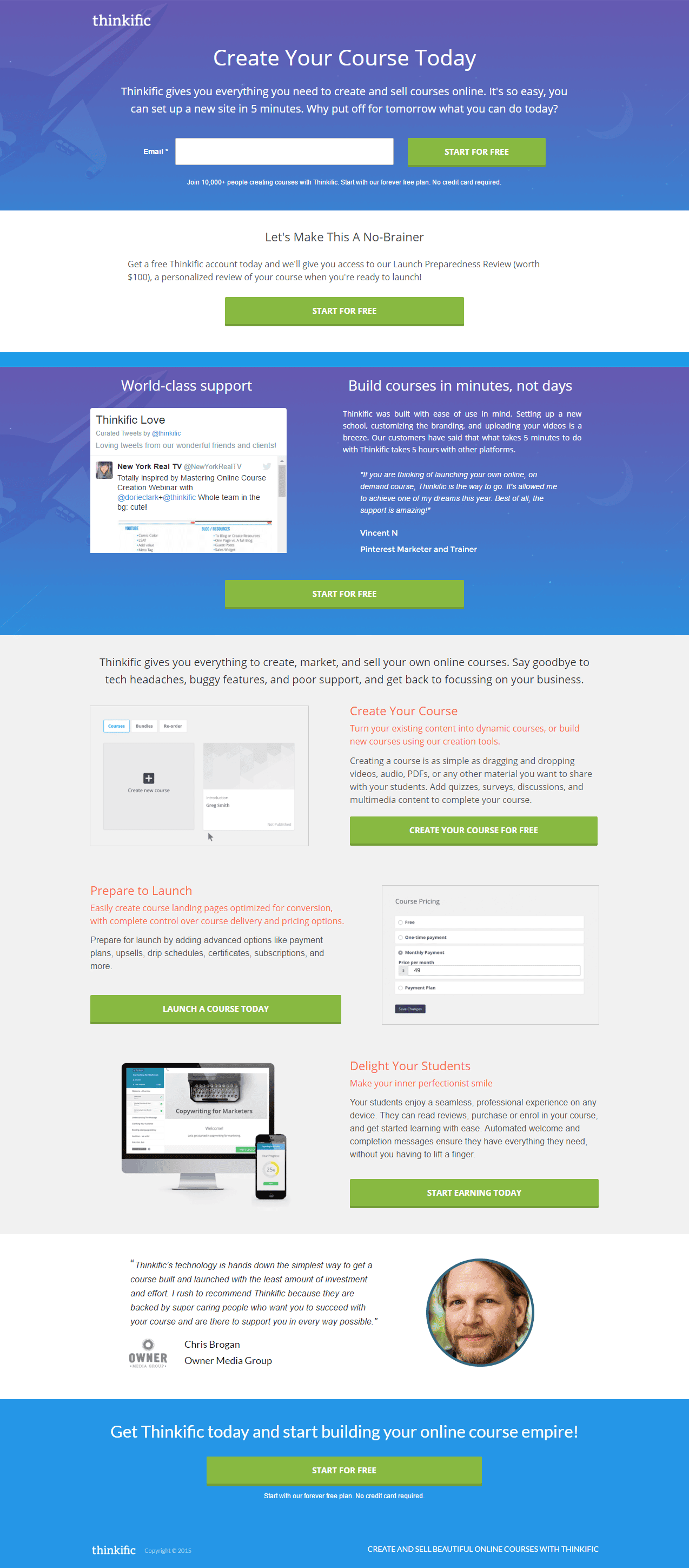
Thinkific, on the other hand, does a better job of keeping the scent of just one ad. You can see the blue ad resonates with the landing page, while the red ad does not seem to belong to the same campaign.

Actions to Take on Step 4
When designing your landing page layout, you should:
- Look for inspiration and create a reference board you can check whenever you need to organize the structure of a landing page.
- You can work with wireframing tools.
- Remember to stick to a clean design to help the visitor easily find the information.
- Use bold, colorful, and large text and images for the most important parts of your page. A quick glance at your landing page should be enough for someone to understand your offer.
- Create a natural flow to conversion. A good landing page design guides users’ eyes toward the call to action. Web page viewers tend to look at a page starting from the top left and moving to the bottom right. The design of your page should follow this flow.
Step 5. Designing the Form
Filling out the form and submitting it is a highly engaging moment of the visitors’ experience, so you should make it as clear and direct as possible.
The form should be easy to read and easy to understand. Decide on the form’s length by limiting the required fields. Too many fields might scare new leads away. Too many fields also look like too much trouble to go through. Simplify the form as much as possible.
For example, you will rarely need a full mailing address, because zip codes indicate the city and state. Asking visitors for a telephone number is often a turn-off, as no one relishes the prospect of telemarketing calls. If you need broad demographic data, try using easy-to-click multiple-choice checkboxes.
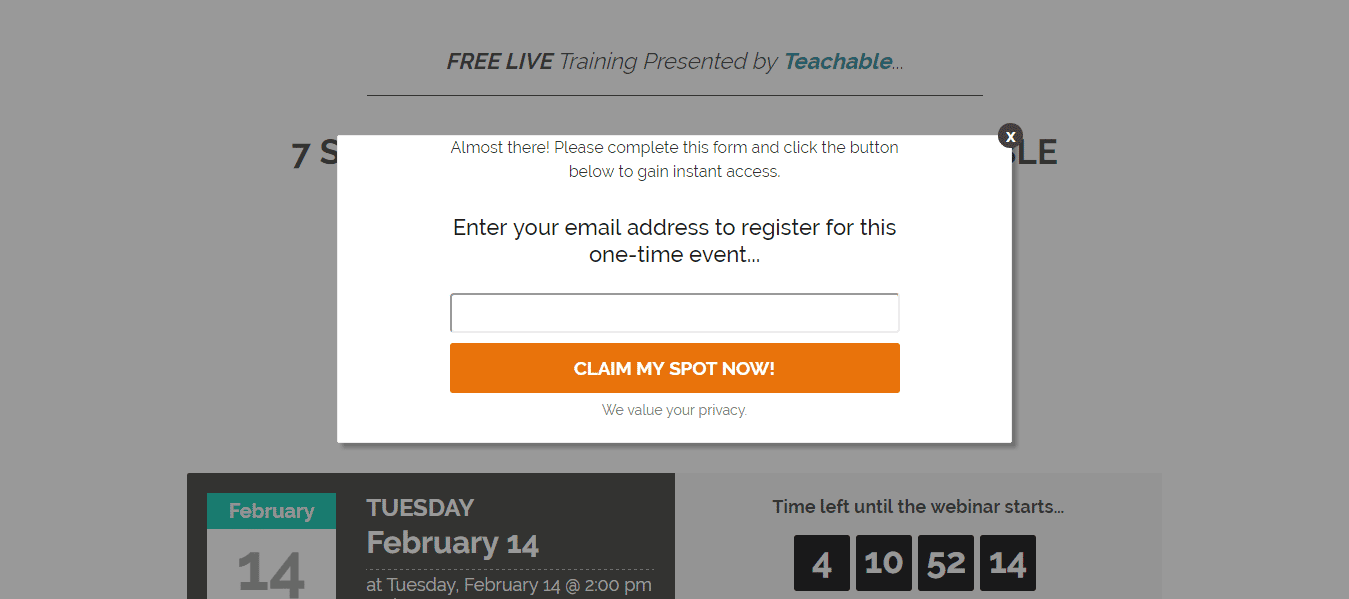
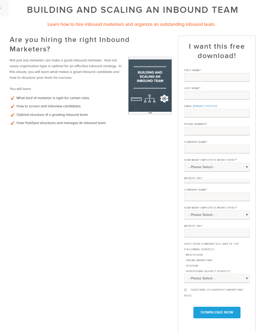
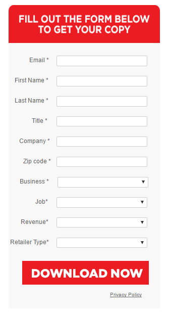
You can see below that Total Retail asks for the company zip code, even for the revenue info, in exchange for offering the benchmark report, while Teachable asks only for the email in exchange for offering free webinar attendance.
Actions to Take on Step 5
To design your landing page form, you should:
- Consider the page’s goal so you can include the right fields to collect only useful information from leads.
- Think about which fields are crucial to qualify the lead for sales:
- Do you need info on the prospect’s job position?
- Do you need a cell phone number, or is email enough to contact leads at the moment?
- Do you need the lead’s physical address?
- Is information on the lead’s company important at this stage?
- Pay attention to the form’s length and keep it short.
- Consider the offer and balance the amount of personal information the visitor will be willing to share to get the free offer.
- Place the form above the fold.
Step 6. Designing the Call-to-Action Buttons
The center of all attention comes to scene. If by now you have defined your goal, decided on the best offer based on your visitors’ interests, and designed a clean layout, the right call-to-action button will be a breeze to create.
You already know where to locate the call-to-action button because you have decided on the best spot while creating the wireframe. Hopefully, you chose to add the first button above the fold. It should be clearly visible and easy to read.
You are also equipped to choose engaging copy for your button because you understand your visitors’ needs. The default text on a form is usually “Submit.” Conventional CRO wisdom is to use clearer text that tells the visitor what will happen when they click the button. While some studies suggest that changing the text can have a significant impact on your bottom line, we think that the impact has been exaggerated.
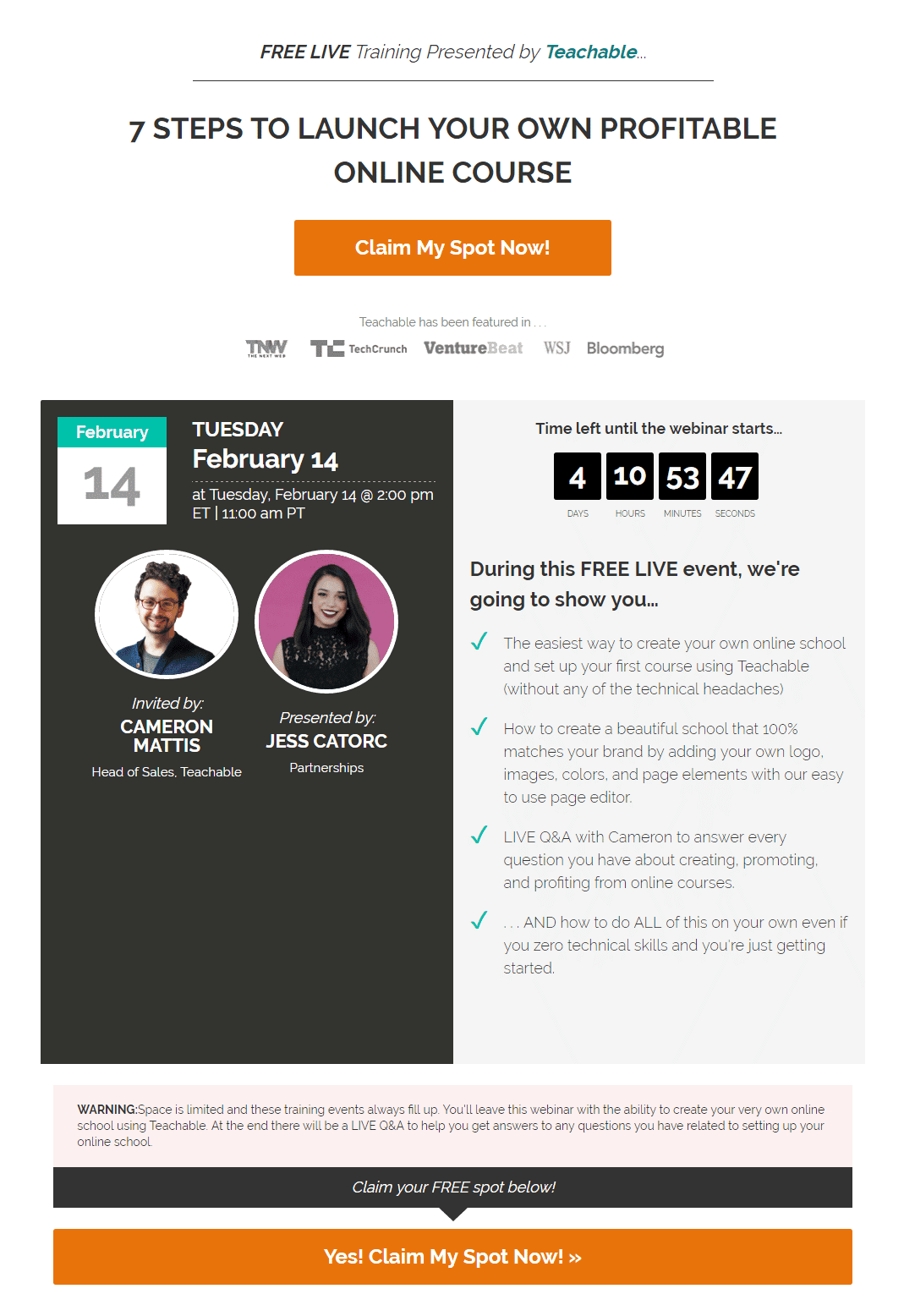
As you can see, Teachable, for instance, chose the first person for the button copy: “Yes! Claim my spot.”
Actions to Take on Step 6
When designing your call-to-action button, pay special attention to:
- The microcopy you choose, make sure it is engaging and relates to the offer and theme of the page
- Multiple locations. You should add more than one CTA button on your page so visitors can easily find them without having to scroll up and down. A rule of thumb is to have a call to action for every “screen,” or about every 400 to 500 lines of vertical resolution.
- A distinct break in your copy at or near the fold, or your reader may not know to scroll down. While web browsers automatically add scroll bars to longer pages, they are not always noticed, so the reader needs to know there is more information below the fold.
Step 7. Choosing Images
With forms and buttons in place, let’s now add some spice to your landing page. Images and videos play a crucial role in helping visitors identify your offer.
There are a few rules of thumbs here. A basic guideline is to use graphics and colors that are similar to, if not the same as, those used in any other promotional creative relating to your page. Changing the graphic approach and/or the color scheme your customer is familiar with can cause confusion and lead them to click away. You need to make sure images keep the scent from ad to page.
The Hero Image
The hero image should convey a strong message along with your headline. A carefully chosen and well-positioned image should be a major element of your landing page design. When scanning a web page, visitors will most often look at the image first.
A key criterion for choosing images is relevance to the product or service being promoted. If you are offering an e-book, choose a cover mockup or display a few interior pages. Anything that helps the reader visualize the offer.
Skillshare uses the picture of someone training in calligraphy, one of the courses available on their platform.
Zoom chose a hero image of someone using their product.
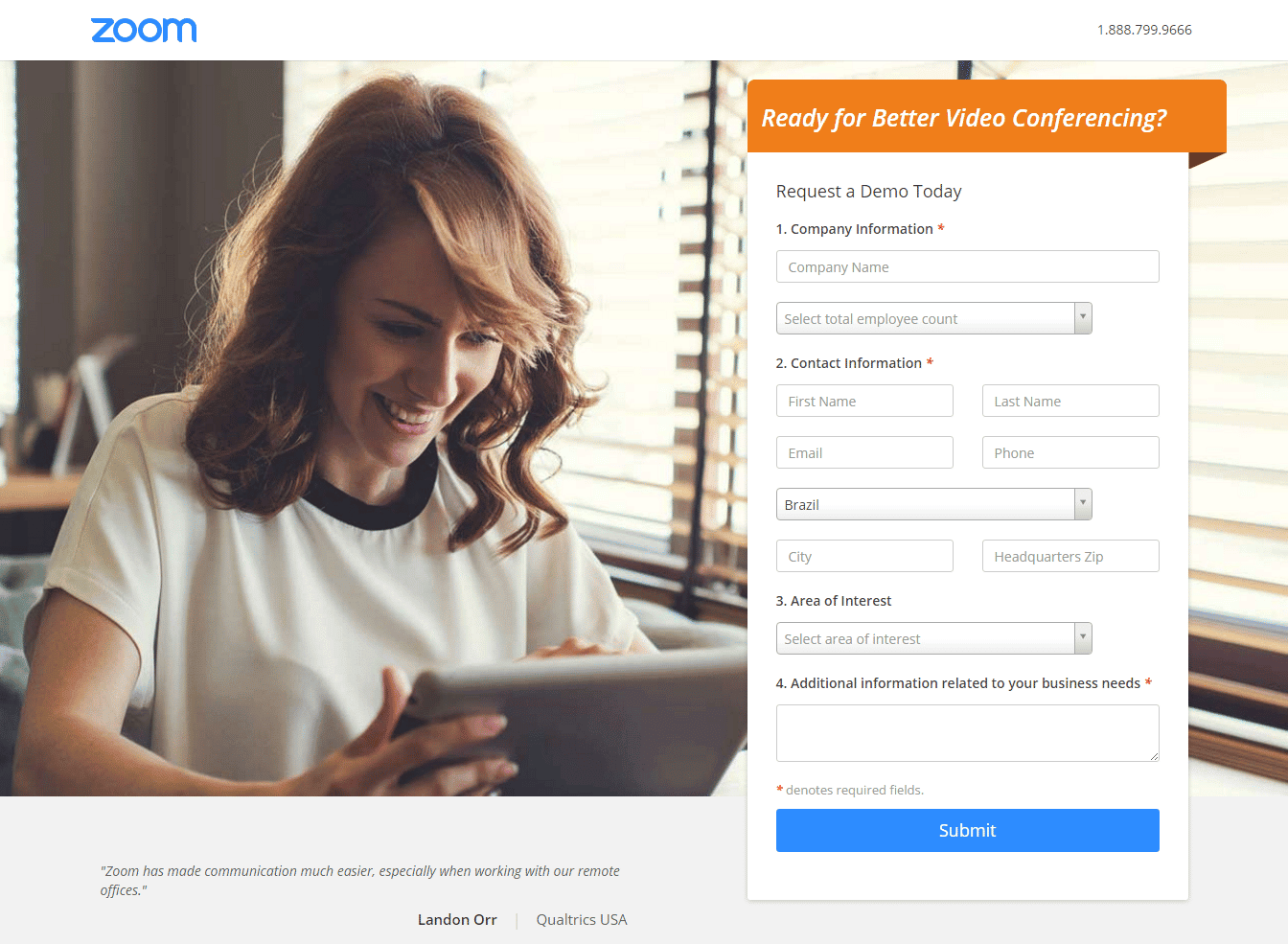
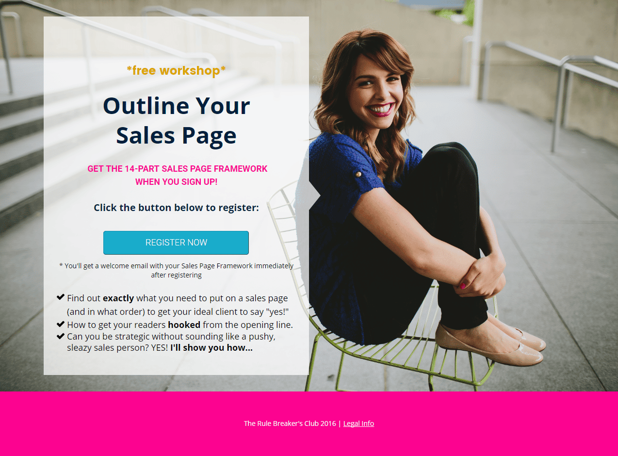
The hero image might also be used to instill trust. On the landing page for Courtney Johnson’s workshop, you can see a hero image of the speaker. This image presents Courtney to visitors and helps establish a relationship of trust between her and future leads.
Sift Science aims to convey the idea of “I trust with my eyes closed,” so they chose an image of a person with closed eyes. Beyond establishing a relationship of trust with visitors, this hero image aims to convey the product’s value proposition.
Wix has an inspirational hero image style.
Supporting Images
Supporting images on your landing page should help convey your arguments.
Skillshare chose six screenshots of classes and three icons to help describe three key benefits.
Sift Science uses icons and a screenshot of its product interface.
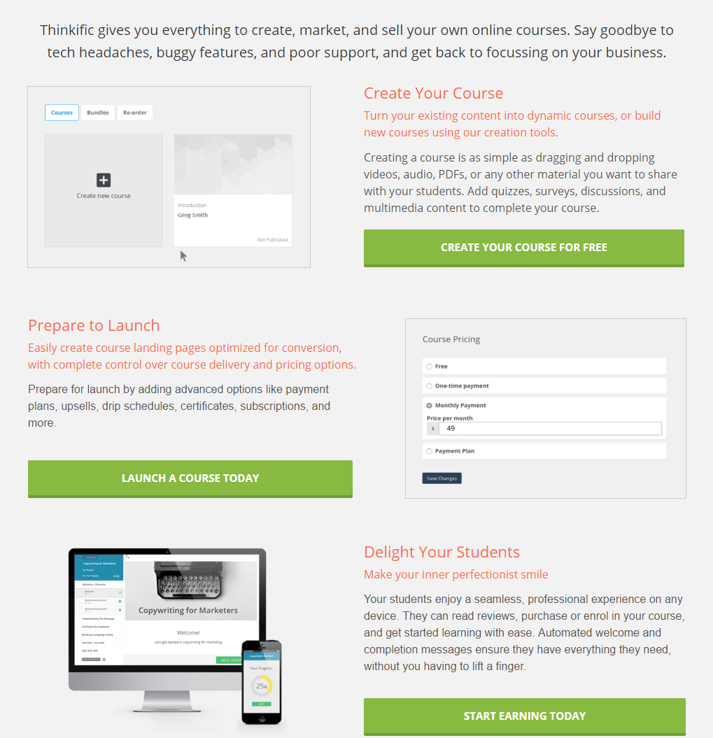
Thinkific also uses screenshots of the interface to create courses.
Actions to Take on Step 7
When choosing images for your landing page, keep in mind these should:
- Help position your offer as legit. So, be careful when using stock images that look phony.
- Come in two different groups:
- Hero image
- Supporting images. If you have technical information, a chart or graph might convey your point more clearly. Make sure that, unless your graphic is the main image, it does not overpower other elements or become the focus of your page—this could distract the viewer from continuing on the path to conversion.
- Use any formats that help better convey the page’s main message. The images might be:
- photos of people
- photos of products
- videos of people
- demo videos
- explainer videos
- cartoons
- drawings
- Have good quality.
- Help you achieve the goal you set for the page.
Step 8. Add Trust Elements
Trust is fundamental for conversions. Visitors need reassurance that they can trust the site they are visiting. The internet is a scary place sometimes. You are, after all, asking visitors to share personal information with you in exchange for your offer.
It is always risky to enter into an online transaction with someone you do not know. People may be afraid to give you money or their personal information because they do not know you. How can you get potential customers to trust you without ever meeting them?
You can convey trust on your landing page by adding a few elements, such as:
- Client testimonials
- Client logos
- Media mentions
- Authority endorsements
- Third-party security certifications
- Guarantee seals
- Trust badges
- Number of clients
- Proof of experience
Sift Science uses clients’ logos on a gray border. This page also provides case studies showing the results some clients achieved using their software. Since both sections help build visitors’ trust in the product, Sift Science chose them as the first and second sections below the fold.
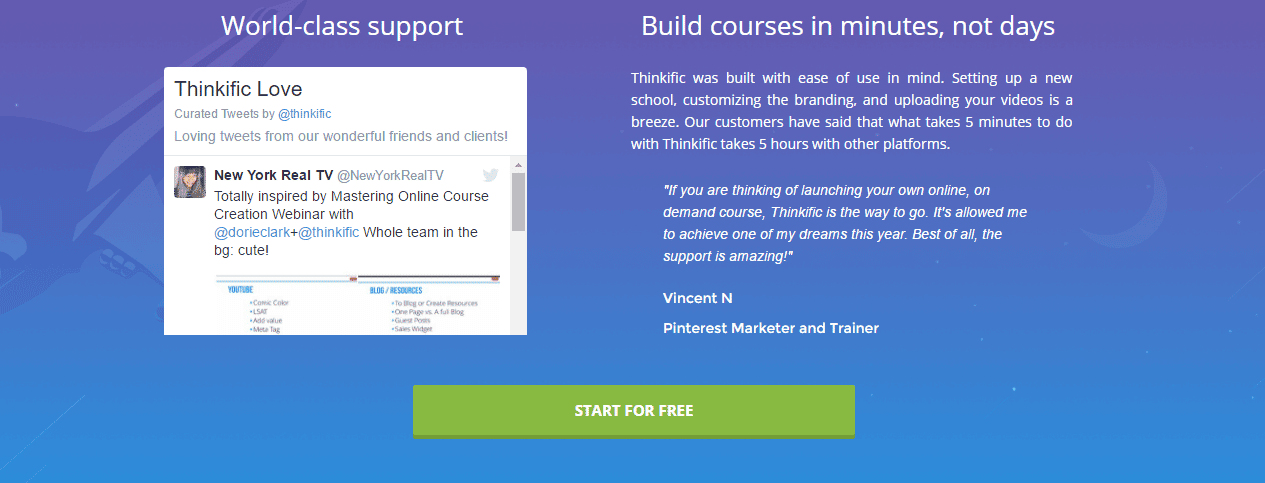
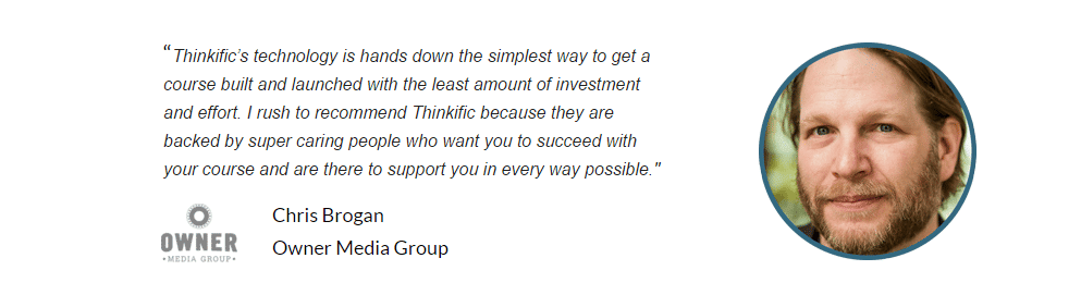
Thinkific uses client testimonials in three different formats. First, they show a tweet from a happy client under “Thinkific love.” They also use a quote from a Pinterest marketer and trainer. To raise visitors’ trust, these two elements appear right below the fold. Further down, before the closing argument, there is another quote, now accompanied by the client’s picture and company logo.
Actions to Take on Step 8
To add trust elements to your landing page, first save a spot for them while you wireframe the page. Next, you have to:
- Gather social proof. You can find advice on building social proof from scratch and on how to use it to boost conversions.
- As possible, ask clients to provide pictures to accompany their testimonials.
- Reduce FUDs (Fear, Uncertainty, and Doubt). Make sure your visitors feel safe in providing their personal information or signing up to your service. To help them feel safe and connected to your offer:
- Maintain scent from ad to landing page.
- Keep your form short; don’t ask for too much information.
- Proofread your page. Grammar and vocabulary mistakes signal fake pages to visitors.
- Add guarantee seals and trust badges.
- Do not add too many trust elements. If you add too many of them, your visitor might doubt your offer is legit.
Step 9. Include a Thank You Page
If a visitor went through the whole process of clicking your ad, checking your landing page, filling out the form, and offering you contact information, the least you can do is say thank you.
The thank-you page shows good manners, but it’s also a prime spot to confirm to the visitor that you received their information. The internet sometimes messes up, so if a visitor just entered a lot of personal information in a form, they want assurance that the information went to the right place.
So, use the thank you page to:
- Say “thank you” to the visitor.
- Confirm the info went through.
- Explain how the visitor gets access to the offer.
- Offer a bonus.
- Add social media sharing buttons.
- Add secondary calls-to-action.
This is a place to further engage visitors and help create and consolidate their experience.
Take advantage of that magic moment directly after the customer says “Yes, I like you”. By paying careful attention to your confirmation pages you add the opportunity for some powerful brand extension touchpoints:
The opportunity for more subtle follow-up marketing: keeping people within the sphere of marketing influence if they follow or share on social media.
The opportunity to exceed expectations: differentiate by being the best. Surprise people with a bonus extra offer or content download.
The chance to offer info/advice that would have crowded your landing page: if you wanted to convey a message that wasn’t appropriate for your landing page (as you were rightfully keeping it focused on a single message), you now have the opportunity to do so.
The chance to offer a guided experience: most people like direction. Offer a suggestion of what to do next.
The Landing Page Course
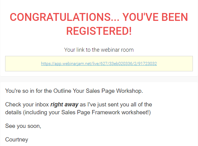
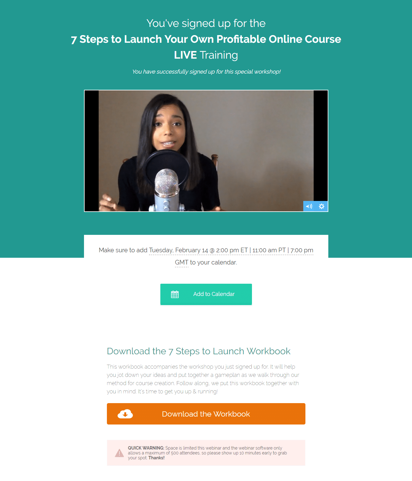
Courtney confirms visitors’ subscriptions on the thank-you page and informs them of the worksheet they will receive via email.
Actions to Take on Step 9
For your thank you page, you should:
- Consider the page goal you set at the beginning. By recognizing the goal, you can decide which sharing buttons to add or which bonus to come up with.
- Think through which actions you want your visitors to take after they accept your offer.
Conclusion: Monitor and Measure the Success of Your Page
Once your page is set, make sure you avoid the most common mistakes when creating your landing page, then monitor it and measure visitors’ engagement.
If you want to improve your results, check my webinar on optimizing landing pages for higher conversion rates. You will learn how to segment your traffic and plan effective A/B tests.
A/B testing is powerful for landing pages. Tests can generate up to 30-40% more leads for B2B sites and 20-25% more leads for e-commerce sites. A/B tests are considered the most effective landing page optimization method by 52% of marketing, sales, and business professionals worldwide.
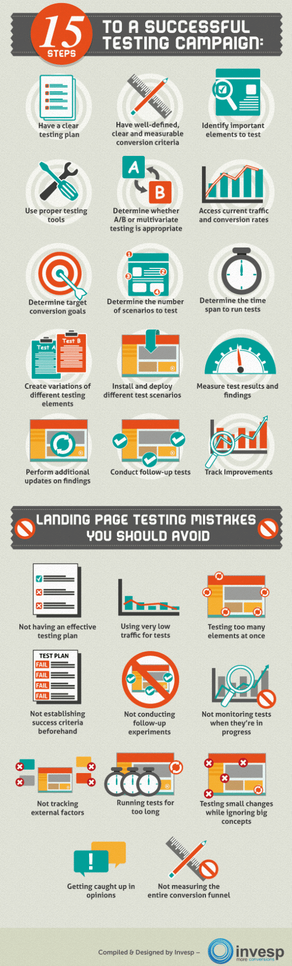
Would you like to start A/B testing your page? Check our guide with the essentials of A/B and Multivariate tests, follow the 15 steps below for successful testing, and avoid these testing mistakes:
While testing and monitoring your landing page, you might find that you do not have enough traffic to it. We recommend you run A/B tests only if your page already has over 200 conversions per month. If you have fewer conversions, that is unfortunate, but fixable. You can still optimize pages with low traffic.