How’s your ecommerce conversion rate doing? Has it improved lately? If you are like the bulk of online retailers, the answers are, in order, “poorly” and “no”.
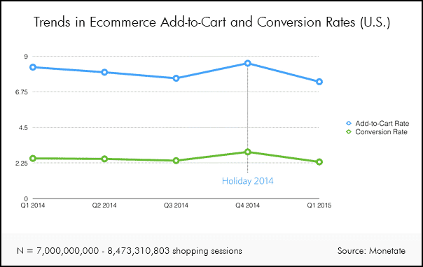
In May of 2012, Invesp reported average online conversion rates of 2.14% in their “Shopping Cart Abandonment Rate Statistics” infographic. Three years later, Monetate analysed almost 8,500,000,000 (yes, eight and a half billion) shopping sessions and found an average conversion rate of 2.25%. It’s up, but if we claim a victory from a tenth of a point uptick in conversion rates over three years, then no one should wonder why conversion rates absolutely suck.
To top it off, that rate increase is not consistent. The same Monetate data shows a decrease in conversion rates between Q1 2014 and Q1 2015.
Conversely, online sales continue to skyrocket as more shoppers turn to mobile and desktop ecommerce sites to make their purchases. According to statista.com, online retail sales in the U.S. grew by 104% between Q2 2010 and Q2 2015. That compares to overall retail sales growth of about 28% in the same period.
So the stunning revelation is that ecommerce sales growth outpaces overall retail sales growth by almost 400% despite measly 2.25% conversion rates – and those rates might be getting measlier.
Why are Conversion Rates So Low?
It’s quickly becoming the eternal question of ecommerce. With bricks and mortar conversion rates well into the double digits, online conversion optimizers continue their search for a responsive chord in the customer.
With years of efforts to improve conversion rates and little to show for it, explanations are difficult to come by. But there are a couple glaring clues:
- Digital marketers continue to devote a dizzyingly disproportionate share of their budgets to getting people to visit their sites, versus actually converting those who arrive. The best estimates put it at $1 spent on conversion rate optimization (CRO) for every $20 spent on traffic generation.As we pointed out in a recent Invesp post, a study conducted by Unbounce discovered that the highest ROI from a digital marketing budget occurs when 30% of it is devoted to CRO.That means we should be spending 600% more on CRO than we do now.
- Customer experience is your unique selling proposition. Online shoppers look for something different in a site before they buy from it. If yours looks the same, has similar prices and works the same as your competition’s, then a shopper has no reason to choose you over them.Online, transparency is at an all-time high. The price, product and service differences between you and your competition are in the palm of your customer’s hand and they increasingly exploit that fact.
So what are you going to give them that they can’t get elsewhere, something that will make you stand out, and get the customer to click?
Give A Better Experience
The big picture of online customer experience is way too large to cover in this post. In a nutshell, the better you engage your customer, solve their concerns, answer their questions and give them what they seek, the better their experience. The experience of your company, brand and product begins when they first become aware of you and, hopefully, it never ends.
Conversion Optimization is Experience Optimization: That’s really how it boils down. When your customers perceive a better experience on your site, they are more likely to convert.
Because we can’t cover every point of experience optimization, we’re going to look at one particular element of one particular step. One that is severely neglected.
The “Call-to-Search” on Your Homepage
While you have product pages, landing pages, a blog and many other places for your customer to start their online experience of your brand, your homepage is still the “signature” page of the site. It sets the tone and pace for the rest of the site, regardless of where the customer entered.
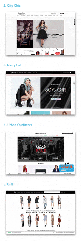
To compare homepages, we looked around for “best ecommerce sites” and found one at WeMakewebsites.com titled “60 Best Fashion Ecommerce Sites”. While the sites listed are no doubt intended to show off the WeMakeWebsites platform, we were impressed by the variety and creativity of the homepage designs and layouts. There is no hint of a template here.
A scroll through the 60 sites shows each one to have either a unique look, feel, layout, colour scheme, and/or experience.
With one exception. The “Call-to-Search”.
Is “Search” the New “Submit”?
On all but two of the 60 very distinctive sites, the homepage call-to-search falls into one of the following categories:
- Non-existent
- A small magnifying glass icon
- An entry field with the word “search” in it
The two exceptions? The two sites used wording other than simply “Search”, including:
- “Search all products…” (really? ALL products? No thanks)
- “Search entire store here…” (Ditto. No thanks.)
Do you like to be told to “Search”? Not likely. You might do a bit of searching on your own, but in the absence of help, you will probably bounce if you don’t find your quarry soon.
Not one of these highly-designed sites bothers to offer a better or truly different call-to-search. Imagine if just one site thought to say “What are you looking for…” or “Let us help you find what you need…”.
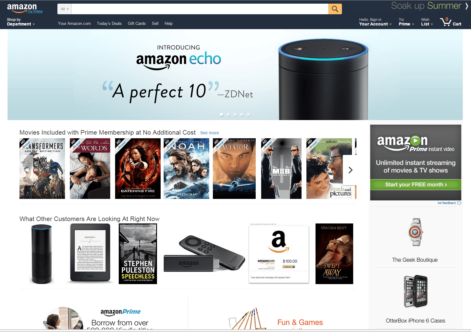
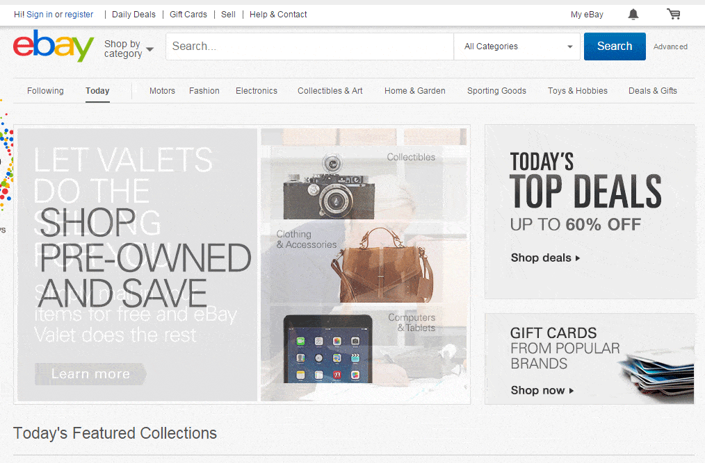
And the story is no different with the traditional big ecommerce players like Amazon and Ebay.
Why We Haven’t Optimized the Call-to-Search
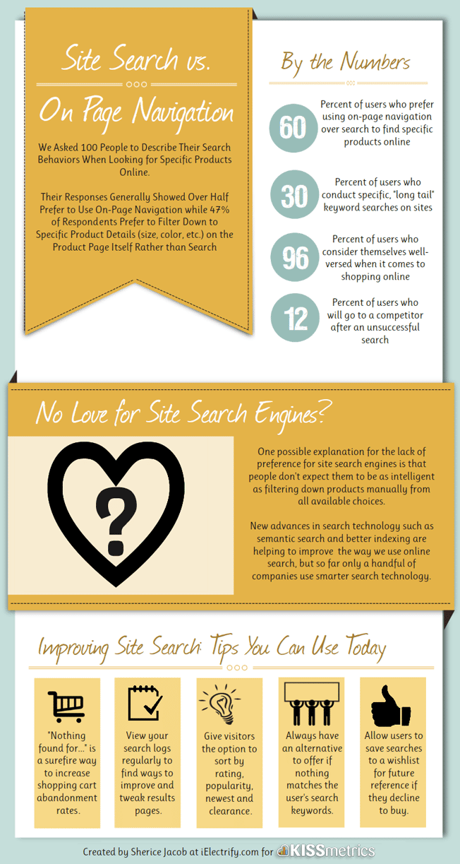
KissMetrics asked 100 shoppers to describe their online ecommerce search behaviours and found the following:
- 60% of the shoppers preferred using the site’s navigation over the search function to find specific products
- Only 30% do “long tail” searches
- Almost 100% considered themselves well-versed online shoppers.
On the surface, digital marketers couldn’t be blamed for marginalizing the call-to-search in their efforts to optimize experience. Why bother if most seasoned shoppers prefer navigating the site on their own?
But is the preference for navigation really due to the poor experience customers have with a function that has yet to be developed past the burdensome invitation to “Search”? Or that the lack of development gives them little faith that a Search will produce any practical results?
One Big Reason You Should Improve Your Invitation to Search
Whether or not you believe that improving your call-to-search will bear any conversion fruit, you should consider it for the following reason: if conversion optimization is ultimately experience optimization, then the more you know about what your customer seeks, the better you will be able to provide it.
By enhancing your call-to-search, using semantic searches and improving your product indexing, customers will come to rely on your search function more often. Each time a customer uses your search function, it is another piece in the puzzle of what they are looking for and how they think.
When you get more into your customers’ minds, you get a better understanding of how to improve their experience. And your conversion rates.

