Does anyone fully appreciate the critical importance of every element of their landing page strategy and design towards the overall success of their entire digital marketing campaign(s)?
It doesn’t seem so, judging by the majority of landing pages we come across.
Whether you’re trying to generate leads or make a sale, your landing page is the most crucial element of your entire digital campaign. It is the ultimate tipping point in a series of tipping points. It is where your visitor either becomes a lead or customer – or scampers away unconverted.
And that’s why landing pages are so important. If there is an issue with any one part of your landing page, it has the potential to negate your entire campaign: including PPC & SEO budgets, your content marketing, social media, web design, and so on.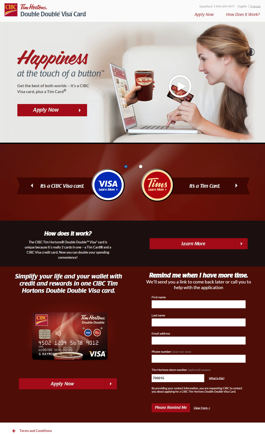
The Landing Page Makeover Guide
Like any makeover, optimizing your landing page is not a one-time proposition. Makeovers don’t last, and you must constantly review, measure, analyze, and adjust each of the following areas and others to keep your landing pages and digital marketing in peak condition.
- Prepare for AB Testing: Want to make sure your landing page is perpetually optimized? Before you do anything, start planning your AB test program. If there is anything that we underestimate about landing pages, it is that they can always be improved, always ‘made over’. While you may not be able to lay out the specifics of your testing program until the elements of the landing page are in place, developing a mindset of ongoing testing from the start will improve the chance that it becomes a fixture of your program, which is as it should be.
- Design for Personas: You need to know to whom you speak before you can convert anyone. Personas, or composite profiles of your typical target customers, are essential to determine the elements you need on your landing page, the content and configuration of each element and the overall design of your page.At a minimum, you should have at least one persona for each of the four main human personality temperaments: logical, caring, impulsive and aggressive. Even if your offer is aimed mainly at one personality type, each type is not absolute, and within each one are different aspects of the others.
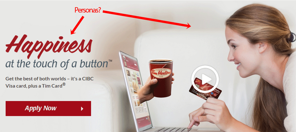
Not only should your persona profiles be as complete as possible, they should also constantly change and evolve like your customers. Each personality type you target might react differently depending on variables like economic climate, the sales season, or their age. - Have Multiple Pages: Hundreds of millions of potential customers are surfing the web right now. It is a grave mistake to think that one single landing page will appeal to them all. It’s a mistake not only because you risk missing huge swathes of your market but also because of how relatively easy it is to create multiple versions of each landing page.
- Create Context – If you change your landing pages as the seasons change, by geographical region time of day, or according to any other pertinent variable, you can improve conversion rates by making them more relative to those variables than a static page.
- Measure Your Marketing – Similar to call-tracking with different telephone numbers, if you have different landing pages for different sources of traffic: for example, one for PPC ads, one for organic results, and one for each social media channel; you can make each one more pertinent to the source and measure the performance of each source.
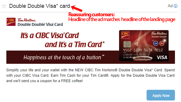
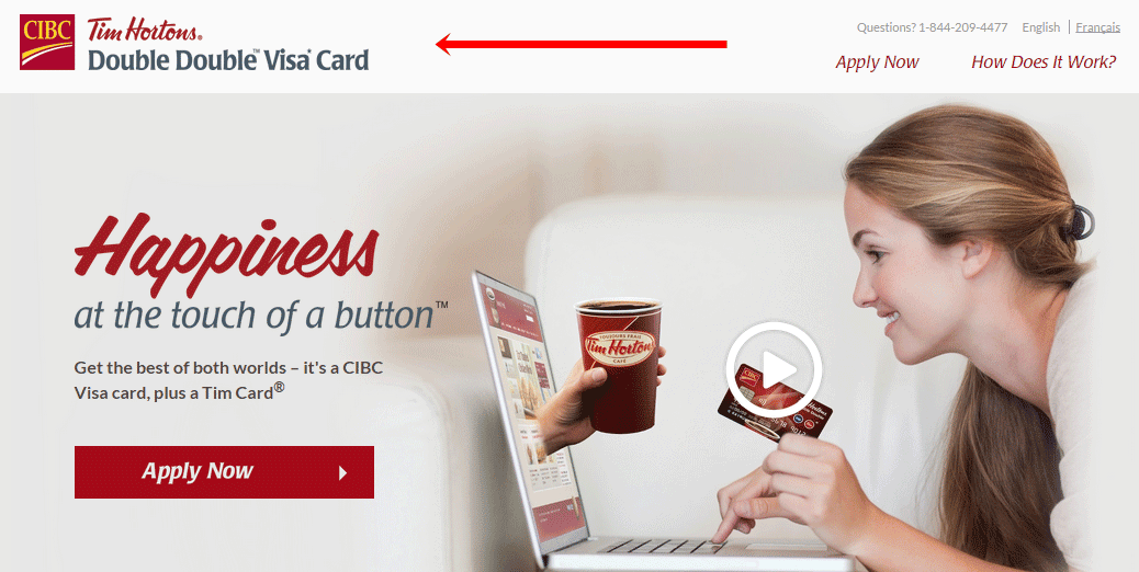
- Reassure Your Customers: Regardless of which page your customers land on, it must quickly reassure them that they are in the right place. Make sure your headlines and/or visual cues match or reinforce the content of the social post or ad copy from whence the customer came.
 Benefit Driven Copy – Like form follows function, features follow benefits. Instead of writing: ‘our new red buttons make our landing page easier to use’, which puts the feature before the benefit, write something like ‘Easy to use landing page has all the answers you need.’
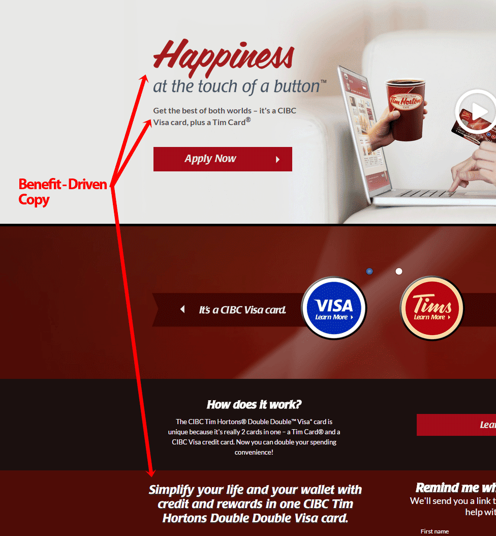
Benefits give customers confidence that they have found something that solves their needs/wants. - Be Graphic: The debate over the effectiveness of long copy versus short copy on landing pages will probably never end. But regardless of which one you choose, the graphics or images on your page are at least as important as the copy. But only if you make everyone count:• Answer potential questions by showing the benefits/features of your product or by demonstrating how it works
• Show social proof with user-generated images
• Prove value with a chart
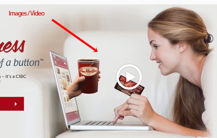 High Quality – Regardless of how you choose to use visuals on your landing pages, make them of the highest quality possible. There’s no excuse for fuzzy images or poor video production.
 - Cure the FUDs: Fears, uncertainties, and doubts, that is. No matter how savvy, every visitor has questions, needs guidance and/or requires assurances that yours is their best option.• Use credibility symbols, including industry associations, security precautions and/or awards, to reinforce the integrity of your company and the soundness of your offer
• Keep data collection forms to a minimum to reduce anxiety over information disclosure.
• Clearly indicate ‘next steps’ to guide the visitor towards conversion
• Highlight customer testimonials so visitors know they are not alone in accepting your offer. Ultimate cure for the FUDs: Landing page personalization. - Go Beyond the Conversion – While this is not an element of an individual landing page, it helps reinforce the customer’s decision to convert if you follow it up with a confirmation, thank you or additional offer.
We called this a Landing Page Makeover “Guide” for a reason. The points outlined are guidelines to make over your page for higher conversion rates. It’s not a rule book. There are no rule books for conversion optimization. If rule books existed, all landing pages would be fully optimized.
Clearly, they are not. And until you get 100% conversion rates, you can always improve your page.

